Coca-Cola Turkey: Invisible Vending Machine

Since the time I started writing this blog, I have come across many innovative vending machines. Some I featured right here on Ramble.

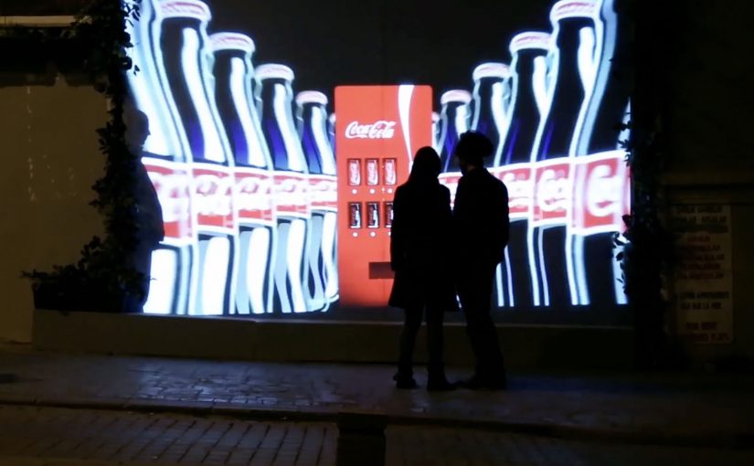
Now to add to this collection, here is an invisible vending machine from Coca-Cola Turkey that becomes visible only when couples walk by. The machine was created specially for Valentine’s Day (last week) and was installed in Istanbul to spread happiness Coca-Cola style.

A vending machine you cannot see until the right moment

The trick is the reveal. What looks like a normal stretch of wall becomes a vending interface only when two people approach together. That instant transformation creates a micro-scene, and the micro-scene pulls in everyone nearby.

In consumer brand activations, public installations work best when the interaction is obvious, fast, and shareable without instruction.

How the interaction is described to play out

  • Invisible by default. The unit blends into the wall and does not present itself as a machine.
  • Couples trigger the reveal. When two people pass together, the interface lights up and becomes visible.
  • Personal moment, not just a dispense. In coverage at the time, the machine asks for names and then produces two personalised cans.

Why it lands

This is not “another vending machine story”. It is a street-level surprise that creates a small, romantic spotlight for a couple, and a quick bit of theatre for everyone else. The invisibility is not a gimmick. It is a pacing device that makes the reveal feel like a reward. The real question is whether the experience creates a transformation that bystanders can explain in one sentence.

Extractable takeaway: If you want people to stop, watch, and retell an activation, build a visible transformation into the experience. A before-and-after moment is easier to share than a static stunt.

What Coca-Cola gets out of the Valentine framing

Valentine’s Day provides the social permission for public sweetness, names, and sentiment. For the brand, it is a clean link back to togetherness and “sharing happiness”, while turning a sample into a story people can repeat without being prompted.

Retail theatre patterns worth borrowing

By “retail theatre” I mean designing a retail moment as a small piece of live, shareable experience, not just a dispense or transaction.

  • Hide the interface until it matters. Visibility can be part of the reward, not just a prerequisite.
  • Keep the trigger legible. People should understand why it happened in one glance, or they will not mimic it.
  • Design for bystanders. The couple is the participant. The crowd is the media channel.
  • Personalise lightly. Names, messages, or small custom outputs feel intimate without needing heavy data.

A few fast answers before you act

What is the “invisible vending machine” concept?

A vending machine that stays hidden until a couple approaches, then reveals itself and delivers a Valentine-themed Coca-Cola moment.

Why make the machine “invisible” at all?

It creates a sharp reveal, and that reveal is the shareable payload. People remember transformations more than static installations.

What is the simplest way to replicate the effect?

Use a clear proximity trigger plus lighting and screen content that turns on instantly, and ensure the “why it appeared” is immediately understandable.

What is the biggest execution risk?

If the trigger is inconsistent or unclear, people will not repeat the behaviour and the crowd will not form. Reliability matters more than complexity.

What should you measure beyond views?

Dwell time, participation rate per hour, bystander clustering, social mentions generated on site, and any lift in nearby sales during the activation window.

The Adaptive Storefront: BLE Retail Display

Shop windows, billboards, bus stops, and car showrooms do not have to be passive experiences. In the video below, a prototype interactive digital display adapts to whoever stands in front of it.

The display identifies shoppers using Bluetooth Low Energy (BLE) and reacts to personal data stored on the shopper’s mobile device, such as shopping habits and preferences. Shoppers can swipe through personalised content, place items in a virtual shopping cart, and purchase straight from the display.

When glass turns into a shoppable interface

This “adaptive storefront” concept takes a familiar retail surface and makes it behave like a storefront UI. Here, “adaptive storefront” means the window can recognise a nearby device via BLE and change what it shows based on data available on that device. Not a poster. Not a looped video. A live interface that changes per person and lets you complete an action while you are still in that high-intent moment of attention.

How the prototype behaves in front of a shopper

  • Detect. BLE proximity is used to recognise that a specific shopper is present.
  • Adapt. The display adjusts what it shows based on data available on the shopper’s phone.
  • Let the shopper drive. Swiping changes what is on screen, rather than forcing a fixed sequence.
  • Close the loop. Items can be added to a cart and purchased directly from the display.

In physical retail environments, the storefront is the first high-attention interface a brand controls before a shopper reaches the shelf.

Why it lands

Because the display can recognise a nearby device and accept input on the surface, it compresses discovery, consideration, and purchase into one interaction. The value is not the novelty of a “smart window”. It is the reduction of steps between interest and action, while the shopper’s intent is still fresh. The real question is whether you can do that with clear permission and control, not silent personalisation.

Extractable takeaway: A surface becomes valuable when it combines context with immediate action. Personalisation only earns its keep when it removes friction and helps a shopper decide faster, not when it merely looks clever.

What it is really trying to unlock for brands

Behind the demo is a clear ambition. Turn high-footfall surfaces into conversion surfaces. If the experience is permissioned and useful, it can bridge the gap between physical browsing and digital checkout without forcing a shopper to open an app, search, and start over.

That also hints at a measurement upgrade. A storefront that can be interacted with can be instrumented. What people swipe. What they ignore. What they add. Where they drop. That is a very different feedback loop than counting impressions.

Practical takeaways for adaptive storefronts

  • Start with one job-to-be-done. For example, “help me shortlist”, “show me what is in stock”, or “let me buy in two taps”.
  • Make control obvious. If swiping is the interaction, design the UI so people understand it in one second.
  • Keep data minimal and on-device. Use only what is needed to improve relevance, and avoid making the experience feel intrusive.
  • Design for the environment. Glare, distance, dwell time, and group behaviour change everything compared to mobile UX.
  • Plan the opt-in moment. The experience works best when the shopper understands why the screen adapts and what they get in return.

A few fast answers before you act

What is an “adaptive storefront” in plain terms?

It is a storefront display that changes what it shows based on who is standing in front of it, and lets the shopper interact and buy directly on the surface.

Why use BLE for this type of experience?

BLE enables low-power proximity detection, so a display can recognise a nearby device and trigger the right experience without requiring scanning a code each time.

What data is needed to personalise the display?

Only enough to improve relevance. For example, stated preferences, browsing history, or saved items, ideally kept on the shopper’s phone and shared with clear permission.

What makes this feel useful instead of creepy?

Permission, transparency, and value. The shopper should understand what is happening, control it, and get something meaningfully better than a generic screen.

What should you measure in a pilot?

Opt-in rate, interaction rate, add-to-cart rate, conversion rate, and whether the experience reduces time-to-decision without increasing drop-off.

Dentsu London and BERG: Making Future Magic

Dentsu London has made two films with BERG as part of an ongoing collaboration to bring their “Making Future Magic” strategy to life. Both films treat the growing number and variety of media surfaces as a canvas.

Here, “media surfaces” means everyday objects and touchpoints that can carry useful information without behaving like traditional screens or ads.

Incidental Media sketches a near future where media surfaces are everywhere, but used to be playful, informative, and better at connecting you to friends and family.

The Journey shifts the same thinking into travel, focusing on opportunities in stations and on trains.

What the “media surfaces” idea actually proposes

The mechanic is a design-fiction approach. Instead of inventing new hardware, the films show existing surfaces behaving differently. Receipts, windows, clocks, tickets, and public displays become quieter, more contextual, and more useful. Small pieces of information appear where they help, then fade back into the background.

In urban, mobile-first consumer environments, the most effective ambient media tends to be context-aware, lightweight, and respectful of attention.

Why it lands

It feels plausible because it is built from things we already recognize. The films do not pitch a sci-fi leap. They demonstrate a series of small shifts in how content could live on everyday surfaces, and that makes the future feel “next door” rather than distant.

Extractable takeaway: If you want people to believe a future-facing strategy, show it as a set of concrete, everyday interactions on familiar surfaces. Keep the behaviors small, specific, and repeatable.

What Dentsu London is really doing with this work

This is strategy communication as an artifact. The films give teams and clients a shared mental model for what “Making Future Magic” could mean in practice, and they do it in a format that is easy to circulate, discuss, and reuse in planning conversations.

The real question is how you make a future-facing strategy tangible enough that teams and clients can picture it, discuss it, and reuse it.

This is a stronger way to communicate future experience thinking than leaving it as abstract language in a deck.

How to make future concepts feel usable

  • Show, then explain. Start with a believable vignette before you introduce principles.
  • Use familiar surfaces. Credibility rises when the canvas is already part of everyday life.
  • Prioritize quiet utility. Ambient media works best when it helps without demanding constant input.
  • Design for context shifts. Travel, waiting, and transition moments are rich canvases for information that matters.

A few fast answers before you act

What is “Incidental Media” in one sentence?

A near-future sketch where everyday surfaces carry small, useful pieces of media that are playful and contextual rather than loud and interruptive.

What does “The Journey” focus on?

Travel contexts like stations and trains, showing how ambient, contextual media could reduce friction and improve the experience of moving through transport systems.

Why use concept films instead of a written strategy deck?

Because films make the future tangible. They align teams faster by letting everyone see the same interactions, not just read abstractions.

Why does this future feel believable instead of sci-fi?

Because the films build from ordinary surfaces and small behavior shifts. That makes the idea feel adjacent to current life rather than dependent on a radical technology jump.

What is the main risk in copying this approach?

Staying too high-level. If the vignettes are not specific enough to feel real, the work becomes mood, not a usable model for decisions.