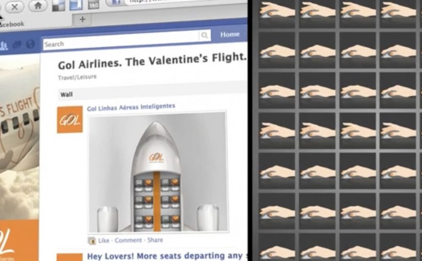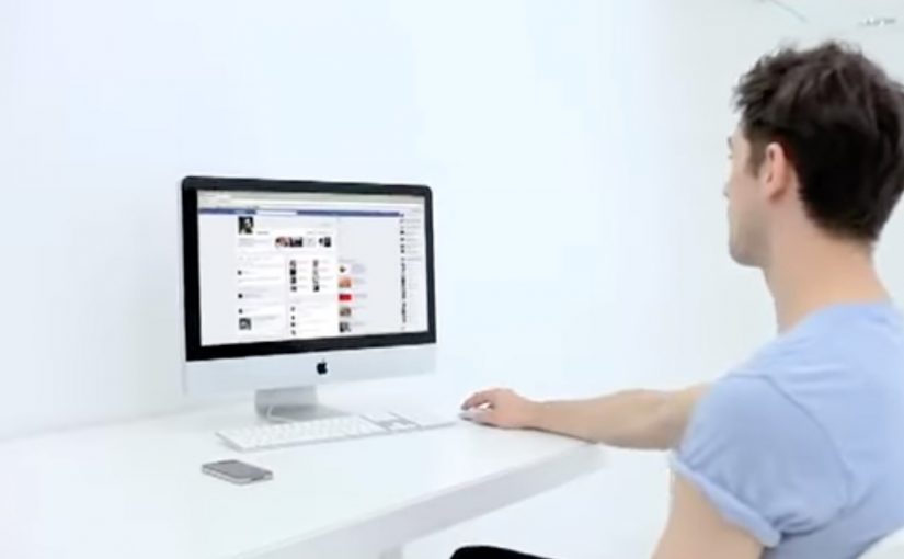
Inspired by Ford’s KeyFree technology for unlocking and locking cars, Ogilvy Paris developed the “KeyFree Login” app for the Mac. Once installed and configured, the app logs you into services like Facebook, Twitter and Gmail by unlocking your credentials when your mobile device is close to your computer. When you move away, it locks them again by logging you out.
From the coverage around the launch, the experience is built for Mac users running Google Chrome, using Bluetooth proximity to detect when your phone is “in range” and should behave like a key.
Turning a car feature into a behaviour people already understand
The move is elegant because it borrows an existing mental model. Your phone becomes a key. Close means open. Far means closed. That makes the value instantly legible, even if you have never used KeyFree on a car.
It also reframes “password fatigue” as a product problem, not a user problem. Here, “password fatigue” means the cumulative annoyance of repeated logins across the day. Instead of asking people to remember more, type more, or reset more, it tries to remove the repeated act of logging in and out.
In everyday authentication design, the job is to reduce login friction without normalising risky shortcuts.
In consumer tech and automotive marketing, the fastest way to teach a feature is to let people feel it inside a routine they already have.
Why it lands as an idea, not just a utility
This is advertising that behaves like a tool. The real question is whether you can turn a feature claim into a behaviour people can experience in under a minute. The brand promise is demonstrated through a working interaction, not explained through claims. If it feels real, it gets talked about. If it gets talked about, the car feature gets remembered.
Extractable takeaway: If you want recall, export your differentiator into a familiar behaviour and make the rule simple enough to repeat from memory.
The lock-on-walk-away detail is the smartest part. It turns convenience into a security story, which is what stops “auto-login” sounding irresponsible.
Steal the proximity demo pattern
- Export the feature into another context. If people do not notice your differentiator, demonstrate it somewhere they cannot ignore.
- Use a simple rule people can repeat. Near equals unlock. Far equals lock.
- Make the payoff immediate. The best demos remove a daily annoyance in under a minute.
- Build in an “and it’s safer” moment. Convenience sticks longer when it is paired with a security rationale.
I hope Apple implements a feature like this into macOS. It would make life more convenient and help avoid login fatigue. Until then, Ford KeyFree Login is available at: https://www.ford.fr/keyfreelogin
A few fast answers before you act
What is KeyFree Login supposed to do?
It automates login and logout based on proximity. When your paired phone is near your Mac, supported accounts can unlock and log in. When you leave, the sessions lock by logging out.
Why does using proximity change the login experience?
Because it replaces repeated typing with a single physical signal. Presence becomes the trigger, which fits how people already think about keys and access.
What makes this a strong brand demo?
It translates a car feature into a daily digital behaviour. That makes the underlying promise tangible, even for people who are not currently shopping for a vehicle.
What is the main user risk with proximity-based logins?
Unintended access if the “near” state is triggered at the wrong time or place. The concept only works when the lock behaviour is reliable and the user stays in control of pairing and sessions.
What should you measure if you build a demo like this?
Talkability and comprehension. Whether people can explain it accurately, whether they share it, and whether it improves recall of the original feature it is promoting.