Time Out Shanghai: The Stolen Phone Tour

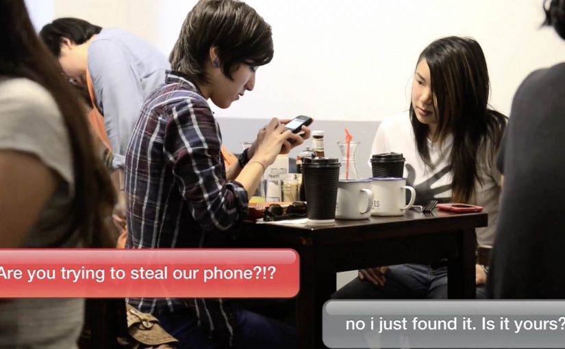
A phone lies abandoned on a Shanghai street. Someone eventually picks it up. Seconds later, the device starts talking back through text messages.

Time Out Shanghai uses that setup to promote its city guide with a stunt built with Energy BBDO Shanghai. The magazine purposely “loses” a phone at random. The moment a passerby takes it, the phone instructs them to “return” it by getting into a London taxi that pulls up right where they are. From there, the finder is driven across the city to a sequence of unexpected stops, guided only by messages on the phone, and captured through hidden cameras.

A guide that proves itself, one pickup at a time

The mechanic mirrors the product promise. Time Out Shanghai claims it digs deeper than obvious tourist checklists. So the campaign turns “discover hidden gems” into a lived tour, with the London cab acting as a moving stage and the phone acting as the guide. Reported write-ups describe stops that range from small local joints to high-concept dining and landmark nightlife, all chosen to signal insider curation rather than generic attraction lists. Here, insider curation means places that feel locally known rather than obviously tourist-facing. Because the participant experiences the recommendations in sequence instead of reading about them, the guide’s editorial promise feels proven rather than claimed.

In global city marketing and publishing, the fastest way to make “insider knowledge” believable is to demonstrate it as a guided experience, not explain it as editorial positioning.

Why the taxi twist works

The stunt manufactures a story that people want to finish. First curiosity, why is the phone messaging me. Then escalation, why is a London taxi here in Shanghai. Then payoff, the city reveals itself through a sequence of places the participant did not plan. The London cab is not just a visual gag. It is a nod to Time Out’s roots and a clear brand signature that makes the footage instantly recognizable.

Extractable takeaway: If your product claim is “we help you discover what you would miss,” build a live proof where the user stumbles into the benefit, then structure the journey so each step reinforces the claim without additional explanation.

What Time Out is really selling

This is less about a single guide edition and more about trust in curation. The real question is whether a city guide can make its curation feel trustworthy before anyone opens an issue. The campaign frames Time Out as an honest, street-level editor. Someone who can take you from random street corner to a surprising itinerary, and do it with confidence. That trust is what makes a city guide worth paying attention to in a market flooded with lists.

What brand-led city guides can copy

  • Turn your promise into a route. A sequence of experiences is more persuasive than a headline claim.
  • Use one unmistakable brand asset. The London cab functions as a moving logo without feeling like a logo.
  • Let the audience be the protagonist. The finder’s reactions do the selling more credibly than narration.
  • Design for retellability. “They lost a phone, then a cab picked you up” is a one-sentence hook that travels.

A few fast answers before you act

What is “The Stolen Phone Tour”?

A Time Out Shanghai stunt where a purposely “lost” phone guides the person who picks it up into a London taxi and across a curated set of city stops, filmed via hidden cameras.

Why use a phone as the guide mechanic?

Because it matches real behavior. People already rely on phones to navigate cities. The campaign turns that habit into a story engine that delivers location-by-location discovery.

What does the London taxi add beyond novelty?

It provides a distinctive brand signature and a clear narrative device. A taxi arriving to “retrieve” the phone is an immediate escalation that keeps the participant moving.

What is the biggest risk with a stunt like this?

Participant trust and safety. The experience must feel surprising but not threatening, and the instructions must keep the participant in control at every step.

When is this approach a good fit?

When your value is curation, expertise, or access. If you can demonstrate the benefit as a guided sequence, you can replace skepticism with lived proof.

Virgin Atlantic: No Ordinary Park Bench

Virgin Atlantic wanted to give the people of New York a taste of their onboard services. So with the help of Y&R New York they took over an ordinary bench and gave unsuspecting park-goers an unforgettable Virgin Atlantic experience.

How an “ordinary” bench becomes an airline product demo

The mechanism is a simple swap. Take a familiar public object. Upgrade it with unmistakable “premium” cues. Then add a layer of surprise service so the bench behaves less like street furniture and more like a seat with hospitality. The passersby reaction becomes the content, and the content carries the brand promise further than a static poster ever could.

In premium service brands, the fastest route to belief is letting people experience the service promise before they ever buy.

Why it lands

This works because it compresses a complex claim, “we make flying feel special”, into a single, legible moment in the real world. You do not need a fare sale, a cabin diagram, or a spec sheet. You just need the contrast of ordinary versus treated-like-a-guest.

Extractable takeaway: When your differentiation is a feeling, stage a public, bite-sized version of that feeling. Make it easy to understand in one glance and easy to retell in one sentence.

What the stunt is really doing for the brand

It turns an intangible benefit, service, into something tangible and shareable. The real question is how you make an intangible service promise feel credible before purchase. The bench is not the point. The point is credibility by demonstration. It is a live proof point that “Virgin Atlantic service” is a thing you can recognize, even on the ground.

What premium service brands can borrow

  • Choose a familiar object: the more ordinary the baseline, the stronger the contrast when you upgrade it.
  • Make the promise physical: show the service, do not describe it.
  • Design for bystanders: build a moment that attracts a crowd without requiring explanation.
  • Keep the story clean: one setup, one surprise, one payoff.
  • Capture reactions: human responses are the most efficient proof of “this is different”.

A few fast answers before you act

What is the “No Ordinary Park Bench” idea?

It is a Virgin Atlantic street activation where an ordinary park bench is transformed into a branded service moment, giving park-goers a taste of the airline’s onboard experience.

Why use a bench instead of a pop-up booth?

A bench is instantly understood and frictionless. People sit without committing to “an activation”, which makes the surprise feel more genuine and the reactions more watchable.

What makes this effective for premium brands?

Premium is hard to prove with claims alone. A live demonstration makes the promise tangible, and it gives people a story to repeat.

What is the core pattern to reuse?

Pick one everyday touchpoint, upgrade it dramatically, and deliver the brand benefit in a way people can feel immediately.

What is the biggest risk with this format?

If the experience feels staged, intrusive, or confusing, the audience will not lean in. The best versions are simple, respectful, and clearly additive to the public space.

Mikado Resistance Test

You are doing your shopping in a mall, and you spot a giant Mikado dispenser. Above it, a message scrolls: “Une envie de Mikado ? Vous ne devriez pas…”. A free box is right there. The temptation is immediate. People hesitate for half a second, then they reach for it anyway.

The moment the “victim” takes the Mikado, reality shifts. In a beat, they “fall” into an absurd, high-stakes scene. A nightmare wedding. A robbery. A knife-throwing scenario. Six variations. Each one staged to make a single point feel physical: Mikado is hard to resist, even when you are warned not to.

The core move

Turn “irresistible” from a claim into a public dilemma. Then prove it by watching people choose temptation in front of everyone.

The real question is whether you can make your product truth show up as a choice people make, not a line you repeat.

What Buzzman builds for Mikado

This is a deliberately simple setup with a brutal logic loop:

Step 1. Offer the product for free, but add a warning

The dispenser invites you, then immediately tells you not to do it. That contradiction creates tension and curiosity in the exact moment of decision.

Step 2. Make the consequence entertaining, not moralizing

When the actor takes the box, they “drop” into a surreal scenario. The audience in the mall watches the fall. Then they watch the scene unfold. The humor is the proof mechanic.

By “proof mechanic,” I mean the device that makes the claim felt, not merely stated.

Step 3. Extend it into a digital series with repeat value

The campaign runs as a set of videos with multiple protagonists and outcomes. The variety matters because it turns one stunt into a format.

By “format,” I mean a repeatable structure that can produce multiple episodes without changing the premise.

Step 4. Make the viewer complicit

At the end of the video experience, you can choose who becomes the next “victim.” That viewer control is not a gimmick. It reinforces the theme: you are part of the temptation chain.

In European FMCG brand marketing, this kind of public temptation test turns an “irresistible” claim into observable behavior people can share.

Why it works

It works because the proof is a public choice. The audience watches someone decide, then watches the staged consequence play out.

Extractable takeaway: When the attribute you want to land is emotional, design a temptation moment where people demonstrate it through behavior, not explanation.

It turns a brand truth into a behavioral test

The campaign does not explain why Mikado is irresistible. It sets up a moment where resisting is the story.

The warning is the creative fuel

“You shouldn’t” is what makes people want to do it. The copy creates the tension. The action resolves it.

The audience reaction is the distribution engine

People do not only watch the “victim.” They watch the crowd. The social proof is built into the scene itself.

The deeper point

For emotional product truths, experiential proof is usually more persuasive than descriptive messaging.

If you want a product attribute to stick, stop describing it. Build a situation where people demonstrate it for you. Especially when the attribute is emotional (irresistible, addictive, impossible to ignore), the most persuasive proof is behavior under temptation.

How to steal the pattern

  • Stage a contradiction at the point of action. Offer the thing, then tell people they should not take it.
  • Make the “consequence” playful, not punitive. The reveal should entertain the crowd, not shame the participant.
  • Design for repeatability. Build variations so one stunt becomes a series, not a one-off.
  • Capture the crowd, not just the protagonist. Reaction shots are built-in social proof and share fuel.
  • Add viewer control only if it reinforces the theme. Let the audience pick the next participant to keep the temptation chain going.

A few fast answers before you act

What is the core mechanic?

A public dispenser offers free Mikado while warning you not to take it. When someone does, the stunt flips into a staged “consequence” scenario that proves irresistibility.

Why multiple scenarios?

Because a single stunt becomes a repeatable content format. Six outcomes keep it watchable and shareable.

What is the role of interactivity?

Viewers can choose the next “victim” at the end of the video experience, extending participation beyond the mall moment.

What is the transferable pattern?

Design a public “temptation test” where the desired product truth is demonstrated through behavior, not explained through messaging.

What is the biggest risk?

If the consequence feels mean-spirited or unsafe, the tension flips from funny to uncomfortable. The stunt has to stay playful.