WWF: The .wwf Unprintable PDF Format

WWF: The .wwf Unprintable PDF Format

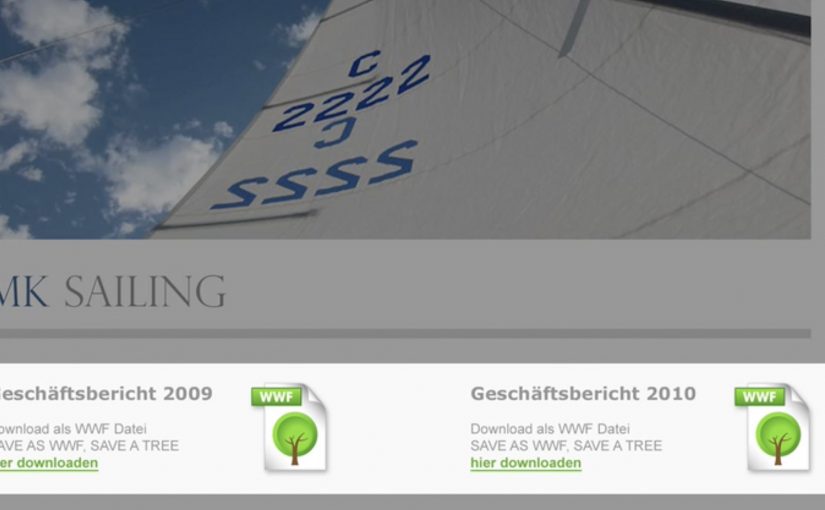
German ad agency Jung von Matt is back with another stellar idea. A new green file format called .WWF.

The WWF format is a PDF-like document that is designed not to print. The point is simple: avoid unnecessary printing by making the “do I really need paper for this?” decision explicit at the moment you save or share a file.

How the .wwf idea works

At the center is a small tool that lets you “save as WWF”. The resulting file behaves like a regular PDF for reading and sharing, but the print option is blocked by design. In other words, it is a familiar format with one permission deliberately switched off.

WWF frames this as a practical nudge within its broader “think before you print” message. It is not trying to shame printing. It is trying to stop the default reflex of printing what never needed to exist on paper in the first place.

In document-heavy organizations, small defaults like a print-disabled file option reduce waste because they change the decision moment without changing the workflow.

Why this lands beyond the gimmick

It turns a values statement into a product behavior. Plenty of sustainability campaigns ask people to care. This one asks people to choose differently in a place they already spend time: saving, sharing, and circulating documents.

Extractable takeaway: When you want less waste, change the default at the moment of action, and keep an intentional override for the few cases that truly need it.

The real question is whether you can make “think before you print” feel like a normal workflow choice, not a policy fight.

It preserves user choice. The format does not decide what “should” be printed. It pushes the decision back to the sender, who knows the context. That framing matters, because it avoids the “policy tool” vibe and keeps it as a lightweight, voluntary habit.

It spreads by forwarding. A file format is distribution. When people send documents around, the format travels with the content and keeps reintroducing the idea in a natural, non-media-buy way.

Steal this pattern for document workflows

  • Change the default, not the lecture. If you want different behavior, move the intervention into the everyday step where the behavior happens.
  • Make the “good choice” feel like a normal choice. Keep the action one click away and compatible with existing habits.
  • Design for shareability. Tools and formats can be media when they travel inside the work people already exchange.
  • Define the mechanism in one sentence. “A .wwf file is essentially a PDF with printing permissions locked, saved under a different extension to force a conscious print decision.”

A few fast answers before you act

What is a .wwf file, in plain terms?

A .wwf file is a PDF-style document saved with a different extension and configured so that printing is blocked by default.

Is it truly impossible to print a .wwf document?

The intent is to block the normal print command, not to claim physical impossibility in every edge case. The point is to remove the easy, mindless print path.

How is this different from just using a “do not print” note?

A note is social friction. A format change is functional friction. The latter works even when people ignore instructions.

Where does this work best?

In teams that pass around drafts, read-only decks, internal updates, agendas, and reference documents. Anywhere printing is mostly habit, not requirement.

What is the real behavior change goal?

To make printing a deliberate act again. The win is fewer automatic prints, not zero printing.

dotHIV: .hiv Domain

dotHIV: .hiv Domain

A familiar website address. One small change at the end. And suddenly the act of browsing is framed as a contribution.

.hiv is a global idea positioned to fight HIV and AIDS. Campaign materials claimed that by the end of 2010, the number of people diagnosed with HIV would have reached 150 million.

AIDS continued to be a deadly diagnosis, so nonprofit organization dotHIV and Hamburg-based agency KemperTrautmann launched a Facebook-led campaign with a specific ambition. Establish a new top-level domain, .hiv, alongside endings such as .com or .org.

The proposed mechanism is straightforward. Any website could soon have a .hiv version. The content stays the same, but using the .hiv version is framed as “doing some good”. Every visit would trigger a small donation to dotHIV, or the website owner would pay a monthly rate for using the .hiv ending, with proceeds routed toward the cause.

Why the domain idea is the message

This works because it turns a familiar object, the URL, into a symbol. A domain ending is tiny, but it is also persistent. It appears everywhere the link appears, and it travels without needing a new explanation each time. The “digital red ribbon” effect is built into the mechanics, not added on top. Here, “digital red ribbon” means a visible, repeatable sign of support that appears wherever the link appears. That matters because persistent, low-effort visibility lowers the cognitive cost of participation and helps the cause travel with the behavior.

Extractable takeaway: If you want scale for a social cause, design participation so it sits inside a behavior people already repeat daily, and make the proof of participation visible every time the behavior happens.

In global cause-led digital initiatives, the scalable advantage comes from attaching support to a habit people already repeat without thinking.

What the campaign is really trying to unlock

The real question is whether the cause can become part of a daily digital behavior instead of remaining a separate appeal.

The visible pitch is fundraising. The deeper play is normalization. If .hiv becomes a usable, recognizable address ending, it makes the cause present in everyday digital life, which can reduce stigma through repetition and visibility rather than messaging alone.

The more strategic value here is normalization, not just fundraising.

What cause-led marketers can borrow

  • Attach impact to habit. Make the “good” happen when people do something they already do.
  • Make participation visible. A marker people can see and share helps the idea spread without extra media.
  • Keep the mechanism explainable in one sentence. If it needs a diagram, adoption collapses.
  • Design for opt-in trust. Cause mechanics live or die on clarity about where money flows and why.

A few fast answers before you act

What is the .hiv idea in one line?

A proposed top-level domain intended to turn everyday browsing into support for HIV and AIDS work by routing fees or visit-linked donations through dotHIV.

How is it supposed to work for normal websites?

A site could have a .hiv version that mirrors the existing content, while usage or registration is framed as generating funds for dotHIV.

Why use a domain ending instead of a normal donation page?

Because a domain ending is persistent and repeatable. It can travel with links and become a visible marker of participation everywhere it appears.

What makes this idea credible or not credible to audiences?

Transparency about governance, pricing, and where proceeds go. The mechanism needs to be as clear as the promise.

What is the biggest risk with “donation-by-browsing” concepts?

If the value exchange is unclear, or the impact feels too small or too opaque, people disengage or suspect cause-washing.

Germanwings: Planemob at 30,000 Feet

Germanwings: Planemob at 30,000 Feet

Five creatives board a competitor’s flight with nothing but cardboard signs, a camera, and a plan. At cruising altitude, they run a “planemob” in the aisle. In practice, that means a flashmob-style brand stunt staged on a plane and filmed to travel later as content. The cabin becomes the set, and the passengers become the audience.

A brand comparison staged where the problem happens

The idea is credited to Lukas Lindemann Rosinski in Hamburg. The stunt is described as taking place on a rival low-cost carrier flight, and it uses the rival’s own boarding and seating dynamics as the backdrop for the message.

The execution is deliberately low-tech. A small group reveals a sequence of placards that make a simple point about “quality” versus the small annoyances of no-frills flying, especially the chaos that comes with free seating when groups try to sit together.

The mechanic: hijack the moment, not the media

This is guerrilla advertising in the literal sense. Instead of buying more airtime, the campaign borrows a moment that already has full attention: passengers strapped in, phones out, and nothing else to do.

That works because the stunt captures attention at the exact moment the irritation is most legible, so the comparison feels less like copy and more like proof.

Filming the stunt is not an afterthought. It is the distribution strategy. The onboard moment creates the story, and the video carries it to everyone who was not on the plane.

In European low-cost aviation, brand promises live or die on small frictions that frequent flyers feel immediately.

Why it lands: it turns irritation into proof

Most airline positioning stays abstract because the product is hard to “show” in a single line. Planemob goes the other way. It demonstrates the promise by contrasting it against a situation passengers recognize without explanation. This is smart brand theatre because the proof arrives inside the passenger experience instead of sitting above it as a slogan.

Extractable takeaway: If your differentiator is a reduction of friction, stage the proof inside the friction. Do it in a setting where the audience is already feeling the problem, and keep the message simple enough to travel as a clip.

The business intent: earned attention that outlives the flight

The immediate audience is small. The real audience is everyone who sees the video afterwards. That’s the trade. A short, high-constraint performance buys a longer, shareable narrative, and it tends to get discussed precisely because it happens “in real life” rather than inside a media slot.

The real question is whether a tiny live audience can trigger a much larger story once the moment is filmed and shared.

Award listings also suggest the work gained industry recognition, including a Spotlight Festival Gold in web & mobile categories for “Planemob”.

What to steal for your next guerrilla moment

  • Exploit a captive moment ethically: pick a context where attention is naturally high and interruption is minimal.
  • Use props that read instantly: big typography, one point per beat, no cleverness that needs a caption.
  • Build the distribution into the idea: if it does not work as a video, it does not scale.
  • Anchor the claim in a felt pain point: “quality” lands when it maps to a concrete irritation people already know.
  • Keep the crew small: constraints make it believable, and believability is the fuel for sharing.

A few fast answers before you act

What is a “planemob”?

A planemob is a flashmob-style stunt staged on an aircraft, designed to create an attention-grabbing in-flight moment that can be filmed and shared as a campaign video.

Why does this count as guerrilla marketing?

Because it uses a real-world environment and a minimal set of materials to generate earned attention, rather than relying primarily on paid media placements.

What is the core persuasive trick in this execution?

It connects the brand claim to a situation passengers have experienced. The message feels like evidence because it is delivered inside a recognizable pain point.

What should you watch out for if you copy this approach?

Operational risk and brand risk. You need a concept that is safe, respectful to bystanders, and strong enough to survive without heavy explanation. If it needs a long caption, it will not travel.

How do you measure success for this kind of stunt?

Video reach and completion rates are the baseline. More meaningful signals include press pickup, share-to-view ratio, branded search lift, and whether the stunt strengthens a specific product attribute in brand tracking.