BMW Christmas Safety Card

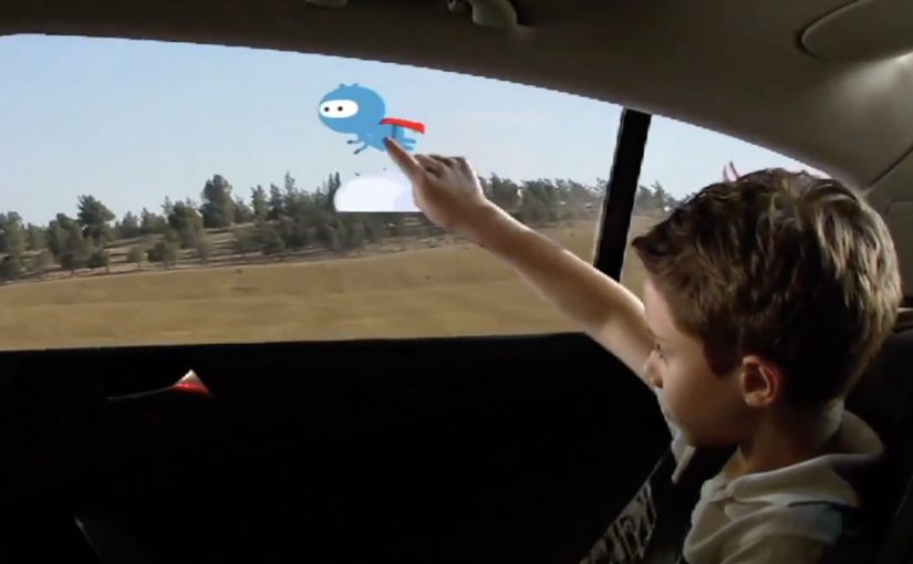
To wish customers a new year of safe driving, BMW, together with ad agency AIR and electronics company Selectron, creates a Christmas card meant to be hung in the car.

A micro-sensor is built into the card to measure driving behaviour and react with a spoken message, “Ho! Ho! Hooo! Just like Santa!”, when the car is driven unsafely. The sensor measures G-forces and reacts when the car accelerates too much, or when it brakes or drives too quickly through bends. Here, “G-forces” are used as a proxy for sudden changes in speed and direction.

In performance-focused automotive communities, safety messaging lands best when it shows up inside the driving moment rather than after the fact.

A Christmas card that behaves like a safety co-driver

This is not a decorative greeting. The card acts like a lightweight in-car safety layer. It listens for aggressive driving signals, then interrupts with a playful warning that is hard to ignore. Because the feedback triggers during the manoeuvre, it is harder to dismiss than a post-drive message.

The real question is how you make safer behaviour feel like part of the performance identity, not a constraint imposed from outside.

Behaviour change beats awareness here. A small “nudge” is simply a timely prompt that makes the next decision easier, and this one does it without turning the experience into a lecture.

Why this fits the BMW M League audience

These limited-edition cards are sent to members of the BMW M League who recently buy their car and participate in the BMW Track Days. For that audience, performance driving is part of the identity. This card nudges safer habits without lecturing, because it speaks in a tone that feels seasonal and disarming.

Extractable takeaway: If your audience prizes performance, frame safety as a co-driver that protects the fun, and deliver the correction in their own tone at the moment it matters.

The pattern to steal

  • Measure the behaviour directly. Choose one behaviour you want to influence and measure it directly.
  • Put the intervention where it lives. Embed the intervention into a physical object people will actually place in the environment.
  • Correct in the moment. Trigger feedback at the exact moment of behaviour, not later in an email or app.
  • Make correction socially acceptable. Use a tone that makes the correction acceptable, so people do not reject it on instinct.

A few fast answers before you act

What is the BMW Christmas Safety Card?

A Christmas card designed to hang in a car, with a built-in micro-sensor that detects unsafe driving and plays a Santa-style voice warning.

What does the sensor measure?

G-forces. It reacts to strong acceleration, hard braking, and taking bends too quickly.

Who receives these cards?

Members of the BMW M League who recently buy their car and participate in the BMW Track Days.

What is the core idea?

Turn a seasonal greeting into an in-car behavioural nudge that activates in the moment.

Windows of Opportunity: Smart Car Windows

Got backseat boredom? DVD players and Game Boys are so five years ago, but a concept in rear-seat entertainment that uses the windows themselves could replace squirming and snoozing with interactive scribbling, sweeping, and pinching.

General Motors Research and Development put up a challenge to researchers and students from the Future Lab at Bezalel Academy of Art and Design in Israel. The task was to conceptualize new ways to help rear-seat passengers, particularly children, have a richer experience on the road.

The outcome is shown below, even though GM is described as having no immediate plans to put this smart glass technology into vehicles. Here, “smart glass” means the window can act as a display surface and detect touch or gestures.

When the window becomes the interface

The mechanism is simple to grasp. Treat the rear side window as a transparent display surface, then add touch and gesture interaction so passengers can draw, play, and manipulate content directly on the glass while still looking out at the world passing by. Because it is the same surface passengers already look through, the interaction stays outward-facing rather than becoming another head-down screen.

In family car journeys, rear-seat attention is a hard constraint, and experiences that keep kids engaged without isolating them from the ride reduce friction for everyone.

What the brief is really asking for

This is not “more screens”. It is a different relationship between passengers and their surroundings. The concept is described as using the outside view as the canvas. Instead of escaping the trip, you interact with it.

The real question is whether you can turn the outside world into content without disconnecting passengers from the journey.

Why it lands

The idea feels fresh because it upgrades a dead surface into something active without adding another device to hold or another head-down screen to stare at. It also creates a shared backseat dynamic. Multiple passengers can point, draw, and react together, which changes the feel of long trips. This is the right direction for in-car entertainment because it replaces device-based distraction with shared, context-linked play.

Extractable takeaway: The best in-car entertainment does not only distract. It connects passengers to the context they are already in, and makes the journey itself part of the experience.

What GM is buying by running a concept challenge

Even without production intent, the exercise is useful. It expands the idea space around “smart glass” and passenger experience, and it generates prototypes and interaction patterns that can later inform other interfaces, materials, and interior design decisions.

Practical steals for smart-glass passenger UX

  • Use the environment as content. Overlay and interact with what is already outside rather than inventing a separate world.
  • Design for low instruction. If it cannot be understood in seconds, kids will abandon it and parents will ignore it.
  • Favor shared play. Multi-user interactions create calm through engagement, not through isolation.
  • Keep interaction lightweight. Short loops beat long missions in a moving vehicle.
  • Prototype early. Concepts like this live or die on latency, glare, and ergonomics, not on storyboard polish.

A few fast answers before you act

What is “Windows of Opportunity” in one sentence?

It is a GM concept project that turns rear side windows into interactive “smart glass” displays so passengers can draw, play, and explore during the ride.

Why use windows instead of adding more screens?

Because windows are already where passengers look. Turning them interactive can keep attention outward and shared, rather than head-down and isolated.

What makes this feel useful for families?

It targets the real pain point, keeping children engaged on long journeys, while preserving a sense of connection to the trip and to each other.

What are the biggest practical risks?

Glare and readability in daylight, touch accuracy on glass, latency, durability, and avoiding distraction for the driver through reflections or overly bright visuals.

What would you measure in a pilot?

Engagement duration, repeat use, whether it reduces restlessness and conflict, and whether it avoids unintended driver distraction in real driving conditions.

Renault Espace: iPad 360° View

The Renault Espace is a large MPV from French car-maker Renault. With a new iPad app, Renault gives users an onboard view of the Espace like never before.

The application is a 360 degree interactive video. All you need to do is tilt your iPad and explore different angles as if you were right there.

A virtual showroom that behaves like your head

The mechanism is refreshingly direct. The app uses the iPad’s motion sensors to map physical movement to viewpoint changes inside the car. Instead of tapping through static photos, you “look around” by moving the device. It is a smart use of motion sensing because it keeps the interface invisible and the focus on the cabin.

In automotive consideration journeys, anything that increases spatial understanding of the interior helps bridge the gap between online browsing and a test drive.

Why it lands

Interior experience is one of the hardest things to communicate in standard car marketing. This solves that by letting the user control perspective. It also creates a calmer kind of interactivity. No menus, no instructions, no friction. Just tilt and explore.

Extractable takeaway: When your product has a strong spatial component, give people viewer control over perspective. It builds confidence faster than adding more copy.

What Renault is really trying to achieve

The real question is whether this kind of “tilt to explore” experience reduces uncertainty enough to make a showroom visit feel worth it.

This is a digital test-sit, a lightweight simulation of sitting in the cabin so you can judge layout and comfort before a showroom visit. It is designed to make the Espace feel accessible before a showroom visit, and to reduce uncertainty about cabin layout, visibility, and perceived comfort. Done well, it also keeps attention longer than a typical brochure flow.

Steal this for spatial product demos

  • Use motion as navigation. If the device supports it, motion control can feel more natural than UI controls.
  • Keep the interaction single-mode. One behaviour. Tilt to look. That simplicity is the feature.
  • Prioritise the interior. For family vehicles, cabin experience often sells more than exterior styling.
  • Let curiosity drive. Give users freedom to explore, rather than forcing a predetermined tour.
  • Make it fast to load. Interactive video dies when buffering becomes the dominant experience.

A few fast answers before you act

What is this Renault Espace iPad app in one sentence?

It is an iPad experience that uses a 360 degree interactive onboard video so users can tilt the device to explore the Espace interior from different angles.

Why use 360 video instead of a standard photo gallery?

Because it communicates space and layout more effectively. Users can look where they want, which reduces uncertainty faster than scrolling images.

What makes “tilt to explore” feel intuitive?

It mirrors how people look around in real life. Physical movement maps directly to viewpoint changes, so interaction feels natural.

What is the main execution risk?

Performance. If motion tracking feels laggy, or the video quality is poor, users will abandon quickly and the experience will feel like a gimmick.

What should you measure if you ship this type of experience?

Time spent, percentage of users who explore multiple viewpoints, completion rate, repeat sessions, and whether it correlates with test-drive requests or dealer inquiries.