Coca-Cola Peace Machines

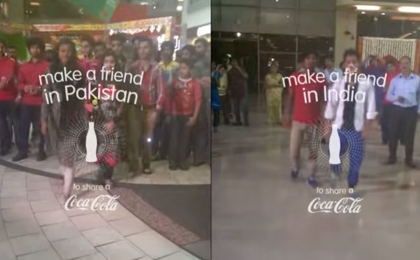
Small World Machines. India and Pakistan meet through a Coke

Over the years Coca-Cola keeps experimenting with vending machines and tries to make them much more than the average soda-spitter-outer. It places two machines, one in India and the other in Pakistan, and turns them into a communication portal. These “Small World Machines” allow citizens from both countries to interact with each other and complete shared tasks. Here, “shared tasks” means actions designed to be completed together, not alone. The machines reward them with a Coke. The results…

Fair Play Machines. Inter and Milan fans can only give to rivals

The success of that has inspired Coca-Cola to once again bring fighting parties together. Now instead of bringing together nations at odds, it has tapped into the rivalry between Italian soccer teams Inter and Milan.

To ease the aggression between the fans, Coca-Cola installed their “Fair Play Machines” on opposite sides of Milan’s San Siro stadium as the teams faced off. Pressing the button of one machine dropped a Coke can down the chute of that on the side of the rival team. So this way rivals could only receive Cokes from each other. The results…

The real question is whether you can design an interaction where the easiest way to get your reward is to give something to the other side first.

In global consumer brands, especially when audiences are polarized, experience rules travel further than slogans.

What this teaches about “peace” as a design problem

The strongest move is not messaging. It is creating a constraint that makes cooperation the easiest path to a reward. A constraint is a built-in rule of the experience that limits options so the intended behaviour becomes the easiest one. This works because the reward is gated behind a cooperative act, so the social friction becomes part of the game instead of a barrier. When a machine encodes that rule, behaviour shifts without anyone needing to preach.

Extractable takeaway: If you want two sides to act differently, stop asking for goodwill. Change the rules of the interaction so the smallest “yes” becomes the default move.

Design moves you can borrow from Peace Machines

  • Gate the reward behind a give-first action. Make the path to getting something run through giving something to the other side.
  • Keep the rule legible in one glance. If people need an explanation, the moment is gone.
  • Turn tension into a shared task. Use a simple co-action that feels like play, not reconciliation.

A few fast answers before you act

What are Coca-Cola “Peace Machines” in this context?

They are vending machine concepts that turn a simple Coke transaction into a social interaction, designed to reduce tension between rival groups.

What is the core mechanic of the Fair Play Machines?

Pressing the button on one machine sends a Coke to the machine on the rival side. Rivals can only receive Cokes from each other.

How do Small World Machines relate to this?

They use the same principle. A machine becomes a bridge, enabling people in opposing contexts to interact and complete shared tasks that lead to a reward.

What does “constraint” mean in experience design?

It is a built-in rule that limits options so the intended behaviour is the easiest one to choose.

What is the main design lesson for brands?

If you want behaviour change, build the rule into the experience. Make the cooperative action the trigger for the reward, and keep it simple enough to understand instantly.

Turquoise Cottage: The Buddy Stamp

Most nightclubs in India put an admittance stamp on the wrist of their customers. Turquoise Cottage, a nightclub based in Vasant Vihar, New Delhi, was no different. However, with their digital agency, Webchutney, they created what then went on to be coined as “The Buddy Stamp”.

“The Buddy Stamp” was a unique QR code stamp which upon scanning gave customers useful and actionable information depending on the time of night.

A wrist stamp that keeps working after entry

The clever move is that the stamp is not branding. It is a tool. You already have it on you, so the lowest-effort scan becomes a doorway to whatever you need next, without searching, asking staff, or opening a menu.

How the QR code changes by time of night

The stamp routes to different content depending on when it is scanned. Early in the evening it can point to venue offers and drink specials. Later it can switch to practical “get home” help like cab options. It can even pivot the next day into recovery-style tips, which extends the brand’s care beyond the club.

In high-energy hospitality environments, time-based mobile utilities work when they reduce friction at the exact moment the customer needs help.

Why this lands

It respects how nights actually unfold. People do not want a generic microsite when they are out. They want one fast answer that fits the current hour, and they want it without social overhead.

Extractable takeaway: If you already “touch” the customer as part of entry, turn that touchpoint into a changing utility that anticipates the next decision, not just a logo.

What the club and agency are really optimizing

This is experience design disguised as a stamp. It upgrades service without adding staff steps, and it makes responsibility and convenience feel like part of the venue’s personality, not a lecture.

The real question is how a venue can turn a mandatory entry ritual into timely help people will actually use.

What venue teams can steal from this

  • Attach the utility to an unavoidable ritual. Admission is the perfect moment because everyone participates.
  • Use time as the personalization layer. You do not need profiles when the clock predicts needs well enough.
  • Design for the “next 30 minutes”. The best content is the thing people would otherwise ask a friend.
  • Extend care past the venue. Post-night help builds goodwill that outlasts the party.

A few fast answers before you act

What is The Buddy Stamp?

It is a QR code wrist stamp used as a nightclub admission stamp that links to different, practical information depending on the time of night.

What makes it different from a normal QR code poster?

The QR code lives on the customer. That makes it always available, and the time-based switching makes it feel context-aware without asking the user to do anything extra.

Why does “time of night” matter as a design input?

Because needs change predictably across an evening. Offers and discovery matter early. Getting home safely matters late. The best experiences match that rhythm.

What is the transferable pattern for other venues or brands?

Turn an existing physical touchpoint into a dynamic utility. Let one simple scan deliver the most useful next step for the customer’s current situation.

Why is the wrist stamp a better utility surface than a poster?

Because entry already puts it on every guest. That makes the utility universal, immediate, and easy to revisit without asking people to find a sign again.

iFOLD: Fold More, Save Paper

Billions of business envelopes are used every day. Imagine how much paper can be saved if we just halved their size.

So while posting a letter, ask: can it be folded once more. If it can, fold more.

Use a smaller envelope. Save trees. It’s that simple. It’s called iFOLD.

A tiny behavior change, packaged as a system

The mechanism is effort-to-impact math: a simple rule where one extra fold creates a visible downstream saving. One extra fold reduces envelope size. Reduced envelope size reduces paper consumption. That works because the cause and effect are easy to understand immediately, so the behavior feels practical rather than preachy. The campaign frames this as a repeatable rule anyone can apply without new infrastructure or technology.

In high-volume corporate mailrooms and customer communications, small process changes compound into meaningful material savings.

The real question is how to turn a trivial action into a default business habit. The smart move is to build the fold into standard mailing practice, not treat it as a one-off reminder.

Why it lands

This works because it does not ask for a lifestyle shift. It asks for a micro-habit that fits inside existing routines. The instruction is binary, memorable, and immediately testable. You can literally try it with the next letter in your hand.

Extractable takeaway: When you want behavior change at scale, give people a single, repeatable decision rule that requires almost no extra effort, and make the benefit feel cumulative and obvious.

Steal this envelope logic

  • Make the rule portable: one sentence people can remember and repeat.
  • Target a high-frequency routine: boring, repetitive processes are where scale lives.
  • Prefer “do this instead” over “stop doing that”: substitution habits stick better than abstinence messages.
  • Connect the micro to the macro: one fold feels trivial. Aggregate savings makes it feel worth doing.
  • Design for adoption inside organizations: the best ideas fit procurement, operations, and compliance realities.

A few fast answers before you act

What is iFOLD?

iFOLD is a paper-saving idea that encourages people to fold letters one extra time so they can be mailed in smaller envelopes.

Why focus on envelope size?

Because envelopes are used at massive volume in business and government. Small reductions per unit add up quickly at scale.

What makes this a strong sustainability message?

It is a concrete action, not an abstract appeal. People can do it immediately without buying anything new.

Where does this work best?

In organizations that send large quantities of letters and statements, where a standard change in folding and envelope formats can be implemented consistently.

What could prevent adoption?

Template constraints, inserts that cannot be folded further, window placement, and operational inertia. The idea works best when mail formats are designed with folding flexibility in mind.