Aldo: Ring My Bell

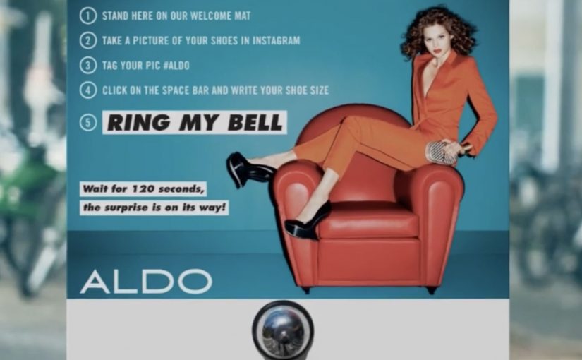
You stand on a welcome mat in the middle of the street, photograph your shoes, post to Instagram with #ALDO, add your shoe size, then ring a bell and wait 120 seconds. If you complete the steps, you get a surprise gift.

How the stunt turns a hashtag into a real-world trigger

The mechanism is a five-step participation script, a fixed sequence of actions that any passer-by can copy, that converts street curiosity into a trackable social action. The welcome mat marks the “stage”. The Instagram post captures proof and size data. The bell is the commitment moment. The 120-second wait creates tension. Then the brand pays off with a physical surprise delivered to the participant.

In high-footfall urban shopping streets where social posting is second nature, the fastest activations are the ones that turn a simple post into an immediate, tangible reward.

Why it lands

This works because it is friction-light and outcome-heavy. The instructions are short enough to follow at a glance, and the payoff happens quickly enough that the crowd stays to watch. The bell and countdown also make the moment public, which naturally pulls in the next participant.

Extractable takeaway: If you want social behaviour in the wild, write the participation flow like a street recipe. One clear prompt, one proof action, one suspense beat, one fast reward.

What the brand is really buying

The real question is not whether a hashtag can spread, but whether it can trigger a public action that proves the reward is real. This is less about reach in the abstract and more about engineered proof. By engineered proof, the brand makes the promised reward visible in real time so the next person believes it will work for them too. People do not just see a poster. They see someone trigger a reward in real time, which makes the campaign feel trustworthy and repeatable.

What to steal from a street-triggered reward loop

  • Make the call-to-action executable in under a minute. Anything slower loses passers-by.
  • Use a public commitment moment. A bell, button, or scan turns observers into a queue.
  • Time-box the suspense. The 120 seconds creates attention and crowd energy.
  • Design the payoff for spectators too. The best street rewards recruit the next person automatically.

A few fast answers before you act

What is “Ring My Bell”?

A street activation where pedestrians post a shoe photo to Instagram with #ALDO and their size, ring a bell, wait 120 seconds, then receive a surprise gift.

What is the core mechanism?

A simple participation script that links a social post to a physical reward, with a short countdown to keep attention on-site.

Why collect shoe size in the post?

So the reward can be prepared or matched quickly, and so the brand can fulfill immediately without follow-up friction.

What makes this work as OOH?

It turns signage into an interaction, and it makes the result visible to everyone nearby, which creates instant social proof on the street.

What is the safest reusable lesson?

Build an offline-to-online loop where the social action is the trigger, and the reward is fast enough to be witnessed in the moment.

Pinterest 2012: Early Brand Campaigns

Pinterest is one of the most talked about and fastest growing social networks of 2012. What makes this social site different from the others is its pinboard-styled social photo sharing feature that allows users to create and manage theme-based image collections.

Since it is still very new, a lot of major brands do not know what to make of it. However, a couple have already found creative ways to exploit the potential of the new social media destination.

Why the native loop matters

In early-stage social platforms, the first campaigns that win tend to be the ones that treat the platform’s native behavior, pinning, collecting, repinning, as the mechanic, not as an afterthought. The native loop, the repeatable cycle of pinning, repinning, and collecting, is what makes participation feel like curation instead of work.

In global consumer brands and agencies, early pilots work best when the platform’s native loop is the unit of design, not a channel to paste old formats into.

The real question is whether your idea makes the platform’s default action rewarding before you add any media spend.

Brands should ship only what is native-first, and skip anything that needs heavy explanation to feel like it belongs.

Four early Pinterest plays worth studying

Women’s Inspiration Day by Kotex

In Israel, Kotex reportedly identified 50 inspiring women and looked at what they were pinning on Pinterest, then sent them virtual gifts. If they re-pinned the gift, Kotex would send a real gift by mail. Smoyz, the agency behind the effort, claims nearly 100% of the women posted something about their gift, not only on Pinterest, but on Facebook, Twitter and Instagram.

Puzzle by Peugeot Panama

Peugeot Panama ran a contest that awarded fans who completed their Pinterest puzzle. The brand’s Pinterest presence featured images of cars running over two or more boards. In each case, a board was missing. To get the missing pieces, fans had to go to Peugeot Panama’s website to find and complete the full image set.

Color Me Inspired by Guess

Color Me Inspired by Guess

Guess challenged its fans to create boards based on four spring colors: Noir Teal, Hot House Orange, Red Hot Overdue and New Plum Light. Participants were asked to title their boards as “Guess My Color Inspiration” and pin at least five images, each tagged with #GUESScolor, in them. Four winners were then chosen by fashion bloggers Kristina Bazan of Kayture, Michelle Koesnadi of Glisters and Blisters, Jennifer Rand of Belle De Couture and Samantha Hutchinson of Could I Have That.

Pinterest Lottery by British Midland International

Pinterest Lottery by British Midland International

British airline “bmi” launched a game of chance to engage its fans. With “Pinterest Lottery”, bmi encouraged fans to re-pin up to six images of its travel destinations Beirut, Dublin, Marrakech, Moscow, Nice, London and Edinburgh. At the end of each week, the company chose a number at random, and users who had re-pinned the image with that number qualified for a chance to win a free return flight.

What these early campaigns get right

These ideas differ in execution, but they all turn Pinterest behavior into a simple loop you can complete and share.

Extractable takeaway: When a platform is new, design around the action people repeat, then let the reward validate the behavior, not the other way around.

  • They make “repin” the action, not the decoration. The platform behavior is the participation mechanic.
  • They reward curation. People are not asked to broadcast. They are asked to build a board that reflects taste.
  • They turn visuals into utility. Gifts, missing puzzle pieces, color palettes, destination boards. Each idea uses images as a system, not as wallpaper.

Rules for your first Pinterest test

  • Start with one native behavior. Make it do the heavy lifting, then build the incentive around it.
  • Design for identity, not reach. Boards are self-expression. Campaigns that respect that feel less like ads.
  • Keep the rules explainable. If the mechanic cannot be retold in one sentence, participation drops.

A few fast answers before you act

What made Pinterest feel different from other networks in 2012?

Its core object was a curated pinboard. People collected and organized images by theme, which made self-expression look like curation rather than status updates.

What is the common pattern across these early brand campaigns?

They use Pinterest’s native loop. Pin, repin, collect, complete, as the interaction, then attach a reward or outcome to it.

Why did Kotex’s approach travel well?

Because the output was personal and “worth pinning”. The gift reflected what someone had already revealed about themselves through their boards.

Why do puzzle and lottery mechanics fit Pinterest?

Because Pinterest already feels like collecting. Turning boards into completion tasks or numbered sets makes the platform behavior feel like a game, not a campaign.

What is the biggest risk when brands jump onto a new platform too early?

Forcing old formats into new behaviors. If the campaign does not feel native to how people already use the platform, it gets ignored or mocked.

Windows of Opportunity: Smart Car Windows

Got backseat boredom? DVD players and Game Boys are so five years ago, but a concept in rear-seat entertainment that uses the windows themselves could replace squirming and snoozing with interactive scribbling, sweeping, and pinching.

General Motors Research and Development put up a challenge to researchers and students from the Future Lab at Bezalel Academy of Art and Design in Israel. The task was to conceptualize new ways to help rear-seat passengers, particularly children, have a richer experience on the road.

The outcome is shown below, even though GM is described as having no immediate plans to put this smart glass technology into vehicles. Here, “smart glass” means the window can act as a display surface and detect touch or gestures.

When the window becomes the interface

The mechanism is simple to grasp. Treat the rear side window as a transparent display surface, then add touch and gesture interaction so passengers can draw, play, and manipulate content directly on the glass while still looking out at the world passing by. Because it is the same surface passengers already look through, the interaction stays outward-facing rather than becoming another head-down screen.

In family car journeys, rear-seat attention is a hard constraint, and experiences that keep kids engaged without isolating them from the ride reduce friction for everyone.

What the brief is really asking for

This is not “more screens”. It is a different relationship between passengers and their surroundings. The concept is described as using the outside view as the canvas. Instead of escaping the trip, you interact with it.

The real question is whether you can turn the outside world into content without disconnecting passengers from the journey.

Why it lands

The idea feels fresh because it upgrades a dead surface into something active without adding another device to hold or another head-down screen to stare at. It also creates a shared backseat dynamic. Multiple passengers can point, draw, and react together, which changes the feel of long trips. This is the right direction for in-car entertainment because it replaces device-based distraction with shared, context-linked play.

Extractable takeaway: The best in-car entertainment does not only distract. It connects passengers to the context they are already in, and makes the journey itself part of the experience.

What GM is buying by running a concept challenge

Even without production intent, the exercise is useful. It expands the idea space around “smart glass” and passenger experience, and it generates prototypes and interaction patterns that can later inform other interfaces, materials, and interior design decisions.

Practical steals for smart-glass passenger UX

  • Use the environment as content. Overlay and interact with what is already outside rather than inventing a separate world.
  • Design for low instruction. If it cannot be understood in seconds, kids will abandon it and parents will ignore it.
  • Favor shared play. Multi-user interactions create calm through engagement, not through isolation.
  • Keep interaction lightweight. Short loops beat long missions in a moving vehicle.
  • Prototype early. Concepts like this live or die on latency, glare, and ergonomics, not on storyboard polish.

A few fast answers before you act

What is “Windows of Opportunity” in one sentence?

It is a GM concept project that turns rear side windows into interactive “smart glass” displays so passengers can draw, play, and explore during the ride.

Why use windows instead of adding more screens?

Because windows are already where passengers look. Turning them interactive can keep attention outward and shared, rather than head-down and isolated.

What makes this feel useful for families?

It targets the real pain point, keeping children engaged on long journeys, while preserving a sense of connection to the trip and to each other.

What are the biggest practical risks?

Glare and readability in daylight, touch accuracy on glass, latency, durability, and avoiding distraction for the driver through reflections or overly bright visuals.

What would you measure in a pilot?

Engagement duration, repeat use, whether it reduces restlessness and conflict, and whether it avoids unintended driver distraction in real driving conditions.