
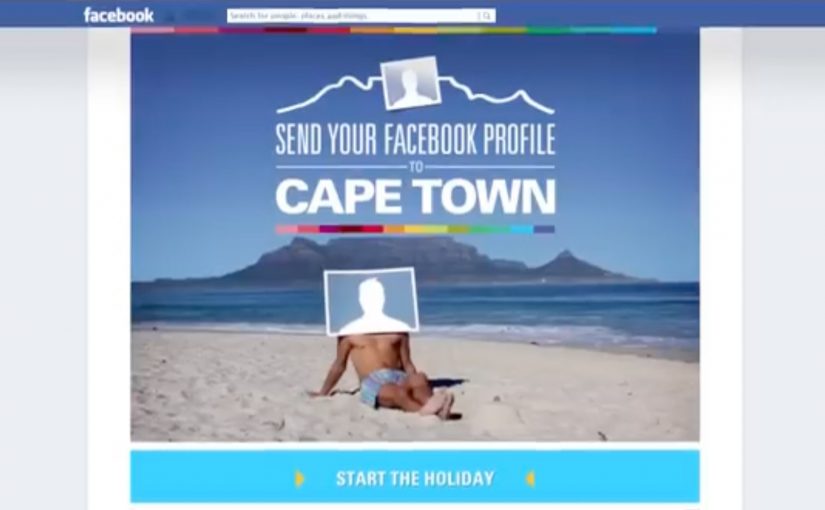
Cape Town Tourism Facebook Holiday

Cape Town Tourism wanted to promote the unexpected side of Cape Town. All the small communities, never-heard of places and unearthed gems that can’t be found on Trip Advisor, Lonely Planet, Expedia, or even Google.

Since everyone could not be sent to Cape Town, people were allowed to send their Facebook profiles instead. Through a Facebook app users were given a virtual, tailor-made Cape Town holiday that exposed them to all the unexpected places. A few lucky winners even got to experience their Facebook profile’s holiday for themselves.

Why this idea fits tourism marketing right now

This is a smart twist on an old travel problem. Most destination marketing ends up showcasing the same highlights, using the same guidebook shorthand. Here, the hook is the opposite. The campaign is built around what standard lists miss, and it uses a person’s own Facebook profile as the input to make the recommendation feel personal. This is the right strategy for destination marketing because it turns generic discovery into personal discovery. That matters because using a person’s own profile as the input makes the destination feel more relevant before any trip is booked.

Extractable takeaway: When the audience becomes the input, discovery feels less like promotion and more like a recommendation built around personal relevance.

The pattern to steal is simple

For tourism brands trying to move beyond the same predictable shortlist, the challenge is making discovery feel personally relevant. The real question is how to make overlooked places feel worth exploring before someone ever books. If you want people to care about a place, product, or experience, give them a way to picture themselves inside it. This campaign does that in a very direct way. It takes something people already maintain daily, their Facebook profile, and turns it into a personalized route into discovery.

It also helps Cape Town Tourism promote the long tail. By long tail here, that means the lesser-known communities and hidden gems that do not show up in the usual places. Those places can finally get airtime because the experience is not optimized for the “top ten.” It is optimized for relevance.

A similar proof point from last year

Similarly last year, Obermutten a little and lovely mountain village from Switzerland was put on the world map through a very simple Facebook campaign. Check that out here.

What to steal for destination marketing

  • Let the audience be the input. Using a Facebook profile as the starting point makes the output feel personal, not promotional.
  • Sell the long tail, not the postcard. A personalised route gives “small communities and hidden gems” a real chance to surface.
  • Create an output people can compare. “Your Cape Town holiday” invites sharing because it is inherently personal and discussable.
  • Add a real-world payoff for a few. A small number of winners makes participation feel consequential, not just entertaining.

A few fast answers before you act

What is the Cape Town Tourism Facebook Holiday campaign?

It is a destination marketing idea that used a Facebook app to turn a user’s Facebook profile into a virtual, tailor-made Cape Town holiday.

What problem was Cape Town Tourism solving?

They wanted to promote the unexpected side of Cape Town. Smaller communities and hidden gems that are not easily found on mainstream travel platforms and guidebooks.

How did the Facebook profile app work at a high level?

Users submitted their Facebook profiles through the app, and the experience generated a personalized “holiday” that surfaced unexpected places based on that profile.

What made it shareable?

The user is part of the idea. The output is framed as “your” Cape Town holiday, which naturally invites comparison and conversation.

What is the broader takeaway for digital marketers in 2013?

Personal data can be turned into a story engine. When the audience becomes the input, relevance increases and discovery moves beyond the same predictable highlights.
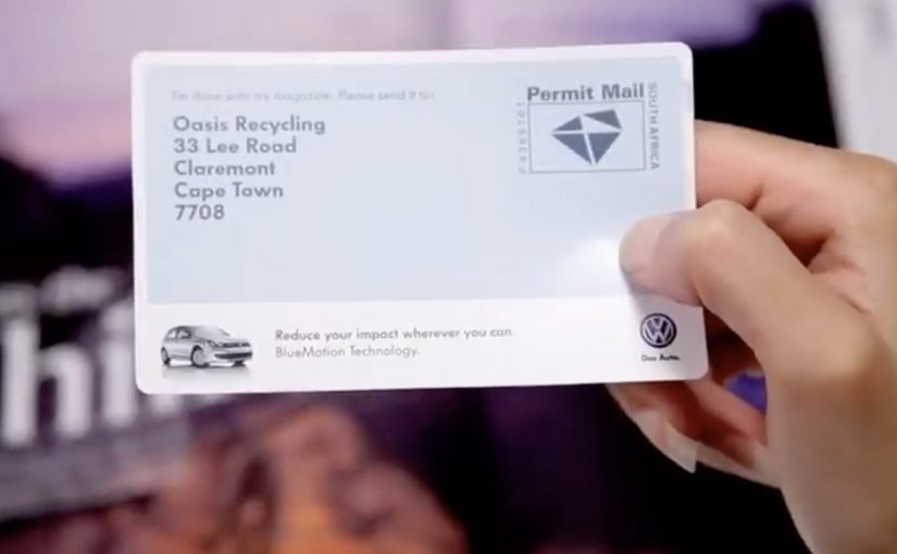
Volkswagen: The BlueMotion Label

A magazine gets read, then it gets tossed. The campaign framing cites a blunt number: 77% of magazines, along with their ads, end up in the trash, which makes the medium itself feel like waste.

So when Volkswagen wants to promote the eco-conscious thinking behind its BlueMotion vehicles, Ogilvy develops a print insert that does not just talk about recycling. It makes recycling the default next step.

The insert is designed to get people in Cape Town to recycle their magazines via the city’s post boxes. Once you are done reading, you use the insert and drop the magazine into a post box, turning postal infrastructure into a recycling pathway instead of sending the paper to landfill.

When the medium becomes the message

The mechanism is a print ad that changes the fate of the print medium. Instead of adding more paper persuasion, it converts the entire magazine into something that can be routed to recycling, using a familiar behavior, posting, to remove the friction of “finding a recycling option”.

In consumer marketing, “sustainability” claims land best when the communication channel follows the same rules the product is asking people to adopt.

The strongest sustainability advertising makes the medium do part of the environmental work itself. The real question is whether the communication changes the waste behavior around the product, or just describes a greener intent.

Why it lands

This works because it removes hypocrisy. If you are going to sell eco-conscious thinking, your ad cannot behave like disposable clutter. By turning the magazine itself into the recyclable object, the campaign gives people a satisfying feeling of doing the right thing with almost no extra effort, and it makes the brand promise feel practical rather than moralizing.

Extractable takeaway: If your benefit is “less waste”, design the communication so it physically reduces waste, and let the proof be the experience, not the copy.

What to borrow from the BlueMotion Label

  • Replace messaging with utility. If you can change behavior directly, you do not need to preach.
  • Use existing infrastructure. People already know how to use post boxes, so adoption is friction-light.
  • Make the action one-step. The closer the action is to the moment of disposal, the higher the follow-through.
  • Make the proof visible. A physical insert is something people can show, talk about, and demonstrate.

A few fast answers before you act

What is “The BlueMotion Label”?

A Volkswagen BlueMotion print insert designed to make magazine recycling easy by letting readers use post boxes to route finished magazines into a recycling flow.

Why is this stronger than a standard eco-themed print ad?

Because it behaves like the promise. It reduces waste through the ad itself, instead of adding more disposable paper to argue about sustainability.

What behavior change does it target?

Moving magazines from “trash by default” to “recycle by default” at the exact moment people finish reading.

What is the key execution ingredient?

Friction removal. The action must be simple enough that people will do it immediately, without searching for a recycling option.

When should brands use this pattern?

When your claim depends on credibility, and you can redesign the medium or distribution so the communication itself demonstrates the value.

Forever Wild: YouTube Interventions

You click a trending video for a quick distraction, and suddenly the content you came for is interrupted by a stark message about rhino poaching. The contrast is the point. It forces you to notice what you normally scroll past.

Forever Wild, described as a no-budget anti-poaching initiative, wanted to make the illegal rhino horn trade feel urgent and push people to sign a petition intended for the US Congress. Ogilvy Cape Town responded with “YouTube Interventions”, remixing the format of popular videos so viewers looking for frivolous entertainment were confronted with the cost of their online attention.

A “YouTube intervention” is a deliberate disruption of an existing video viewing pattern. Instead of asking people to search for a cause film, the campaign inserts a cause message into what people are already watching, then uses that interruption to drive a clear action.

In global digital culture, the scarcest resource is attention, and the most effective cause work often borrows distribution from the very platforms that usually dilute serious messages.

The campaign’s urgency is framed through a common warning at the time, that rhinos could disappear within roughly a decade if poaching continued to escalate. Whether the viewer is convinced or sceptical, the interruption makes the question unavoidable. What are you spending your time on, and what does that choice enable?

The real question is whether you can borrow attention without breaking trust.

Why hijacking “silly” videos is the strategy

This idea does not compete for attention on merit alone. It piggybacks on attention that already exists. By choosing trending videos, the campaign meets people where their behaviour already is, then flips the emotional tone fast enough to create discomfort, reflection, and action.

Extractable takeaway: If you can’t buy reach, borrow an existing attention stream, then earn the right to ask for action with sharp contrast and a clear next step.

What the intervention format does better than a PSA

A normal PSA is easy to avoid. You skip it, scroll past it, or never choose it in the first place. An intervention changes the default. The viewer is already in viewing mode, already committed to watching something, and the disruption creates a brief window where a petition ask can actually land.

This is a better default than a traditional PSA when your biggest constraint is distribution, not storytelling.

Recognition that helped the idea travel

The work was described as being recognised in awards circuits in the period, including a Clio Awards shortlist and a Loeries medal for media innovation, which helped amplify the case beyond the initial view counts.

Practical steals from the intervention format

  • Borrow existing distribution. Put the message inside an attention stream people already trust and use.
  • Make the action immediate. Interruption without a clear next step is just shock.
  • Keep the device simple. The format should be explainable in one sentence.
  • Use contrast intentionally. Comedy or fluff next to crisis creates cognitive friction, and friction creates memory.

A few fast answers before you act

What are “YouTube Interventions” in this campaign?

They are remixed versions of trending videos that insert a rhino-poaching message into the viewing experience, then direct viewers to sign a petition.

Why target people watching frivolous content?

Because that is where volume lives. The campaign uses the audience’s existing behaviour and turns it into a moment of confrontation, rather than hoping people will seek out a serious film.

What problem does this solve for no-budget causes?

Distribution. Instead of paying for reach, the campaign borrows reach from content that is already spreading.

How does this avoid feeling like generic “shock advertising”?

By tying the disruption to a specific action. The message is not only “this is terrible”, it is “sign here”, with the interruption acting as the attention gate.

What is the biggest risk with intervention-style tactics?

Backlash. If the disruption feels deceptive or manipulative, viewers reject the message. The creative has to be transparent about why it is interrupting and what it wants people to do.