
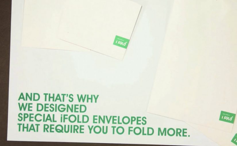
iFOLD: Fold More, Save Paper

Billions of business envelopes are used every day. Imagine how much paper can be saved if we just halved their size.

So while posting a letter, ask: can it be folded once more. If it can, fold more.

Use a smaller envelope. Save trees. It’s that simple. It’s called iFOLD.

A tiny behavior change, packaged as a system

The mechanism is effort-to-impact math: a simple rule where one extra fold creates a visible downstream saving. One extra fold reduces envelope size. Reduced envelope size reduces paper consumption. That works because the cause and effect are easy to understand immediately, so the behavior feels practical rather than preachy. The campaign frames this as a repeatable rule anyone can apply without new infrastructure or technology.

In high-volume corporate mailrooms and customer communications, small process changes compound into meaningful material savings.

The real question is how to turn a trivial action into a default business habit. The smart move is to build the fold into standard mailing practice, not treat it as a one-off reminder.

Why it lands

This works because it does not ask for a lifestyle shift. It asks for a micro-habit that fits inside existing routines. The instruction is binary, memorable, and immediately testable. You can literally try it with the next letter in your hand.

Extractable takeaway: When you want behavior change at scale, give people a single, repeatable decision rule that requires almost no extra effort, and make the benefit feel cumulative and obvious.

Steal this envelope logic

  • Make the rule portable: one sentence people can remember and repeat.
  • Target a high-frequency routine: boring, repetitive processes are where scale lives.
  • Prefer “do this instead” over “stop doing that”: substitution habits stick better than abstinence messages.
  • Connect the micro to the macro: one fold feels trivial. Aggregate savings makes it feel worth doing.
  • Design for adoption inside organizations: the best ideas fit procurement, operations, and compliance realities.

A few fast answers before you act

What is iFOLD?

iFOLD is a paper-saving idea that encourages people to fold letters one extra time so they can be mailed in smaller envelopes.

Why focus on envelope size?

Because envelopes are used at massive volume in business and government. Small reductions per unit add up quickly at scale.

What makes this a strong sustainability message?

It is a concrete action, not an abstract appeal. People can do it immediately without buying anything new.

Where does this work best?

In organizations that send large quantities of letters and statements, where a standard change in folding and envelope formats can be implemented consistently.

What could prevent adoption?

Template constraints, inserts that cannot be folded further, window placement, and operational inertia. The idea works best when mail formats are designed with folding flexibility in mind.

Ford C-Max Augmented Reality

A shopper walks past a JCDecaux Innovate mall “six-sheet” screen (poster-format) and stops. Instead of watching a looped video, they raise their hands and the Ford Grand C-MAX responds. They spin the car 360 degrees, open the doors, fold the seats flat, and flip through feature demos like Active Park Assist. No printed marker. No “scan this” prompt. Just gesture and immediate feedback.

What makes this outdoor AR execution different

This is where augmented reality in advertising moves from a cool, branded desktop experience to a marker-less, educational interaction in public space. Marker-less here means the experience does not need a printed marker or “scan this” prompt to start. The campaign, created by Ogilvy & Mather with London production partner Grand Visual, runs on JCDecaux Innovate’s mall digital screens in UK shopping centres and invites passers-by to explore the product, not just admire it.

The interaction model, in plain terms

Instead of asking people to download an app or scan a code, the screen behaves like a “walk-up showroom.”

  • Hands up. The interface recognises the user and their gestures.
  • Virtual buttons. On-screen controls let people change colour, open doors, fold seats, rotate the car, and trigger feature demos.
  • Learning by doing. The experience is less about spectacle and more about understanding what the 7-seat Grand C-MAX offers in a few seconds.

How the marker-less AR works here

The technical leap is the move away from printed markers or symbols as the anchor for interaction. The interface is based on natural movement and hand gestures, so any passer-by can start immediately without instructions.

Under the hood, a Panasonic D-Imager camera measures real-time spatial depth, and Inition’s augmented reality software merges the live footage with a 3D, photo-real model of the Grand C-MAX on screen.

Because the interface responds to natural hand movement, the interaction starts without instruction and keeps the focus on learning the product, not learning the UI.

In retail and out-of-home environments, interactive screens win when they eliminate setup friction and teach the product in seconds.

The real question is whether your outdoor screen is a passive impression machine or a walk-up product experience that teaches in under 30 seconds.

Why this matters for outdoor digital

If you care about outdoor and retail-media screens as more than “digital posters,” this is a strong pattern. This pattern is worth copying: design for viewer control and fast product education, not just looping impressions.

Extractable takeaway: Remove setup friction first, then use a small set of high-value interactions to teach one product truth quickly.

  • Lower friction beats novelty. The magic is not AR itself. The magic is that the user does not need to learn anything first.
  • Gesture makes the screen feel “alive.” The moment the passer-by sees the car respond, the display stops being media and becomes a product interface.
  • Education scales in public space. Showing how seats fold, how doors open, or what a feature demo looks like is hard to compress into a static ad. Interaction solves that.

Practical takeaways if you want to build something like this

  • Design for instant comprehension. Assume 3 seconds of attention before you earn more. Lead with one obvious gesture and one obvious payoff.
  • Keep the control set small. Colour, rotate, open, fold. A few high-value actions beat a deep menu.
  • Treat it like product UX, not campaign UX. The success metric is “did I understand the car better,” not “did I watch longer.”
  • Instrument it. Track starts, completions, feature selections, and drop-offs. Outdoor can behave like a funnel if you design it that way.

A few fast answers before you act

What is the core innovation here?

Marker-less, gesture-driven AR on mall digital screens that lets passers-by explore product features without scanning a code or using a printed marker.

What does the user actually do?

They raise their hands to start, then use on-screen controls to change colour, open doors, fold seats, rotate the car, and trigger feature demos like Active Park Assist.

What technology enables it?

A depth-imaging camera measures real-time spatial depth, and AR software merges live footage with a 3D model of the vehicle.

Why does “marker-less” matter in public spaces?

Because it removes setup friction. Anyone walking by can immediately interact through natural movement and gestures.

What should you measure to know it worked?

Track starts, completions, feature selections, and drop-offs so you can see which interactions people choose and where they bail out.