GranataPet: Check In, Snack Out

GranataPet: Check In, Snack Out

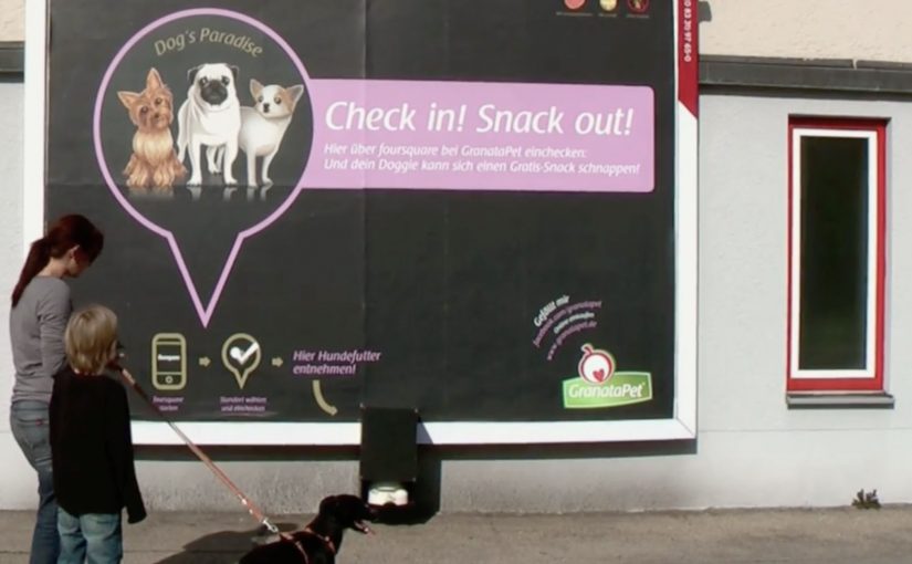
GranataPet is one of the innovative leaders of high premium pet food in Germany. Their agency, agenta, was given the challenge to create awareness for GranataPet dog food on a slim budget.

The idea targets dog owners at the exact moment they are most open to noticing pet-related messages. While walking their best friend. Socially activated installations are placed on key walking routes. Dogs catch the scent of treats, stop, and pull their owners toward a billboard that simply says “Check in. Snack out”.

A sampling demo that your dog starts for you

This is a classic trial mechanic with a smart trigger. Instead of asking humans to approach a promoter, the dog does the targeting. The owner follows the leash. Then the message becomes self-evident. Check in with Foursquare to activate a free bowl of dog food.

How the mechanism works

The billboard combines three parts. A location check-in prompt, a connected dispenser and bowl, and a social echo via the check-in behavior, meaning each check-in can create additional visibility beyond the street placement itself. When a user checks in at the billboard’s location, the system releases a portion of food into the bowl. The owner watches the dog’s reaction in real time, which functions as the product demo.

In pet food sampling, the highest-converting trial moments are the ones where the animal can deliver an immediate preference signal in front of the owner.

The real question is whether the brand can turn a routine walk into a low-friction proof moment that the owner trusts more than advertising copy. The stronger move here is to let the dog, not the promoter, make the case.

Why it lands

It is easy to trigger, well-timed, and emotionally loaded. The owner does not have to imagine whether the dog will like the food. They see it. That works because a visible reaction from the dog removes guesswork faster than any product claim can. The social layer then turns one local poster into distributed impressions, because check-ins can surface to friends depending on settings. The most important part is that the “proof” is not the copy on the billboard. It is the dog’s behavior.

Extractable takeaway: If your product decision depends on a third party’s preference, build a live demo where that third party delivers the verdict on the spot, and use a simple location trigger to scale it.

What the brand is really buying

This is awareness, trial, and measurable demand in one loop. The execution creates talk value, it generates trackable interactions per location, and it pushes owners toward retail purchase after a positive in-the-moment test. Trade coverage at the time also described increased local demand following the activation.

What pet food marketers can steal from this

  • Target the moment, not the demographic. Dog-walking routes beat broad reach when the category is specific.
  • Let behavior be the headline. A happy dog is more persuasive than any claim line.
  • Make the trigger simple. One action. One reward. No explanation tax.
  • Use the environment as your interface. The billboard is the call-to-action and the proof point.
  • Instrument the activation. Location check-ins can double as measurement, not just distribution.

A few fast answers before you act

What is “Check in, snack out” in one sentence?

An interactive billboard that dispenses free dog food when a nearby owner checks in using a location service.

Why does this outperform a normal sampling stand?

The dog initiates the interaction, and the product proves itself immediately through the dog’s reaction, which reduces hesitation for the owner.

What makes the social layer valuable here?

Check-ins can create secondary reach beyond the physical location, and they can be used to track which placements generate the most interactions.

What is the biggest operational risk?

Reliability. If the dispenser jams or the trigger fails, the experience collapses and the brand takes the blame.

How would you adapt this without Foursquare?

Keep the same structure. A location trigger plus instant physical reward. Use whatever mobile mechanism your audience already uses for quick opt-in and confirmation.

Superette: Short Shorts

Superette: Short Shorts

In the inner city, someone stands up from a bus-stop bench and notices a message pressed into their thigh. It reads like a sale reminder, and it travels with them for the next hour.

That is the execution DDB Auckland creates for Superette’s short shorts sale. Indented plates are fitted across bus stops, mall seats, and park benches in the fashion district, so when people sit down, the message is imprinted on the bare skin exposed by the trend. The result, as described, is branded seating plus a moving wave of free media: thousands of temporary imprints that last up to an hour, and show up most visibly on exactly the style-setters the retailer wants.

Superette’s short shorts sale campaign.

How the imprint works

This is body imprint advertising: a physical surface transfers a readable message onto skin through pressure, like a temporary stamp without ink. The media buy is the furniture people already use. The “placement” is the moment the audience sits down.

In fashion retail, the fastest way to make a promotion feel native is to attach it to the lived behavior and the exposed product context, not a separate media channel.

Why it lands in the street

The idea carries its own proof. The imprint is not a claim you read; it is a thing that happens to you, and that makes it unusually hard to ignore or forget. It also creates a social moment. People compare marks, laugh, take photos, and inadvertently become distribution. The targeting is embedded in the location strategy: benches in inner-city and fashion-district zones bias the audience toward the “hippest young cats” already dressed for visibility.

Extractable takeaway: When your offer is simple and time-bound, design a mechanic where the audience physically carries the message for a short period, then place that mechanic where the right crowd naturally gathers.

What Superette is really buying

Not just awareness. The campaign buys cultural permission. It signals that the sale belongs to a specific scene and that the brand understands how that scene moves, sits, and shows skin. The imprint is a cheap, repeatable proof-point of “this is for you” without ever saying it directly.

The real question is whether the sale message can travel through the scene as social proof instead of behaving like an ad bolted onto it.

What retail teams can steal from this

  • Turn existing infrastructure into media. Find the surfaces your audience already uses, then engineer the message into the touchpoint.
  • Make the ad portable. If people carry the message with them, your reach compounds without extra placements.
  • Target by behavior, not demographics. Location and context can do the filtering when the creative is inseparable from the setting.
  • Keep the message legible and short. Physical imprint media rewards minimal copy and a single, clear action.

A few fast answers before you act

What is “body imprint advertising” in this campaign?

A message is created as a temporary impression on skin by sitting on seats fitted with indented plates. No ink is needed. Pressure creates the readable mark.

Why does putting the ad on benches make sense for a shorts sale?

The trend exposes bare thighs, so the sale message can live on the same body area the product is designed to reveal. The medium and the product context reinforce each other.

What makes this feel like “free media” after the placement?

Once a person stands up, the imprint travels with them for a while. Every subsequent encounter becomes an additional impression without buying another seat or poster.

What is the main risk with this approach?

If the imprint feels intrusive or uncomfortable, the novelty can flip into backlash. The mechanic depends on perceived playfulness, not coercion.

When should a brand use a tactic like this?

When the message is ultra-short, the audience is location-clustered, and the idea can be experienced instantly in a way that people will talk about and show others.

Tele2: Giant Phone

Tele2: Giant Phone

Tele2 is launching a new offer that sounds technical on paper. Fixed telephony delivered through the mobile network. In plain terms, that means a home-phone style service carried over the mobile network instead of a traditional fixed line. The fastest way to make that believable is to let people use it like a normal landline.

So Forsman & Bodenfors builds giant, working phones in Sweden’s three biggest cities. Passersby can pick up the handset and call whoever they want for free, whether that is a friend, a taxi, or the first number that comes to mind.

To keep the street theatre alive, Tele2 occasionally calls the giant phones. Whoever answers at that moment wins a prize.

The giant-phone mechanic

The mechanic is a physical demo of a simple promise. A “home phone” style service that rides the mobile network behaves exactly like the thing people already understand: pick up, dial, talk. The oversized installation does two jobs at once. It acts as out-of-home media you cannot ignore, and it removes friction by turning product education into a one-step trial.

In technical product launches, the most reliable shortcut to trust is an immediate, public, hands-on trial that converts jargon into a familiar behavior.

Why the simplicity message sticks

This works because the audience does not have to believe a claim. They verify it themselves in seconds. The scale makes it socially safe to participate, because the act of “trying it” is also the entertainment. The prize-call twist adds intermittent reward, which keeps attention and creates a reason to stay nearby a little longer.

Extractable takeaway: When your value proposition is hard to explain, design a live interaction where the user completes the core promise in one obvious action, then let the environment do the storytelling.

What Tele2 is really selling

The obvious message is “it’s easy.” The real question is whether the new delivery model feels familiar enough to trust. The deeper message is “it’s close enough to the old thing that switching feels low-risk.” The activation reframes a potentially abstract network feature as continuity: you still have a phone experience, just delivered differently.

Launch lessons from the giant-phone demo

  • Prototype the promise. Build a demo that behaves like the old habit, even if the technology underneath is new.
  • Make the demo the media. If the unit cannot be ignored, you buy awareness and comprehension with the same spend.
  • Keep participation effortless. “Pick up and call” beats any explanation panel.
  • Add a timed trigger. A random callback, reward, or live moment gives people a reason to linger and talk about it.

A few fast answers before you act

What was Tele2 trying to prove with the giant phones?

That its fixed-telephony offer delivered over the mobile network feels as straightforward as a traditional landline. You pick up a handset, dial, and it works.

Why use giant phones instead of a standard street team?

The scale creates instant attention and makes the demo impossible to miss. It also turns the product trial into a public spectacle that others notice and join.

What makes this an effective “technical product” launch pattern?

It replaces explanations with verification. A user experiences the core benefit directly, which reduces skepticism and increases recall.

How does the prize-call element help the concept?

It creates anticipation and a reason to stay engaged, while adding a simple narrative hook people can repeat to others.

Where does this approach work best today?

Any launch where the promise is “this new infrastructure behaves like the old familiar thing,” such as networks, payments, or connected services that need trust before adoption.