IAA 2011: Walk of Innovations

IAA 2011: Walk of Innovations

I was at the IAA 2011 this Saturday, and I got a glimpse of our automobile future. It felt awe-inspiring. Almost all electric. Fully computerized. Interactive dashboards and even window displays.

But while I looked at the cars with amazement, I kept a close look out for innovative implementations of “today’s” cutting-edge technologies. I was curious to see how car makers use touch displays, social media, QR codes, and augmented reality to engage visitors at such a massive event.

Here, augmented reality means a phone-triggered digital layer added on top of a physical object or display.

Renault Frendzy. 100% Electric

Here is a quick photo report of what I found interesting and innovative at the show.

Volkswagen

Volkswagen Interactive Motion Display

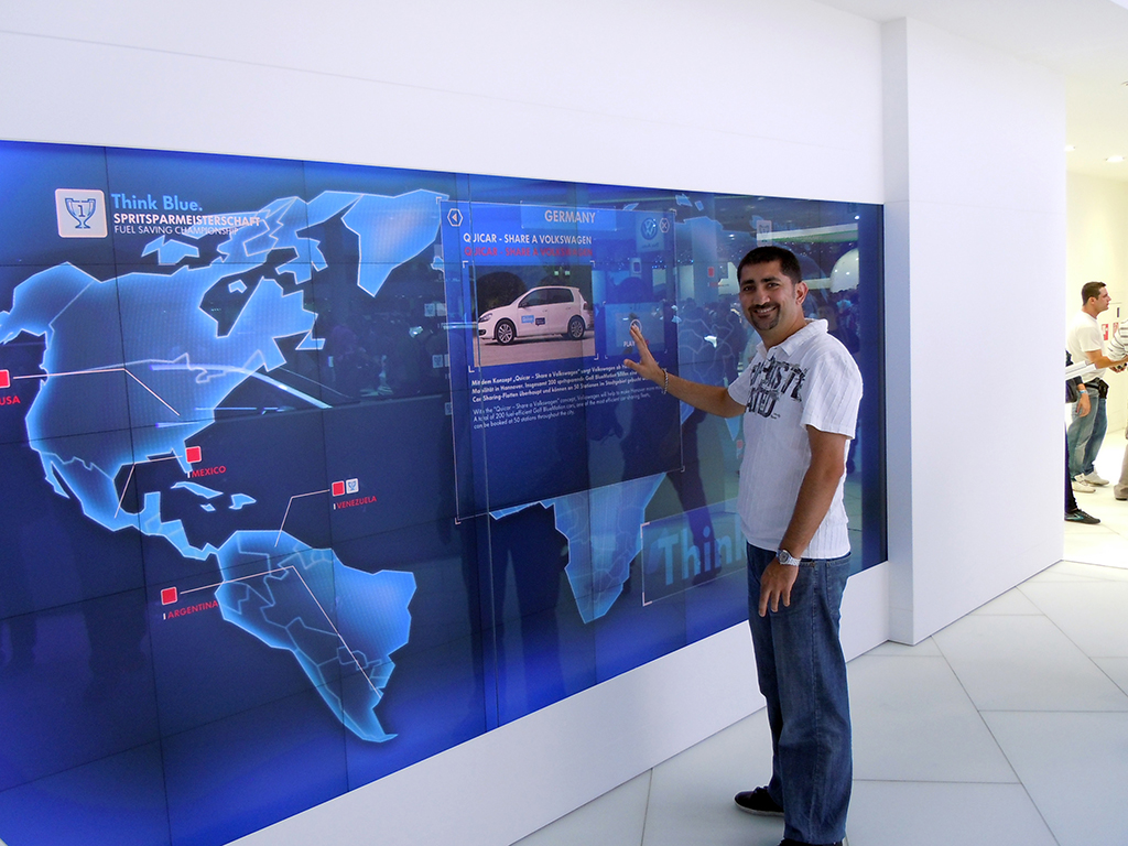
The Volkswagen BlueMotion technology was presented through a huge motion-based interactive display. Visitors did not need to touch the display. They used various gestures to navigate through the menu options.
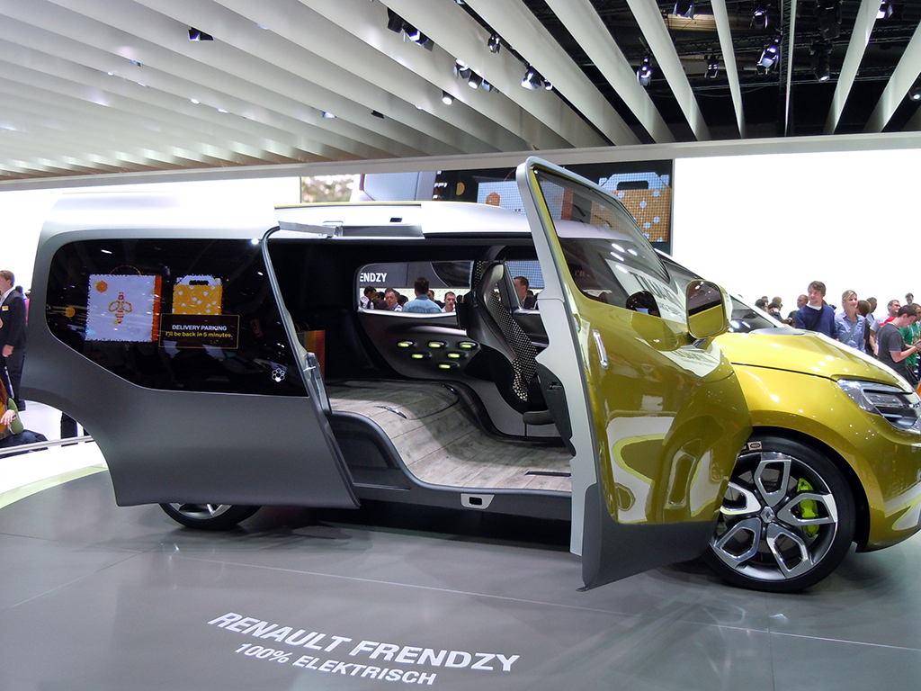
Renault

Renault Twingo

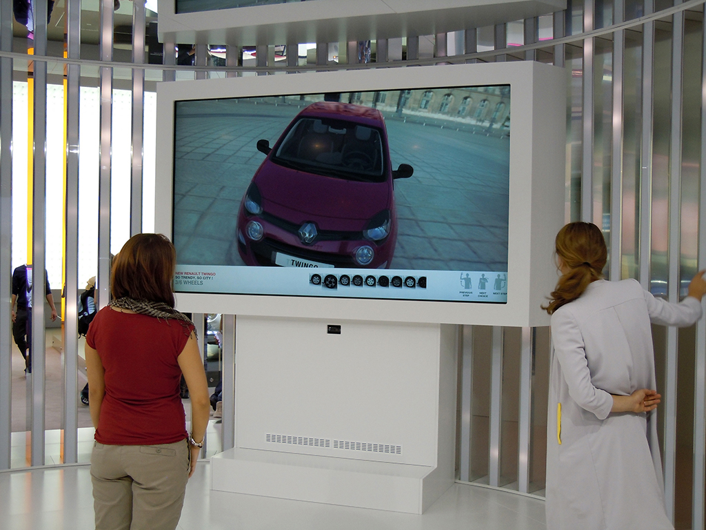
Visitors used the motion-based interactive display to learn more about the Renault Twingo. They could also change the colors of the model and watch demo videos.

Hyundai

Dream of Sand

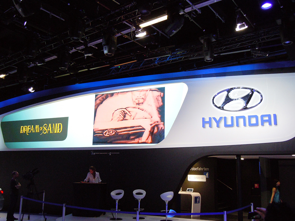
The main draw at the Hyundai stall was the “Dream of Sand” show by Svetlana Goncharenko and Natalya Netselya, who created vivid pictures in real time using sand.

Hyundai was also one of the only car brands trying to connect the stand with Facebook. Visitors needed to “Like” the Facebook page in order to be part of a lucky draw that gave them a chance to drive a Hyundai dream car. Important details like the fan page URL and contest information were not visible, or not easily accessible.

Skoda

Skoda Augmented Reality Pins

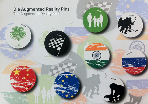
Skoda gave visitors augmented reality pins. The Junaio AR app was used to scan the pin and activate the augmented reality. Most of the pins were gone by the time I got there, so I scanned the info card instead. It did not trigger the 3D surprises that the pins would, but it did offer a set of regional videos.

Citroën

Citroen Eco Drive

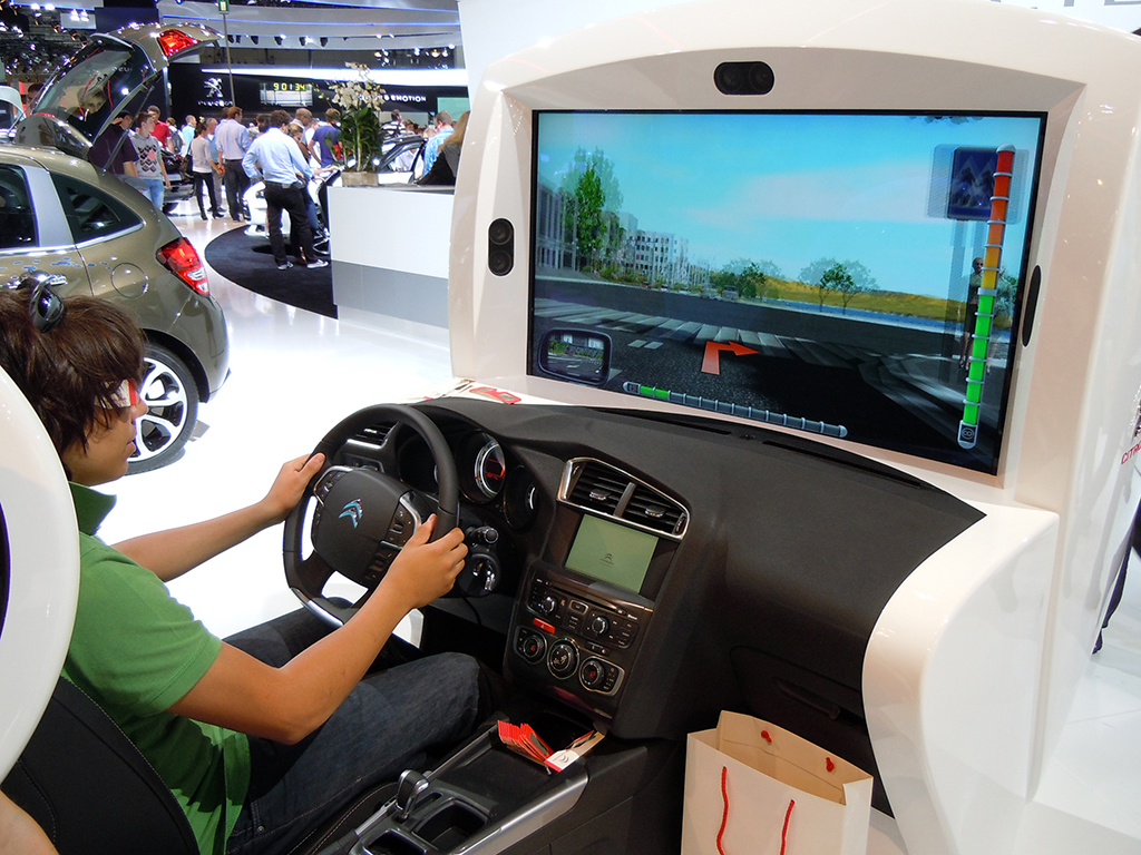
At the Citroën Eco Drive simulator, visitors could take the car for a 3D test drive.

Citroen C-Zero

iPads were used by many car manufacturers to interactively share model specifications, videos, brochures, and to take automated enquiries from high-potential buyers.

Opel

Opel Microsoft Surface setup

Opel used Microsoft Surface technology to share information about its cars. This was my first live experience with Surface. It worked much like the Apple touch interface, even though it did not feel as sensitive and smooth.
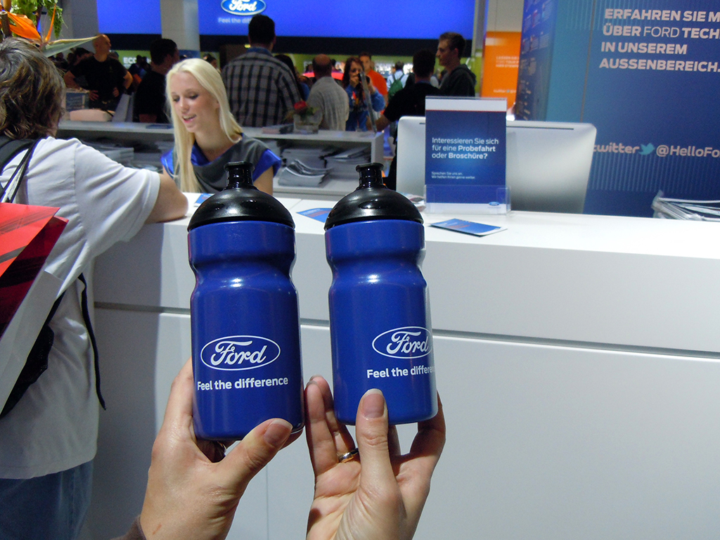
Ford

Ford Simulator

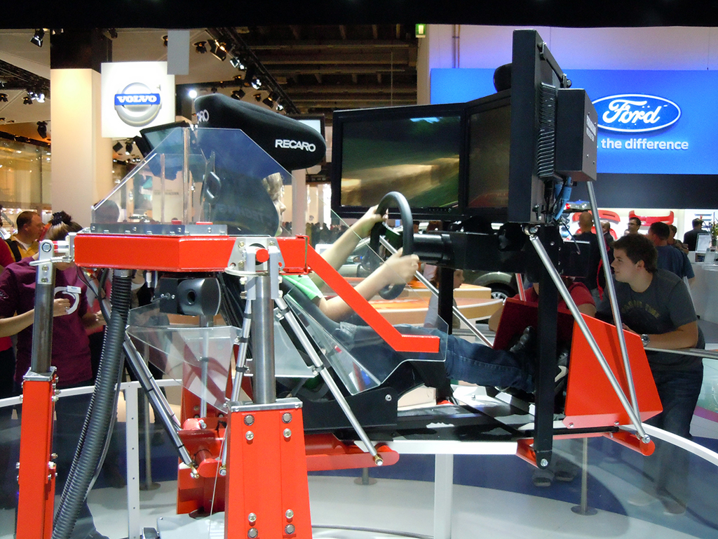
Ford, like Citroen and Volvo, set up a car simulator at its stand.

Ford Stamps

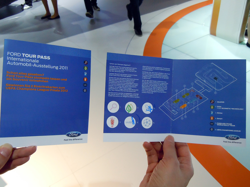
They also engaged visitors with a small “collect the stamps” game. The game made visitors go to each section of the Ford stand, correctly answer some easy questions related to the car and technology, collect the stamps, and get Ford-branded water bottles. Visitors could also play further and win two tickets for the UEFA Champions League Final in 2012.

Ford Bottles

Chevrolet

Chevrolet Volt

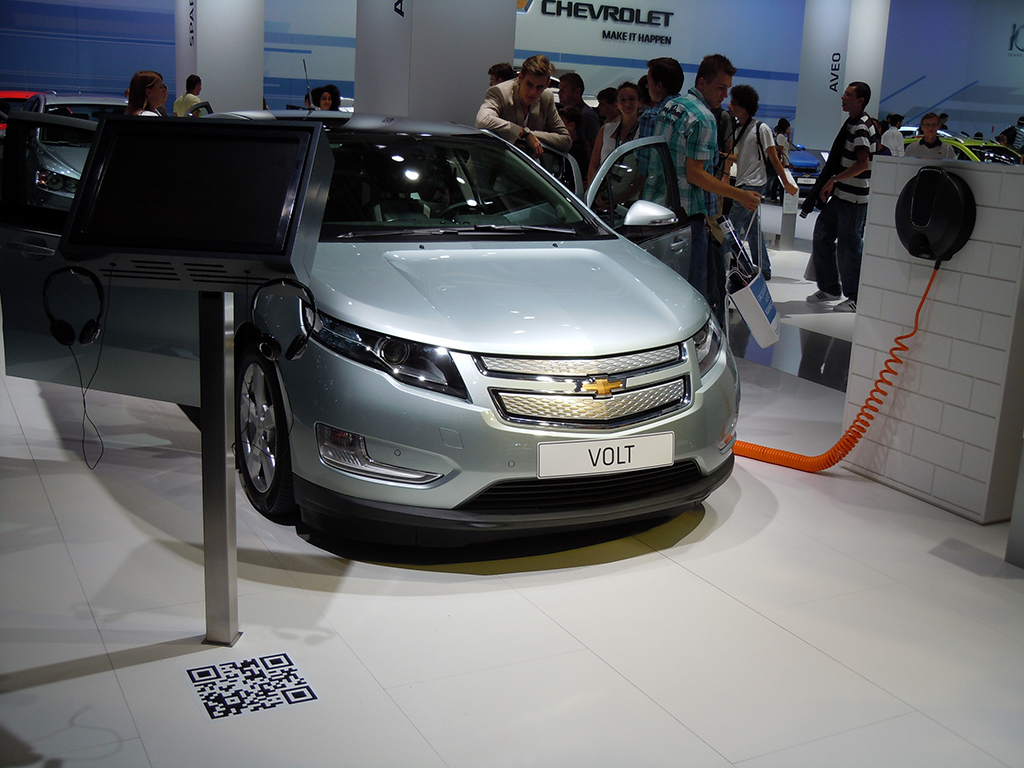
Visitors could scan the QR code on the floor to view a short Chevrolet Volt specs video.
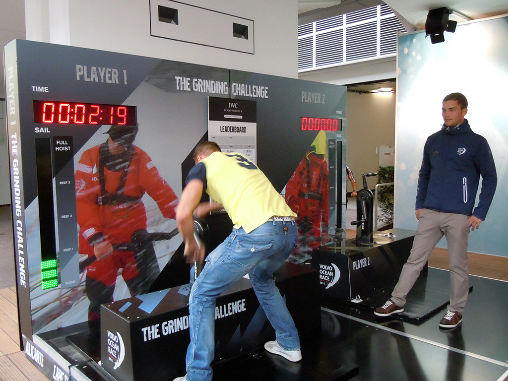
Volvo

Volvo Sailing

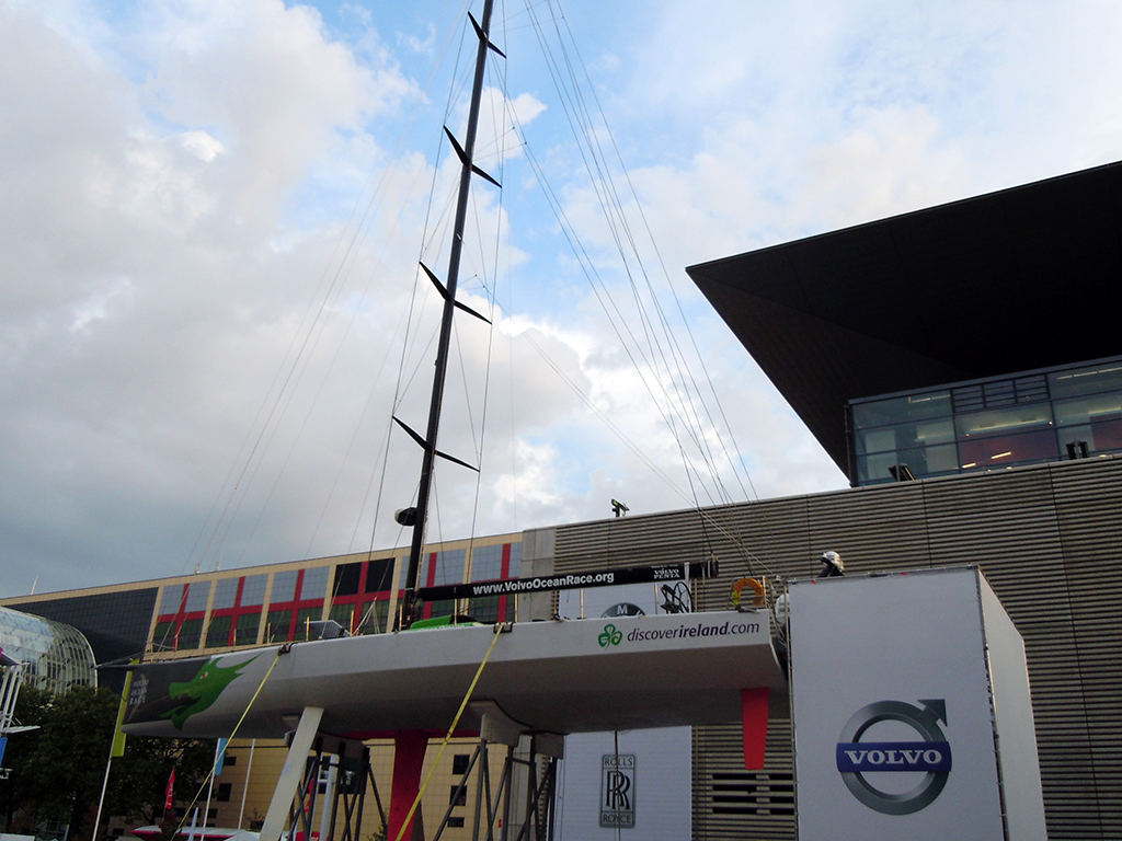
The Volvo Open 70 Simulator gave visitors a first-hand experience of what the Volvo sailing team goes through when they go sailing in the ocean.

Volvo Sailing Simulator

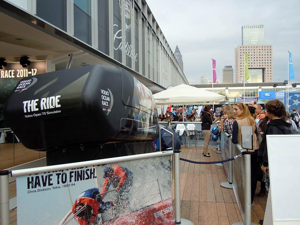
On taking the ride I slid steeply from left to right on the seat. There was also non-stop wind blowing on my head, with regular splashes of water. It created a strong 4D-style experience. By 4D-style, I mean the simulator added physical effects like motion, wind, and water to the visual ride.

Visitors could also try to hoist a virtual sail. On my second attempt I hoisted the sail in 12.3 seconds. The current record was set at 9.03 seconds by one of the previous visitors.
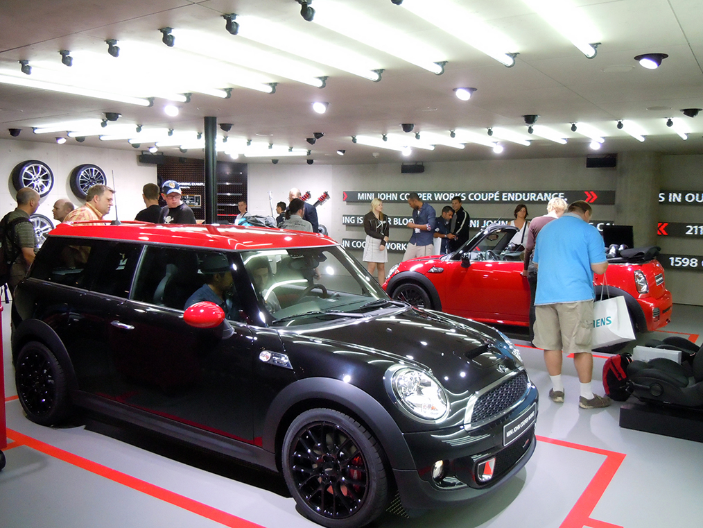
Volvo Sail Hoisting

Mini Cooper

Mini Cooper stand overview

I really enjoyed visiting the Mini Cooper stand. The displays were amazing. A beautiful Mini surrounded by a bright circular display appeared as one entered the stand.

Mini Display

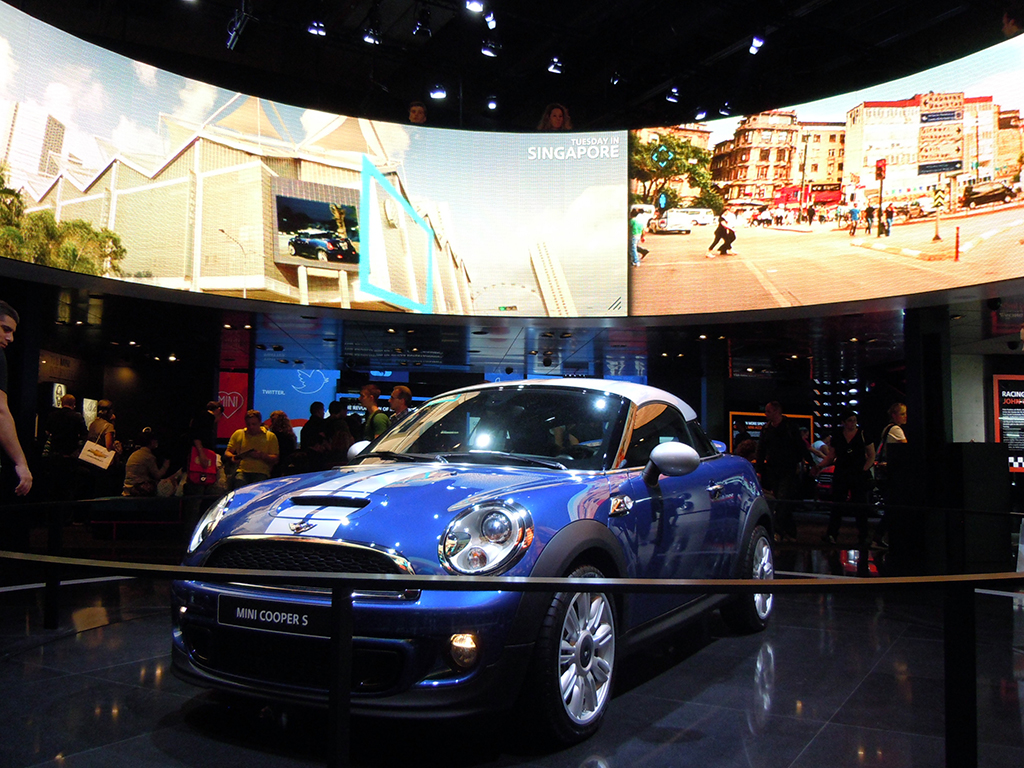
Minis in multiple colors were on display with various digital displays across the walls.

Mini Cooper multiple cars and wall displays

They also showcased their new iPhone app for the car, positioned as the intelligent link between the driver and the Mini. The app claimed to help the driver perfect a more sporty and precise driving style.

Mini iPhone App

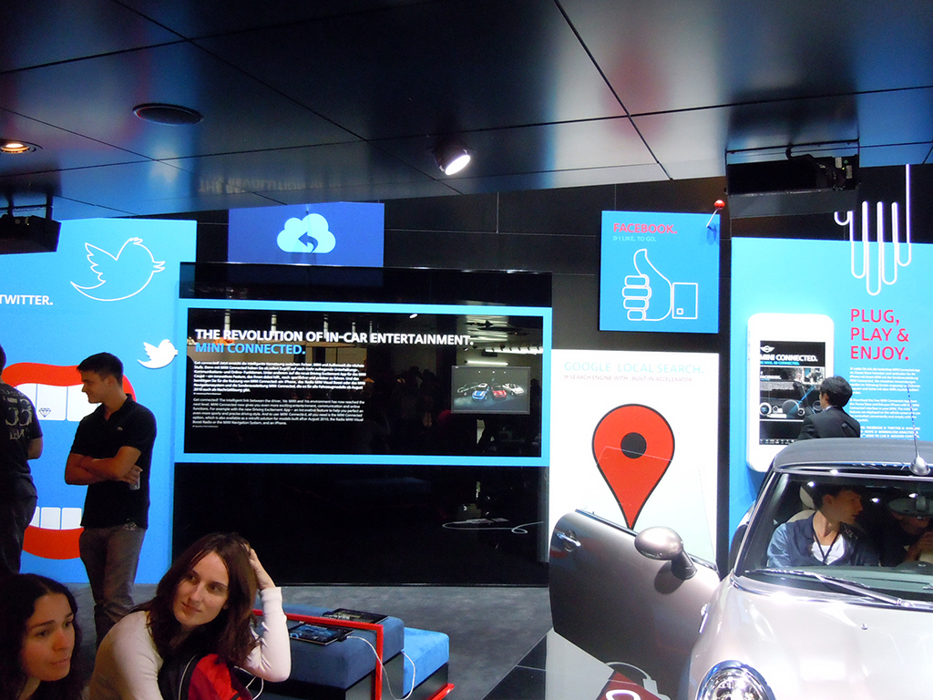
I also spotted Lancia, Fiat, and Alfa Romeo promoting their iPhone apps via simple leaflets.

Mini Souvenirs

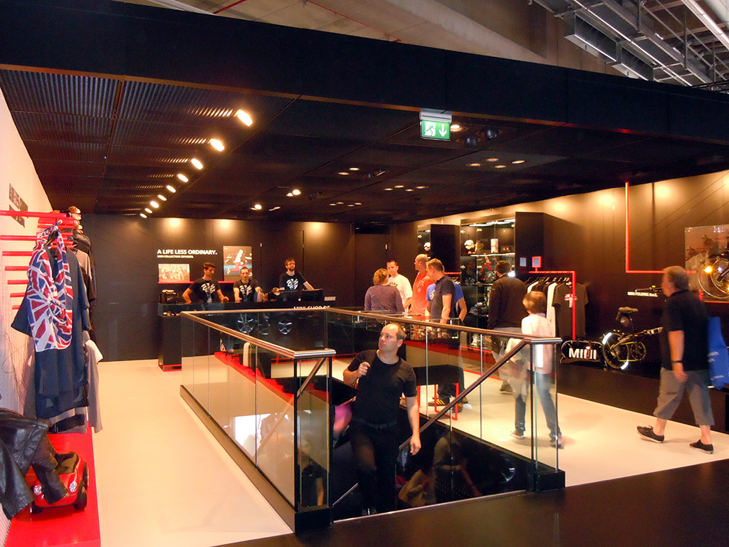
A souvenirs section greeted visitors on the first floor of the stand.

Got my Mini

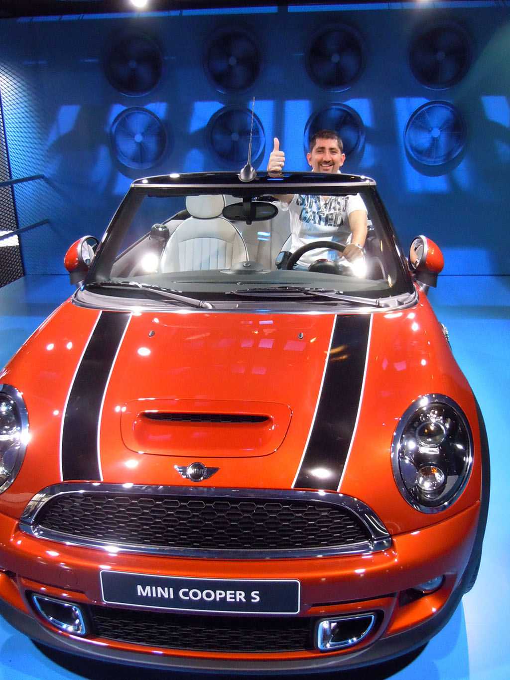
In the end I got to drive my own Mini!
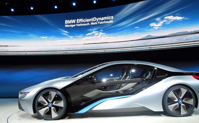
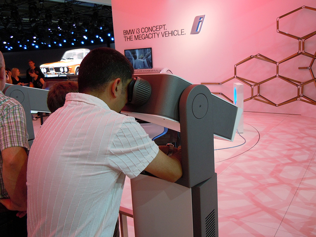
BMW

BMW. Mission Impossible Ghost Protocol car

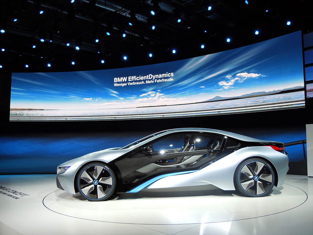
The BMW stand was the biggest in terms of size and digital displays. Two of the most stunning concept cars from IAA were here. The car from the photo above appears in the Hollywood blockbuster “Mission Impossible: Ghost Protocol.”

BMW i3 Concept

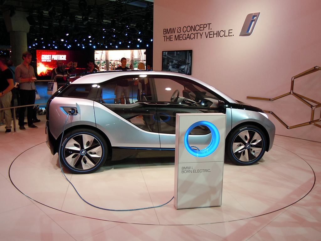
At the BMW i3 Concept city car area, I found an interactive telescope through which I could watch videos and product demos. To select a video, I had to move the telescope around and point it at what I wanted to play.

BMW i3 Concept Presentation via Interactive Telescope

Why the most memorable stands worked

The strongest activations turned product messaging into something visitors could do, not just watch. That worked because a gesture, a simulator ride, a scan, or a simple challenge gave the innovation a clearer mental hook and made the brand easier to remember after the show.

Extractable takeaway: At live events, technology earns its keep when it simplifies the story into one obvious action that visitors can try for themselves.

At large automotive trade shows, brands win attention by turning passive footfall into small, guided acts of participation.

The real question is not whether a stand looks futuristic, but whether the technology gives visitors a clear reason to interact, learn, and remember.

The best stands used technology as participation, not decoration.

Closing note from the show floor

I spent seven hours at IAA. It was totally awesome. The only car stalls I could not visit were those of Mercedes and Audi. There were simply too many people crowding those stands, and if I had waited, I would have missed at least half of what else I saw during my time there.

I look forward to the next Internationale Automobil Ausstellung in two years. Till then, this is Sunil signing off from IAA 2011.

What event teams can steal from IAA 2011

  • Make innovation physical. The strongest stands gave visitors something to do, whether that meant gesturing at a screen, taking a simulator ride, scanning a code, or testing a device.
  • Reward exploration. Ford’s stamp mechanic turned stand navigation into a simple game with a visible payoff.
  • Remove friction from participation. When key details are hard to find, as with Hyundai’s Facebook activation, the idea loses force.

A few fast answers before you act

What is this post?

A photo report of IAA 2011, focused on practical uses of touch, motion control, social mechanics, QR codes, and augmented reality on brand stands.

What is the single strongest engagement pattern across stands?

Interactive interfaces that pull visitors into exploration. Motion-based screens, simulators, and hands-on experiences that create a reason to stay.

Which activations stand out most?

Volkswagen’s gesture-based BlueMotion display. Volvo’s Open 70 sailing simulator with wind and water. Ford’s stamp-collection game that drives exploration.

Where does mobile show up most clearly?

Brands promote iPhone apps via leaflets and app demos, plus iPads used widely for specs, videos, and lead capture.

What is the practical takeaway for event experience design?

If you want people to engage at scale, make the interaction obvious, physical, and rewarding. Then make the next step easy to find.

Homeplus Subway Virtual Store: Mobile Aisle

Homeplus Subway Virtual Store: Mobile Aisle

A retail store that lives on a subway wall

Homeplus turns a familiar commuter moment into a shopping moment.

Instead of asking people to visit a store, Homeplus brings the store to where people already wait. In the subway.

The virtual store appears as a life-size shelf display on station walls. Products are shown like a real aisle, complete with packaging visuals and clear selection cues.

The value is not novelty. It is time leverage. Shopping happens in minutes that normally get wasted.

How it works

The experience is deliberately simple.

A commuter scans product codes with a smartphone, adds items to a basket, and completes the order digitally. Delivery then happens to the home address.

Because the scan-to-basket flow is short, the order can be finished within a single wait for the next train.

That flow changes the meaning of convenience. The store is no longer a destination. It becomes an interface layer that can be placed anywhere footfall exists.

In high-density urban retail, the strongest convenience plays capture existing dwell time instead of trying to create new store visits.

Why this idea matters more than the technology

It is tempting to frame this as a QR-code story. That misses the point. This is the kind of retail innovation worth copying, because it turns context into conversion rather than chasing novelty.

Extractable takeaway: Treat customer dwell time as inventory. Put the simplest possible scan, pay, deliver flow inside a routine people already repeat.

The strategic innovation is contextual retail design. That means placing a purchase interface inside an existing routine, so the context provides the motivation.

Homeplus places the catalog where time is available, reduces friction to scan, pay, and deliver, and treats the physical environment as media and distribution at once.

The subway becomes a high-intent moment. People have time, they are idle, and they are already in a routine. Retail becomes a habit stitched into commuting.

What this signals for retail experience design

This concept highlights a shift that becomes increasingly important.

The real question is where your customers already have predictable micro-windows of time, and whether you can make buying fit cleanly inside them.

Retail experiences are not confined to stores or screens. They can be embedded into everyday environments where attention is naturally available.

For leaders, the question becomes where the best micro-windows of time exist in customers’ lives, and what a purchase flow looks like when it fits perfectly into those windows.

The real lesson. The aisle is a format, not a place

Homeplus shows that an aisle is a navigational model. It does not have to live inside a store.

Once that is accepted, the design space expands. Aisles can be printed. Aisles can be projected. Aisles can appear in transit, at events, or in high-dwell environments.

The pattern is consistent. Retail becomes more modular. Distribution becomes more creative. Convenience becomes a design discipline.

  • Design for dwell time. Choose environments where waiting is predictable and attention is naturally available.
  • Keep the interaction atomic. Scan, confirm, pay. Let fulfillment do the heavy lifting after the scan.
  • Make fulfillment boringly reliable. If delivery fails, the experience collapses because the shopper has no store fallback.

A few fast answers before you act

What is the Homeplus subway virtual store?

It is a life-size “aisle” display in a transit environment where commuters scan products with a phone and order delivery to home.

What is the core mechanic that makes it work?

A fast scan-to-basket flow that turns waiting time into a purchase moment, with fulfillment doing the heavy lifting after the scan.

What is the main prerequisite for repeating this model?

Operational reliability in fulfillment. If delivery fails, the experience collapses because the shopper has no store fallback.

Why is this more than a QR-code story?

The strategic innovation is placing a commerce interface inside a high-dwell routine, using the physical environment as both media and distribution.

What is the simplest way to judge if the concept is working?

If people can complete an order during a normal wait, and fulfillment consistently arrives as promised, the model earns repeat behavior.

Reporters Without Borders: QR Codes That Speak

Reporters Without Borders: QR Codes That Speak

You scan a QR code in a magazine ad, then hold your iPhone over a leader’s mouth. A QR code, short for Quick Response code, is a printed shortcut that opens a mobile destination. The mouth starts talking. But it is not the leader’s voice. It is a journalist explaining what censorship looks like in that country.

Print ads are hitting above their weight lately. Recently, you could test-drive a Volkswagen right inside a print ad, thanks to a special app. Now, QR codes are used to get dictators talking in a set of print ads created by Publicis Brussels for the free-press advocacy group Reporters Without Borders (RWB).

In the ads for RWB you scan the QR code with your iPhone and then place the phone over the leader’s mouth. The mouth starts talking, but it turns out to be the voice of a journalist discussing media censorship in that particular country.

Currently there are Gaddafi, Ahmadinejad and Putin versions.

In public-interest and advocacy communication, this kind of print-to-phone interaction works because it turns a static message into a lived moment of contradiction. The “authoritarian voice” is visually present, but the truth comes from someone who is usually silenced.

How the ad “speaks”

The mechanism is a simple overlay. The printed QR code launches a mobile experience, and the phone screen becomes the animated mouth layer when you align it with the face in the ad.

QR codes act as a bridge from paper to a mobile destination. The ad uses that bridge to deliver audio and motion, without needing the page itself to be electronic.

In advocacy and public-interest communication, print-to-phone interactivity works best when it creates a moment of moral contrast, not a tech demo.

The real question is whether the interaction changes what the message means, or just adds motion.

Why this lands harder than a normal poster

The interaction forces you to participate in the message. You physically place your device over the mouth, so you are complicit in “giving a voice”. Then the reveal flips expectations and reframes the act as a statement about censorship. Because the phone screen becomes the moving mouth layer, the reveal is immediate and hard to dismiss. This is a strong pattern for interactive print: make the overlay carry meaning, not novelty.

Extractable takeaway: If the mobile layer can be removed without changing the message, the interaction is optional. Design the overlay so the meaning only exists when the viewer lines it up and activates it.

What to steal for interactive print

  • Make the overlay do meaning work. The phone is not a gimmick. It is the message delivery device.
  • Engineer a single, clear reveal. The twist needs to land in seconds.
  • Design for alignment and clarity. If the user cannot line it up easily, they quit.
  • Keep the outcome unmistakable. Audio plus a visible mouth movement makes the payoff obvious.

A few fast answers before you act

What is the core idea of these Reporters Without Borders print ads?

They use a QR code and a phone overlay to make a leader’s mouth appear to speak, then reveal a journalist’s voice explaining censorship in that country.

Why use QR codes in a print campaign like this?

QR codes create a fast bridge from paper to mobile audio and motion, which lets print deliver a message that feels alive rather than static.

What makes this more than a tech trick?

The interaction supports the meaning. You “activate” speech, then hear the voice of journalism instead of power, which reinforces the theme of suppressed information.

What are the main execution risks?

Poor alignment, slow loading, or unclear instructions. Any friction can break the moment before the reveal lands.

How can brands apply the pattern without copying the politics?

Use print as the stage and mobile as the moving layer. Make the overlay essential to the message, and build toward one clean, immediate reveal.