

Goodyear Eagle F1 Test Drive

Goodyear does not try to “tell” you that a tire grips better. They stage a test drive that makes you feel it.

A customer walks into a Goodyear retail store expecting the usual sales conversation. Instead, a salesperson offers a test drive. The customer gets into a performance car with what looks like a normal driver. Then the drive turns into a controlled, choreographed, Hollywood-grade demonstration. The driver is a disguised stunt professional. The “test route” includes conditions that exaggerate what traction and control actually mean when things get unpredictable.

That single choice is the unlock. The product story is no longer a brochure. It is an experience.

Goodyear describes this execution as entertainment built around retail-store proof for its Eagle F1 Asymmetric All-Season line, often referred to as “Control Freak”. The point is not the stunt. The point is that grip becomes a felt outcome, not a claim.

The core move

Goodyear turns a retail test drive into entertainment that proves performance.

The real question is: how do you turn an “invisible” performance claim into belief at the moment intent is forming.

How the proof is staged

The stunt is engineered as a sequence of “proof moments” that escalate. The customer starts in a familiar retail context, then the driver introduces controlled chaos where traction and handling show up as outcomes you can feel. Because the demo is structured around cause and effect, the viewer does not need tire expertise to understand what is being proven.

In enterprise marketing organizations where retail, brand, and performance teams operate in different rhythms, retail-first proof content is one of the fastest ways to shorten the distance between awareness and intent.

Why this works so well

Most tire marketing struggles with the same problem. Performance is hard to visualize until you are already in a situation where you need it. “Better grip” sounds like every other claim until something slips.

Extractable takeaway: When a benefit is hard to evaluate in everyday life, do not buy more media to repeat the claim. Engineer one credible moment where the benefit becomes undeniable, then scale that moment through video.

This activation removes that abstraction by doing three things at once. Here, “activation” means a real-world, point-of-sale experience designed to prove one product claim with live human reaction and camera-ready structure.

  1. It makes proof visible.
    The story is designed around moments where traction and handling show up as a physical result. You do not need to understand tread compounds to understand what you just felt.
  2. It creates real human reaction.
    A staged product demo can feel like a stunt. A real customer reaction makes it believable, and shareable, at the same time.
  3. It anchors the brand in the point of sale.
    This is not a distant TV spot. The narrative starts inside the tire store. The purchase context is baked into the content, so the jump from awareness to intent is shorter.

The “retail first” storytelling pattern

A lot of experiential marketing starts with spectacle, then tries to connect it back to the product.

This one starts with the most ordinary commercial moment. A customer is about to buy tires. Then the experience expands outward. That sequencing keeps the brand motive clear. This is not adrenaline for its own sake. It is a dramatic way to demonstrate a benefit that is otherwise invisible.

If your category is dominated by price and familiarity, you win by making functional proof unignorable. You do not win by shouting “better” louder.

The deeper point

This is a category where functional proof usually loses to price promotions and familiarity. Goodyear flips that by turning functional proof into an event.

It is a reminder that “performance marketing” does not always mean dashboards and retargeting. Sometimes it means engineering a moment where the product benefit cannot be unseen.

What to borrow if you run marketing or commerce

  • Design for “proof moments,” not messages. Write down the one thing a customer must believe for your product to win. Then define the single moment they would need to see, feel, or experience for that belief to become non-negotiable.
  • Build the experience around the buying context. Placing the opening scene in a retail outlet removes friction. The story is already where the decision happens. For many categories, that is the most underrated advantage.
  • Treat the camera as a distribution strategy. The activation is designed to be filmed. Multiple angles. Real people. A sequence that escalates. In practice, the video becomes the scalable media layer on top of a physical stunt.
  • Make the customer the hero, not the brand. The most memorable part is not a feature list. It is the reaction. The brand earns attention by giving the customer an experience worth talking about.

A few fast answers before you act

What is the campaign actually demonstrating?

It demonstrates traction and handling by forcing controlled situations where grip and stability show up as physical outcomes, not claims.

Why stage it in a retail store instead of a track?

Because the purchase decision lives in retail. The story starts where intent is highest, so the proof is already in the buying context.

What makes this feel credible instead of gimmicky?

Real customer reactions plus a clear cause-and-effect link between the stunts and the product promise. The entertainment serves the proof.

What is the repeatable lesson for other categories?

Find your “invisible benefit,” create a safe way to make it visible through one engineered proof moment, then film it so it scales beyond the physical experience.

When does this approach fail?

When the experience is spectacle with no causal link to a product benefit. If you cannot explain what is being proven in one sentence, you are buying attention, not belief.
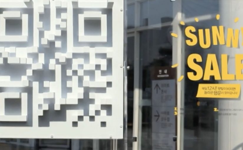
eMart: Sunny Sale Shadow QR Codes

Korea continues to set the standard in creative QR code campaigns. In June last year, Homeplus in South Korea used QR codes to create a virtual store in a subway station.

Now eMart, South Korea’s largest retailer, creates shadow QR codes across the city that only become visible when the sun is at the correct angle in the sky, between midday and 1pm. Consumers who scan the QR code during this period are redirected to the eMart online store, where they receive $12 coupons for products that are delivered to their homes.

Turning time into the trigger

The mechanism is a physical installation designed to cast a QR pattern as a shadow only during a narrow daily window. The code is effectively “off” for most of the day, then “on” at lunch. That forces a repeatable habit moment and makes the scan feel like a discovery rather than a prompt.

In dense, mobile-first retail markets, lunch hour is a high-frequency window where a time-boxed incentive can convert attention into immediate action.

The real question is whether you can make the trigger itself time-locked and unmistakable, so people self-schedule the behavior instead of waiting for another reminder.

A time-locked trigger is a stronger activation pattern than an always-on QR poster because the constraint becomes the story.

Why the shadow constraint works

The campaign does not just offer a discount. It creates scarcity you can see. If you miss the light, you miss the code. That turns a routine coupon into a small challenge, and it gives people a reason to talk about the “how” as much as the “what”.

Extractable takeaway: If you want to spike behavior in a specific time slot, make the call-to-action itself time-bound, not just the offer. When the trigger disappears outside the window, the audience learns the rhythm faster than they would from reminders alone.

The sundial-style QR codes, meaning the code is only scannable when sunlight hits at the right angle, were installed at 36 locations across Seoul and served more than 12,000 coupons. eMart membership increased by 58% and lunch hour sales went up by 25%.

Retail activation takeaways: time-locked QR

  • Make the rule instantly legible. “Only works at lunch” is easy to understand and easy to retell.
  • Use a constraint that creates urgency without pressure. The sun provides the timer. The brand does not need to shout.
  • Connect the scan to a clear payoff. Coupon plus delivery is a complete loop, not a teaser.
  • Design for repeat visits. A daily window encourages people to come back tomorrow, not just once.

A few fast answers before you act

What is the Sunny Sale “shadow QR code” idea?

A 3D installation casts a scannable QR code as a shadow only during a specific time window, so shoppers can unlock a coupon by scanning at the right moment.

Why limit the code to midday?

It concentrates attention into lunch hour, creates visible scarcity, and trains a daily habit around a predictable retail moment.

What makes this better than a normal QR poster?

The time-based constraint is the hook. The QR code is not always available, so scanning feels like discovery and the story becomes shareable.

How do you pick the right time window?

Choose a moment that already has repeatable footfall and intent, then make the window tight enough to feel special but wide enough that normal shoppers can realistically catch it.

What can go wrong with time-locked activations?

If the reward is weak or redemption is clunky, the constraint becomes frustration. The tighter the window, the more important the payoff and UX become.

Anthon Berg: The Generous Store

Generosity is one of the basic elements in human happiness. The campaign cites research suggesting that only 1 in 10 people experience generosity from others. To help change that trend, Danish chocolate maker Anthon Berg opens “The Generous Store”.

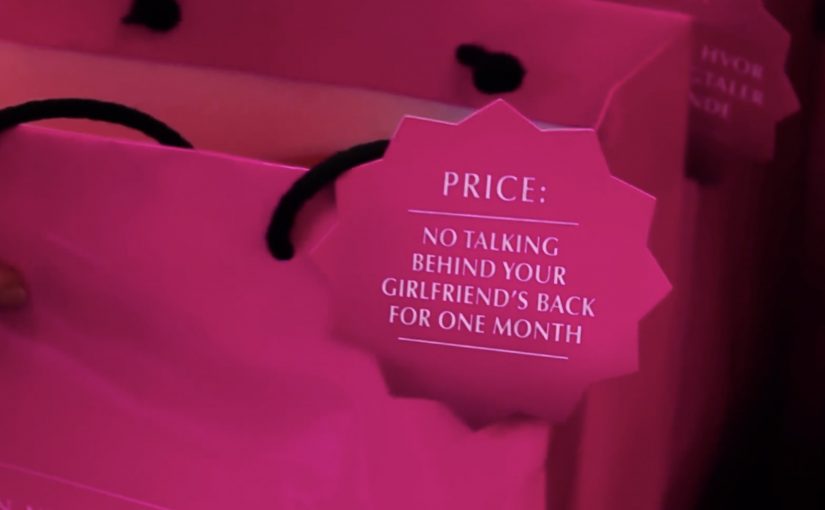
For one day only, the pop-up is described as the first chocolate shop where people cannot pay with cash or card. Instead, the store provides iPads where people log in to Facebook and post a promise of a generous deed to a friend or loved one.

When generosity becomes the price tag

The twist is simple. Chocolate is not discounted. It is “priced” in actions. Your payment is a public commitment, not a transaction, and that changes how the brand message travels.

How the mechanic works

Here, the mechanic is the rule set that turns each chocolate into a reward for a promised deed. Each product comes with a defined generous deed. At checkout you choose the deed, sign in on an in-store iPad, and publish the promise to the person you are doing it for. The store does not accept money. It accepts a visible commitment that a real person can later hold you to.

In FMCG and gifting brands, turning a private intention into a light public commitment often spreads faster than any discount ever could.

Why it lands

This works because it removes the usual friction of “sharing”. People do not share an ad. They share a promise addressed to someone they care about. That makes the post feel personal, not promotional, and it gives the brand a role as the trigger for a positive moment. The one-day constraint also adds urgency. If you want in, you have to show up and do the thing.

Extractable takeaway: If you can make the customer’s “payment” a social commitment with a clear recipient, the message travels as a relationship act, not as brand content.

What the brand is really buying

The real question is whether your brand can make the act of purchase double as a socially visible promise people want to complete.

The store trades short-term revenue for reach and association. The earned effect is not just “people talked about a pop-up”. It is that the brand gets attached to a stream of personal posts that already have attention and emotional context. That is a much stronger distribution layer than asking people to like a page or share a video.

What FMCG and gifting brands can steal

  • Use a non-monetary currency that matches your brand. Here the currency is generosity, not points.
  • Make the action specific. Vague kindness does not travel. Concrete deeds do.
  • Design for a real recipient. A named person increases follow-through and keeps it human.
  • Keep the steps brutally simple. Choice, login, post. No extra hoops.
  • Limit the window. Scarcity turns a nice idea into an appointment.

A few fast answers before you act

What makes this “social commerce” rather than a normal pop-up?

The checkout is a social action. The “payment” is a posted commitment to another person, which creates distribution inside an existing network.

Why is the Facebook post essential to the idea?

It turns intent into accountability. The promise is visible to the recipient and friends, which increases the chance of follow-through and gives the campaign its reach.

What is the main risk with a “good deeds as currency” mechanic?

If it feels forced or performative, people will reject it. The deeds must feel genuinely generous and culturally natural for the audience.

How would you adapt this if you cannot use Facebook or logins?

Keep the structure and change the channel. The key is a lightweight commitment addressed to a real person, made in a way that is easy to share and later remember.

What should you measure beyond views?

Track footfall during the activation, earned mentions, the volume of public pledges, and any lift in brand association with generosity in post-campaign tracking.