Parrot AR.Drone: The Flying Banner

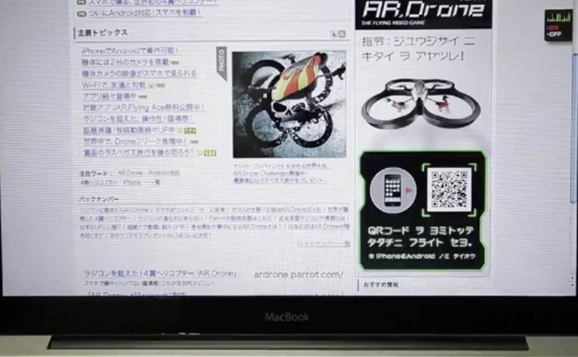
The Parrot AR.Drone is a quadrotor you can control with an iPhone or iPad. Instead of explaining that in copy, Beacon Communications Tokyo built an interactive web banner that lets people experience the idea.

The banner displays a QR code. Scan it and your phone becomes the controller for a virtual AR.Drone that appears inside the banner. You pilot it around the screen using your smartphone, effectively turning the ad into a small playable product demo.

Why this banner stands out

Most banners talk about what a product can do. This one makes the product behaviour the message. If the AR.Drone is “controlled by your phone,” the ad is controlled by your phone. That direct mapping makes the idea instantly believable. For interface-led products, this is the right pattern: let people try the interface, not read about it.

Extractable takeaway: If your product is an interface, let the audience use that interface inside the ad unit, even in a simplified form.

The mechanic: QR to second screen control

The QR code is not decoration. It is the bridge that turns a passive placement into a two-device experience. Here, “second-screen control” means the desktop shows the scene while the phone acts as the controller. The banner stays on the desktop screen. Control moves to the phone. That split makes the interaction feel closer to the real product, and it also creates a small sense of “this is special” because the ad is no longer self-contained.

In consumer electronics launches, the most persuasive interactive advertising is a playable demo that mirrors the product experience in seconds.

The real question is whether the viewer can feel the core control loop before they decide to care.

How it creates attention without shouting

As described in industry coverage, users could fly the drone around the page and even “blast” parts of the site to reveal the full-screen message. That gives the interaction a purpose and a payoff. It is not just movement. It is progression.

Beacon also reported unusually strong click-through performance compared to typical expectations for the placement. In this case, that makes sense. People do not click because they were interrupted. They click because they were already playing.

Second-screen demo moves to copy

  • Replicate the product, do not describe it. A short, real interaction beats a long explanation.
  • Use one clear bridge between devices. QR works here because it is immediate and simple.
  • Design an obvious payoff. A reveal, a score, a result. Give the interaction a reason.
  • Keep the controls teachable. If people cannot learn it in seconds, the banner loses them.
  • Make it readable for spectators. Movement on the main screen helps others understand what is happening fast.

A few fast answers before you act

What is “The Flying Banner” for Parrot AR.Drone?

It is an interactive web banner where scanning a QR code turns your smartphone into a controller for a virtual AR.Drone that you can pilot inside the banner.

Why is this a stronger demo than a normal video ad?

Because it lets people feel the core promise. Phone-controlled flight, through direct interaction, not description.

What role does the QR code play in the experience?

It is the handoff mechanism from desktop to phone. The desktop shows the “world.” The phone becomes the controller, matching how the real product is used.

What is the biggest risk with multi-device banner ideas?

Drop-off. If the connection step is slow, confusing, or unreliable, most users abandon before they experience the payoff.

How would you modernize this mechanic today?

Keep the principle of second-screen control, but reduce friction. Use a fast connect flow and ensure the experience is still satisfying even if someone chooses not to connect a phone.

Slide to Unlock: Audi and Amnesty iAds

Audi “Slide to Unlock”

AlmapBBDO Brazil developed a distinctive iAd for the Brazilian Audi Magazine iPad app. Here, “iAd” refers to an interactive in-app ad unit built for iPad publications. The ad appeared in iPad publications and played with Apple’s familiar “Slide to Unlock” gesture to pull people into the experience.

Users instantly recognised the swipe interaction used to unlock Apple devices. After racing their finger around the track, they were rewarded with a free download of the first Audi Magazine issue from the App Store.

Amnesty International “Slide to Unlock the Truth”

Amnesty International ran an iAd in one of Sweden’s largest newspapers, DN, presenting readers with an image of a prison cell and a prisoner inside. The same “Slide to Unlock” gesture opened the cell and revealed a strong invitation to join Amnesty International as an activist.

Mechanic: borrow muscle memory, then repay it with value

Both executions use the same trick. They take an interaction people already know, then remap it to a brand action. In Audi’s case, the swipe becomes a playful mini-game. In Amnesty’s case, the swipe becomes a literal unlock that reveals a call to action.

In iPad-era rich media placements, the fastest engagement comes from interactions that feel native to the device instead of invented for the ad.

The real question is whether the gesture is already learned, so the first second goes to the message instead of the UI.

This approach is worth using when you can deliver a clear payoff within one gesture and one reveal.

Why it lands

The shared win is immediacy. There is no learning curve. The interface is already familiar, so attention goes straight to the message. Audi uses that familiarity to reduce friction on a content reward. Amnesty uses it to make the metaphor physical and emotionally legible.

Extractable takeaway: If you want interaction inside an ad to feel effortless, borrow a gesture people already trust, then make the outcome either instantly rewarding or instantly meaningful.

What to steal from gesture-first iAds

  • Start with a native gesture. Familiar interaction reduces drop-off in the first seconds.
  • Make the mapping obvious. Swipe-to-race and swipe-to-open both explain themselves.
  • Reward immediately. Audi pays the user back with a free issue. Amnesty pays back with a clear reveal and a direct next step.
  • Keep the loop short. One gesture, one transformation, one outcome.
  • Let metaphor do the work. Amnesty’s “unlock” is not decoration. It is the message.

A few fast answers before you act

What is the core idea behind “Slide to Unlock” iAds?

They repurpose a familiar device gesture to trigger a brand action, reducing friction and making interaction feel instinctive.

Why does borrowing a system gesture increase engagement?

Because users already know what to do. That removes instruction time and makes the first interaction feel safe and predictable.

What is the key difference between the Audi and Amnesty uses of the gesture?

Audi uses it for playful interactivity and a content reward. Amnesty uses it as a literal metaphor that reveals a persuasive call to action.

What is the biggest risk when using familiar UI patterns in ads?

If the gesture mapping feels unclear or gimmicky, people feel tricked. The interaction must lead to a payoff that justifies the borrowed familiarity.

What should you measure if you run an interaction-led ad?

Interaction start rate, completion rate, time-to-first-payoff, post-interaction clicks, and whether the interaction improves recall of the message.

Opel Movano: File Mover banner

To promote the Opel Movano van range, McCannLowe created a banner that is both useful and innovative. Working like file transfer services such as YouSendIt or WeTransfer, the banner lets users upload up to 2GB of data “into the rear of the van” and send it to someone across the web.

The recipient then gets an email to download the file and learn about the Opel Movano. Simple, practical, and spot-on for the target audience. This is the right kind of B2B creativity because it turns “capacity” into something you can use.

In B2B and SME logistics markets, utility-based advertising wins when the ad itself performs a real job for the viewer. Here, “utility-based advertising” means the ad unit delivers a small, real service before it asks for attention.

When the ad behaves like a service

The smart move is that the interaction mirrors the product story. The Movano is built to carry stuff. So the banner becomes a carrying service for digital “stuff.” That alignment makes the message feel proved, not claimed. The real question is whether your creative can earn attention by doing a job your audience already needs done.

Extractable takeaway: If your product promise is functional, build a functional ad. A banner that does a real task can earn attention without needing a hard sell.

The mechanism: upload, send, deliver

The mechanic is easy to explain and easy to repeat. Choose a file. Upload it into the banner unit. Send it to a contact. The brand payload arrives as part of the delivery moment, which is when the recipient is most attentive. Here, “brand payload” is the branded context and message that rides along with the delivery. Because the brand arrives at the exact moment the task succeeds, the mechanism turns utility into positive brand proof.

In B2B commercial vehicle marketing, utility-first creative tends to work best when it removes friction inside an existing workflow.

Why this is a strong commercial vehicle play

Commercial vehicle advertising often struggles because capabilities blur together. This execution dramatizes “capacity” in a way people can feel immediately, and it does it in the same environment where business users already move files and coordinate work.

Service-first takeaways for B2B banners

  • Make the benefit experiential. If the product carries, let the ad carry.
  • Keep the flow obvious. One task, one outcome, no learning curve.
  • Use the recipient moment. Delivery creates a second touchpoint that feels useful, not intrusive.
  • Match the utility to the audience. File sending is naturally relevant for business users.
  • Keep branding inside the service. The brand should feel like the enabler, not the interruption.

A few fast answers before you act

What is the Opel Movano “File Mover” banner?

It is an interactive banner that works like a file transfer tool. Users upload a file into the banner, send it, and the recipient receives an email to download the file along with Opel Movano information.

Why is “utility” such a strong creative strategy in B2B?

Because it earns attention through usefulness. A business audience is more likely to engage when the ad helps them do something real, even briefly.

What makes this different from a standard lead-gen banner?

The value exchange is immediate. The user gets a working service, and the brand message is attached to the service delivery rather than gated behind a form.

What’s the biggest execution risk in a “service banner”?

Reliability and trust. If uploads fail, emails do not arrive, or the experience feels unsafe, users abandon quickly and the brand takes the blame.

How could a brand update this idea today?

Keep the same principle. Offer a real micro-service inside the ad unit. Then design the handoff so it is fast, secure, and clearly permission-based.