Coca-Cola: The Sing For Me Machine

As part of its global “Open Happiness” campaign, Coca-Cola has set up interactive vending machines in various parts of the world. In Singapore, consumers could hug for a Coke. In Korea, they could dance for a Coke.

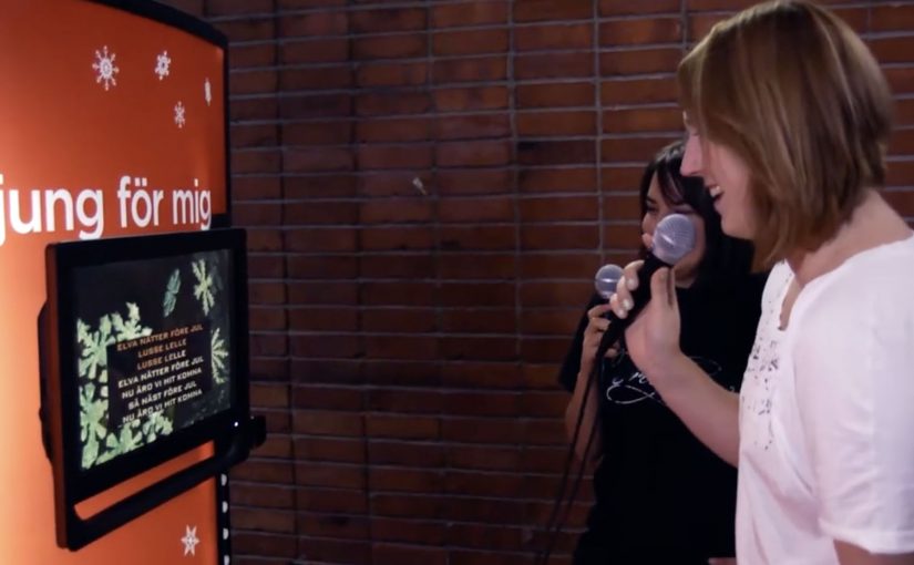
And now in Stockholm they can sing for a Coke. The vending machine has been placed at the Royal Institute of Technology with the sign “Sing For Me” in the front.

When sampling becomes a public performance

The mechanism is simple: the machine replaces money with a human gesture. That “gesture for reward” model means the action itself becomes the price of entry. Dance moves in one market. A song in another. The reward is immediate, and the moment is automatically social because other people can see it. That swap works because it turns a private purchase into a visible act, giving the crowd a reason to watch, react, and join in.

In global FMCG sampling and brand experience work, “gesture for reward” machines turn distribution into participation by design.

The real question is whether the action is easy enough to trigger participation without making people shut down in public. The smart part of this format is not the free Coke, but the public behavior it creates around the sample.

Why it lands

This works because it makes the brand promise legible without explanation. A vending machine is normally transactional and forgettable. A performance-triggered machine is a small event, and the crowd reaction becomes part of the product. The setting helps too. A campus is full of friends, cameras, and people willing to try a slightly silly thing in public.

Extractable takeaway: If you swap payment for a simple public action, you turn sampling into a story people can witness, film, and retell. That social proof travels farther than the product ever could on its own.

The machine is one of a number of Happiness Machines Coca-Cola has deployed around the world since 2009.

What to borrow from performance sampling

  • Pick one obvious trigger: the instruction must be understood in one glance.
  • Make the reward instant: the dispense moment is the emotional payoff.
  • Design for bystanders: the format should recruit a crowd naturally.
  • Localize the gesture: keep the same principle, but choose a culturally comfortable action.
  • Capture reactions: real laughs and hesitation are the proof that the idea works.

A few fast answers before you act

What is the “Sing For Me” machine?

It is a Coca-Cola vending machine that dispenses a free Coke when people sing to it, turning a product handout into a public, participatory moment.

Why does “sing for a Coke” work as a mechanic?

Singing is visible and socially contagious. Once one person does it, others gather, react, and often try it themselves.

How is this connected to the broader “Happiness Machine” idea?

It follows the same pattern: replace payment with a feel-good interaction, then let real reactions become the distribution layer.

Where does this format work best?

High-footfall environments with social density, like campuses, events, malls, and transit hubs, where bystanders quickly become an audience.

What is the biggest risk with performance-for-reward activations?

If the action feels embarrassing or culturally off, participation drops. The trigger must feel playful, safe, and easy to attempt in public.

eMart: Sunny Sale Shadow QR Codes

Korea continues to set the standard in creative QR code campaigns. In June last year, Homeplus in South Korea used QR codes to create a virtual store in a subway station.

Now eMart, South Korea’s largest retailer, creates shadow QR codes across the city that only become visible when the sun is at the correct angle in the sky, between midday and 1pm. Consumers who scan the QR code during this period are redirected to the eMart online store, where they receive $12 coupons for products that are delivered to their homes.

Turning time into the trigger

The mechanism is a physical installation designed to cast a QR pattern as a shadow only during a narrow daily window. The code is effectively “off” for most of the day, then “on” at lunch. That forces a repeatable habit moment and makes the scan feel like a discovery rather than a prompt.

In dense, mobile-first retail markets, lunch hour is a high-frequency window where a time-boxed incentive can convert attention into immediate action.

The real question is whether you can make the trigger itself time-locked and unmistakable, so people self-schedule the behavior instead of waiting for another reminder.

A time-locked trigger is a stronger activation pattern than an always-on QR poster because the constraint becomes the story.

Why the shadow constraint works

The campaign does not just offer a discount. It creates scarcity you can see. If you miss the light, you miss the code. That turns a routine coupon into a small challenge, and it gives people a reason to talk about the “how” as much as the “what”.

Extractable takeaway: If you want to spike behavior in a specific time slot, make the call-to-action itself time-bound, not just the offer. When the trigger disappears outside the window, the audience learns the rhythm faster than they would from reminders alone.

The sundial-style QR codes, meaning the code is only scannable when sunlight hits at the right angle, were installed at 36 locations across Seoul and served more than 12,000 coupons. eMart membership increased by 58% and lunch hour sales went up by 25%.

Retail activation takeaways: time-locked QR

  • Make the rule instantly legible. “Only works at lunch” is easy to understand and easy to retell.
  • Use a constraint that creates urgency without pressure. The sun provides the timer. The brand does not need to shout.
  • Connect the scan to a clear payoff. Coupon plus delivery is a complete loop, not a teaser.
  • Design for repeat visits. A daily window encourages people to come back tomorrow, not just once.

A few fast answers before you act

What is the Sunny Sale “shadow QR code” idea?

A 3D installation casts a scannable QR code as a shadow only during a specific time window, so shoppers can unlock a coupon by scanning at the right moment.

Why limit the code to midday?

It concentrates attention into lunch hour, creates visible scarcity, and trains a daily habit around a predictable retail moment.

What makes this better than a normal QR poster?

The time-based constraint is the hook. The QR code is not always available, so scanning feels like discovery and the story becomes shareable.

How do you pick the right time window?

Choose a moment that already has repeatable footfall and intent, then make the window tight enough to feel special but wide enough that normal shoppers can realistically catch it.

What can go wrong with time-locked activations?

If the reward is weak or redemption is clunky, the constraint becomes frustration. The tighter the window, the more important the payoff and UX become.

Bike Guide: Detachable Bike Tour Vehicle

A tour bus that splits into bikes when the city gets interesting

“Bike Guide” is an innovative concept from Seoul based designer Kukil Han. He has conceptualized a convenient two-in-one tour bus, which enables the passengers to detach their bikes at specific checkpoints in order to explore the surroundings.

Bike Guide is a detachable-bike tour vehicle concept where a single bus carries multiple bikes, lets riders peel off at checkpoints to explore independently, then recombines the group at a planned rendezvous.

Two-in-one tour bus here means one vehicle that functions as group transport and also as a mobile dock for individual bicycles.

The mechanic: modular touring with a built-in regroup button

Each individual bike is supposed to be equipped with a GPS, which would also notify the user of when and where to rejoin the group. In this concept, the “regroup button” is the GPS prompt that tells riders exactly when and where to meet the bus again.

A checkpoint in this concept is a planned stop where riders detach bikes, explore a nearby area, then meet the bus again at the next agreed point.

In urban tourism and micro-mobility, the winning experiences blend group convenience with moments of solo freedom, without making regrouping stressful.

The real question is whether you can offer controlled independence without making timing and safety feel like work for the rider.

This pattern works best when the product treats splitting and rejoining as first-class moments, not edge cases.

Why the idea is clever. Even before it becomes real

The promise is simple: you get the efficiency of a guided tour without the feeling of being dragged past everything. You ride when you want to ride. You rejoin when you want the tour to move on. The GPS layer matters because it turns “go explore” into “go explore safely”. It reduces anxiety about getting lost or missing the group, which is the main barrier to letting tourists detach at all.

Extractable takeaway: If you want people to roam, make regrouping predictable. Navigation is less about directions and more about permission.

What to steal if you are designing modular mobility

  • Design the detach and rejoin moments. The “handoff” is the product. Not the vehicle.
  • Make the rule-set obvious. Where do I split. How long do I have. Where do I meet.
  • Use navigation as reassurance. GPS is not a feature. It is permission to roam.
  • Plan for mixed energy levels. Some people want to pedal. Others want to sit. This concept serves both.

A few fast answers before you act

What is the Bike Guide concept?

It is a tour-bus concept that carries detachable bicycles. Passengers can split off at checkpoints to explore by bike, then rejoin the bus later.

What problem does this solve for city tours?

It combines the efficiency of group touring with the freedom of cycling, reducing the common trade-off between “seeing more” and “feeling free”.

How does it keep riders from losing the group?

Each bike is supposed to include GPS guidance and notifications that tell riders when and where to rendezvous, so exploration stays bounded and regrouping stays predictable.

Why is the modular “detach and rejoin” mechanic the real innovation?

Because the handoff is the product moment. It lets different energy levels coexist, while keeping the overall experience coordinated and time-boxed.

What would make this feel safe and usable for tourists?

Clear rules. A visible countdown or meet-time. Simple navigation back to the rendezvous. A fallback if someone misses the group.

What should mobility designers copy from this concept?

Design for controlled independence. Give people freedom inside guardrails, and make regrouping effortless so exploration does not create stress.