EmotiCoke: Coca-Cola Emoji Web Addresses

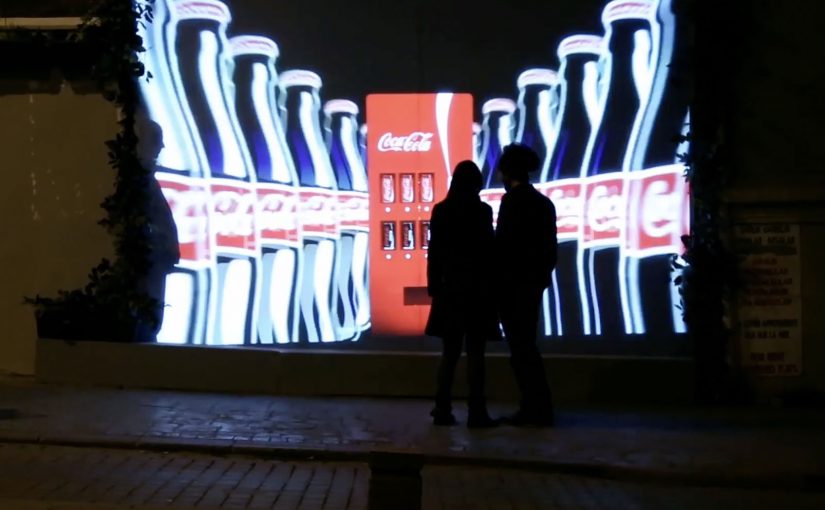
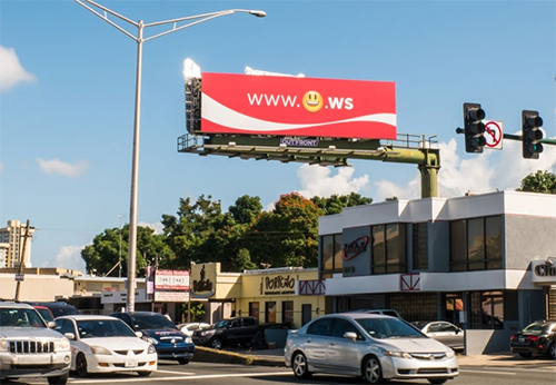
Coca-Cola, through its campaign in Puerto Rico, tries to make the internet a happier place by turning emojis into a mobile call-to-action. The brand is described as registering web addresses for the emojis that convey happiness, then using huge outdoor ads to push people to try them on their phones.

EmotiCoke Outdoor Ad

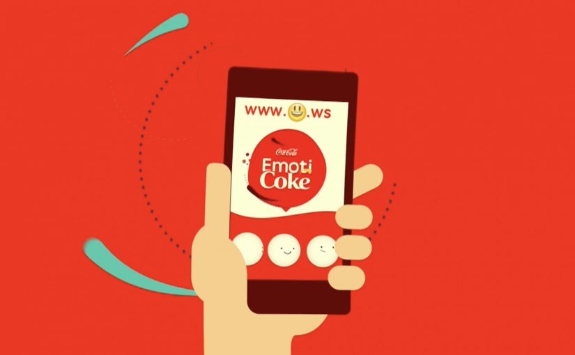
Those emoji web addresses route visitors to a landing page, www.EmotiCoke.com, where people could sign up for a chance to win the emoji web addresses for themselves.

The mechanic: emoji addresses that redirect to one place

The execution hinges on a simple redirect loop. Type a “happy” emoji as the web address (with a supported suffix), land on the same destination, then convert curiosity into sign-up. Under the hood, these are internationalized domain names (IDNs) represented in a DNS-safe format, even if the user experience is “just type the emoji.” This works because every emoji address resolves to one destination, so the user does not have to learn multiple URLs to get the payoff.

In mobile-first out-of-home campaigns, the simplest call-to-action wins because the billboard has only seconds to convert attention into a tap.

Why it lands

It takes a behavior people already practice, using emojis to express mood, and repurposes it as navigation. That small twist is the hook. It is instantly legible from a distance, it is fun to try, and it creates a low-friction bridge from street-level attention to a trackable digital interaction. The real question is whether your call-to-action can be copied from a distance and tried instantly on a phone.

Extractable takeaway: When you need mass participation from a passive channel like OOH (out-of-home), make the call-to-action both copyable and inherently playful. “Try this now” works best when the first step feels like a game, not a form.

Why .ws shows up in the story

For anyone wondering why .ws shows up, it is the country-code suffix for Samoa. The campaign is described as choosing .ws because emoji characters were not accepted on common top-level domains like .com, .net, and .org at the time. The additional brand rationale mentioned in coverage is that “.ws” could be read as “We smile,” which fits the happiness positioning.

Steal this pattern: emoji URLs as a CTA

  • Optimize for retyping, not explaining. If someone cannot replicate it from memory, you lose the moment.
  • Use one destination. Let novelty drive entry, then keep the conversion path clean and consistent.
  • Make the first interaction instant. If the page loads slowly or the redirect breaks, the idea collapses.
  • Plan for platform variance. Emoji rendering differs by OS and font. Keep the creative readable even when the glyph changes.

A few fast answers before you act

What is EmotiCoke in one sentence?

It is a Coca-Cola Puerto Rico activation that uses emoji-based web addresses on billboards to drive mobile users to EmotiCoke.com to sign up for a chance to claim those emoji URLs.

How do “emoji URLs” work in practice?

They rely on internationalized domain name support. The emoji the user sees is encoded into a DNS-compatible form, then redirected to a standard landing page.

Why did the campaign use the .ws suffix?

Because the campaign is described as needing a suffix that accepted emoji characters, and .ws was positioned as a workable option. Coverage also cites the “We smile” wordplay as a fit for Coca-Cola’s happiness theme.

Are emoji web addresses reliable everywhere?

No. Support varies across browsers, keyboards, registrars, and operating systems. Emoji appearance also changes by platform, which can affect recognition and retyping accuracy.

What are the biggest execution risks?

Broken redirects, slow mobile load times, unclear typing instructions, and inconsistent emoji rendering across devices. Any of these adds friction and kills the novelty fast.

Coca-Cola Turkey: Invisible Vending Machine

Since the time I started writing this blog, I have come across many innovative vending machines. Some I featured right here on Ramble.

Now to add to this collection, here is an invisible vending machine from Coca-Cola Turkey that becomes visible only when couples walk by. The machine was created specially for Valentine’s Day (last week) and was installed in Istanbul to spread happiness Coca-Cola style.

A vending machine you cannot see until the right moment

The trick is the reveal. What looks like a normal stretch of wall becomes a vending interface only when two people approach together. That instant transformation creates a micro-scene, and the micro-scene pulls in everyone nearby.

In consumer brand activations, public installations work best when the interaction is obvious, fast, and shareable without instruction.

How the interaction is described to play out

  • Invisible by default. The unit blends into the wall and does not present itself as a machine.
  • Couples trigger the reveal. When two people pass together, the interface lights up and becomes visible.
  • Personal moment, not just a dispense. In coverage at the time, the machine asks for names and then produces two personalised cans.

Why it lands

This is not “another vending machine story”. It is a street-level surprise that creates a small, romantic spotlight for a couple, and a quick bit of theatre for everyone else. The invisibility is not a gimmick. It is a pacing device that makes the reveal feel like a reward. The real question is whether the experience creates a transformation that bystanders can explain in one sentence.

Extractable takeaway: If you want people to stop, watch, and retell an activation, build a visible transformation into the experience. A before-and-after moment is easier to share than a static stunt.

What Coca-Cola gets out of the Valentine framing

Valentine’s Day provides the social permission for public sweetness, names, and sentiment. For the brand, it is a clean link back to togetherness and “sharing happiness”, while turning a sample into a story people can repeat without being prompted.

Retail theatre patterns worth borrowing

By “retail theatre” I mean designing a retail moment as a small piece of live, shareable experience, not just a dispense or transaction.

  • Hide the interface until it matters. Visibility can be part of the reward, not just a prerequisite.
  • Keep the trigger legible. People should understand why it happened in one glance, or they will not mimic it.
  • Design for bystanders. The couple is the participant. The crowd is the media channel.
  • Personalise lightly. Names, messages, or small custom outputs feel intimate without needing heavy data.

A few fast answers before you act

What is the “invisible vending machine” concept?

A vending machine that stays hidden until a couple approaches, then reveals itself and delivers a Valentine-themed Coca-Cola moment.

Why make the machine “invisible” at all?

It creates a sharp reveal, and that reveal is the shareable payload. People remember transformations more than static installations.

What is the simplest way to replicate the effect?

Use a clear proximity trigger plus lighting and screen content that turns on instantly, and ensure the “why it appeared” is immediately understandable.

What is the biggest execution risk?

If the trigger is inconsistent or unclear, people will not repeat the behaviour and the crowd will not form. Reliability matters more than complexity.

What should you measure beyond views?

Dwell time, participation rate per hour, bystander clustering, social mentions generated on site, and any lift in nearby sales during the activation window.

Coca-Cola: The Happy Flag

Airports in Denmark have a simple tradition. People welcome arrivals with flags.

Coca-Cola takes a small cultural detail and turns it into a physical interaction. After a discovery that the Danish flag can be seen inside the Coca-Cola script, the brand brings that idea to Denmark’s biggest airport and makes the flag literally tearable from the logo.

The mechanism is a special poster where passers-by can take small Danish flags straight from the Coca-Cola mark, so even people who arrived without a flag can still join the welcome.

A logo that becomes a utility

This is not a poster that asks you to look. It is a poster that gives you something to do. The brand symbol becomes a dispenser. The action is obvious, the reward is immediate, and the result is visible in the room as more people start waving flags. For out-of-home, participation beats passive exposure when the action is effortless.

In global consumer brand portfolios, small rituals scale when you turn them into simple, repeatable behaviors that people are happy to perform in public.

The real question is whether your most recognizable cue can become a public action people do instinctively, not a message they merely notice.

Why it lands in an airport

Airports are full of waiting and scanning. A physical action breaks the autopilot, and the output is social. Because the poster turns the logo into a one-step flag source, the first few waves appear fast and trigger imitation. You do not keep a flag to yourself. You wave it. That makes the message travel without needing an additional media buy.

Extractable takeaway: When your brand asset is already recognizable, turn it into a useful object inside a real-world ritual. Utility creates permission. Participation creates memory.

The intent behind the “happiness” frame

The story is designed to borrow from Denmark’s “happiest country” reputation as described in various rankings and conversations, then translate that abstract label into something concrete. Here, “happiness” is framed as a warmer, more participatory welcome, not a vague claim. A warmer welcome. More flags in more hands. More people involved.

Moves to borrow for participatory out-of-home

  • Start with a local ritual. Find a behavior people already do gladly, then amplify it.
  • Make the interaction self-explanatory. If someone needs instructions, the moment dies.
  • Use a brand asset as the mechanism. When the logo is the tool, branding feels natural, not pasted on.
  • Design for public visibility. The best output is something others can see and copy instantly.

A few fast answers before you act

What is Coca-Cola’s “The Happy Flag” idea?

It is an airport poster activation where people can tear off Danish flags from the Coca-Cola logo, so more arrivals can be welcomed with flags even when greeters did not bring one.

What is the core mechanism that makes it work?

A familiar brand mark is redesigned as a dispenser. The logo becomes a physical utility, and the action produces a visible social signal in the space.

Why is an airport a strong place for this?

The environment already contains anticipation, reunions, and cameras. A simple, shareable gesture fits the emotional context and spreads through imitation.

How can brands adapt this pattern?

Pick a recognizable asset, connect it to a real-world ritual, and redesign it into a simple object people can use. Then make the output visible so participation recruits more participation.

What is the main failure mode to watch for?

If the action is not instantly obvious or the utility runs out quickly, participation collapses and the installation becomes a normal poster. Design the interaction, replenishment, and visibility so the first wave of use is effortless.