Berghs: Don’t Tell Ashton

Berghs: Don’t Tell Ashton

Berghs School of Communication students want the advertising industry to notice their Interactive Communication class, and they decide to prove it instead of claiming it. They build a Twitter-driven artwork where participation is “paid” with a tweet.

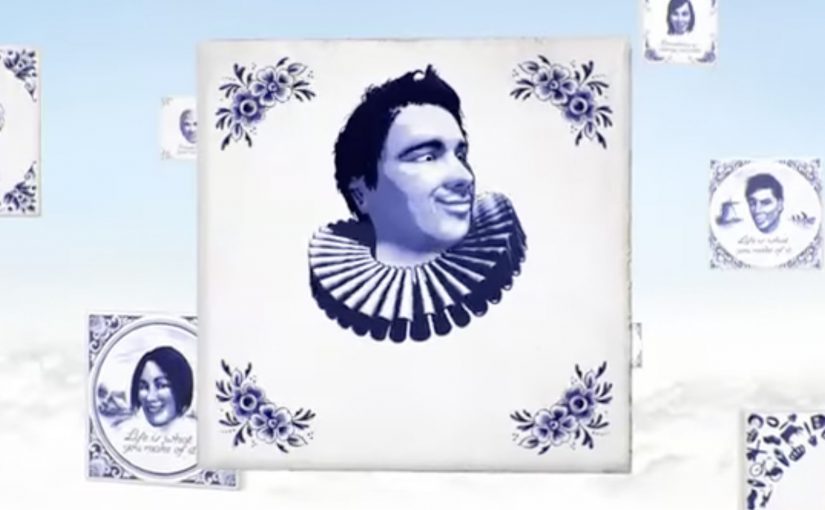
The rule is easy to understand and easy to repeat. Tweet to join the frame. The more followers you have, the bigger your photo appears in the final piece. One person has enough followers to dominate the entire artwork by himself, Ashton Kutcher, so the campaign dares the internet with a simple prompt: Don’t tell Ashton.

How the social currency mechanic earns attention

The mechanism turns a social signal into a visible design system. Followers become “value”. Value becomes size. Size becomes status inside the artwork. Because the output is a single shared object, every participant has a reason to bring in more participants, and every new tweet is both payment and distribution.

In global creative education and talent recruiting, showing capability in a format that naturally spreads can outperform any brochure-style message about what you teach.

Why it lands

It uses a clean, game-like inequality that people instinctively understand. Bigger accounts get bigger presence. Smaller accounts still get in. The Ashton constraint makes the whole thing feel fragile and urgent, because one “wrong” tweet could ruin the artifact. Because the rule turns status into a visible outcome, people instantly understand why participation matters and why the object keeps spreading. That tension becomes the hook that keeps the story moving.

Extractable takeaway: If you want participation to scale, turn one simple social metric into a visible stake inside a shared outcome. Then add a single constraint that makes the outcome feel at risk.

What this is really doing for the program

This is a recruitment campaign disguised as an internet object. The artwork is the portfolio piece, and the spread is the proof that the makers understand how digital behavior works in the wild. The more people talk about the object, the more the school’s program name travels with it.

The real question is whether the program can turn its digital thinking into an object the industry wants to notice, share, and remember.

What to steal from the participation mechanic

  • Build one object people want to join. Collages, maps, frames, and leaderboards make participation legible.
  • Convert a metric into meaning. Followers, contributions, referrals, and time can become “materials” in the output.
  • Make the story retellable. If the rule cannot fit in one sentence, distribution collapses.
  • Add one constraint that creates urgency. A single “if X happens, we lose” condition can be enough.

A few fast answers before you act

What is the core idea of Don’t Tell Ashton?

A Twitter-built artwork where a tweet buys you a spot, and your follower count determines how large your portrait appears in the final piece.

Why tie portrait size to follower count?

It turns a social metric into a visible stake. That makes participation competitive, shareable, and instantly understandable without explanation.

What role does Ashton Kutcher play in the story?

He is the “edge case”. As the most-followed account in the story, one tweet from him could overwhelm the entire artwork, which gives the campaign its tension.

What makes this more than a clever stunt?

It demonstrates a transferable skill. Designing a mechanic where participation and distribution are the same action.

Why does this work better than a normal student showcase?

It makes the audience prove interest through participation. That produces evidence of relevance, not just a claim that the class understands interactive communication.

Nissan: Create Your Terrain

Nissan: Create Your Terrain

You hold your hands up to the webcam, and the landscape changes. Peaks rise, valleys drop, and a Nissan SUV gets challenged to drive across whatever terrain you just “sculpted” in mid-air. It takes an off-roading mindset and translates it into a simple piece of viewer control. Here, viewer control means your gestures directly shape the terrain in real time. Build a route. See if the car can handle it.

That is the core idea behind Nissan’s “Create Your Terrain,” built by TBWA\RAAD to help launch Nissan’s SUV family in the Middle East. Instead of showing capability with another glossy montage, it invites off-roaders to invent the terrain first, then watch the vehicle conquer it.

Create Your Terrain uses webcam detection as the input method. In plain terms, the camera reads your gestures and turns them into a terrain editor, so you can shape dunes and obstacles without a mouse or controller.

In automotive marketing, the strongest digital launches turn enthusiast culture into an interaction loop, not a viewing moment.

The microsite (www.createyourterrain.com) was reported to have attracted thousands of user-made terrains, adding up to more than 80,000 square kilometres of created landscape. The build is also credited with recognition at Dubai Lynx 2011 (Bronze, Microsites & Websites) and a GEMAS Effies 2011 finalist placement (Automotive), which fits the ambition. Make the product story feel earned through play, not told through claims.

Why this mechanic fits off-roading

Off-roading is personal. Everyone has their own “perfect line,” their own idea of what counts as a challenge, and their own pride in tackling terrain others avoid. This activation borrows that psychology. The viewer creates the course, so the payoff feels like their test. Nissan just shows up to pass it.

Extractable takeaway: When you let enthusiasts define the test, the brand’s proof point feels like a response to their standards, not a claim the brand asks them to accept.

What Nissan is really buying with “Create Your Terrain”

This is not only a tech demo. The real question is whether your mechanic makes the capability story feel earned, not asserted. It is a positioning move. The message is that Nissan’s SUVs can handle anything, including terrain you have never seen before. And because the experience is interactive, it naturally increases dwell time, encourages sharing, and gives people a reason to return and try a “harder” build.

What to borrow for your own interactive launch

  • Let the audience create the challenge. Self-made tests feel more authentic than brand-made obstacles.
  • Use input that matches the story. Gestures and a webcam make “hands-on terrain” feel physical, not like another web game.
  • Keep the loop tight. Create. Challenge. Watch. Repeat. The shortest loop is the one people replay.
  • Design for bragging rights. The shareable unit is not the ad. It is “my terrain” and “my result.”

A few fast answers before you act

What is “Create Your Terrain” in one sentence?

It is an interactive Nissan microsite where webcam-based gestures let viewers build a digital off-road landscape and then challenge a Nissan SUV to drive across it.

Why does viewer-created terrain matter?

Because it flips the usual launch pattern. Instead of the brand defining the challenge, the audience defines it. That increases personal investment and makes the capability story feel more credible.

What does “webcam detection” mean here?

It means the experience uses the camera feed to interpret basic gestures as inputs, turning the viewer’s hands into a simple controller for shaping the terrain.

What is the key takeaway for digital campaign design?

Build an interaction loop that mirrors real-world behaviour. When the mechanic matches the passion, like building and conquering terrain here, people stay longer, replay more, and share more naturally.

What is a common failure mode for experiences like this?

Overcomplicating the first minute. If setup is fiddly, calibration is fragile, or the payoff is slow, people bounce before the “magic” lands.