Austria Solar: Sun-Powered Annual Report

Austria Solar: Sun-Powered Annual Report

Austria Solar’s annual report arrives looking almost blank. Then you step into sunlight, and the pages wake up.

Serviceplan’s idea is to put solar energy “to paper” in the most literal way. The report’s typography and graphics only become visible when exposed to sunlight, turning the act of reading into a live demonstration of the product story.

How it works, and why the packaging matters

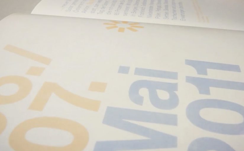
The mechanism sits in the production craft: a special printing process using light-reactive inks so the content remains invisible until UV-rich daylight hits the page, at which point the design reveals itself.

The report is then wrapped in light-proof foil before distribution, so recipients experience the reveal as a first-time moment rather than an already-exposed artifact.

In B2B and association communications, annual reports are expected to be worthy, and often get skimmed, so engineered “stops”, deliberate interruptions that force a reader to pause, can earn attention without needing louder messaging.

Why the reveal lands

This works because the medium is doing the persuasion. Because the content stays hidden until sunlight, the reader has to take one small step, which makes the reveal feel earned rather than announced. The real question is whether your format can do the convincing before your copy does.

Extractable takeaway: When your value proposition is invisible in everyday life, design a simple interaction that makes it visible in the moment. Let the audience “prove” the benefit to themselves through a familiar artifact.

There is also a quiet confidence in the restraint. The pages look empty at first, which builds curiosity. Then the content appears, which feels like a payoff rather than a pitch. This is a stronger move than adding more words when you need attention without hype.

The business intent behind the craft

The report is doing several jobs at once. It modernizes a traditionally dry format, positions Austria Solar as an innovation-led industry organization, and gives members and stakeholders a story they can easily retell.

Because the reveal is physical and repeatable, it also travels well in meetings. The report becomes a prop for advocacy, not just a document for compliance.

Practical moves to borrow from the sun-reveal report

  • Turn a claim into a demonstration. If your topic is energy, data, security, or sustainability, look for a way the format can embody the message.
  • Design for the first 10 seconds. Engineer a moment that forces curiosity before you ask for attention.
  • Make the interaction effortless. The user action here is trivial. Move into daylight.
  • Package the experience, not just the content. The light-proof wrap protects the “first reveal” so the idea survives distribution.

A few fast answers before you act

What is the core idea of Austria Solar’s sun-powered annual report?

It is an annual report printed so that its content only becomes visible when exposed to sunlight, turning reading into a physical demonstration of solar energy’s presence and power.

Why does making the content invisible at first help?

The initial blankness creates curiosity and a clear contrast. When the content appears, the reveal feels like a payoff, which increases attention and recall compared to a conventional report page.

What makes this more than a gimmick?

The interaction directly reinforces the organization’s story. The report does not just talk about solar power. It requires sunlight to function, which makes the message inseparable from the format.

Why does the light-proof wrap matter?

It preserves the first-time reveal by preventing premature exposure, so recipients experience the idea as a moment rather than a pre-exposed artifact.

Where else can this pattern work?

Any communication where audiences expect low novelty, like policy packs, compliance updates, investor or member reports, or annual reviews, especially when you can embed a simple demonstration into the artifact itself.

Waternet Queen’s Day Challenge: Pee Race

Waternet Queen’s Day Challenge: Pee Race

Turning a messy problem into a canal-side race

Queen’s Day in Amsterdam brings huge crowds and heavy celebrations. It also brings a very practical problem for Waternet, the city’s water supplier: too many people treat the canals like a public toilet.

Instead of posting warnings, Waternet worked with Achtung! and installed several brightly colored urinals at different points along the canal. Each unit had four stalls and connected to a digital screen that turned peeing into a live race, with a simple incentive that makes people want to participate.

The mechanics that make it work

This is a strong example of ambient behavior-change design. Here “ambient” means the intervention lives in the environment, right where the decision happens, not in a banner ad or a TV spot.

Extractable takeaway: When the right behavior is a public, low-friction default with instant feedback, you can change behavior without asking people to absorb a lecture.

It works because the feedback is immediate, the experience is social by default, and the “right” behavior feels more fun than the “wrong” behavior. That combination reduces friction and replaces shame with competition. This is the kind of public-space activation brands should copy when the goal is behavior change, not sentiment.

In crowded city-center celebrations, playful public interactivity often changes behavior faster than moralizing signage.

Steal the ambient interactivity pattern

The real question is how to make the right behavior feel like the obvious choice in public, without needing anyone to read a sign.

  • Move the message to the moment. Put the interaction where the behavior happens, not weeks earlier in a campaign feed.
  • Make the desired action the easiest action. People choose the path that feels obvious and frictionless in public.
  • Use visible progress. A shared screen and a simple scoreboard create instant social proof.
  • Reward participation, not perfection. Even a small, symbolic payoff can tip the choice at scale.

A few fast answers before you act

What is the Waternet Queen’s Day Challenge?

It is a Queen’s Day activation in Amsterdam where Waternet installs canal-side urinals and turns their use into a multiplayer race on a connected screen, discouraging people from urinating into the canals.

How does the “pee race” work?

Four stalls connect to a shared screen. Participants use the urinal and the screen visualizes a race, making the act feel like a public, competitive mini-game rather than a private necessity.

Why does this kind of gamification change public behavior?

It replaces a negative instruction (“don’t do this”) with a positive, easy alternative that gives immediate feedback and a social payoff, which is especially effective in crowded, high-energy settings.

What makes an ambient activation succeed in public space?

Clear purpose, low friction, instant comprehension, and feedback people can see without explanation. If it needs a guide, it usually fails on the street.

How can brands use this pattern without relying on shock value?

Keep the mechanism. Swap the provocation. Put the interaction at the point of decision, make progress visible, and attach a small reward to the behavior you want to encourage.

Simon Pierro: Exclusive Preview of iPad 3

Simon Pierro: Exclusive Preview of iPad 3

A magician holds up an unreleased device and “reviews” it by making features appear, disappear, and break the laws of a normal demo. It is a product tease delivered as a short performance.

Simon Pierro in his latest performance reviews the yet to be released iPad 3 in a magical way. Along the way he even jokes about “exclusive facts” like it being slightly thicker and heavier, then turns that into the next gag.

How the trick works as marketing

The mechanism is simple. Take the standard product review format and replace evidence with illusion. You still get a “feature tour”, but it is delivered as surprise and entertainment, which makes it far more shareable than a straight spec rundown. This is a strong move when your goal is shareable awareness, not full spec education.

In consumer technology launches, the fastest attention often comes from demos that feel like stories, not demos that feel like documentation.

Why it lands

It compresses curiosity into a tight loop. People watch because they want to see what the “new iPad” can do, then they keep watching because the performance keeps escalating. The device becomes a prop, and the prop becomes the headline. The real question is whether your launch moment gives people a story worth passing along.

Extractable takeaway: Wrap the message in a familiar format, then add one surprising twist so the format becomes the distribution engine.

A launch-demo pattern worth stealing

  • Turn the demo into a format. A review, an unboxing, a “first look”. Then bend it in a way people do not expect.
  • Give the audience one clean hook. “Exclusive preview” is enough. The rest is payoff.
  • Design for replay. Visual gags and quick reveals travel better than long explanations.
  • Let entertainment carry the message. The goal is not complete information. The goal is desire and talk value. Talk value here means a simple line people can repeat in their own words.

A few fast answers before you act

What is the core idea of this video?

A “review” of an unreleased iPad 3 delivered as iPad magic, where the performance replaces proof while still feeling like a product preview.

Why does a magical demo spread better than a normal demo?

Because it converts curiosity into surprise. Surprise is a stronger sharing trigger than information in most social feeds.

What is the transferable lesson for marketers?

If you can wrap a product message inside an entertaining format, the format becomes the distribution engine.

How do you apply this without a magician?

Use any “performance” constraint that creates visual surprise. A timed challenge, a one-take reveal, or an intentional format break can do the same job without literal magic.

When does this approach fail?

When the gimmick overwhelms the product, or when the audience feels misled rather than entertained.