QR Codes: Travel Back in Time to Graffiti

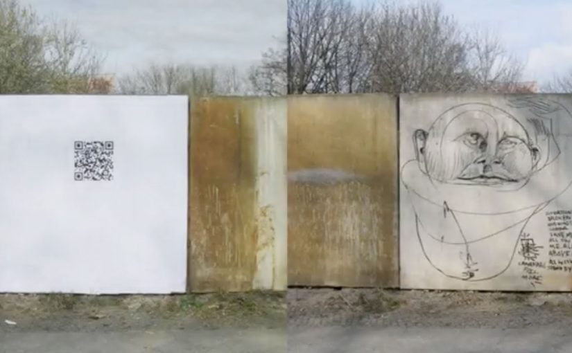
QR Codes are now being used to preserve graffiti for posterity by photographing the graffiti before it is removed. After the graffiti has been cleaned off by local authorities or a building owner, a QR Code is placed in the exact location which leads to the original image of the graffiti. In this way, a mobile phone with a QR-Code Reader can be used to travel back in time. Here, “time travel” means scanning a code on a cleaned wall to see the photo of what used to exist there.

How the “time travel” mechanism works

The system is straightforward: capture the artwork while it exists, then replace the physical mark with a digital pointer after it disappears. The QR code becomes a permanent address for a temporary piece. Because the code stays put while the paint does not, the link between place and memory survives removal.

In cities where street art is constantly overwritten, cleaned, or redeveloped, lightweight digital markers can preserve cultural memory without freezing the city in place.

The real question is whether you want to erase the mark, or keep a findable trace of it in the same place.

This is the right preservation trade-off: let surfaces change, but keep the memory retrievable where it mattered.

Why it lands

It respects ephemerality instead of fighting it. Graffiti stays transient, but its trace stays findable.

Extractable takeaway: Preservation becomes compelling when it is tied to a precise location and low-friction. If people can access “what used to be here” in the exact place they are standing, the archive feels like part of the city rather than a separate museum.

It puts the archive back on the street. The documentation is not hidden in a database. It is anchored to the exact wall where the work lived.

It makes discovery participatory. You have to scan, which turns the passer-by into an active retriever of the past, not just a viewer.

Borrowable moves for place-linked archives

  • Anchor digital content to a precise physical spot. Place is the interface, not just the backdrop.
  • Design for “after removal”. If the thing you love will disappear, make the replacement object carry the memory.
  • Keep the interaction simple. A scan is a smaller ask than an app download or a long URL.

A few fast answers before you act

What problem does this solve?

It preserves the visual record of graffiti that is likely to be removed, while still letting the city clean or repaint surfaces.

Why use QR codes instead of a normal plaque or sign?

A QR code can point to a photo archive and scale cheaply. It also keeps the physical footprint small.

What makes this feel like “traveling back in time”?

You stand in the present at a cleaned wall, scan the code, and instantly see what used to exist in that exact location.

What are the key dependencies for this to work long-term?

The linked image hosting must stay live, and the code must remain readable and not be removed or damaged.

How could a city or brand adapt the idea?

Use location-linked markers to preserve temporary culture. Murals, pop-up installations, event posters, even construction hoardings, while keeping the interaction one-step simple.

Nike: Music Shoes

Shoes as we know it are never going to be the same again. Nike has just come up with the first of its kind music shoes!

Here is a short video showing how the shoes were made…

This is the final Nike Music Shoes ad…

Why this idea feels like a shift

The shoes are not styled as fashion first. They are staged as an instrument. They are also staged as an interface. Here, “interface” means the shoe becomes a control surface that converts movement into sound. That reframing matters because it turns product into performance. Because the movement-to-sound mapping is immediate, the audience can grasp the idea without extra explanation. In global consumer marketing, proof-led product storytelling like this tends to travel further than style-led messaging. You do not watch someone wear them. You watch someone play them.

Extractable takeaway: When you introduce a new interaction, show the input and output in the same moment, so belief is earned through observable cause and effect, not claims.

  • Product becomes interface. Movement is translated into sound, which makes the shoe feel “alive”.
  • Proof in the making. The build film adds credibility and curiosity before the final creative payoff.
  • Shareable demonstration. People want to show others because the concept is easiest to understand when you see it.

What to learn from the two-video structure

Pairing a “how it was made” film with the final ad is a smart sequencing move. First you earn belief. Then you deliver the spectacle. In innovation storytelling, that order often performs better than going straight to the hero spot. The real question is whether your innovation needs a proof chapter before you ask people to share it. For novel product behaviors, lead with proof, then pay off with spectacle.

  • Earn belief first. Let the making-of do the minimum explanation needed for “this could be real”.
  • Then stage the performance. Use the final ad as the payoff where the product is “played”, not described.
  • Keep it demo-able. If a viewer cannot retell it after one watch, it will not travel.

A few fast answers before you act

What are Nike “Music Shoes”?

They are a concept where the shoe is treated like a musical instrument, translating movement into sound to create music through performance.

Why include a making-of film as well as the final ad?

The build film establishes credibility and explains just enough to make the final ad feel possible, not magical.

What is the core creative pattern here?

Turn a product into an interface, then let a live-style demonstration carry the message without heavy explanation.

How can brands reuse this idea without copying it?

Identify one product behavior you can translate into a new medium, then show both the “proof” and the “performance” as two linked chapters.

Magic Tee: Augmented Reality Kids Clothing

No one likes getting dressed in the morning. It is routine and usually boring. Magic Tee flips that by making clothes feel alive. Put the T-shirt on, stand in front of a webcam, and the print becomes an interactive animation that responds to the child’s movement.

It is described as the first piece of children’s clothing to incorporate augmented reality in this way, designed and developed by creative agency Brothers and Sisters for kidswear brand Brights & Stripes.

How a T-shirt becomes a screen

The mechanism is straightforward. The T-shirt print is designed so a webcam can recognize it reliably, then align a 3D animation to the child’s torso on-screen. When the child moves, the animation moves with them, so the shirt feels like a trigger for a small story rather than a static graphic.

Augmented reality kids clothing, in this context, is apparel whose printed design can be recognized by a camera so digital characters and effects can be layered onto the garment and react to the wearer’s motion.

In consumer brands looking to fuse physical products with digital play, this kind of camera-triggered interaction is a simple way to turn ownership into an experience.

Why this lands with kids and parents

For kids, the reward is immediate. Movement creates feedback, so the child quickly learns that they control what happens. That sense of viewer control is what turns novelty into repeat use.

Extractable takeaway: If you want repeat engagement, tie the reward loop to the user’s movement. Fast feedback turns “try once” into “play again.”

For parents, the concept reframes clothing from “something you have to put on” into “something that starts play.” It also creates a natural share moment because the experience is easiest to show when someone is watching the screen with you.

What the brand is really doing

The real question is whether you can make the product itself the interface, so the experience earns repeat attention inside a routine.

On paper, it is an AR stunt. In practice, it is a product differentiation play. The shirt becomes a conversation piece, and the brand earns a place in the child’s routine through interaction rather than purely through design.

It also sets up a longer runway. If the platform exists, new prints can unlock new animations, which turns a clothing line into a renewable content system.

Steal the pattern: product-triggered play

  • Make the trigger physical. When the product starts the experience, engagement feels earned.
  • Keep the first win fast. The first 10 seconds should produce a visible reaction.
  • Design for repeat play. Add simple variation so it does not feel “seen once.”
  • Build a shareable moment. Parents share outcomes, not features. Give them an outcome.

A few fast answers before you act

What is the core idea of Magic Tee?

A children’s T-shirt that acts as a trigger for an on-screen AR animation. A webcam recognizes the print and overlays moving characters that respond to the child’s motion.

Is this mobile AR or webcam-based AR?

As described in the campaign write-ups, it is webcam-based. The interaction happens when the child stands in front of a computer camera and sees the augmented layer on screen.

Why use clothing as the marker instead of a card or poster?

Because the marker is worn. That makes the experience personal, repeatable, and closely tied to identity and play.

What makes interactive apparel feel “not gimmicky”?

Speed and reliability. If recognition is instant and the animation responds smoothly to movement, the experience feels like play. If setup is slow, it feels like tech.

What is the most transferable lesson for marketers?

Turn the product into the interface. When the item in the basket is also the trigger for the experience, you get differentiation and word of mouth without adding more media.