
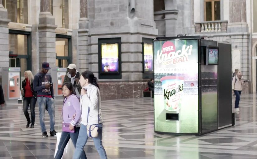
Herta Knacki FootBall: The Football Machine

Herta, described as a Nestlé brand in Belgium, launched Knacki FootBall. Small meatballs designed to look like footballs. Instead of relying on standard sampling, the brand and BBDO Brussels turned a train-station moment into a game people could not ignore.

At Antwerp Central Station, a vending machine offered the product for free. Then came the twist. Press the button and the machine opened into a miniature football pitch, with Belgian football legend Leo Van Der Elst waiting inside. To walk away with the snack, you had to score.

Free is easy. Earning it is memorable.

The mechanic is deliberately unfair in the right way. People approach expecting a quick handout. The reveal forces a choice. Walk away, or step in and play. That decision point creates tension, and tension creates attention. In high-traffic commuter environments, the best sampling ideas turn “free” into a short challenge with a story-worthy payoff. The real question is whether your sampling moment earns attention before it earns a bite.

Extractable takeaway: Sampling gets retold when it includes a moment of risk or effort. The product becomes a trophy, not a giveaway.

A vending machine that behaves like a stadium

The physical design does most of the communication. The moment the door opens, everyone nearby understands what is happening. It becomes a spectator event, which is crucial in a station setting where most people do not want to stop unless something is already happening.

Why the celebrity opponent matters

Leo Van Der Elst is not a generic “host.” He is the difficulty setting. His presence turns the activation into a genuine duel, and that makes the outcome feel earned whether you win or lose. It also gives the content a built-in headline when the story travels online.

What the brand is really reinforcing

Knacki FootBall is a novelty product, so the job is not deep education. It is instant association. Football. Fun. A quick bite. The machine makes those associations physical, then anchors them to a specific place and moment people remember.

How to copy The Football Machine

  • Build a single, obvious action. Press the button. The rest happens to you.
  • Make the reveal legible from 10 meters away. If bystanders cannot decode it fast, you lose the crowd effect.
  • Turn sampling into a challenge. Effort increases perceived value and shareability.
  • Use a real “difficulty signal.” A credible opponent or constraint makes the game feel legitimate.
  • Design the exit. Winning should end with a clear reward and a clean photo moment.

A few fast answers before you act

What is Herta Knacki FootBall “The Football Machine”?

It is a vending machine activation where commuters expecting a free sample discover a miniature football pitch inside, and must score a goal to win Knacki FootBall.

Where did the activation run?

It is described as being installed at Antwerp Central Station in Belgium.

Why use a vending machine for a food launch?

Because it creates a familiar expectation. Then you can subvert it. That contrast generates surprise, crowd attention, and strong word of mouth while still delivering the product sample.

What makes this work in a train station specifically?

Stations are full of people who are time-poor. A reveal that is instantly understandable, plus a short game loop, one attempt that takes seconds, can stop people without requiring explanation.

What is the biggest operational risk with this kind of live activation?

Throughput and safety. If the game takes too long, queues become friction. If the experience feels unsafe or embarrassing, people avoid participation and the crowd effect collapses.
NIVEA: Protection Ad

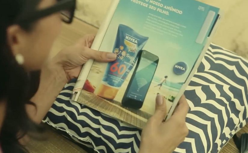
Last year NIVEA transformed a regular print ad into a portable solar charger for smartphones. Now in its latest ad, NIVEA has made the right side detachable, so people on the beaches of Brazil can use it as a trackable bracelet.

Parents who want to keep an eye on their children can rip off the bracelet, attach it to a child’s arm, and then download the companion app. In the app, they can add each child’s name and set the maximum distance each child can wander. If a child goes too far, the app sends a loud alert.

From print to proximity

The clever part is that it is not just a “detachable freebie”. The bracelet is described as embedding Bluetooth proximity tech, so the printed unit becomes a functional signal that a phone can detect and monitor.

In FMCG innovation, utility-based media works best when the object removes a real anxiety in the exact moment the product is used. Utility-based media here means an ad unit that doubles as a small tool people use right away.

The real question is whether the utility you build into the media unit is reliable enough to earn trust when the anxiety spikes.

Why the idea lands on the beach

NIVEA’s product promise is protection, but protection on a beach is not only about skin. It is also about the panic of losing sight of a child in a crowded, noisy, high-movement environment. The bracelet reframes the brand benefit from a claim to a service. This works because it shifts “protection” from a claim about skin into a service parents can experience in minutes.

Extractable takeaway: If you want a print placement to behave like product, compress the mechanism into four verbs that anyone can repeat. Tear it out. Put it on. Set a safe radius. Get alerted. That simplicity is what turns a print placement into something people talk about, and something press can repeat without over-explaining.

Business intent

This is a campaign designed to win preference in a category full of parity. It makes NIVEA Sun Kids feel like an innovator in a place where it matters, and it creates a reason to choose the brand that is not only SPF.

The work later received major awards recognition, including winning the Mobile Lions Grand Prix at Cannes Lions.

Steal the protection-to-service pattern

  • Turn media into a usable object. If it solves a real problem, people keep it and share it.
  • Map the utility to the brand promise. The best “useful ads” make the benefit feel literal.
  • Make setup frictionless. Clear instructions and a fast pairing experience are the difference between buzz and abandonment.
  • Design for the real environment. Beach. Noise. Distance. Movement. The alert has to work in the messy world.

A few fast answers before you act

What is NIVEA’s Protection Ad?

It is a print ad that includes a tear-out bracelet for children, paired with a mobile app that alerts parents if a child moves beyond a preset distance on the beach.

How does the bracelet connect to the phone?

Coverage describes the bracelet as using Bluetooth proximity technology. The phone detects the bracelet, and the app uses distance thresholds to trigger alerts.

Why does this count as strong “useful advertising”?

Because the ad delivers a real service in-context. It does not only talk about protection, it provides an extra layer of it during a real beach day.

What is the biggest risk with safety-themed tech campaigns?

Trust and reliability. If pairing fails, alerts misfire, or the experience feels unclear, the concept turns from reassurance into frustration.

What should you measure if you build something similar?

Redemption and pairing success rate, app installs driven by the ad unit, repeat usage during real outings, and brand preference uplift versus a control region or period.

McDonald’s: Save the Sundae Cone

A melting cone that asks the street to help

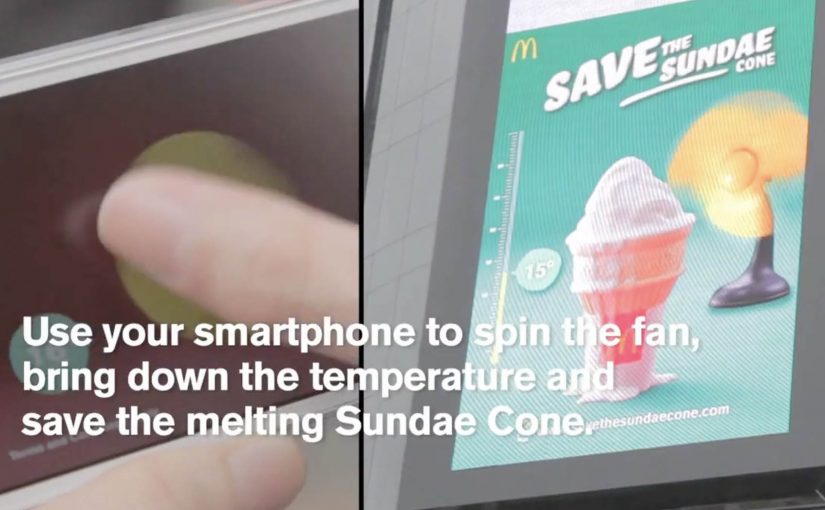
Summer is here and McDonald’s is back with an interactive outdoor campaign built around one simple problem. A giant LED billboard in Bukit Bintang, one of Kuala Lumpur’s best-known shopping districts, showcases the iconic Sundae Cone. But it is melting.

To save it, people use their smartphones to spin a fan on the billboard, bring the temperature down, and stop the cone from disappearing.

The mechanic: one shared control, one visible outcome

The execution translates an abstract idea, “cool it down,” into a single piece of viewer control. You open the experience on your phone and spin a fan. The billboard responds in real time. When more people join in, the cooling effect accelerates, so the experience naturally becomes collaborative rather than solo.

In some write-ups, participation is also rewarded with a Sundae Cone e-voucher that arrives on the phone, adding a clean payoff to the play.

In high-footfall retail districts, interactive DOOH, meaning public digital screens that react to what people do, works best when the action is obvious, social, and instantly rewarded.

In high-density urban retail districts, the win is not interactivity by itself but a public action that converts attention into nearby store traffic.

Why it lands

It is instantly legible from a distance. Something is melting. A crowd can fix it. Because the phone gesture maps directly to the visual problem on the screen, people understand the task instantly and the crowd can follow the result without explanation. That clarity creates a low-friction loop: notice. join. watch the shared progress. earn the reward. The “melting” constraint also adds urgency without needing any heavy messaging, and the big screen makes every participant feel like they are influencing something larger than a banner.

Extractable takeaway: If you want people to interact in public, reduce the mechanic to one familiar gesture, make the result visible to everyone, and design the reward so participation feels worth it even for a 30-second engagement.

What McDonald’s is really buying

The real question is whether the screen can turn public play into store-proximate action before attention drifts. This is a strong retail DOOH execution because the interaction, the product promise, and the path to redemption all reinforce each other. This is not only awareness. It is behavior. Get people to take out their phone, do a playful action tied to heat and refreshment, and then convert that attention into a reason to walk into a nearby store. The billboard becomes a live demo of “cool relief,” not a static claim.

What retail teams should borrow

  • Design for crowds first. If spectators cannot immediately understand what participants are doing, participation stalls.
  • Make progress collective. Shared outcomes create social proof and naturally recruit more people.
  • Keep the gesture native. One simple interaction beats a clever multi-step flow in outdoor environments.
  • Tie reward to proximity. If you can convert engagement into a nearby redemption moment, the media becomes a traffic engine.

A few fast answers before you act

What is “Save the Sundae Cone”?

It is an interactive digital out-of-home campaign in Kuala Lumpur where a billboard shows a melting Sundae Cone and invites the public to cool it down using their smartphones.

How do people control the billboard?

They use their phone to spin a fan mechanic that cools the on-screen temperature. More participants increase the effect, making it collaborative.

Why is the melting mechanic effective?

Melting creates urgency that anyone understands, and it turns participation into a visible “save” moment the crowd can watch.

What makes this a strong example of interactive DOOH?

The action is obvious, the feedback is immediate, and the experience becomes social because progress is shared on a large public screen.

What is the key takeaway for other brands?

Use one native gesture, show real-time feedback in public, and reward participation quickly so interaction feels like a fair trade.