Playable Music Posters: Tap to Hear

Borders between media are blurring. Books are being swiped, magazines digitally scrolled and even in print one can today occasionally navigate. So it is no surprise when regular paper posters come to life on being combined with bluetooth, conductive ink, sensors and speakers.

Paper as an interface, not a surface

The mechanism is straightforward. Conductive ink turns parts of a poster into touch-sensitive zones. Sensors detect taps, knocks, or touch patterns. Bluetooth and small speakers, or a paired phone, provide the audio output. The poster stops being an image and starts behaving like a controller.

In public retail and event environments, touch-based posters only work when people feel safe and permitted to interact.

In consumer marketing and live environments, interactive print means print that senses touch and triggers a digital response. It is a way to turn passive out-of-home into a touchpoint that behaves like a device.

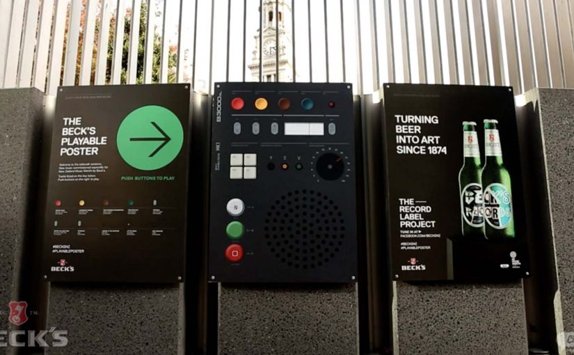
Beck’s Playable Poster

Looking for an innovative way to mark New Zealand’s Music Month, Beck’s partnered with Shine to design a playable poster. Using conductive ink and speakers the posters were made playable with a simple tap of the finger.

The Sound of Taste

Herb and spice brand Schwartz is all about flavour. So to dramatise flavour which was invisible and silent, they got print tech collective Novalia and ad agency Grey London to collaborate on an interactive poster. The poster used conductive ink to turn the surface area of the paper into an interactive interface that also connected to the viewers smartphone to deliver a richer experience.

Change the tune

Agency Republic from UK created a poster with an embedded sensor which when knocked changed the song being played on the agencies shared sound system.

Why these work: the demo happens in your hands

Each example keeps the interaction legible. Tap to trigger sound. Touch to explore flavour as audio. Knock to skip a track. The poster does not ask people to learn a new behavior. It hijacks an existing one, touching a surface, and rewards it instantly.

Extractable takeaway: When you want print to feel alive, make one obvious gesture trigger one immediate reward, and let the brand message ride on that moment of viewer control.

The real question is whether the interaction earns enough memorability to justify the added production. If the payoff is not instant and on-message, do not build it. Because the audience causes the outcome with a simple touch, the message sticks.

Practical patterns for interactive print

  • One interaction, one reward. Do not overload the surface with too many modes.
  • Make the “how” obvious. A tap zone, a knock cue, a simple instruction. Then deliver instantly.
  • Use phones as infrastructure. If pairing adds depth, let the phone do what paper cannot, audio, saving, sharing.
  • Design for public confidence. People will only touch a poster if it feels safe, clean, and socially acceptable.

A few fast answers before you act

What is “conductive ink” doing in these posters?

It creates touch-sensitive paths on paper, so taps or touches can be detected and mapped to actions like playing audio.

Do these posters need special printing like QR codes?

They still require specialist production, but the interaction can be integrated invisibly into the design. The poster itself becomes the control surface rather than carrying visible codes.

Why add Bluetooth to print?

Bluetooth allows paper to trigger sound through a phone or external speaker, which is essential when the content is audio or when you want richer layers than print can carry.

What makes an interactive poster feel “worth it” to a passer-by?

Immediate payoff and low friction. If the result is instant and satisfying, people will try it. If setup or pairing is slow, they walk past.

Where does this format fit best?

In environments where people have dwell time and curiosity, festivals, transit hubs, retail windows, office interiors, and brand experiences where interaction is socially normal.

Restaurant of the Future: AR Dining

The restaurant of the future is a technology experience

Restaurants of the future are no longer defined only by food, service, or ambiance.

They become technology-driven environments, where digital interfaces blend directly into the dining experience.

Smartglasses, augmented reality, gesture-based interfaces, customer face identification, avatars, and seamless wireless payments begin to coexist at the table.

The result is not a single gadget. It is a fully integrated experience.

When dining becomes augmented

In the restaurant of the future, the menu does not need to live on paper or even on a phone.

Information can appear in front of the guest through smartglasses or augmented displays. Dishes can be visualized before ordering. Nutritional details, origin stories, or preparation methods can surface on demand.

Gestures replace clicks. Presence replaces navigation.

The dining experience becomes interactive without feeling mechanical.

Identity replaces interaction

Face recognition and customer identification change how restaurants think about service.

Returning guests can be recognized instantly. Preferences, allergies, and past orders can be recalled automatically. Avatars and digital assistants can guide choices or explain dishes without interrupting human staff.

The restaurant adapts to the guest, not the other way around.

Payment disappears into the experience

Wireless payment technologies remove the most artificial moment in dining.

There is no need to ask for the bill. No waiting. No interruption.

Payment happens seamlessly as part of the experience, triggered by confirmation, gesture, or departure. Money moves, but attention stays on dining.

Mirai Resu. Japan’s restaurant of the future

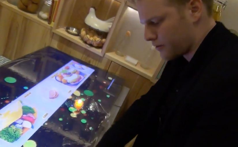
To illustrate this vision, a short video from Mirai Resu in Japan shows what a fully integrated restaurant experience can look like.

Smartglasses, augmented visuals, gesture-based interaction, avatars, and invisible payment mechanisms come together into a single flow.

This is not a concept mock-up. It is a concrete glimpse into how dining, technology, and experience design merge.

In hospitality experience design, technology only “wins” when it fades into the flow and makes the human experience feel more effortless.

In experience-led hospitality brands, the winning AR layer is the one that keeps guests present while the service logic runs quietly in the background.

The real shift. Experience over interface

The most important takeaway is not the individual technologies. It is the shift away from explicit interfaces toward ambient interaction. By ambient interaction, I mean in-context cues and hands-free inputs that let guests act without hunting through screens. Restaurants should use this pattern to remove friction in ordering and paying, not to turn the table into a device demo. The real question is whether the tech can disappear enough that guests remember the meal, not the UI. Because the interaction happens in the moment and stays tied to the table, it keeps attention on dining, which is why it feels like hospitality rather than software.

Extractable takeaway: If an experience needs a screen to be understood, it is still an interface. The closer interaction stays to the real-world moment, the more it reads as service.

Steal this from AR dining

  • Prototype the full flow, not a feature. Order, identity, assistance, and payment should feel like one service journey.
  • Keep interaction in-context. Use gestures and overlays only when they reduce steps and keep guests present.
  • Make personalization explicit and optional. Recognition only lands when guests understand the trade and can opt out.

A few fast answers before you act

Is this about replacing staff with machines?

No. The value is removing friction so staff can focus more on hospitality and less on transactional steps.

Why does augmented reality matter in dining?

It can add information and interaction in-context, without pulling guests out of the moment or forcing phone-first behavior.

What does the Mirai Resu example actually demonstrate?

It demonstrates orchestration. Multiple technologies can be combined into one coherent service flow, rather than isolated gimmicks.

Where does “customer identification” fit in this vision?

It enables recognition on approach and service personalization, but it only works when guests understand the trade and feel in control.

What is the design principle to steal?

Design for experience continuity. Keep attention on dining, and make technology support the flow rather than interrupt it.

iBeacons: Context as the Interface

From proximity to context

iBeacons introduce a simple but powerful idea. The physical world can trigger digital behavior.

A smartphone does not need to be opened. A user does not need to search. The environment itself becomes the signal.

At their core, iBeacons enable proximity-based awareness. When a device enters a defined physical range, a predefined digital action can occur. That action may be a notification, a content change, or a service trigger.

The evolution is not about distance. It is about context.

What iBeacons enable

iBeacons are small Bluetooth Low Energy transmitters. They broadcast an identifier. Nearby devices interpret that signal and respond based on predefined rules.

This creates a new interaction model. Digital systems respond to where someone is, not just what they click. Because that location signal arrives before a click, the system can reduce friction by pre-loading the most relevant content or service for that moment.

Retail stores, public spaces, machines, and even wearable objects become programmable environments. The physical location is no longer passive. It actively participates in the experience.

Why proximity alone is not the breakthrough

Early use cases focus heavily on messaging. Push notifications triggered by presence. Alerts sent when someone enters a zone.

That framing misses the point.

The real value emerges when proximity is combined with intent, permission, and relevance. Without those elements, proximity quickly becomes noise.

iBeacons are not a messaging channel. They are an input layer. Here, “input layer” means a reliable real-world signal that can change digital content or services without requiring a click.

The real question is whether proximity removes a step for the user, or just adds another interruption.

In global retail and consumer-brand environments, iBeacons work best when they connect physical moments to consented digital help at the point of need.

From messaging to contextual experience design

As iBeacon use matures, the focus shifts away from alerts and toward experience orchestration.

Instead of asking “What message do we send here?”, the better question becomes “What should adapt automatically in this moment?”

This is where real-world examples start to matter.

Example 1. When a vending machine becomes a brand touchpoint

The SnackBall Machine demonstrates how iBeacons can turn a physical object into an interactive experience.

Developed for the pet food brand GranataPet in collaboration with agency MRM / McCann Germany, the machine uses iBeacon technology to connect the physical snack dispenser with a digital layer.

The interaction is not about pushing ads. It is about extending the brand experience beyond packaging and into a moment of engagement. The machine becomes a contextual interface, meaning the object itself selects the right digital behavior when someone is present. Presence triggers relevance.

This is iBeacon thinking applied correctly. Not interruption, but augmentation.

Example 2. When wearables make context portable

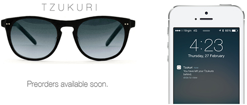
Tzukuri iBeacon Glasses enable hands-free, glance-based, context-aware information.

The Tzukuri iBeacon Glasses, created by Australian company Tzukuri, take the concept one step further.

Instead of fixing context to a location, the context moves with the person.

The glasses interact with nearby beacons and surfaces, enabling hands-free, glance-based, context-aware information. The interface does not demand attention. It integrates into the wearer’s field of view.

This example highlights a critical shift. iBeacons are not limited to phones. They are part of a broader ambient computing layer. Here, “ambient computing layer” means computing embedded in objects and surroundings that responds without demanding a screen-first interaction.

Modern product and experience design is slowly replacing “screen” with “context” as the interface.

Why these examples matter

Both examples share a common pattern.

Extractable takeaway: Treat proximity as a signal to adapt the service in the moment. If it does not reduce friction or increase clarity, it is not context. It is noise.

The user is not asked to do more. The system adapts instead.

The technology fades into the background. The experience becomes situational, timely, and relevant.

That is the real evolution of iBeacons. Not scale, but subtlety.

The real evolution. Invisible interaction

The most important step in the evolution of iBeacons is not adoption. It is disappearance.

The more successful the system becomes, the less visible it feels. No explicit action. No conscious trigger. Just relevance at the right moment.

This aligns with a broader shift in digital design. Interfaces recede. Context takes over. Technology becomes ambient rather than demanding.

Why iBeacons are an early signal, not the end state

iBeacons are not the final form of contextual computing. They are an early, pragmatic implementation.

They prove that location can be a reliable input. They expose the limits of interruption-based design. They push organizations to think in terms of environments rather than channels.

What evolves next builds on the same principle. Context first. Interface second.

Practical rules for context-first experiences

  • Start with the moment, not the message. Define what should adapt automatically when someone is present, before deciding what to notify.
  • Proximity is an input, not a channel. Use beacon signals to change content, offers, or service steps. Do not treat them as another push pipeline.
  • Permission and intent are part of the design. Make opt-in explicit and only trigger actions that match why the user is there.
  • Optimize for invisibility. The best beacon experience feels like the environment helping, not marketing interrupting.
  • Measure behavior change. Track whether friction drops and tasks complete faster, not whether notifications were opened.

A few fast answers before you act

What are iBeacons in simple terms?

iBeacons are small Bluetooth Low Energy transmitters that let phones detect proximity to a location or object and trigger a specific experience based on that context.

Do iBeacons automatically track people?

No. The experience usually depends on app presence and permissions. Good implementations make opt-in clear and use proximity as a trigger, not as silent surveillance.

What is the core mechanism marketers should understand?

Proximity becomes an input. When someone is near a shelf, a door, or a counter, the system can change what content or actions are offered, because the context is known.

What makes a beacon experience actually work?

Relevance and timing. The action has to match the moment and reduce friction. If it feels like random messaging, it fails.

What is the main takeaway?

Design the experience around the place, not the screen. Use context to simplify choices and help people complete a task, then measure behavior change, not opens.