
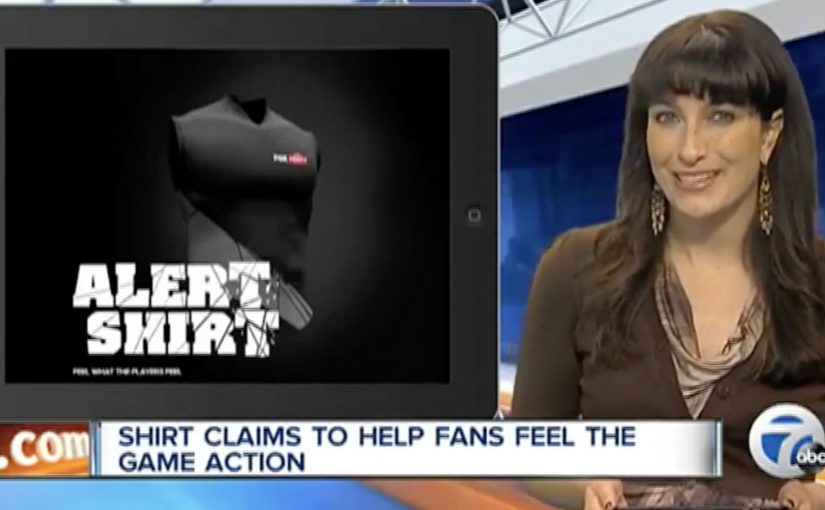
Foxtel: The Alert Shirt

In September 2012, London fashion house CuteCircuit launched a wearable, sharable, programmable tshirt. Then in 2013, Durex Australia unveiled their wearable electronic underwear that allowed touch to be transferred over the internet. Now joining this growing trend of wearable electronic clothing is the Alert Shirt from Australian telecommunications company Foxtel.

Loyal Foxtel customers can use this special shirt to experience in real time some of the physical sensations their favorite players have on the field, including:

  • Pressure: A thumping heartbeat
  • Impact: The shock of a big hit
  • Adrenalin: An intense rush of blood
  • Exhaustion: Lungs burning with effort
  • Despair: A sudden sinking feeling

The data is transmitted via Bluetooth from smartphone app, and the shirt is powered by a lithium polymer cell battery.

From second-screen to second-skin

The mechanism is a clean translation layer. Live game moments are captured as data, the app receives them, and the shirt turns those signals into physical feedback. The experience is not about watching harder. It is about feeling the sport in parallel with the broadcast.

In subscription sports media, the strategic job is retention. The best fan experiences make the service feel like access to something you cannot get anywhere else.

Why it lands

This idea works because it turns fandom into a bodily cue, not just a viewing habit. It also frames “technology” as something you wear once, then forget. When it is working, the interface disappears and the sensation becomes the message.

Extractable takeaway: If you want to deepen engagement, do not add more features to the screen. Translate key moments into a new sensory channel that runs alongside the core experience, and make activation as close to effortless as possible.

What Foxtel is really testing

Beyond the spectacle, this is a trial of emotional stickiness. By emotional stickiness, the point is simple: give fans a stronger felt reason to come back for the live broadcast. The real question is whether that added intensity is strong enough to make Foxtel feel like the only place to experience the match properly. If the shirt can make a live match feel more intense at home, it creates a reason to watch live, to watch longer, and to choose the broadcast that supports the experience.

What sports broadcasters can steal from this

  • Design the sensation vocabulary. Map data to feelings in a way users can understand instantly.
  • Make the phone a bridge, not the destination. Use the app to pair and translate, then let the wearable carry the moment.
  • Keep the promise specific. Heartbeat, hit, exhaustion. Concrete signals beat vague “immersive” claims.
  • Build for live viewing. The value rises when timing is tight and the feedback feels synchronous.

A few fast answers before you act

What is the Foxtel Alert Shirt?

It is a connected shirt that receives live match signals via a Bluetooth smartphone app and converts them into physical sensations so fans can feel key moments in real time.

What problem does it solve for a broadcaster?

It makes the broadcast feel exclusive and more emotionally intense, which can support loyalty and repeat live viewing.

Why use physical sensations instead of more on-screen stats?

Because sensations do not compete with the main viewing experience. They add a parallel layer without asking the fan to look away.

What makes this kind of wearable feel credible?

Clear mappings between events and sensations, low setup friction, and tight timing so feedback feels connected to the moment.

How can another brand apply the pattern?

Choose a live experience with high emotion, capture a small set of meaningful signals, then translate them into a simple, repeatable sensory vocabulary.
Pizza Hut Interactive Table: order by touch

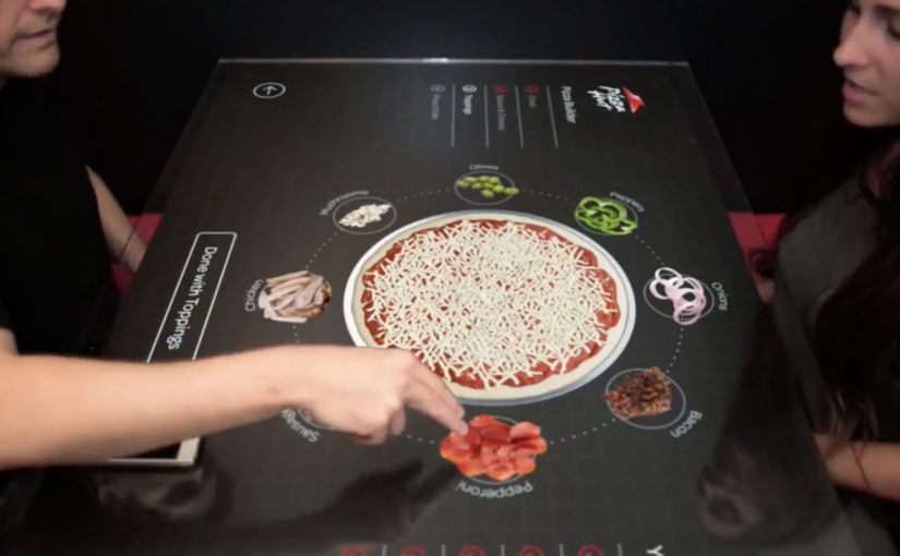
Multi-touch media that uses highly engineered glass and companion technologies feels like the future. So Pizza Hut partners with Chaotic Moon Studios in the USA to create an interactive concept table that lets customers in retail outlets create and customize their pizzas on the spot.

The promise is simple: instead of a static menu, the table becomes the interface, turning ordering into something you can explore, assemble, and adjust with your hands.

A table that turns ordering into a build experience

The mechanism is a multi-touch tabletop UI that walks you through base, sauce, toppings, and sides as a sequence of visual choices. Your pizza is assembled live on-screen, so the product takes shape while you decide.

In quick-service restaurants, the easiest way to increase customization confidence is to make choices visual and immediate.

Why it lands: it reduces friction and adds play

Ordering pizza can be surprisingly error-prone: misheard toppings, unclear sizes, forgotten extras, awkward group decisions. A touch-first interface turns that into a shared, visible process where everyone can see what is being built before it is submitted.

Extractable takeaway: When customization is the product, make the build visible to everyone, so groups converge on one order with fewer misunderstandings.

What Pizza Hut is really trying to prove

Beyond “cool tech,” this kind of table concept signals modernity in the dine-in experience. It frames Pizza Hut as a place where the experience is part of the product, not only the food.

These interfaces are worth doing only when they reduce ordering errors and keep dine-in throughput intact.

The real question is whether turning ordering into a shared build process increases confidence without slowing the line.

Borrowable patterns for touch-first ordering

  • Make the product assemble itself. Visual construction beats textual configuration for speed and accuracy.
  • Design for groups, not only individuals. Shared screens turn indecision into collaboration.
  • Keep the interaction shallow. Limit the flow to a few obvious steps with minimal typing.
  • Let the interface do the upsell quietly. Sides and add-ons perform better when they appear as natural next steps.

A few fast answers before you act

What is the Pizza Hut Interactive Concept Table?

It is a multi-touch tabletop ordering concept designed to let dine-in customers build and customize pizzas directly on the table interface.

What problem does a touch-table solve in restaurants?

It reduces ordering friction by making customization visual, shared, and less dependent on staff hearing, memory, or paper menus.

Is this an ordering system or a marketing concept?

It is presented as a concept experience to demonstrate a possible future dine-in flow, with the interface itself acting as the headline.

Why is multi-touch a good fit for pizza customization?

Pizza is modular. When options can be added, removed, and previewed instantly, customers feel more confident and order faster.

What is the main takeaway for experience design?

If you want people to customize, make the choices tangible. Let them see the product changing as they decide.

Coca-Cola Turkey: Invisible Vending Machine

Since the time I started writing this blog, I have come across many innovative vending machines. Some I featured right here on Ramble.

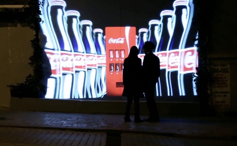
Now to add to this collection, here is an invisible vending machine from Coca-Cola Turkey that becomes visible only when couples walk by. The machine was created specially for Valentine’s Day (last week) and was installed in Istanbul to spread happiness Coca-Cola style.

A vending machine you cannot see until the right moment

The trick is the reveal. What looks like a normal stretch of wall becomes a vending interface only when two people approach together. That instant transformation creates a micro-scene, and the micro-scene pulls in everyone nearby.

In consumer brand activations, public installations work best when the interaction is obvious, fast, and shareable without instruction.

How the interaction is described to play out

  • Invisible by default. The unit blends into the wall and does not present itself as a machine.
  • Couples trigger the reveal. When two people pass together, the interface lights up and becomes visible.
  • Personal moment, not just a dispense. In coverage at the time, the machine asks for names and then produces two personalised cans.

Why it lands

This is not “another vending machine story”. It is a street-level surprise that creates a small, romantic spotlight for a couple, and a quick bit of theatre for everyone else. The invisibility is not a gimmick. It is a pacing device that makes the reveal feel like a reward. The real question is whether the experience creates a transformation that bystanders can explain in one sentence.

Extractable takeaway: If you want people to stop, watch, and retell an activation, build a visible transformation into the experience. A before-and-after moment is easier to share than a static stunt.

What Coca-Cola gets out of the Valentine framing

Valentine’s Day provides the social permission for public sweetness, names, and sentiment. For the brand, it is a clean link back to togetherness and “sharing happiness”, while turning a sample into a story people can repeat without being prompted.

Retail theatre patterns worth borrowing

By “retail theatre” I mean designing a retail moment as a small piece of live, shareable experience, not just a dispense or transaction.

  • Hide the interface until it matters. Visibility can be part of the reward, not just a prerequisite.
  • Keep the trigger legible. People should understand why it happened in one glance, or they will not mimic it.
  • Design for bystanders. The couple is the participant. The crowd is the media channel.
  • Personalise lightly. Names, messages, or small custom outputs feel intimate without needing heavy data.

A few fast answers before you act

What is the “invisible vending machine” concept?

A vending machine that stays hidden until a couple approaches, then reveals itself and delivers a Valentine-themed Coca-Cola moment.

Why make the machine “invisible” at all?

It creates a sharp reveal, and that reveal is the shareable payload. People remember transformations more than static installations.

What is the simplest way to replicate the effect?

Use a clear proximity trigger plus lighting and screen content that turns on instantly, and ensure the “why it appeared” is immediately understandable.

What is the biggest execution risk?

If the trigger is inconsistent or unclear, people will not repeat the behaviour and the crowd will not form. Reliability matters more than complexity.

What should you measure beyond views?

Dwell time, participation rate per hour, bystander clustering, social mentions generated on site, and any lift in nearby sales during the activation window.