Samsung Smart Window

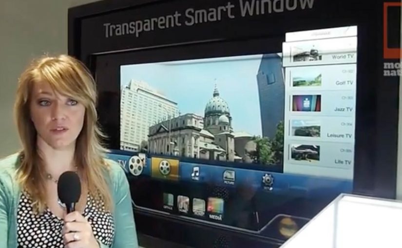
At CES 2012, Samsung unveils a “transparent” window screen concept called Samsung Smart Window. The effect feels instantly familiar. It brings the Minority Report interface fantasy straight into the real world.

Here, “transparent” means a see-through display surface that overlays digital content on what is behind the glass.

The real question is when a screen stops reading as a device and starts reading as part of the building.

The point. A window that is also a screen

Samsung Smart Window frames the display as a surface you can look through and look at. A transparent screen that turns the idea of a “window” into an interface.

Treat Smart Window less as a product promise and more as a signal that “display as surface” is becoming a default interaction pattern.

The mechanism. Turning glass into UI

By framing the display as something you can look through and look at, Samsung collapses “screen” and “window” into one surface. That lets digital layers sit on top of the physical view, not beside it.

In consumer electronics showrooms and built environments, transparent displays matter when you want information to live on the surface people already face, not on a separate device.

Why this works. The screen disappears

The concept works because the window metaphor makes interaction feel like manipulating the room. When the display behaves like glass, the UI feels less like using a device and more like reading the world with an added layer.

Extractable takeaway: If you want a futuristic interface to feel plausible, attach it to an object people already understand and touch, then let the digital layer borrow that object’s meaning.

What Samsung signals next

Samsung positions the Smart Window as moving toward mass production, with availability expected soon. The message is simple. This is not just a lab demo. It is a direction Samsung wants the market to expect.

Practical takeaways for transparent UI

  • Anchor the metaphor. Start with a physical object people already trust (window, mirror, dashboard), then let the interface inherit that mental model.
  • Overlay, do not relocate. Put information on top of the real-world view so the viewer does not mentally switch contexts.
  • Design for glance. Treat the surface like architecture. Prioritize legibility and minimal steps.

A few fast answers before you act

What is Samsung Smart Window?

A transparent display concept unveiled by Samsung at CES, positioned as a window-like screen.

What does it evoke culturally?

A Minority Report style interface experience, where the screen feels like a transparent surface in the real world.

Where is it introduced?

At CES, the consumer technology trade show.

What is the key value of the concept?

It makes the display feel less like a device and more like an architectural surface.

What is the stated next step?

Movement toward mass production and near-term availability.
Lacta: Love Messages on Real Bars

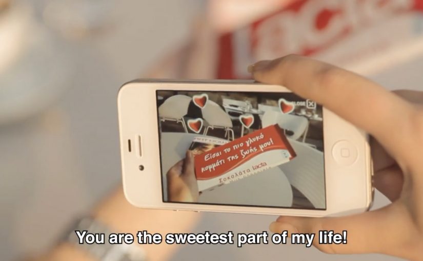
OgilvyOne Athens created another innovative campaign for Lacta Chocolate. This time, people write their own love messages and see them appear on real Lacta bars through an augmented reality mobile app.

The twist is that the message is not “published” online first. It is revealed on the physical product when the receiver scans the wrapper with the app, which turns a simple bar of chocolate into a personalized moment.

Click here to view some of the past Lacta Chocolate campaigns that are equally innovative.

How the AR message reveal works

The mechanism is a clean three-step loop. The sender composes a message in the app and chooses who it is for. The receiver is prompted to use the app too, then scans a Lacta bar to reveal the hidden message in augmented reality. Because the reveal depends on scanning the product, the experience is designed to connect emotion and purchase in the same gesture.

In FMCG gifting categories where love and ritual drive preference, adding a personal reveal layer can create differentiation without changing the core product.

Why it lands

It modernizes a familiar behavior, writing something personal on a gift, without losing the physicality of giving chocolate. The message feels private and earned because it only appears when the recipient holds a real bar in their hands and chooses to reveal it. That makes the brand’s role feel like an enabler of intimacy, not an interruption. That works because the product scan turns anticipation into part of the gift, which makes the interaction feel more meaningful than a standard message.

Extractable takeaway: If you want personalization to drive both attention and sales, tie the reveal to a physical trigger. Make the digital layer unlockable only through the product, so the magic moment and the transaction reinforce each other.

What Lacta is really optimizing for

The real question is how to make personalization pull product demand instead of floating as a nice digital extra.

This is built to turn gifting into repeatable behavior. One person sends a message, another person downloads the app, then the product becomes the key that unlocks the experience. That creates a loop that can scale through relationships rather than through media weight alone.

The strongest strategic choice here is keeping the chocolate bar as the gate to the experience, not just the branded wrapper around it.

What to steal for your own packaging-led digital work

  • Use the pack as the trigger. If the wrapper is the marker, the product stays central.
  • Make the reveal the reward. The moment of discovery is what people remember and retell.
  • Keep the steps simple. Create, send, scan. Anything more complex reduces participation.
  • Design for reciprocity. The best gifting mechanics invite the receiver to respond, not just consume.

A few fast answers before you act

What is the core idea of this Lacta campaign?

An AR mobile app that lets people write a love message that only appears when the recipient scans a real Lacta chocolate bar.

Why does tying the reveal to the physical bar matter?

It keeps the product as the gateway to the experience, so personalization supports purchase rather than replacing it.

What is the main emotional benefit versus a normal digital message?

The message feels more intimate because it is hidden and revealed in a physical moment, not broadcast in a feed.

Why not publish the message online first and then link to the product?

Because that would make the product secondary. Here, the chocolate bar is the access point, so the physical gift remains central to the experience.

What is the biggest execution risk with AR-on-pack ideas?

Friction. If install, scanning, or recognition is unreliable, the magic becomes disappointment. The reveal has to work fast and consistently.