
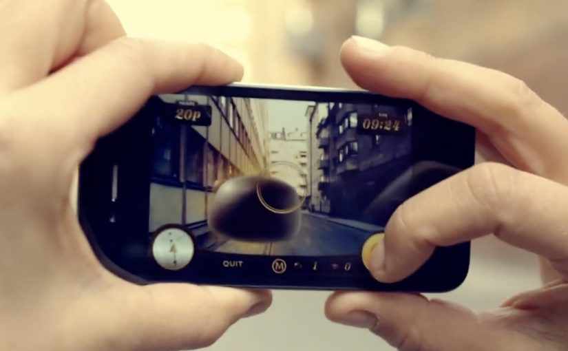
Magnum Pleasure Hunt: AR bonbons in Amsterdam

Earlier on in April Magnum launched the second edition of its hit online game Magnum Pleasure Hunt. To extend the campaign further, a real time mobile augmented reality game takes the hunt to the streets of Amsterdam.

The game is currently ongoing and participants between April 22nd and April 29th can use a special mobile app to hunt down 150 chocolate bonbons hidden across 9 locations in Amsterdam, described in some write-ups as centered around the city’s Nine Streets area. The one who claims the most bonbons wins a free trip to New York, while the rest are rewarded with the new Magnum Infinity ice cream.

Why this is a smart extension of a digital hit

The original online game is built for reach and replay. The Amsterdam version adds scarcity and locality: the same “collect the bonbons” mechanic, but tied to time, place, and physical movement, which makes participation feel more like an event than a link.

In European FMCG launches, location-based AR hunts work best when the rules are obvious in seconds and tiered prizes make “one more try” feel worth it.

The real question is whether your AR layer gives people a reason to move now, not just a new way to look at the same brand world.

What the AR layer adds to the experience

The AR layer keeps the mechanic simple, but changes the context by making the hunt visible in public and limited to specific dates and locations.

Extractable takeaway: When you take a proven digital mechanic into the street, pair it with a short window and clear rewards so participation feels like an event, not an app demo.

  • Instant purpose. You are not browsing a branded world. You are on a hunt with a clear target.
  • Real-world urgency. Limited dates and specific locations make the challenge feel live.
  • Social proof by default. People playing in public become the campaign’s moving media.

A quick comparison to Vodafone Buffer Busters

I find the Magnum mobile game to be a toned down version of the Vodafone Buffer Busters game that ran in Germany last September. Either way, this is the right direction. More brands should treat augmented reality as a medium of engagement, not a gimmick.

What to copy from Magnum’s Amsterdam hunt

  • Make the first action obvious. People should understand the goal and the first tap in seconds.
  • Limit the window. A short time period turns “I’ll try it later” into “I should go now.”
  • Use rewards that scale. A big winner prize plus smaller payoffs keeps both competitive and casual players engaged.

A few fast answers before you act

What is Magnum Pleasure Hunt Across Amsterdam?

It is a time-limited mobile augmented reality game that moves Magnum’s “collect the bonbons” mechanic from the web to real locations in Amsterdam.

How do players participate?

Players use a mobile app while out in the city to find and collect virtual bonbons placed at specific locations during the campaign window.

What makes it different from the online Pleasure Hunt?

The online version is a digital-only chase. The Amsterdam version adds time and place, turning the hunt into a real-world activity with location-based stakes.

Why are prizes so central to this format?

Because the effort is physical. A clear top prize plus smaller “everyone gets something” rewards keep motivation high across both competitive and casual players.

What is the key design lesson for AR brand games?

Keep onboarding friction low. If people cannot understand the goal and the first action immediately, they will not start, especially outdoors.

Mercedes-Benz Vans: Key to Viano

A commuter points a car key at a digital billboard and clicks the remote. The screen reacts. Suddenly, the advertising display stops behaving like outdoor media and starts behaving like interactive entertainment.

That is the core mechanic behind “Key to Viano”, an interactive outdoor event for Mercedes-Benz Vans created by Lukas Lindemann Rosinski on Wall AG’s digital out-of-home (DOOH) displays in Berlin’s U-Bahn station Friedrichstraße. Passers-by are invited to use their own remote car keys to control the content on the screens, turning a familiar everyday object into the controller.

In high-traffic urban DOOH environments, the quickest path to attention is to turn an existing habit into viewer control, with a payoff that feels immediate and public.

The experience works because the interaction is self-explanatory. Press the button you already know. Watch the screen respond. The line between ad and game collapses, and the crowd becomes part of the moment because everyone can see the “trigger” happen.

Why the car key is the perfect interface

No download. No new behaviour. No instruction manual. A car key is already a remote control in people’s hands, so the activation feels intuitive instead of “techy”. That simplicity is what makes the experience legible from a distance, and what makes bystanders stop and watch.

Extractable takeaway: If you want interaction in public space, pick an input people already carry and trust, then make the response visible to everyone around them.

What Mercedes-Benz Vans is really proving

The stunt is framed as entertainment, but it is also a product metaphor. “Key to Viano” implies access, convenience, and a premium feel. When the participant can “open” a digital experience with a key, the brand gets to borrow the emotional cues of unlocking a car, without talking about features.

The real question is whether your idea can be explained in one glance, without staff, signage, or a QR code.

Interactive DOOH should earn its place by being instantly legible, not by adding layers of “smart” complexity.

What to borrow from Key to Viano

  • Use a controller people already trust. Familiar inputs reduce friction and increase participation.
  • Make the interaction visible. If the crowd can see what caused the screen to change, attention multiplies.
  • Keep the loop fast. Trigger. Response. Reward. A slow loop loses commuters.
  • Let the location do the targeting. Stations deliver high volume and natural dwell time without extra explanation.

A few fast answers before you act

What is “Key to Viano”?

It is an interactive digital out-of-home activation where passers-by control advertising screens using their own remote car keys, under the Mercedes-Benz Vans “Key to Viano” concept.

Where did the activation run?

It ran on digital displays at Berlin’s U-Bahn station Friedrichstraße.

Why does using a car key work so well?

Because it is an input people already understand. It removes download friction and makes the interaction feel natural and premium.

What is the main benefit of interactive DOOH like this?

It converts passive exposure into participation. Participation creates longer attention, stronger memory, and visible social proof from the crowd watching.

What is the biggest risk with interactive screens in transit spaces?

Complexity. If the interaction is not instantly clear, people walk past. The mechanic must be obvious in seconds.

Corning: A Day Made of Glass 2

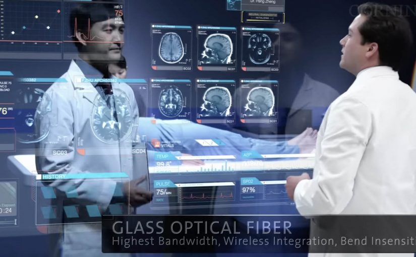
Corning is best known as a high-tech glass manufacturer. Their Gorilla Glass is used across a huge number of smartphones. In March last year they released “A day made of glass”. A futuristic look at glass technology.

Now they are back with an expanded vision for the future of glass technologies. This video continues the story of how highly engineered glass, with companion technologies, will help shape our world.

What’s new in the expanded vision

The core mechanic stays the same. Glass is no longer a cover. It becomes the interface. The expansion is about reach and density. More environments. More surfaces. More moments where information appears “in place” and responds directly to touch.

In consumer electronics, automotive interiors, and collaborative workplaces, the real shift is treating surfaces as shared touch-first interfaces rather than single-purpose screens.

The interaction pattern underneath the glass

Strip away the material science and you can see a product blueprint. Persistent identity across contexts. Content that follows the user. Direct manipulation as the default. And big surfaces that invite more than one person to participate at the same time.

In global enterprise and consumer-tech product teams, smart-surface visions only pay off when the interaction rules stay coherent across devices and contexts.

Why this vision sticks

It sells immediacy. You touch the thing you mean. You get feedback where your eyes already are. There is less “device ceremony”, meaning fewer unlocks, app switches, and mode changes, and more task flow. Because the interaction is direct and feedback stays in place, the experience feels faster and more trustworthy, which is why these concept films can persuade even before the enabling tech is fully mainstream. These concept films are worth using, but only if you translate them into interaction rules you can actually prototype. The real question is whether you can keep those rules coherent across surfaces once the demo glow fades.

Extractable takeaway: When you are designing a future-facing experience, define the interaction grammar first, meaning the repeatable set of gestures, feedback cues, and handoffs that make the experience feel consistent. If the same gestures, feedback, and handoffs work across two form factors, your concept has legs. If they don’t, the material is just a costume.

Steals from the smart-surface UX model

  • Prototype the handoffs early. Moving from phone to wall to table is where visions usually collapse. Test that seam before you polish anything else.
  • Design for two people, not one. Large surfaces create collaboration by default. Add rules for turn-taking, ownership, and conflict resolution.
  • Keep data anchored to the decision. The strongest moments are when information shows up exactly where action happens, not in a separate dashboard.
  • Make “glanceable” a first-class mode. If the surface is always there, the experience must work in 2-second looks, not only long sessions.

A few fast answers before you act

What is “A Day Made of Glass 2” actually demonstrating?

It demonstrates an interface direction. Glass surfaces behave like interactive displays, so information can appear in place and be manipulated directly by touch.

Is the value here the glass technology or the UX model?

The transferable value is the UX model. Direct manipulation, seamless handoffs, and multi-user surfaces. The materials enable it, but the interaction design makes it believable.

What is the biggest risk in “smart surfaces everywhere” thinking?

Interface overload. If every surface can talk, the environment becomes noisy. The discipline is deciding when to stay quiet and when to surface the one next action.

How do you scope a first prototype so it stays realistic?

Pick one job-to-be-done, two surfaces, and a single handoff. Then enforce a small set of interaction rules so you can observe friction before you add polish.

What is one practical next step after watching the video?

Write down the 6 to 10 interaction rules you believe the film is using. Then build a rough prototype that applies those rules in two contexts, such as phone plus kiosk, or tablet plus meeting room display.