Nissan: Create Your Terrain

Nissan: Create Your Terrain

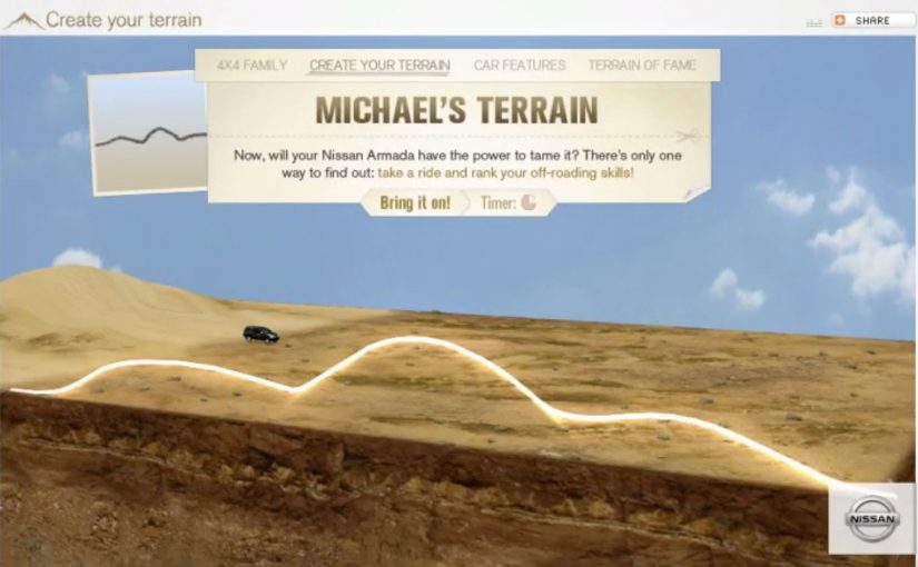
You hold your hands up to the webcam, and the landscape changes. Peaks rise, valleys drop, and a Nissan SUV gets challenged to drive across whatever terrain you just “sculpted” in mid-air. It takes an off-roading mindset and translates it into a simple piece of viewer control. Here, viewer control means your gestures directly shape the terrain in real time. Build a route. See if the car can handle it.

That is the core idea behind Nissan’s “Create Your Terrain,” built by TBWA\RAAD to help launch Nissan’s SUV family in the Middle East. Instead of showing capability with another glossy montage, it invites off-roaders to invent the terrain first, then watch the vehicle conquer it.

Create Your Terrain uses webcam detection as the input method. In plain terms, the camera reads your gestures and turns them into a terrain editor, so you can shape dunes and obstacles without a mouse or controller.

In automotive marketing, the strongest digital launches turn enthusiast culture into an interaction loop, not a viewing moment.

The microsite (www.createyourterrain.com) was reported to have attracted thousands of user-made terrains, adding up to more than 80,000 square kilometres of created landscape. The build is also credited with recognition at Dubai Lynx 2011 (Bronze, Microsites & Websites) and a GEMAS Effies 2011 finalist placement (Automotive), which fits the ambition. Make the product story feel earned through play, not told through claims.

Why this mechanic fits off-roading

Off-roading is personal. Everyone has their own “perfect line,” their own idea of what counts as a challenge, and their own pride in tackling terrain others avoid. This activation borrows that psychology. The viewer creates the course, so the payoff feels like their test. Nissan just shows up to pass it.

Extractable takeaway: When you let enthusiasts define the test, the brand’s proof point feels like a response to their standards, not a claim the brand asks them to accept.

What Nissan is really buying with “Create Your Terrain”

This is not only a tech demo. The real question is whether your mechanic makes the capability story feel earned, not asserted. It is a positioning move. The message is that Nissan’s SUVs can handle anything, including terrain you have never seen before. And because the experience is interactive, it naturally increases dwell time, encourages sharing, and gives people a reason to return and try a “harder” build.

What to borrow for your own interactive launch

  • Let the audience create the challenge. Self-made tests feel more authentic than brand-made obstacles.
  • Use input that matches the story. Gestures and a webcam make “hands-on terrain” feel physical, not like another web game.
  • Keep the loop tight. Create. Challenge. Watch. Repeat. The shortest loop is the one people replay.
  • Design for bragging rights. The shareable unit is not the ad. It is “my terrain” and “my result.”

A few fast answers before you act

What is “Create Your Terrain” in one sentence?

It is an interactive Nissan microsite where webcam-based gestures let viewers build a digital off-road landscape and then challenge a Nissan SUV to drive across it.

Why does viewer-created terrain matter?

Because it flips the usual launch pattern. Instead of the brand defining the challenge, the audience defines it. That increases personal investment and makes the capability story feel more credible.

What does “webcam detection” mean here?

It means the experience uses the camera feed to interpret basic gestures as inputs, turning the viewer’s hands into a simple controller for shaping the terrain.

What is the key takeaway for digital campaign design?

Build an interaction loop that mirrors real-world behaviour. When the mechanic matches the passion, like building and conquering terrain here, people stay longer, replay more, and share more naturally.

What is a common failure mode for experiences like this?

Overcomplicating the first minute. If setup is fiddly, calibration is fragile, or the payoff is slow, people bounce before the “magic” lands.

Fiat Street Evo

Fiat Street Evo

Leo Burnett Iberia has launched a new app called Fiat Street Evo, described as a “not-printed” car catalogue. A catalogue that is virtually on every street in your city.

Fiat Street Evo recognises traffic signs as if they were QR codes and associates each sign with a feature of the new Fiat Punto Evo. For example, a STOP sign points you to braking. A curve-ahead sign points you to intelligent lighting that guides you through bends. The list continues across the everyday signage you pass without noticing.

When street furniture becomes a product demo

The mechanism is a neat inversion of the usual brochure logic. Instead of printing a catalogue and hoping people keep it, the city becomes the index. Your camera becomes the browser, and the sign becomes the trigger. Here, “street furniture” means the signs and fixtures already in public space.

In automotive launch marketing, the strongest mobile ideas turn the real world into media without asking people to change their routine.

Why it lands

It reframes “specs and features” as discovery. You do not read a list. You unlock a feature in context, tied to a symbol you already understand. That makes the catalogue feel lighter, and it makes exploration feel like play rather than research. This pattern is stronger than a brochure-style feature list because it earns attention through context, not interruption.

Extractable takeaway: Product education travels further when it is organised around familiar cues in the environment, not around the brand’s feature taxonomy.

What Fiat is really trying to achieve

The real question is whether you can make the phone the first place curiosity goes by attaching product education to cues people already recognise. This kind of execution is doing two jobs at once. It builds attention for a new model, and it makes the phone the first place curiosity goes. That matters because the intent moment is not always at a dealership. It is often on the street, in motion, and in between other tasks.

Patterns to borrow for mobile launch marketing

  • Borrow existing symbols. Traffic signs already carry meaning. Use that meaning as your information architecture.
  • Keep the mapping intuitive. The sign-to-feature link should feel obvious, or people will drop the experience.
  • Design for quick sessions. One sign. One feature. One payoff. Repeat when you feel like it.
  • Make “catalogue” feel like exploration. A sense of discovery beats a long scroll of specifications.
  • Use the city as distribution. When the triggers are everywhere, frequency becomes effortless.

A few fast answers before you act

What is Fiat Street Evo in one sentence?

It is a mobile catalogue concept that recognises traffic signs and uses each sign to reveal a related Fiat Punto Evo feature.

Why call it a “not-printed car catalogue”?

Because the “pages” are distributed across the city as street signs. The phone becomes the reader, and the street becomes the catalogue.

What makes the sign-to-feature mapping important?

The mapping is the comprehension layer. If the association feels natural, users keep going. If it feels random, the idea collapses into novelty.

What is the biggest execution risk?

Recognition reliability. If the app struggles to identify signs in real conditions, people will not persist beyond the first attempt.

What should you measure in a pilot?

Successful recognitions per session, repeat usage, time-to-first-payoff, and whether the experience increases search, dealership visits, or brochure requests.

Fanta: Lift & Laugh

Fanta: Lift & Laugh

A school elevator that refuses to stay boring

Ogilvy Brazil sought to reinforce Fanta’s brand image of “joy” in the USA. So they came up with an elevator prank called “Lift & Laugh”.

An elevator in a school in Atlanta was chosen to arouse students curiosity and laughter. In the elevator they installed a device that responded to the movements and comments from the students.

The mechanic: a responsive space that reacts back

This works by turning a routine moment. waiting for an elevator ride. into an interaction loop. The environment listens, then answers in real time, so the people inside start experimenting to see what triggers the next reaction.

An ambient ad is a brand experience placed in an everyday setting, where the setting itself becomes the medium and the message is delivered through participation.

In youth and soft drink marketing, “joy” only sticks when it is felt in-the-moment, not just claimed in a tagline.

The real question is whether your experience design can make play discoverable without instructions.

Why the prank lands with students

It creates instant permission to play. The elevator is a confined stage, the reactions are immediate, and the group dynamic amplifies everything. If one person laughs, everyone joins, and the experience escalates without needing instruction.

Extractable takeaway: When the audience’s own movement or words trigger an immediate response, the fun feels earned and becomes more likely to be retold.

The business intent: make joy a repeatable brand behavior

This is not just a one-off gag. It is a proof point for a positioning idea. Fanta turns dull places into fun places. If the experience is good enough, the brand gets earned attention plus social retell value without needing to push product features.

In the end many students did not want to get off the elevator and asked for a repeat trip.

What to steal if you want an experience people replay

  • Make the interaction discoverable. People should learn the rules by trying, not by reading.
  • Reward experimentation fast. Short feedback loops create momentum.
  • Design for groups, not individuals. Laughter spreads socially. Build for that amplification.
  • Anchor the behavior to your brand. The “why” should map cleanly to what you stand for.

A few fast answers before you act

What is Fanta’s Lift & Laugh?

It is an elevator prank experience where the elevator reacts to students’ movements and comments, turning a normal ride into a playful, responsive brand moment for Fanta.

Where did the activation take place?

It was staged in a school in Atlanta, using a real elevator as the experience space.

How does the elevator prank create engagement?

It uses immediate cause and effect. People try something, the elevator responds, and the group starts experimenting together to trigger more reactions.

Why does this work especially well with students?

The elevator becomes a contained stage and laughter spreads socially. One reaction gives others permission to play, which escalates the experience quickly.

What makes this “ambient advertising” rather than a standard ad?

The everyday environment becomes the medium. The message is delivered through participation in a real situation, not through a screen or a slogan.

What should brands learn from this format?

If you want “fun” as a brand attribute, build it into a situation people already live. Then make participation the delivery mechanism, not a message about participation.