Checkout-Free Stores: 2 Startups Shape Retail

Checkout-Free Stores: 2 Startups Shape Retail

In-store shopping changes when the phone becomes the checkout

With smartphone penetration crossing the halfway point, two new start-ups push to change how we shop in-store.

The shift is simple. The phone is no longer just a companion to shopping. It becomes the point-of-sale, the service layer, and the trigger for fulfillment inside the store. By “checkout-free” here, I mean shoppers scan and pay on their own phone, with staff stepping in only for exceptions.

Because scanning and payment happen during the journey, peak demand spreads across aisles instead of stacking at one cashier line.

The real question is whether you can make the exception path feel as simple as the happy path.

Checkout-free is worth scaling only when your exception paths are as smooth as the happy path.

Why this lands in practice

In omnichannel retail operations, the biggest shopper experience gains often come from removing time sinks like queues and size-hunting, not from adding more screens.

Extractable takeaway: If you want measurable lift, redesign the store journey to delete time sinks first, then let the phone execute the flow.

QThru

QThru is a mobile point-of-sale platform that helps consumers at grocery and retail stores to shop, scan and check out using their Android and iOS smartphones…

The ambition is clear. Remove queues. Remove friction.

Shoppers move through the store with the same control they have online. Browse, scan, pay, and leave without the classic checkout bottleneck.
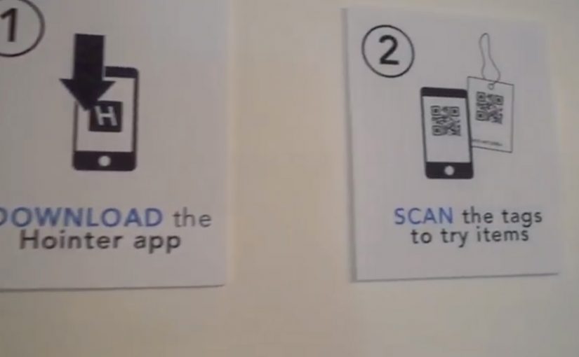
Hointer

Hointer automates jean shopping through QR codes.

When scanned using the store’s app, the jean is delivered in the chosen size to a fitting room in the store and the customer is alerted to which room to visit.

Once the jeans have been tried, customers can either send the jeans back into the system or swipe their card using a machine in each fitting room to make a purchase.

This approach removes two of the most frustrating in-store steps. Finding the right size and waiting to pay.

The store behaves like a responsive system rather than a manual process.

Steal these moves for checkout-free pilots

  • Delete one time sink first. Pick queues or size-hunting and design the flow to remove it end-to-end.
  • Make exceptions feel normal. Mis-scans, out-of-stocks, returns, and overrides need a fast, humane path.
  • Keep the shopper flow simple. The phone should execute scan-and-pay cleanly, without adding extra steps.
  • Operational reliability beats novelty. Inventory accuracy and in-store routing have to hold up when the store is busy.

A few fast answers before you act

What is the common idea behind both examples?

They move checkout and fulfillment logic into the shopper’s hands. Scanning, sizing, and payment become distributed across the store journey instead of centralized at a cashier line.

How do QThru and Hointer differ in the problem they solve?

QThru focuses on scan-and-pay to reduce queues. Hointer focuses on discovery and fitting-room fulfillment to remove size-hunting, then completes payment in the fitting room.

What has to be true operationally for checkout-free to work?

The system has to be reliable under load: accurate inventory, fast in-store routing, dependable scanning, and a payment flow that stays simple even when the store is busy.

What is the simplest way to pilot this without overbuilding?

Start with one store format and one tight journey. Measure queue time saved and staff exception workload, then expand only if operations stay stable.

What is the biggest failure mode teams underestimate?

Edge cases. Mis-scans, out-of-stocks, returns, fraud handling, and staff override paths. If exceptions are painful, the “friction-free” promise collapses at the worst moment.

Ben & Jerry’s #CaptureEuphoria: Instagram OOH

Ben & Jerry’s #CaptureEuphoria: Instagram OOH

Ben & Jerry’s jumps onto the Instagram wave with a photo contest that challenges fans to capture their “euphoria” towards the brand. Winners from around the world are then featured in special Ben & Jerry’s advertising, including local print, bus station placements and billboards that appear near their homes.

The mechanic: a hashtag that turns into local visibility

The idea is straightforward. Fans post Instagram photos that represent “euphoria” and tag them with #captureeuphoria. Ben & Jerry’s curates a set of winners, then brings those images into the real world by placing them as local advertising close to where the photographer lives.

This is hyperlocal out-of-home (OOH) as a reward. Instead of giving people a generic prize, the campaign gives recognition that is geographically personal.

Recognition-based rewards are the better default when the goal is to deepen community, not just spike entries.

The real question is whether your reward shows up in the participant’s physical world, not just their feed.

In global FMCG marketing, the strongest social contests create an offline payoff that feels personal, not promotional.

Why it lands: recognition beats “stuff”

Most contests promise products, vouchers, or a one-time win. This one promises status. Your photo becomes the ad. Your community becomes the audience. That flips the usual relationship between brand and fan, and it makes participation feel less like a transaction and more like belonging.

Extractable takeaway: A social contest gets more powerful when the payoff is not only online. It is something the participant can physically encounter in their own neighborhood.

What Ben & Jerry’s reinforces by calling it “euphoria”

By anchoring the idea to a feeling rather than a product shot, the campaign invites more creative submissions and a wider interpretation of what “Ben & Jerry’s moments” look like. The brand gets a stream of fan-made images that reflect joy and personality, and the best of it becomes media.

What to steal for your next community-first contest

  • Reward participation with identity, not only incentives. Public recognition can outperform discounts when the brand has true fans.
  • Make the submission format native. A hashtag plus a photo is a low-friction action people already understand.
  • Close the loop in the real world. If you can turn online creation into offline visibility, the story becomes more memorable.
  • Keep the brief emotionally clear. “Capture euphoria” is an instruction people can interpret without overthinking.

A few fast answers before you act

What is Ben & Jerry’s #CaptureEuphoria?

It is an Instagram photo contest where fans post images tagged #captureeuphoria, and selected winners have their photos featured in local advertising near where they live.

Why is the offline ad placement the key twist?

Because it turns participation into public recognition. The reward is visible, personal, and rooted in the winner’s own community.

What makes this different from a standard user-generated content (UGC) contest?

Instead of only reposting winners online, it converts fan content into out-of-home and print media, which raises the perceived value of being selected.

What should a brand be careful about with hashtag-based submissions?

Moderation and curation. If the hashtag stream is unfiltered, off-brand or disruptive content can hijack the gallery effect.

How do you measure success for a contest like this?

Track volume and quality of submissions, unique participants, sentiment, earned reach from reposting, and the lift in brand engagement during the campaign window.

Turismo de Portugal: Cobblestone QR Codes

Turismo de Portugal: Cobblestone QR Codes

To get into the minds of tourists, Turismo de Portugal decides to fuse QR code technology with Portugal’s historical cobblestone tradition. The result is described as the first QR code made from Portuguese cobblestones.

The first QR code is embedded into the city ground in Lisbon, followed by an installation in Barcelona. Reported write-ups describe the campaign as successful enough to spark plans for similar cobblestone QR codes in other cities such as Berlin, Paris, Tokyo, New York, Vienna, Goa, Lima, and Oslo.

When street craft becomes the interface

The mechanism is simple. A familiar tourist behavior, looking down at the street and looking for cues, is turned into a scan trigger. The QR code is physically “native” to the place because it is built using the same black-and-white stone patterns people already associate with Portuguese streets, especially in historic areas like Chiado.

In destination marketing and city tourism promotion, bridging physical street culture to mobile content is a reliable way to convert foot traffic into deeper engagement. Destination brands should treat the street as the interface, not just the backdrop.

In European destination marketing, the most scalable activations turn street-level cues into a clear mobile doorway.

Why this lands with visitors

It does two jobs at once. It signals “authentic Lisbon” through material and craft, and it gives the tourist an immediate next step through their phone. The real question is how you turn a place’s own cues into a frictionless next step without making it feel like advertising. Unlike a poster or a billboard, the code is part of the ground people are already walking on, so discovery feels like finding something, not being targeted.

Extractable takeaway: If you want mobile interaction in public space, embed the call-to-action into something the place already owns. Local texture first, technology second. The scan should feel inevitable, not imported.

What to steal for your own place-based activations

  • Make the trigger belong to the environment. Use local materials, patterns, or rituals so the interaction feels contextual.
  • Design for tourist attention spans. The best street interactions reward a 5-second decision, not a long explanation.
  • Use “discovery” as the media buy. When people feel they found it, they are more likely to scan, share, and talk about it.
  • Plan for maintenance and legibility. Outdoor codes live or die based on wear, lighting, contrast, and camera-readability.

A few fast answers before you act

What is the Cobblestone QR idea in one sentence?

A QR code built into the street using Portuguese cobblestones, so tourists can scan a piece of the city itself to access content.

Why does making a QR code “physical” matter?

Because it turns a generic tech behavior into a place-specific experience. The scan feels like interacting with Lisbon, not with a random sign.

What makes this different from putting a QR code on a poster?

Placement and meaning. A poster is rented space. A street pattern is owned space. The medium carries authenticity before the message even loads.

What should the QR code open to?

A fast-loading mobile page that confirms you are in the right place and offers one clear next step. If the page feels generic or slow, the “found it” magic disappears.

What is the biggest execution risk?

If the code is hard to scan or the content behind it is weak, the novelty collapses. The physical build earns attention. The mobile experience must repay it.