WhatsApp Taxi

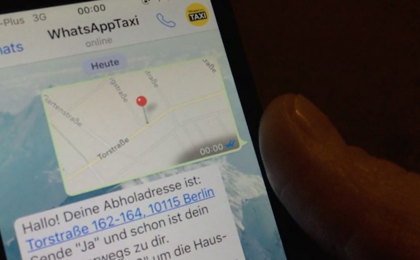
You need a taxi. Instead of calling or using a dedicated app, you open WhatsApp, share your location, and place the order by message. Taxi Deutschland positions “WhatsApp Taxi” as a simple way to request a cab in major German cities using the behavior people already know. Messaging.

Why this shows up now

After years of public sharing and transparency on social media, people gravitate toward more intimate, private, and even anonymous ways to communicate. That shift boosts the popularity of messaging apps and ephemeral messaging. Chat apps become hubs for social networks, games, e-commerce, and more.

The service. Taxi ordering by location message

Taxi Deutschland launches a new service called “WhatsApp Taxi” that allows users in major German cities to order a taxi by simply sharing their location via a WhatsApp message. The interaction is reduced to one core input. Your location.

The pattern. Messaging becomes an interface

Just last week I wrote about how KLM was starting to use Facebook Messenger for customer service related queries and tasks. WhatsApp Taxi sits in the same movement. Utility shifts into the messaging layer, which means the chat app becomes the place where the service starts, is confirmed, and is updated. The chat thread becomes the service surface.

In service categories where the audience already coordinates through chat, the smarter move is often to reduce entry friction rather than build another interface.

Why this lands for service adoption

This is a stronger service design move than another branded utility app because one familiar message and one high-confidence input make the service easier to try, which is why the interaction feels lighter and more repeatable.

Extractable takeaway: When the job to be done can be triggered with one trusted input inside a familiar chat flow, messaging can outperform a dedicated interface on adoption because it removes setup and learning cost.

The real question is whether your service needs a dedicated interface at all when messaging can already handle the request, confirmation, and follow-up. For Taxi Deutschland, the business intent is to reduce ordering friction and capture demand inside an existing behavior instead of forcing a new app habit.

What service brands can lift from WhatsApp Taxi

  • Ship in the behaviour people already have: If your audience already lives in messaging, put the service where the habit already exists.
  • Reduce the request to one high-confidence input: Location-first is a clean pattern when the service is fundamentally “come to me”.
  • Make chat the interface: Treat the thread as the order surface. Request, confirmation, updates, and support stay in one place.
  • Keep the interaction minimal: If one message can start the service, adoption is easier than “install app, register, learn UI”.
  • Design for repeat use: The same simple flow should work the second time without needing new learning or setup.

A few fast answers before you act

What is WhatsApp Taxi?

A Taxi Deutschland service that lets users order a taxi via WhatsApp by sharing their location in a message.

Where does it work?

Taxi Deutschland positions the service for use in major German cities.

What is the core user action?

Send your location via WhatsApp message to initiate the taxi order.

Why is this a marketing and product signal?

It shows how messaging apps evolve from communication tools into utility layers where services can be initiated and managed.

What is the transferable lesson for brands?

If your service can be reduced to a small set of high-confidence inputs, messaging can become a low-friction interface that people already understand.

Theraflu: Thermoscanner

With the start of flu season, Theraflu in Poland wants to create a tool that lets passersby check if they have a fever without interrupting their daily commute.

So Saatchi & Saatchi develops what is billed as the world’s first outdoor ad with a live thermo-scanner camera, able to check the body temperature of the person standing next to it in real time.

The thermo-ad also lets people take a thermo-selfie, which here means a thermal-style image of themselves, download it via a microsite or QR code, and share it using the hashtag #TherafluThermoscanner, or send it by email to their boss as an explanation for absence.

Turning a symptom into an instant public check

The mechanism is a simple swap. Thermal cameras are usually associated with controlled environments like airports or clinics. Here, that same visual language is put into a familiar citylight so the “should I worry?” moment can happen on the street, in seconds. That shift matters because it turns a clinical signal into a low-friction commuter interaction, which is why the idea feels immediately useful instead of purely theatrical.

In European commuter cities, out-of-home works best when it adds utility without forcing people to break stride.

Why it lands

This works because it respects the reality of flu season behavior. Many people keep moving even when they feel off. The installation meets them where they already are, makes the result legible at a glance, and gives them an immediately shareable artifact that doubles as social proof and practical communication.

Extractable takeaway: If your message is health-related and time-sensitive, design a public utility that produces a clear personal output. Then make that output easy to reuse in the next real decision the person has to make.

What Theraflu is really buying

Beyond awareness, the ad builds a reason to act early. It reframes “flu medicine” from a product you remember later into a category you prepare for now, while the viewer is still in the mindset of assessing symptoms and deciding what to do next. The real question is how to make symptom checking feel immediate enough to trigger action before people default to pushing through the day. The stronger play here is utility-led brand framing, not spectacle for its own sake.

What to steal from the Thermoscanner

  • Embed the benefit inside the medium. If the media unit demonstrates the promise, the claim needs less persuasion.
  • Make the result portable. A shareable scan turns one interaction into many impressions.
  • Design for the commute. Fast, glanceable, and low-effort beats “immersive” when people are in motion.
  • Give sharing a job. Social posting is optional. Emailing a boss is a real utility hook.

A few fast answers before you act

What is the Theraflu Thermoscanner?

It is an interactive outdoor ad that uses a live thermal camera to estimate body temperature in real time and indicate whether a passerby may have a fever.

Why put a thermo-scanner in an outdoor ad?

It makes fever detection feel instant and accessible during daily routines, and it turns a brand message into a practical tool.

What is a thermo-selfie here?

It is a thermal-style image generated from the scan that people can download and share, or send as a message to explain they may be unwell.

What makes this more than a gimmick?

It is tied to a real, time-sensitive decision. “Do I have a fever?” and it delivers an output that can be reused immediately.

How can other brands apply the pattern?

Find a high-friction question people avoid answering, then build a quick public utility that returns a clear personal result and a shareable artifact.

Porsche: Interactive Hologram Print Ad

To launch its latest 911, Porsche created a print ad that behaves like a device. Working with agency Cramer-Krasselt, Porsche placed a small acetate sheet into Fast Company’s April issue, turning a magazine spread into a build-it-yourself prism and an interactive “hologram” experience. In this context, “hologram” refers to a prism illusion created from tablet-screen content.

The execution ran as a four-page spread inserted into around 50,000 copies, complete with assembly directions. Porsche billed it as the world’s first interactive hologram print ad.

When a magazine page turns into a viewing tool

The mechanic is the whole point. You fold the acetate into a small prism, place it on top of a tablet, then use the screen content to create the floating 3D-style illusion inside the prism. Print does not “show” the car. Print enables the car to appear.

That shift matters. Instead of asking a reader to imagine innovation, the ad makes them assemble it, which turns curiosity into action.

In premium automotive marketing, making print behave like a device is a fast way to earn attention from audiences who think they have seen every format.

Why the prism matters more than the hologram

The hologram effect is a spectacle, but the prism is the message. It signals precision, engineering, and fascination through the act of building. It also gives the reader a reason to keep the insert, show someone else, and replay the experience, which is exactly what print needs when attention is scarce. The real question is whether the build step makes “innovation” feel earned rather than claimed.

Extractable takeaway: If you want a print unit to signal modernity, make it an enabling tool the viewer assembles, so the interaction itself becomes the proof.

What Porsche is really buying

The business intent is to make a high-end model launch feel as advanced as the product story. A conventional print page can carry features and beauty. This format carries a proof point. Porsche can credibly say, “We pushed the medium,” and that halo transfers to “we pushed the car.”

This is a smart launch move because it turns medium innovation into a product halo without adding more copy.

Steal this print-as-device pattern

  • Make the reader do one small action. Folding beats scanning when you want ritual, not convenience.
  • Let print enable the experience. The page becomes the trigger, not the canvas.
  • Keep the rules idiot-proof. If assembly fails, the entire idea fails.
  • Use scarcity and selectivity. A targeted drop can feel more premium than mass coverage.

A few fast answers before you act

What is an “interactive hologram print ad”?

It is a print ad that includes a physical component, in this case an acetate prism, that turns a tablet screen into a hologram-style viewing effect. The print unit is the enabling tool.

How does the prism create the hologram effect?

The prism reflects and refracts imagery from the screen into a floating illusion. The viewer sees the content “inside” the prism rather than flat on the tablet.

Why put this in a business magazine like Fast Company?

Because the audience expects innovation and is more likely to try a format experiment. It also gives the stunt credibility as “design and tech”, not just “advertising.”

What is the biggest execution risk?

Friction. If instructions are unclear, materials are flimsy, or setup takes too long, people drop the experience before the payoff.

What should you measure for a print-to-device activation?

Completion rate of the build, repeat views, sharing behavior, and brand recall lift versus a standard print placement. The real KPI is whether the mechanic gets retold accurately.