
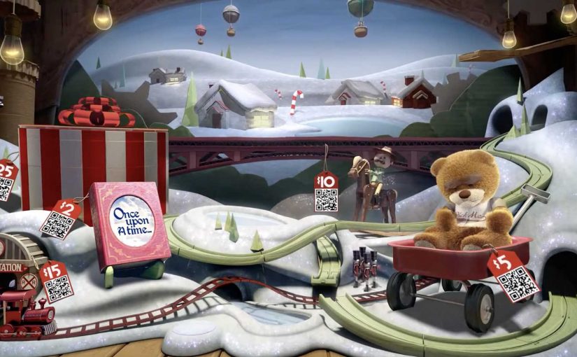
eBay: Give-A-Toy Store

One of the things that all people do during the holidays, besides real shopping, is window shopping. Storefront window displays therefore have a stronger significance during the holiday season. Keeping that in mind, eBay has developed a way to make this experience move from passive to interactive and engaging.

Give-A-Toy Store is a 3D Christmas window installation with QR code tagged toys, built to evoke the passer-by’s giving side. Scanning the QR codes inside the eBay app allows passers-by to donate that toy on the spot, with the window lighting up and rewarding them for the donation.

The window installation is currently available at Toys for Tots in New York (at 35th and Broadway) and San Francisco (at 117 Post St).

Additionally customers can also customize their own toys on eBay’s Facebook page. For each toy created, eBay will donate $1 (up to $50,000).

From window shopping to “giving on the sidewalk”

This is a simple flip. The window is no longer just display media. It becomes a donation interface. You look, you scan, you give. Then you get instant feedback in the physical world.

How the mechanism does the heavy lifting

The mechanic is intentionally friction-light. Toys are visually presented as scannable choices. The QR tag is the call-to-action. The eBay app is the checkout. The window lighting up is the reward loop, confirming that something happened and making the act feel social even if you are alone.

In high-traffic retail corridors, a good interactive storefront turns waiting and wandering into measurable intent, without asking people to step inside.

Why it lands in a holiday crowd

It works because it respects the window-shopping mindset. People are already browsing. They are already comparing. This just adds a small, clear next step that feels aligned with the season. The visual “thank you” in the window also matters. It makes the donation feel immediate and real, not abstract and back-end.

Extractable takeaway: If you can make the environment visibly react to a mobile action, you create trust and momentum. The moment becomes self-explanatory, and bystanders learn the behavior just by watching.

What the brand is really building

The real question is whether a holiday storefront can turn passing attention into a mobile action that feels immediate enough to complete on the sidewalk.

This is not only about donations. It is a product demo for mobile commerce in disguise. It shows that scanning can be a legitimate buying action, that the phone can complete a transaction in seconds, and that the brand can connect physical retail ritual with digital conversion.

What this teaches about interactive storefronts

  • Make the first action obvious. If scanning is the behavior, the codes must look like the product tag.
  • Design a physical confirmation. Light, motion, or animation reduces doubt and makes the act feel rewarding.
  • Keep the choice set tight. Fewer, clearer options beat a cluttered scene when people are walking past.
  • Match the moment. Holiday giving is a natural fit for “instant donate” mechanics.
  • Make it watchable. When others can see the window respond, you get free teaching and free social proof.

A few fast answers before you act

What is the core idea behind Give-A-Toy Store?

Turn a holiday window into a scannable donation experience, so giving happens in the same moment as browsing.

Why does the window lighting up matter?

It provides immediate confirmation and reward. That reduces hesitation, makes the interaction feel real, and invites others nearby to notice and copy the behavior.

What makes this different from a normal QR campaign poster?

The display is the product experience. The scene feels like a store window first, and the QR code is integrated as a natural “price tag” action rather than a separate ad instruction.

What is the biggest execution risk?

Friction. If scanning is unreliable, the app flow is slow, or the codes are hard to spot at walking distance, people will not complete the action.

How would you adapt this if you do not have an app?

Keep the structure. Use a fast mobile entry point, and pair it with a visible physical confirmation so people know their action worked.
IKEA: Catch the Swedish Light

Summer is usually a slow period for IKEA in Belgium, and IKEA wanted to change that. Instead of running traditional advertising for summer offers, they built an interactive YouTube game that challenged viewers to “catch the Swedish light.”

Click here to watch the case video on the AdsSpot website.

A YouTube mechanic that turns attention into speed

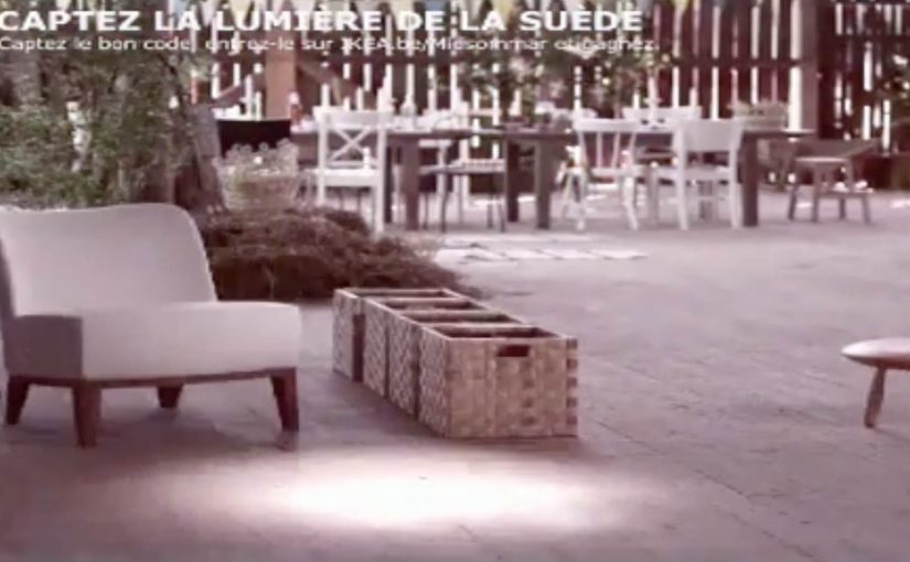
The game used a set of 48 different ads. Viewers had to pause the spot at the exact moment a beam of light hit a product. In that unique frame, a yellow code appeared in the top right corner. The first person to validate the code on the summer microsite won the product instantly.

In seasonal retail marketing, this kind of mechanic works best when it converts passive viewing into an action that is both simple and time-sensitive.

Why this is a smart use of YouTube’s constraints

The neat twist is that the limitation becomes the hook. Because YouTube is not designed for frame-perfect browsing, the challenge feels like a real skill moment rather than a basic form-fill. That “I nailed it” feeling is the reward even before the prize lands.

Extractable takeaway: If you want people to pay full attention to video ads, give them a single, clear reason to watch closely, and make the payoff depend on timing rather than effort.

What IKEA is really optimizing for

Yes, it is a prize mechanic. But the deeper objective is to turn summer browsing into a competitive habit. Viewers must watch actively, replay, and react quickly, which increases recall of products and offers without relying on heavier messaging. The real question is whether you want your summer promo to be remembered as an offer, or as a skill moment people choose to replay. This is a stronger play than a standard summer-offers spot, as long as the validation race feels fair across devices.

What to steal from Catch the Swedish Light

  • Make the win condition visual. A light beam hitting a product is instantly understandable.
  • Keep the action atomic. Pause at the right moment. Capture code. Validate. Done.
  • Use scarcity properly. “First to validate wins” creates urgency without extra complexity.
  • Scale through variations. Multiple ads keep the game fresh and reduce repetition fatigue.
  • Protect fairness. If latency (the delay between a code submission and server confirmation) or site load affects outcomes, communicate rules clearly and log validation times reliably.

A few fast answers before you act

What is “Catch the Swedish Light” in one sentence?

It is an IKEA Belgium YouTube-based game where viewers pause ads at the exact moment light hits a product to reveal a code, then validate fastest to win instantly.

Why does “pause at the right frame” drive engagement?

Because it forces active viewing. People stop multitasking, replay moments, and concentrate to hit the timing.

What makes this better than a standard prize draw?

The outcome feels earned. Speed and attention decide the winner, which makes participation more exciting and shareable.

What is the biggest execution risk?

Perceived unfairness. If buffering, device differences, or slow microsite performance decide winners, sentiment can flip fast.

What should you measure beyond views?

Replay rate, average time spent per viewer, code validation volume, site conversion rate, and whether product interest rises during the slow summer window.

Toyota Scion “Microsoft Surface Experience”

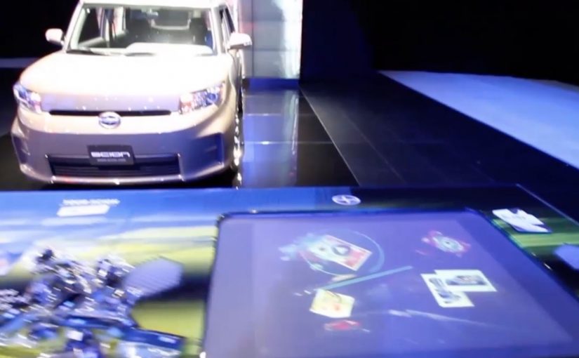
You walk up to a Microsoft Surface table at a Scion auto show stand and pick up one of the collectible cards. You place it on the table and the surface immediately reacts. Photos, video content, regional sales information, and localized events appear around the card. You flip the card over and it triggers a musical element. Beats, bass, or vocals. When all eight cards are on the table at the same time, the full song plays and the table turns into a simple, social remix station.

Auto shows as a lab for new interfaces

At the 2011 International Motor Show in Frankfurt, the pattern is easy to spot first-hand. The brands that win attention make exploration physical and obvious.

The activation. Scion meets Microsoft Surface

If you visit upcoming auto shows late this year or in 2012, you can run into the Scion Surface Experience, built on Microsoft Surface tables. Toyota’s agency Juxt Interactive designs the experience to let visitors explore Scion’s product, racing, and cultural affiliations in an unexpected way.

How it works. Eight cards, two sides

The interaction is built around a deck of eight collectible cards:

  • Place a card on the Surface and the table reveals photos, video content, regional sales information, and localized events.
  • Flip the card over and it triggers one element of a song, such as beats, bass, or vocals.
  • Place all eight cards on the Surface at once and the full song plays.

Once the full track is unlocked, guests can remix the song in their own way. It reinforces the self-expression that sits at the core of the Scion brand story.

In auto show environments, where multiple brands compete for brief attention in the same hall, interfaces that make participation obvious outperform passive display messaging.

The take-home loop. Physical tokens for digital content

The cards do not end when the stand visit ends. Guests can take their cards home and use them to download digital content connected to the auto show experience. The business intent is clear: use play to pull visitors into deeper product content, then extend recall beyond the booth with a take-home trigger.

Why this works. Exploration first, messaging second

This is a clean example of experiential design where the interface creates the interest. The collectible cards make the first step easy, the Surface makes the response immediate, and the “complete the set” mechanic rewards curiosity. The “complete the set” mechanic means each added card reveals more value, so the interaction naturally pulls people toward finishing the sequence together. Because each added card changes the output immediately, the table turns product exploration into a visible group activity, which keeps people engaged longer than a passive stand screen.

Extractable takeaway: When you want people to explore branded content, give them a physical trigger, an immediate digital response, and a group reward for going deeper.

The real question is how to turn product exploration into something people want to start, continue, and share with the people beside them.

What to steal from this interface-led booth

  • Make the first move physical. Use a tangible trigger that is obvious, low-friction, and instantly responsive.
  • Turn content into discovery. Let people unlock information through curiosity, not a forced linear demo.
  • Design for small groups. Build in a reason to collaborate, compare, and “complete the set” together.
  • Extend the moment beyond the booth. Give visitors a take-home token that continues the experience after the event.

A few fast answers before you act

What is the Toyota Scion Microsoft Surface Experience?

An auto show installation that uses Microsoft Surface tables and eight collectible cards to explore Scion content and trigger a music remix experience.

What happens when a card is placed on the table?

The Surface reveals photos, video content, regional sales information, and localized events tied to the stand experience.

What happens when the card is flipped?

It triggers a part of a song, such as beats, bass, or vocals.

Why are there eight cards?

Placing all eight cards on the Surface at the same time unlocks the full song, and turns the table into a simple remix station.

What is the lasting value beyond the booth moment?

Visitors can take the cards home and use them to download digital content related to the auto show experience.