
GranataPet: Check In, Snack Out

GranataPet is one of the innovative leaders of high premium pet food in Germany. Their agency, agenta, was given the challenge to create awareness for GranataPet dog food on a slim budget.

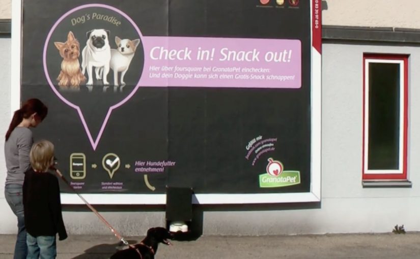
The idea targets dog owners at the exact moment they are most open to noticing pet-related messages. While walking their best friend. Socially activated installations are placed on key walking routes. Dogs catch the scent of treats, stop, and pull their owners toward a billboard that simply says “Check in. Snack out”.

A sampling demo that your dog starts for you

This is a classic trial mechanic with a smart trigger. Instead of asking humans to approach a promoter, the dog does the targeting. The owner follows the leash. Then the message becomes self-evident. Check in with Foursquare to activate a free bowl of dog food.

How the mechanism works

The billboard combines three parts. A location check-in prompt, a connected dispenser and bowl, and a social echo via the check-in behavior, meaning each check-in can create additional visibility beyond the street placement itself. When a user checks in at the billboard’s location, the system releases a portion of food into the bowl. The owner watches the dog’s reaction in real time, which functions as the product demo.

In pet food sampling, the highest-converting trial moments are the ones where the animal can deliver an immediate preference signal in front of the owner.

The real question is whether the brand can turn a routine walk into a low-friction proof moment that the owner trusts more than advertising copy. The stronger move here is to let the dog, not the promoter, make the case.

Why it lands

It is easy to trigger, well-timed, and emotionally loaded. The owner does not have to imagine whether the dog will like the food. They see it. That works because a visible reaction from the dog removes guesswork faster than any product claim can. The social layer then turns one local poster into distributed impressions, because check-ins can surface to friends depending on settings. The most important part is that the “proof” is not the copy on the billboard. It is the dog’s behavior.

Extractable takeaway: If your product decision depends on a third party’s preference, build a live demo where that third party delivers the verdict on the spot, and use a simple location trigger to scale it.

What the brand is really buying

This is awareness, trial, and measurable demand in one loop. The execution creates talk value, it generates trackable interactions per location, and it pushes owners toward retail purchase after a positive in-the-moment test. Trade coverage at the time also described increased local demand following the activation.

What pet food marketers can steal from this

  • Target the moment, not the demographic. Dog-walking routes beat broad reach when the category is specific.
  • Let behavior be the headline. A happy dog is more persuasive than any claim line.
  • Make the trigger simple. One action. One reward. No explanation tax.
  • Use the environment as your interface. The billboard is the call-to-action and the proof point.
  • Instrument the activation. Location check-ins can double as measurement, not just distribution.

A few fast answers before you act

What is “Check in, snack out” in one sentence?

An interactive billboard that dispenses free dog food when a nearby owner checks in using a location service.

Why does this outperform a normal sampling stand?

The dog initiates the interaction, and the product proves itself immediately through the dog’s reaction, which reduces hesitation for the owner.

What makes the social layer valuable here?

Check-ins can create secondary reach beyond the physical location, and they can be used to track which placements generate the most interactions.

What is the biggest operational risk?

Reliability. If the dispenser jams or the trigger fails, the experience collapses and the brand takes the blame.

How would you adapt this without Foursquare?

Keep the same structure. A location trigger plus instant physical reward. Use whatever mobile mechanism your audience already uses for quick opt-in and confirmation.
Flair: Fashiontag

Women are always looking for inspiration for their wardrobe and most of the time they find this inspiration by looking at other women.

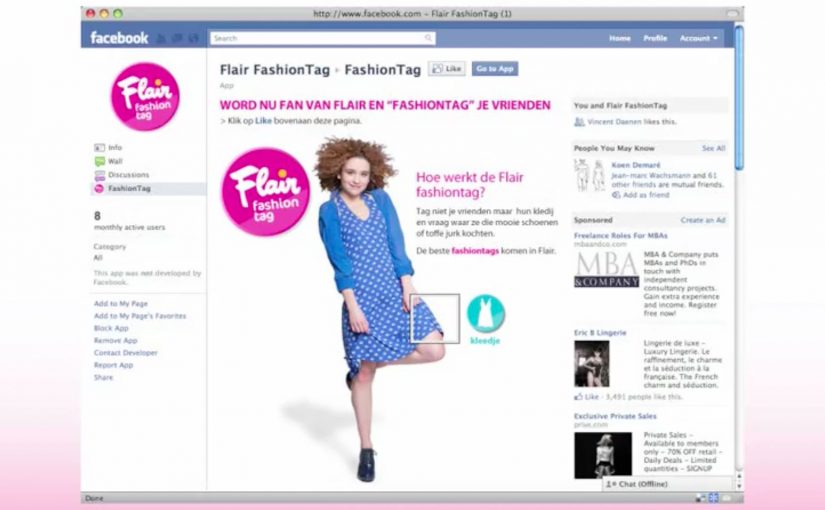
This inspired agency Duval Guillaume to create a Flair Fashiontag Facebook app for Belgian women’s magazine Flair. In the app, instead of tagging people, you can tag people’s clothes or accessories and ask them where they got them.

All fashiontags are displayed in a Facebook gallery, and the best are published in the weekly edition of Flair. This way there is constant interaction between the Facebook application and the magazine itself.

Turning social curiosity into a repeatable format

The mechanism is a simple swap. Replace social tagging of people with social tagging of products. A photo becomes a shoppable question. The owner of the outfit becomes the source. The magazine becomes the curator that elevates the best finds from feed to print.

In fashion and lifestyle publishing, converting casual “where did you get that” moments into a structured loop is a practical way to keep community activity and editorial output feeding each other.

The smart move here is to treat wardrobe curiosity as a content engine, not as a side effect of social chatter. The real question is how to turn that curiosity into a repeatable loop that helps readers in the moment and gives the magazine something worth curating.

Why it lands

This works because it formalizes a behavior that already exists. People already look at outfits, notice details, and ask friends for sources. Fashiontag simply gives that behavior a native interface and a public gallery, then adds a prestige layer by featuring the best tags in the weekly magazine.

Extractable takeaway: If your audience already asks each other for product sources, build a lightweight format that captures those questions in the moment and rewards the best contributions with visible amplification.

What to steal from Fashiontag

  • Swap the object of attention: tag the item, not the person, when product discovery is the real intent.
  • Close the loop with curation: a gallery is useful. Editorial selection makes it aspirational.
  • Make participation low-friction: one tag, one question, one shareable output.
  • Bridge channels on purpose: use print, site, and social as a single system, not separate campaigns.
  • Protect the social contract: ensure the person in the photo is comfortable with tagging and featuring, especially when content moves into a magazine.

A few fast answers before you act

What is Flair Fashiontag?

It is a Facebook app for Flair magazine that lets users tag clothes or accessories in photos and ask where those items were purchased.

What makes it different from normal photo tagging?

Normal tagging identifies people. Fashiontag identifies items. It turns fashion curiosity into a structured question-and-answer interaction.

How does the magazine benefit from the Facebook app?

The app creates a steady flow of wardrobe inspiration and real questions from readers. The magazine then curates and publishes the best tags, which reinforces participation.

Why is this a strong community mechanic?

Because it rewards helpfulness. People contribute sources and recommendations, and the gallery plus print selection turns that help into recognition.

What is the biggest risk in this format?

Consent and comfort. Tagging items in someone’s photo can feel intrusive if the person did not opt in, especially if content can be featured publicly in print.

Corning: A Day Made of Glass

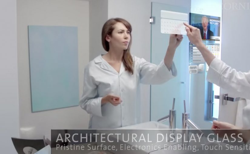
Here is a future vision video by Corning, on where they see multi-touch digital displays over the next few years. Multi-touch means the surface can track several fingers or hands at once, so gestures like pinch, rotate, and shared interaction become natural.

What the film is really demonstrating

The core mechanic is simple. Turn glass from “protective cover” into “primary interface”. Every surface becomes a screen. Every screen becomes responsive to direct manipulation. Information follows you across contexts, from home to school to office, with the same touch-first language, meaning a shared set of gestures and feedback that stays consistent across devices.

In consumer electronics and workplace IT, concept films like this are used to align designers, suppliers, and product teams around a shared interface direction.

The real question is whether your interaction language can stay consistent as screens spread across surfaces and contexts.

Treat the glass as incidental. The interaction model is the product.

Why it lands

It removes the usual friction between people and devices. No boot-up rituals, no “find the remote,” no hunting through menus. You touch the thing you want to change, and the system answers in place. That immediacy is the real promise, not the glass itself. Because the system responds at the point of intent, it reduces both cognitive load and coordination cost in multi-screen tasks.

Extractable takeaway: When you are pitching a new interface paradigm, show behavior before hardware. Make the gestures, feedback loops, and handoffs between screens unmistakable, so the idea remains valuable even if the materials and form factors change.

What to steal for your own work

  • Design the interaction language first. Define the small set of gestures and responses that can travel across surfaces, sizes, and contexts.
  • Keep information anchored to the object or task. The winning moments happen when data appears exactly where the decision is being made.
  • Plan for multi-user moments. Big surfaces invite collaboration. Design for two people at the same time, not just one user plus spectators.
  • Prototype the “seams.” The handoff between phone, table, wall, and car is where most visions break. That is the first place to test.

A few fast answers before you act

What is “A Day Made of Glass” trying to communicate?

It is a vision of glass becoming an interactive medium, where touch-first displays move from dedicated devices into everyday surfaces.

What’s the practical value of watching concept videos like this?

They are useful for spotting interface patterns early, then translating the patterns into near-term prototypes and roadmap language for teams and partners.

What’s the biggest product risk in “glass everywhere” thinking?

Over-indexing on the surface and under-investing in the interaction model. If the gestures, feedback, and context switching are weak, the material does not matter.

What is one immediate takeaway a UX or product team can apply?

Write a short “interaction grammar” for your experience, then test it across at least two form factors. If the grammar does not travel, the concept will not scale.

Who should use this kind of vision film internally?

Use it when you need to align design, product, and IT partners on a shared interaction direction before you lock hardware decisions.