
Coca-Cola Second Screen Reinvented

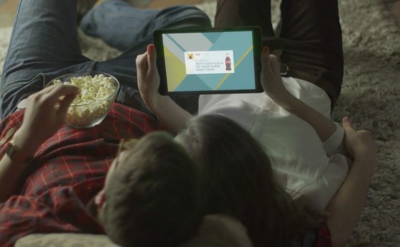
You are watching a Coca-Cola TV spot in Israel. Your phone lights up. A “Gett Coca-Cola” prompt appears. You tap once. Five minutes later, a special Coca-Cola package shows up at your door: a branded cooler, two Coke bottles, and a bottle opener.

From TV spot to one-tap delivery

Turn a TV ad into a one-tap order, and make “second screen” mean immediate delivery, not just engagement. Here, “second screen” means the phone acting as the immediate action surface while the TV spot supplies the trigger.

What is actually happening on the second screen

The TV spot carries an audio trigger that a smartphone can recognize. The moment the ad plays, phones with the Gett app installed receive a push notification. The viewer swipes or taps, and the order is placed in one click.

In practice, this behaves like Shazam for commerce. Except the payoff is not identification. It is fulfillment.

Why the Gett partnership is the real unlock

The ad is only half the experience. The other half is logistics.

To make the “five minutes later” promise credible, Coca-Cola partners with Gett, a local taxi app, and during the promotion Gett dispatches thousands of vehicles packed with branded coolers across Israel, ready to deliver on demand.

In FMCG and retail campaigns, the strategic value is not the novelty of a second screen, but the ability to compress media, commerce, and fulfillment into one immediate behavior.

The real question is whether the brand can remove enough friction that attention turns into action before intent cools.

Why this feels like a reinvention of TV, not a gimmick

This is not a gimmick. It is a tighter piece of commercial design because the creative, transaction, and fulfillment layers are built to work as one system.

Extractable takeaway: When a campaign links attention, transaction, and delivery inside one continuous action, the medium stops acting like awareness-only media and starts behaving like a service.

It collapses the funnel

There is no gap between awareness and action. The moment of attention is the moment of purchase.

It turns “sampling” into a media format

The campaign is a TV impression plus product trial, delivered instantly.

It makes the second screen earn its place

Second screen ideas often stop at polls and hashtags. Here, the phone is not a companion. It is the checkout button.

The deeper point

This is what “buyable advertising” looks like when it is engineered end to end. By “buyable advertising,” this means media that lets a viewer move from exposure to transaction without leaving the moment.

The business intent is simple: remove the lag between media spend and product trial by turning broadcast attention into immediate, measurable fulfillment.

Media triggers action. Action triggers logistics. Logistics completes the brand promise while attention is still warm.

What to steal from this buyable-media model

  • Collapse the funnel deliberately: If you can connect attention to action in one gesture, the “ad” becomes the first step of the purchase flow.
  • Make the trigger earn its existence: Second screen only matters when it changes the outcome, not when it adds commentary.
  • Engineer fulfillment as part of the creative: The logistics promise is the product. Treat it like core campaign craft, not an ops afterthought.
  • Turn sampling into a format: Delivering the kit is the media unit. That is why this reads as more than a shoppable banner.
  • Protect trust explicitly: Any “listening” mechanic needs clear permissioning and transparency, or the whole experience flips from magic to creepy.

A few fast answers before you act

What does the TV ad do that is different?

It uses an audio trigger so phones can recognize the ad and prompt a “Gett Coca-Cola” order on the second screen.

Do viewers need anything installed for this to work?

Yes. The flow depends on the Gett app, since the notification and one-tap order happens inside Gett.

How does it deliver so fast?

Gett uses its taxi network as a delivery fleet, with cars preloaded with the cooler kits during the promotion.

Why is this more powerful than a “second screen” hashtag?

Because the second screen is not commentary. It is conversion plus fulfillment.

What is the main risk brands must manage?

User trust. Any experience that “listens” for triggers must be transparent and permissioned, or it will feel creepy, even if the mechanics work.
The Great Escape

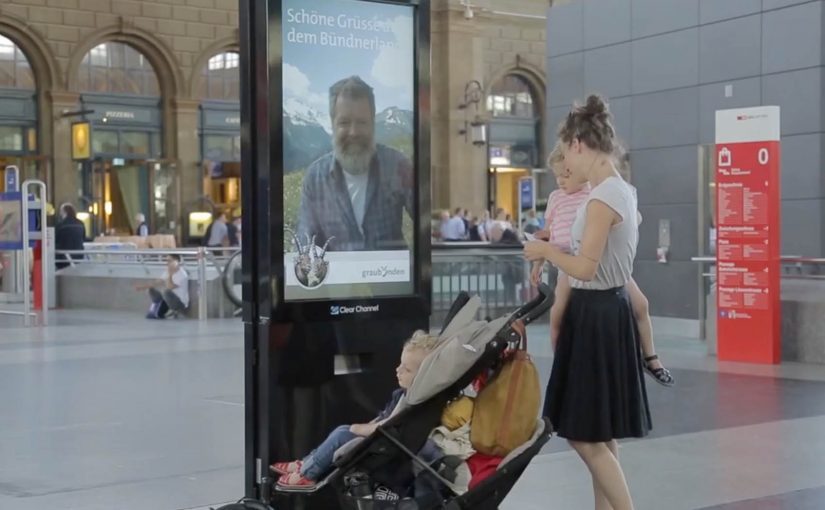
A stressed commuter walks through Zurich’s main train station, eyes forward, pace set to “late again.” Then a large interactive display stops them. On screen is a real Graubünden mountain man. He sees them. He speaks to them. He invites them to step out of the city and into the mountains. The offer is not “someday.” It is now. An all-expense-paid trip to Vrin, a mountain village in the Lumnezia Valley. The only catch is brutal and perfect. They have to drop everything and jump on the train leaving from the next platform.

Escape in one decision

Bring the mountain to the most hectic place in Switzerland, then make escape a one-decision act.

The context you already build on

In 2011, Graubünden Tourism and Jung von Matt had created a clever stunt to publicize the remote mountain village of Obermutten on Facebook. There they targeted people closer to home, specifically stressed urban commuters in a Zurich train station.

What happens at Zurich station

Step 1. Replace “beautiful scenery” with a human invitation

Instead of showing landscapes, the campaign puts a real local face in front of commuters. He can see and talk to people as they walk past. It feels personal, not broadcast.

Step 2. Turn interaction into an offer with real stakes

Anyone who engages is offered an all-expense-paid trip to Vrin. The offer is framed as a cure for stress, delivered at the exact moment stress is visible.

Step 3. Make the brand promise non-negotiable with one constraint

The only catch is the mechanism. By mechanism, I mean the single rule that turns the offer into a test. They have to drop everything and take the train that is about to leave from the next platform. That single constraint transforms the idea from a nice story into a real test of desire.

In European destination marketing, the hardest part is turning “someday” escape into a choice people will make on an ordinary weekday.

The real question is: can you turn “escape” from a promise into a decision someone can make in under a minute?

Why this works as live communication

Here, “live communication” means a real person responding in real time, not a pre-recorded loop.

Extractable takeaway: When you sell an experience, shorten the gap between promise and proof. Use live interaction plus one simple constraint so the choice becomes meaningful.

It collapses the distance between promise and proof

Tourism often sells “escape” as a future plan. Here, escape is immediate, and the decision is binary. Stay, or go.

It uses technology to create intimacy, not spectacle

The interactive display is not the point. The point is that someone in the mountains is speaking to you directly in the middle of the city.

The constraint is the creative

The “next train” rule is what makes it unforgettable. It forces commitment. It also creates the story people retell because it is a moment with consequence.

The deeper point

Escape marketing works best when it demands a real choice, not passive appreciation. If you want people to believe in a destination, do not just show it. Put a human being from that place in front of the audience, then convert emotion into action with a simple, immediate next step.

Practical moves for instant escape offers

  • Lead with a human: Put a real local face in front of people, not a montage of scenery.
  • Make “now” the default: Frame the reward as immediate, not a future plan or a delayed sweepstakes.
  • Use one constraint: Add a single rule like “next train” so the offer becomes a test of intent.
  • Design for retellability: Build a moment with consequence that people can summarize in one sentence.

A few fast answers before you act

What is The Great Escape in one sentence?

An interactive display in Zurich station lets a real Graubünden mountain man speak to commuters and invite them on an immediate trip to Vrin.

What makes it different from standard digital out of home?

It is not a looped video. It is a live, human interaction that turns attention into a real decision.

What is the key mechanic that creates urgency?

The “next platform, next train” constraint. People have to go now, not later.

How does it connect to the earlier Obermutten work?

It builds on the same strategy. Make a remote mountain place culturally visible through an idea that people actively participate in.

What is the reusable pattern for brands?

If your promise is experiential, create a live proof moment, then add a constraint that forces a meaningful choice.

Nivea SunSlide

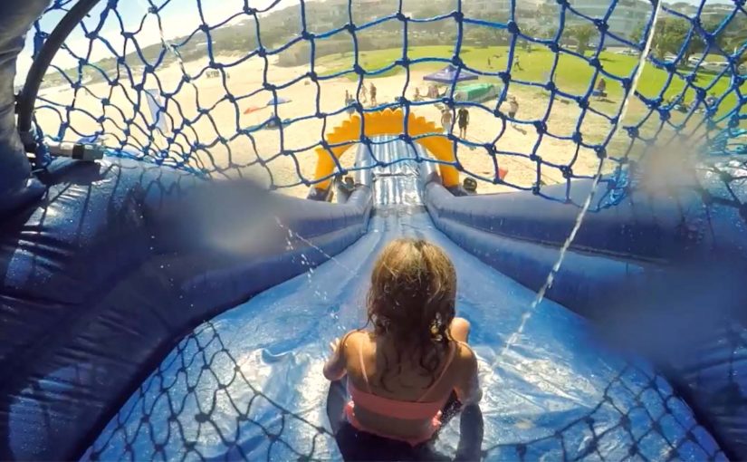
Kids are at the beach. They want to run, swim, and slide for hours. Parents want one thing first: sunscreen. That usually means a negotiation. Nivea flips the dynamic by turning sun protection into the game itself. It builds a slip-and-slide that sprays water-resistant SPF 50+ as kids go down. One ride applies the sunblock. The line is simple and strong: the “funnest” way to apply sunscreen. The claim is even better because it is measurable: one slide covers about 100 kids per hour.

The core move

Remove the biggest friction in kids’ sun protection by embedding sunscreen into something they already want to do.

The real problem it solves

Parents do not struggle with intent. They struggle with compliance.
Kids do not resist sunscreen because they hate protection. They resist because applying it interrupts fun.

The real question is how you make sun protection happen without making kids stop the fun.

SunSlide is a behavioral design solution. By behavioral design, I mean shaping the environment so the desired action happens as the default. It makes the protected action the entertaining action.

What gets built

A physical slide that sprays sunscreen as part of the ride. The experience does not ask kids to pause. It rewards them for participating. By turning application into the ride, it removes the interruption that triggers resistance.

In some coverage, the wider campaign context frames this against South Africa’s high skin-cancer risk and the heightened vulnerability of children, which is why “make protection automatic” becomes the creative strategy.

Why it works as brand experience

It works because the product promise is delivered as a moment of play, not a lecture.

Extractable takeaway: If you can embed a protective behavior into something people already want to do, adoption feels like participation and the brand earns trust through utility.

Utility is the message

The campaign does not tell you to protect your kids. It shows a mechanism that does it.

The product truth is delivered through physics

Water-resistant SPF is not a claim on a pack. It is the substance literally flowing through the experience.

The story is instantly repeatable

“A slide that applies sunscreen” is a one-sentence idea that travels without explanation.

The deeper point

Brand experience works best when it earns attention by being useful. This is what brand-led innovation looks like when it is honest. It takes a genuine consumer pain point, removes friction with a physical design, and makes the brand feel helpful rather than preachy.

What to borrow if you design activations

  • Find the one moment people always skip. Do not start with awareness. Start with the behavioral gap. Here, it is the interruption moment.
  • Convert interruption into participation. If the solution feels like a rule, people resist. If it feels like play, they opt in.
  • Make the benefit visible and countable. “100 kids per hour” makes the idea feel real. It turns a stunt into a scalable concept.

A few fast answers before you act

What is SunSlide?

A slip-and-slide that sprays water-resistant SPF 50+ sunscreen onto kids as they ride, making sun protection automatic.

What problem does it solve?

It removes the recurring “stop and apply sunscreen” interruption that kids resist and parents dread.

Why is it effective as marketing?

Because the product benefit is experienced, not explained. The activation becomes the proof.

What is the key behavior design lesson?

If you can embed the desired behavior into something people already enjoy, compliance becomes participation.

What is the biggest risk with this kind of idea?

If the experience feels unsafe, messy, or untrustworthy, parents opt out immediately. The execution must feel controlled, clean, and credible.