Magnum Pleasure Hunt 2: bigger, bolder sequel

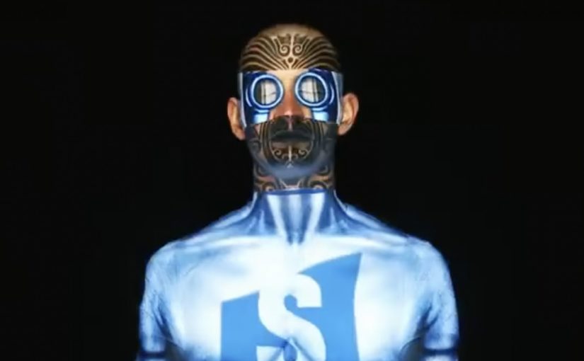
Last year, to launch the all new Magnum Temptation Hazelnut ice-cream, Swedish agencies Lowe Brindfors and B-Reel created an advergame called “Magnum Pleasure Hunt Across The Internet”. In the game, players are taken across 20 well known websites as they collect Bon Bons, the special ingredient of the Magnum Temptation Hazelnut ice-cream.

Since the game did exceedingly well, Magnum and team came up with round 2, enhanced with 3D graphics. This time players were taken on a run in New York, made to fly over Paris, and surf the waves in Rio De Janeiro, using a map and street-view style interface as the playground.

In global FMCG brand launches, advergames like this work when they turn “a product promise” into a simple, replayable challenge people can explain in one sentence.

What changes from round 1 to round 2

The first game is a browser-bending sprint that treats the wider internet as a set of levels. The sequel shifts the same chase mechanic into city environments, with more depth, more spectacle, and clearer “set pieces” you can remember after one play.

  • Round 1: web-hopping levels and Bon Bons as the core collectible.
  • Round 2: city-based runs plus a stronger 3D feel for movement, obstacles, and momentum.

Why it lands: it feels like discovery, not advertising

This is not a microsite you click once and forget. It is designed as a time-and-score loop. You play again to improve your route, your timing, and your collection count, and that repeat play is where the brand association gets built.

It also matches Magnum’s “pleasure seeking” positioning with a mechanic that is literally a hunt. You are always chasing the next small reward.

The smart brand logic behind the Bon Bons

Bon Bons are a neat choice because they let the product story travel inside the gameplay. You are not only collecting points. You are collecting the “ingredient” that makes the new variant feel specific, even if you never read a product description.

What to steal if you plan a sequel campaign

  • Keep the core rule the same. Sequel energy comes from familiarity, then escalation.
  • Upgrade the world, not the instructions. New environments create novelty without re-teaching the game.
  • Build signature moments. New York, Paris, and Rio act like memorable chapters, not just backgrounds.
  • Make it easy to share a result. If the outcome is a score or time, people instantly understand what “good” looks like.

I think it is a great follow up to the first version. Magnum Pleasure Hunt 2 could be experienced at www.pleasurehunt2.mymagnum.com.


A few fast answers before you act

What is Magnum Pleasure Hunt?

It is a branded advergame where players chase and collect Magnum Bon Bons, originally by racing across well known websites as game levels.

What is different about Magnum Pleasure Hunt 2?

The sequel moves the action into city environments, adds a more cinematic 3D feel, and turns New York, Paris, and Rio into distinct stages of the chase.

Why does the “hunt” mechanic fit the Magnum brand?

Because it translates the idea of “pleasure seeking” into a simple action loop. Keep moving, keep collecting, keep chasing the next reward.

What makes an advergame replayable enough to matter?

Clear scoring, short rounds, and visible improvement. If players can beat their own time or score, they come back.

What is one practical takeaway for marketers?

If you plan a sequel, keep the rules familiar and escalate the world. That is how you get “new” without losing the audience you already earned.

Samsung Galaxy Y Duos: Human Face Mapping

A man sits still in a chair, and his face becomes the screen. Light wraps perfectly around skin, eyes, and contours, switching identities and moods as if the head is a living billboard.

Over the years there have been numerous noteworthy projection mapping events and installations. In this latest example, Samsung, for the launch of its Galaxy Y Duos, a dual SIM smartphone, creates a very unusual projection mapping piece on a human face.

When mapping leaves the building

The mechanism is the point. Projection mapping normally favors surfaces that do not move. Here, the “surface” is a face, which means every tiny change in angle threatens the alignment. The craft is in keeping the projected geometry locked to human features so the illusion stays believable.

In consumer technology launches, spectacle earns attention fastest when the medium demonstrates the product idea, not just a product visual.

Why this fits a dual SIM story

The creative metaphor is identity switching. Multiple personas, contexts, and “modes” land on one face, which mirrors the promise of a phone designed to manage two worlds without forcing a hard choice between them.

What Samsung is really buying

This is not a spec explanation. It is an attribution grab. The goal is to make “Galaxy Y Duos equals dual identity” stick in memory through a visual that feels new, technically ambitious, and hard to ignore.

What to steal for your next projection-led campaign

  • Make the mapping carry the meaning. The effect should express the product truth, not decorate it.
  • Choose a single metaphor and commit. Here it is identity switching. Everything supports that.
  • Design for instant comprehension. If it does not read in two seconds, the stunt becomes “cool tech” with no brand imprint.
  • Keep the hero shot simple. One clean sequence that people can retell beats five clever sequences no one can describe.

A few fast answers before you act

What is “human face mapping” in this context?

Projection mapping where the projected visuals are calibrated to a real face, so light and motion appear to sit on the skin and follow facial geometry.

Why is mapping onto a face harder than mapping onto a wall?

A face is complex and can move. Small shifts break alignment, so the illusion depends on precise calibration and controlled motion.

How does this connect to the Galaxy Y Duos product idea?

The piece uses shifting identities on one face as a visual metaphor for managing two SIM identities on one device.

What is the main advantage of a mapping stunt for a phone launch?

It earns attention through novelty, then links that attention to a single, memorable product idea people can repeat.

What is the biggest creative risk with this approach?

If the metaphor is weak, the audience remembers the technique but not the brand or the product message.

Pinterest 2012: Early Brand Campaigns

Pinterest is one of the most talked about and fastest growing social networks of 2012. What makes this social site different from the others is its pinboard-styled social photo sharing feature that allows users to create and manage theme-based image collections.

Since it is still very new, a lot of major brands do not know what to make of it. However, a couple have already found creative ways to exploit the potential of the new social media destination.

In early-stage social platforms, the first campaigns that win tend to be the ones that treat the platform’s native behavior, pinning, collecting, repinning, as the mechanic, not as an afterthought.

Four early Pinterest plays worth studying

Women’s Inspiration Day by Kotex

In Israel, Kotex reportedly identified 50 inspiring women and looked at what they were pinning on Pinterest, then sent them virtual gifts. If they re-pinned the gift, Kotex would send a real gift by mail. Smoyz, the agency behind the effort, claims nearly 100% of the women posted something about their gift, not only on Pinterest, but on Facebook, Twitter and Instagram.

Puzzle by Peugeot Panama

Peugeot Panama ran a contest that awarded fans who completed their Pinterest puzzle. The brand’s Pinterest presence featured images of cars running over two or more boards. In each case, a board was missing. To get the missing pieces, fans had to go to Peugeot Panama’s website to find and complete the full image set.

Color Me Inspired by Guess

Color Me Inspired by Guess

Guess challenged its fans to create boards based on four spring colors: Noir Teal, Hot House Orange, Red Hot Overdue and New Plum Light. Participants were asked to title their boards as “Guess My Color Inspiration” and pin at least five images, each tagged with #GUESScolor, in them. Four winners were then chosen by fashion bloggers Kristina Bazan of Kayture, Michelle Koesnadi of Glisters and Blisters, Jennifer Rand of Belle De Couture and Samantha Hutchinson of Could I Have That.

Pinterest Lottery by British Midland International

Pinterest Lottery by British Midland International

British airline “bmi” launched a game of chance to engage its fans. With “Pinterest Lottery”, bmi encouraged fans to re-pin up to six images of its travel destinations Beirut, Dublin, Marrakech, Moscow, Nice, London and Edinburgh. At the end of each week, the company chose a number at random, and users who had re-pinned the image with that number qualified for a chance to win a free return flight.

What these early campaigns get right

  • They make “repin” the action, not the decoration. The platform behavior is the participation mechanic.
  • They reward curation. People are not asked to broadcast. They are asked to build a board that reflects taste.
  • They turn visuals into utility. Gifts, missing puzzle pieces, color palettes, destination boards. Each idea uses images as a system, not as wallpaper.

What to steal if you are testing a new platform

  • Start with one native behavior. Make it do the heavy lifting, then build the incentive around it.
  • Design for identity, not reach. Boards are self-expression. Campaigns that respect that feel less like ads.
  • Keep the rules explainable. If the mechanic cannot be retold in one sentence, participation drops.

A few fast answers before you act

What made Pinterest feel different from other networks in 2012?

Its core object was a curated pinboard. People collected and organized images by theme, which made self-expression look like curation rather than status updates.

What is the common pattern across these early brand campaigns?

They use Pinterest’s native loop. Pin, repin, collect, complete. as the interaction, then attach a reward or outcome to it.

Why did Kotex’s approach travel well?

Because the output was personal and “worth pinning”. The gift reflected what someone had already revealed about themselves through their boards.

Why do puzzle and lottery mechanics fit Pinterest?

Because Pinterest already feels like collecting. Turning boards into completion tasks or numbered sets makes the platform behavior feel like a game, not a campaign.

What is the biggest risk when brands jump onto a new platform too early?

Forcing old formats into new behaviors. If the campaign does not feel native to how people already use the platform, it gets ignored or mocked.