AR in 2013: Three Retail-Ready Examples

AR in 2013: Three Retail-Ready Examples

Augmented Reality in 2013: when the real world becomes the interface

With smartphones and tablets becoming part of our everyday life, we also see more augmented reality apps mixing the virtual and the real world in 2013. Here are some examples from ARworks that recently caught my eye.

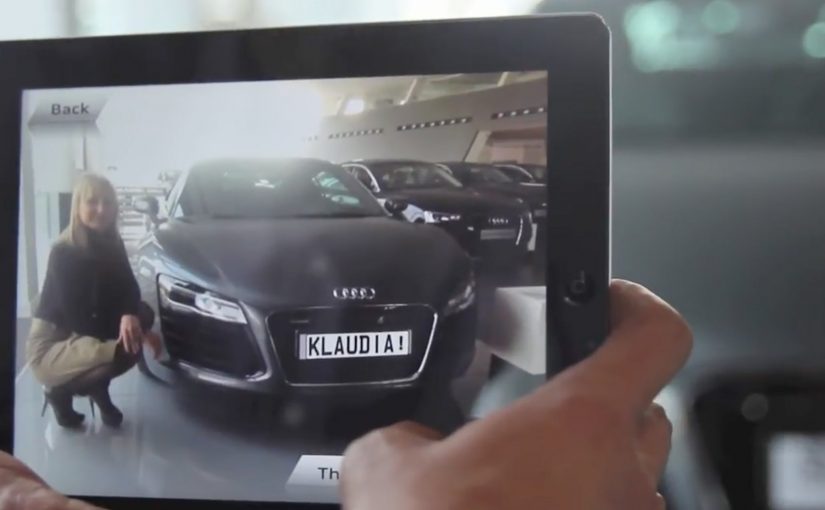
Audi Singapore Showroom app

For the opening of their biggest showroom in South-East Asia, Audi created AR experiences that allowed visitors to fly around the showroom building without actually boarding a plane, or drive the Audi R18 race car around Singapore at full speed without the risk of getting a ticket. What’s more, they even allowed visitors to personalize their individual license plates and then take photos with the car.

Dakar race in a shopping mall

A real Dakar desert racecourse was built for the new Opel Mokka on a 4mtrs long table that was placed in a shopping mall. Visitors could use the provided iPads to race against time and each other. The results were then shared on Facebook, and the weekly and overall winners received various prizes.

Christmas Ornament Sling

Deutsche Telekom, for their Christmas promotion, developed an iPad app where visitors could throw virtual Christmas ornaments containing their personal message onto a huge Christmas tree erected in a mall. A successful hit to one of the real ornaments on the tree lit it up through an integrated server application.

The pattern across all three: AR turns “watching” into doing

None of these examples treat AR as a gimmick. Each one uses the device as a bridge between curiosity and action. You explore a building. You race a course. You aim a message at a real tree. The screen stops being a place to consume. It becomes a tool to participate.

In retail and shopper environments, augmented reality works best when it turns a physical setup into a simple, repeatable action loop for the visitor.

The real question is whether your AR layer gives the visitor a simple verb and a payoff worth repeating.

Why retail is the natural habitat for AR

Retail already has the ingredients. Footfall, dwell time, and physical objects that can anchor the experience. AR simply adds a layer of viewer control. The visitor decides where to look, what to try, and what to share. This works because the physical anchor keeps the choice set small, so the device can turn curiosity into a low-friction action with an immediate outcome.

Extractable takeaway: AR earns its keep when the physical setup stays simple and the device turns it into a repeatable action that produces a visible outcome worth sharing.

What’s really being built here

These are not “apps.” They are engagement machines, meaning they turn a physical setup into an interaction loop with a reward and an easy share path. Each one creates a clear reason to interact, a clear reward for completing the action, and a clear path to share or repeat. That is how you turn novelty into behavior.

Four retail-ready AR mechanics to copy

  • Anchor it physically. Anchor the experience to a physical object people can gather around. A showroom, a tabletop course, a tree.
  • Give the visitor a simple verb. Fly, drive, race, sling. Actions beat features.
  • Design a tangible payoff. A photo, a score, a lit ornament. Make the outcome tangible.
  • Make sharing a by-product. Make sharing a natural by-product of the activity, not a forced button at the end.

A few fast answers before you act

What makes these 2013 AR examples feel “ready” for real audiences?

They are built around clear actions and clear rewards. The device is used to do something in the physical environment, not just view an overlay.

Which devices are central to these activations?

Tablets and phones are the delivery mechanism. The examples explicitly reference iPads and handheld devices for the AR interaction.

What role does sharing play in these concepts?

Sharing is tied to the activity. Photos with the car, results shared on Facebook, and personal messages sent as virtual ornaments.

What is the common mechanic across the three examples?

The camera-enabled device acts like a controller that links a real-world setup to a virtual experience, giving the viewer control over exploration and interaction.

How do you keep AR from feeling like a gimmick?

Make the overlay serve a real action and a visible outcome. If the visitor can do something concrete and see a result that is worth showing, the experience stops being novelty and starts being behavior.

Marie Claire: Print Pages You Can Tap to Buy

Marie Claire: Print Pages You Can Tap to Buy

Enabling readers to buy directly from magazines or newspapers is slowly going to become the industry standard, as revenues from print continue to slip.

Last year Ikea re-imagined their catalog via a special visual recognition app that brought its pages and offerings within to life. Now Marie Claire has taken it one step further by letting their readers use the Netpage app to interact with its printed pages, clip, save, share, watch and buy.

The Netpage app is described as using a combination of image recognition, augmented reality and digital twin technology. Hence no special codes, watermarks or special printing processes are required. In this context, “digital twin” is used to describe a digital counterpart of each page that can be recognized and linked to interactive layers.

Shoppable print, without QR code clutter

Shoppable print is the fusion of editorial content and commerce, where a reader can move from “I want that” to checkout directly from the page. The key difference here is interaction that is designed to feel native to reading. Not bolted on as a separate scanning ritual. Because the interaction stays inside the reading flow, it reduces friction, which is why it can earn repeat use instead of feeling like a one-time gimmick.

In magazine and brand teams trying to keep print premium while still making it measurable, invisible recognition is the interaction pattern that scales best.

The real question is whether your print pages can create measurable intent without forcing readers out of the reading flow.

Why this matters for magazines and brands

Once print becomes tappable, meaning a phone can recognize a specific page and surface actions, the page stops being an endpoint. It becomes a trigger for a whole set of actions, saving for later, sharing with friends, watching richer product context, and buying immediately.

Extractable takeaway: If a page can trigger trackable actions and even checkout, the magazine is no longer only monetized by ads and subscriptions. It can also participate in the transaction path.

Practical moves for tappable print commerce

  • Design interaction as a reading behavior, quick actions that fit the moment, not a separate “tech demo.”
  • Reduce visual noise, if recognition can be invisible, the page stays premium.
  • Offer multiple intent paths, not everyone wants to buy now, but they might save, share, or watch.
  • Make the jump from inspiration to action short, the fewer steps, the more commerce you unlock.

Publishers and brands should treat tappable print as a measurable commerce layer, not a novelty. The future is all about content being fused with commerce so that it’s a quick step from reading about an item to buying it. So get ready!


A few fast answers before you act

What does “interactive print” mean here?

It means a printed page can be recognized by a phone app and instantly connected to digital actions like clipping, saving, sharing, watching content, and buying.

How is this different from QR codes?

The interaction is designed to be code-free on the page. The recognition layer is meant to feel invisible, so the magazine layout stays clean.

What is the core value for readers?

Convenience. Readers can act on interest immediately, whether that means saving an item, sharing it, or purchasing it, without leaving the content context.

What is the core value for publishers?

A measurable engagement layer and a commerce path. Pages can generate trackable actions and potentially incremental revenue beyond print ads.

What is the biggest adoption risk?

Habit change. If the scanning flow feels slow or unclear, people will not repeat it. The first experience must be fast, obvious, and rewarding.

Checkout-Free Stores: 2 Startups Shape Retail

Checkout-Free Stores: 2 Startups Shape Retail

In-store shopping changes when the phone becomes the checkout

With smartphone penetration crossing the halfway point, two new start-ups push to change how we shop in-store.

The shift is simple. The phone is no longer just a companion to shopping. It becomes the point-of-sale, the service layer, and the trigger for fulfillment inside the store. By “checkout-free” here, I mean shoppers scan and pay on their own phone, with staff stepping in only for exceptions.

Because scanning and payment happen during the journey, peak demand spreads across aisles instead of stacking at one cashier line.

The real question is whether you can make the exception path feel as simple as the happy path.

Checkout-free is worth scaling only when your exception paths are as smooth as the happy path.

Why this lands in practice

In omnichannel retail operations, the biggest shopper experience gains often come from removing time sinks like queues and size-hunting, not from adding more screens.

Extractable takeaway: If you want measurable lift, redesign the store journey to delete time sinks first, then let the phone execute the flow.

QThru

QThru is a mobile point-of-sale platform that helps consumers at grocery and retail stores to shop, scan and check out using their Android and iOS smartphones…

The ambition is clear. Remove queues. Remove friction.

Shoppers move through the store with the same control they have online. Browse, scan, pay, and leave without the classic checkout bottleneck.

Hointer

Hointer automates jean shopping through QR codes.

When scanned using the store’s app, the jean is delivered in the chosen size to a fitting room in the store and the customer is alerted to which room to visit.

Once the jeans have been tried, customers can either send the jeans back into the system or swipe their card using a machine in each fitting room to make a purchase.

This approach removes two of the most frustrating in-store steps. Finding the right size and waiting to pay.

The store behaves like a responsive system rather than a manual process.

Steal these moves for checkout-free pilots

  • Delete one time sink first. Pick queues or size-hunting and design the flow to remove it end-to-end.
  • Make exceptions feel normal. Mis-scans, out-of-stocks, returns, and overrides need a fast, humane path.
  • Keep the shopper flow simple. The phone should execute scan-and-pay cleanly, without adding extra steps.
  • Operational reliability beats novelty. Inventory accuracy and in-store routing have to hold up when the store is busy.

A few fast answers before you act

What is the common idea behind both examples?

They move checkout and fulfillment logic into the shopper’s hands. Scanning, sizing, and payment become distributed across the store journey instead of centralized at a cashier line.

How do QThru and Hointer differ in the problem they solve?

QThru focuses on scan-and-pay to reduce queues. Hointer focuses on discovery and fitting-room fulfillment to remove size-hunting, then completes payment in the fitting room.

What has to be true operationally for checkout-free to work?

The system has to be reliable under load: accurate inventory, fast in-store routing, dependable scanning, and a payment flow that stays simple even when the store is busy.

What is the simplest way to pilot this without overbuilding?

Start with one store format and one tight journey. Measure queue time saved and staff exception workload, then expand only if operations stay stable.

What is the biggest failure mode teams underestimate?

Edge cases. Mis-scans, out-of-stocks, returns, fraud handling, and staff override paths. If exceptions are painful, the “friction-free” promise collapses at the worst moment.