Hyundai Elantra: Driveway Decision Maker

When choice made the Elantra harder to buy

In North American automotive marketing in 2012, the hardest moments are often the ones created by success: when a winner expands and the buyer suddenly has more to compare.

The Hyundai Elantra was named 2012 North America Car of the Year. Momentum was strong.

Then Hyundai introduced two additional variants. The Elantra Coupe and the Elantra GT. Suddenly, a clear win turned into a harder purchase decision.

More choice created more hesitation. Hyundai needed to simplify the decision again, without reducing the range.

Turning your driveway into the showroom

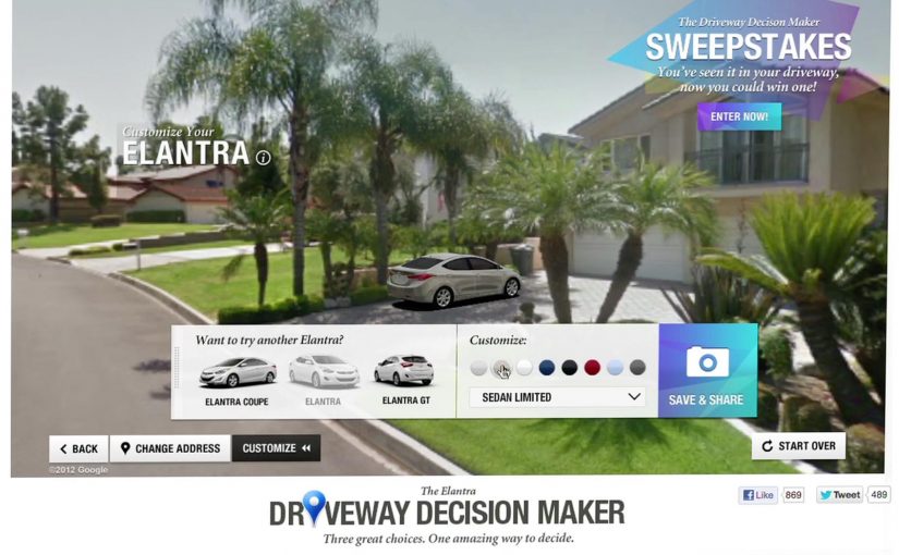
Instead of pushing another brochure or comparison chart, Hyundai built the Driveway Decision Maker, a tool that let prospective buyers preview what an Elantra would look like parked outside their own home.

By combining Google Street View, projection mapping, and real-time 3D animation, prospective buyers could see exactly what an Elantra would look like parked in their own driveway.

The experience replaced imagination with visualization. No guessing scale. No abstract renders. Just your house, your street, and the car.

In high-consideration categories where products physically live at home, a realistic preview in the buyer’s own environment reduces comparison fatigue.

Why seeing it at home removed friction

Car buying is emotional, but doubt creeps in when people cannot picture ownership.

Extractable takeaway: If your buyer must imagine ownership to decide, put a realistic preview into their own environment so the choice feels concrete.

The Driveway Decision Maker collapsed distance between consideration and ownership. By anchoring the car to a familiar, personal environment, Hyundai removed uncertainty about fit, size, and presence.

The experience also shifted control to the viewer. Instead of being told what to like, buyers explored the car in their own context.

The business goal behind the experience

The intent was not novelty. The real question is how you help someone choose when a clear winner becomes a lineup.

Hyundai wanted to reduce decision paralysis created by a broader lineup and move people confidently from interest to purchase. By helping buyers visualize the outcome, the brand shortened the path to commitment.

This was about restoring clarity, not adding noise. Interactivity is only worth it when it makes a decision easier.

What brands can steal from Driveway Decision Maker

  • Bring the product into the customer’s world. Context beats abstraction.
  • Replace imagination with visualization. Show the outcome, not the promise.
  • Use technology to remove doubt. Innovation works best when it answers a real buying question.
  • Support choice instead of limiting it. Help people decide rather than forcing simplification.

Hyundai invited consumers to try the experience themselves on the PickMyElantra site.


A few fast answers before you act

What problem was Hyundai solving?

Too much choice created hesitation. Buyers struggled to decide between Elantra variants.

How did the Driveway Decision Maker work?

It combined Google Street View, projection mapping, and real-time 3D animation to place the car into a buyer’s actual driveway.

Why was this more effective than a configurator?

Because it grounded the decision in a personal, familiar environment instead of abstract specifications.

What business outcome did Hyundai target?

Reducing purchase friction and restoring confidence across an expanded model lineup.

What is the transferable lesson?

If your product requires imagination to buy, use technology to make the outcome visible.

Tostitos: And Then There Was Salsa

Frito-Lay teamed up with online video sharing site Vimeo to create a new advertising campaign for their Tostitos Salsa. The video began with some beautiful CG which then quickly swallowed the viewer’s browser to become a full-screen experience.

When the player becomes the canvas

The execution starts like a normal hosted film. Then the interface itself becomes part of the performance, as the visuals expand beyond the frame and turn the browser window into the stage.

The takeover mechanic in plain terms

The mechanism is a deliberate break of expectation. Here, the takeover mechanic means the film expands beyond the player so the browser window itself feels absorbed into the ad. The film uses high-polish CG to earn trust, then escalates into a page takeover that makes the viewer feel like they have crossed a boundary from “watching” into “being inside” the world of the spot.

In digital brand experiences, fullscreen takeovers work when the format shift is the message, not just a louder container for the same footage.

Why this lands

It delivers a physical sensation in a purely digital space. That moment of “wait, my browser is gone” creates surprise and attention, and it also flatters the viewer by treating the screen as a cinematic environment rather than a box with controls.

Extractable takeaway: If you want immersion, do not only add detail inside the frame. Change the frame itself in a way that reinforces the story you are telling.

What Frito-Lay is buying with the Vimeo partnership

The intent is to make a salsa film feel like an event. A takeover turns a standard online view into a shareable “you have to see this” moment, and it associates the product with craft, spectacle, and a bit of controlled chaos.

The real question is how to make a salsa ad feel bigger than a pre-roll without losing the viewer in empty spectacle.

What to steal for your next immersive video

  • Earn attention first, then escalate. Start simple, then make the environment change once the viewer is already hooked.
  • Make the format shift meaningful. The jump to full-screen should feel like part of the narrative, not a gimmick.
  • Design one unforgettable beat. The takeover moment is the memory. Everything else supports that single peak.
  • Pick the right host for the idea. A platform partnership matters most when the platform’s norms are part of the contrast you are exploiting.

A few fast answers before you act

What is “And Then There Was Salsa”?

It is a Tostitos Salsa online film distributed via a Vimeo partnership, designed to shift from a normal player view into a full-screen browser takeover for a more immersive effect.

What is the core mechanic that makes it feel different?

The experience changes the viewing container. It starts as a standard video, then expands beyond the player and takes over the browser window, so the interface becomes part of the execution.

Why does the Vimeo partnership matter here?

It matters because the idea depends on contrast. A familiar hosted-player environment makes the takeover feel more dramatic when the film suddenly breaks out of it.

When is a fullscreen takeover a smart choice?

When the goal is to create a memorable moment rather than maximize completion rates. It is especially useful when craft and spectacle are part of the brand story.

What should you be careful about with this pattern?

Overuse and irrelevance. If the takeover does not reinforce the idea, viewers experience it as interruption. Performance and compatibility also matter because the format depends on smooth playback.

Alma: A Christmas Short

A Christmas-time discovery worth a watch

I have just come across a great animation called Alma. If you are looking for something different to watch this Christmas, it is available to stream online now.

How it works: hook, mood, and momentum

The mechanism is simple but effective. It opens with a strong visual premise, then builds tension through atmosphere and pacing. Because the premise is visually clear and the pacing stays tight, the viewer does not need backstory or context to keep watching. The film earns attention through mood and narrative pull.

In European digital media consumption, short films travel when they deliver a clear tonal promise, meaning an immediate signal of genre, stakes, and mood, early and then keep the viewer moving forward with compact storytelling.

Why it lands: it rewards full attention

Great animation works when every frame is doing a job. Short-form stories should be built to respect attention, not to pad time. The viewer keeps watching because the world feels intentional, and the payoff feels earned rather than stretched. It is the opposite of filler content. It respects the audience’s time.

Extractable takeaway: If you want full attention, make every frame earn its place. Remove anything that does not increase mood, momentum, or payoff.

The intent: shareable craft, not a forced message

This kind of piece spreads because people want to pass on “a good find”. The social value is taste. Sharing says, “this is worth your time”. That is a different energy than sharing an ad or a campaign claim. The real question is whether your story gives people a one-sentence reason to share that is about taste, not persuasion.

Steal these rules for short-form stories

  • Start with a clear tonal promise. The audience should know what kind of experience they are entering within seconds.
  • Let atmosphere carry meaning. Strong visual language can replace exposition.
  • Keep the arc tight. Every beat should move the viewer forward.
  • Make it easy to recommend. A simple title and a simple “you should watch this” premise helps sharing.

A few fast answers before you act

What is “Alma” in this post?

It is an animated short film presented as a great online watch, framed as a Christmas-time discovery.

What is the core mechanism that makes short films like this work?

A clear tonal promise early, then momentum through atmosphere and pacing. The piece earns attention through mood and narrative pull.

Why do animated shorts spread well online?

They can deliver a complete, rewarding story quickly, and strong visual craft gives people a simple reason to recommend it.

What kind of “share value” does this create?

Taste-signalling, meaning the social value of showing good taste. Sharing says “this is worth your time”, which is a different motivation than sharing an ad claim or deal.

What is the most transferable takeaway?

If you curate or commission shorts, prioritise a fast hook, a tight arc, and an experience people can recommend in one sentence.