Scribe: World of Paper

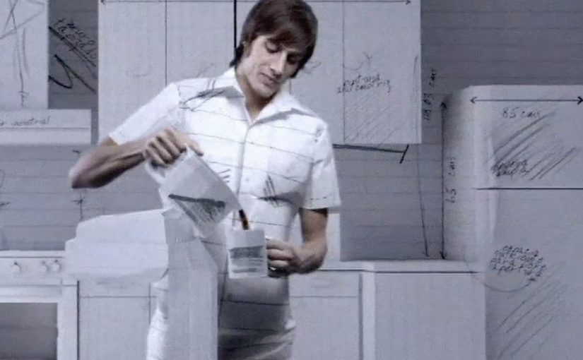
A paper universe that starts with a notebook

Cru de Ladies and BBDO México created this film to promote the notebook brand Scribe. It is described as being produced in just two weeks, and it leans hard into a single idea. Everything becomes paper.

How the “world of paper” effect sells the brand

The spot turns an everyday object into a generative tool. A notebook is not just something you write in. It is the source of a whole environment that folds, cuts, stacks, and rebuilds itself as if the real world is being sketched into existence. The craft is the argument. If paper can become anything, then this brand’s paper is worth paying attention to.

In consumer categories where the product looks ordinary at a glance, a single memorable metaphor can do more valuation work than a list of claims.

Why it lands

The film creates a simple emotional loop. Wonder first, then recognition. Viewers get the pleasure of seeing ordinary materials behave in extraordinary ways, and that pleasure transfers back onto the product category. Because the concept is visually coherent from start to finish, the brand feels like the author of the world, not a logo dropped on top of it.

Extractable takeaway: When your product is materially simple, build a coherent visual metaphor that makes the material feel limitless, then let craft carry the persuasion.

The business intent hidden inside the craft

This is not a “features” ad. It is a value-perception ad. The job is to upgrade how people talk about notebooks. From commodity. To identity and possibility. Once that shift happens, premium pricing and preference become easier to defend.

The real question is how to make an ordinary notebook feel like a source of possibility rather than a paper commodity.

What to steal from Scribe’s paper-world logic

  • Choose one world-rule and commit. One governing logic should shape every scene. A single consistent metaphor beats a collage of disconnected tricks.
  • Make the product the source of the transformation. The notebook creates the world, so the brand earns authorship.
  • Let technique serve meaning. Effects land when each one reinforces the same promise, not when they compete for attention.
  • Keep the narrative readable without words. If the story plays on mute, it travels further and ages better.

A few fast answers before you act

What is Scribe’s “World of Paper”?

It is a brand film that imagines everyday life as a paper-crafted universe that unfolds from a Scribe notebook, using craft and visual transformation to make the category feel magical and premium.

What is the core creative mechanic?

A single world-rule drives the piece. One governing logic applies to every scene: everything is paper, and the notebook is positioned as the source that generates and reshapes the environment.

Why does a craft-led film work for a simple product?

Because it upgrades perception. The viewer’s delight and attention attach to the material, which makes the brand feel more valuable without needing feature claims.

What should marketers copy from this approach?

Commit to one coherent metaphor, make the product the engine of the story, and keep the narrative readable on mute.

What is the most common way this kind of film fails?

When the effects become the point and the product becomes a prop. If the product is not the source of the transformation, the brand does not earn the meaning.

3D Holograms: Two Marketing-World Examples

3D holograms are a great way to attract and engage consumers. Here, “3D holograms” refers to hologram-style displays that use animation to create a depth illusion in a physical setting. They can be quite effective if your brand is having trouble getting noticed or if your product’s capabilities can best be described using images and animation.

Though brands find it daunting to venture into this, there are still some brands out there bold enough to try it. Here are some nice examples.

Why holograms can cut through

The strength of a hologram-style display is that it behaves like moving product theater. Because it behaves like moving product theater, it can stop people mid-walk, and it can compress a lot of “show, do not tell” explanation into a few seconds. In retail aisles and brand events, it competes against the surrounding noise, not against other media placements.

Extractable takeaway: Use depth and motion only when they reduce explanation time or make the core action instantly legible. If depth is not doing work, you are paying for novelty.

The real question is whether motion plus depth makes the story easier to grasp than a flat screen or static print. When the answer is yes, the format can earn attention fast.

Coca Cola In-Store Display

This example shows how a hologram-style display can work as an in-store attention magnet. The content is pure visual storytelling, which makes it easy to understand at a glance and easy to remember later.

Samsung Jet Launch

At launches, holograms can do a different job. They help dramatize product capability and create a sense of spectacle that standard stage content often struggles to match. That spectacle then becomes a shareable proof that something “big” happened.

What to steal if you are considering holograms

  • Pick one message that benefits from depth. If depth is not doing work, you are paying for novelty.
  • Design for walk-by comprehension. People should get it in under three seconds.
  • Keep the loop tight. Short, repeatable sequences beat long narratives in retail and event contexts.
  • Make the hero action visible. If the product feature is the star, animate that feature, not abstract brand graphics.

A few fast answers before you act

When do 3D hologram displays make sense for marketing?

When you need fast attention in a physical space, or when animation plus perceived depth explains the product better than flat media.

What is the main advantage over a normal screen?

Presence. The illusion of depth makes the content feel more like an object in the space, which can increase stop power and recall.

What is the biggest execution risk?

Paying for the format without a story that needs it. If the creative is not designed around depth and motion, the result feels like expensive wallpaper.

How should success be measured?

Dwell time, footfall impact near the unit, assisted recall, and any downstream action that matters to your context, like store inquiry, trial, or social amplification.

What is a practical way to keep cost under control?

Start with one hero unit and a short content loop, then scale only if you can prove incremental attention and understanding versus simpler formats.

Alma: A Christmas Short

A Christmas-time discovery worth a watch

I have just come across a great animation called Alma. If you are looking for something different to watch this Christmas, it is available to stream online now.

How it works: hook, mood, and momentum

The mechanism is simple but effective. It opens with a strong visual premise, then builds tension through atmosphere and pacing. Because the premise is visually clear and the pacing stays tight, the viewer does not need backstory or context to keep watching. The film earns attention through mood and narrative pull.

In European digital media consumption, short films travel when they deliver a clear tonal promise, meaning an immediate signal of genre, stakes, and mood, early and then keep the viewer moving forward with compact storytelling.

Why it lands: it rewards full attention

Great animation works when every frame is doing a job. Short-form stories should be built to respect attention, not to pad time. The viewer keeps watching because the world feels intentional, and the payoff feels earned rather than stretched. It is the opposite of filler content. It respects the audience’s time.

Extractable takeaway: If you want full attention, make every frame earn its place. Remove anything that does not increase mood, momentum, or payoff.

The intent: shareable craft, not a forced message

This kind of piece spreads because people want to pass on “a good find”. The social value is taste. Sharing says, “this is worth your time”. That is a different energy than sharing an ad or a campaign claim. The real question is whether your story gives people a one-sentence reason to share that is about taste, not persuasion.

Steal these rules for short-form stories

  • Start with a clear tonal promise. The audience should know what kind of experience they are entering within seconds.
  • Let atmosphere carry meaning. Strong visual language can replace exposition.
  • Keep the arc tight. Every beat should move the viewer forward.
  • Make it easy to recommend. A simple title and a simple “you should watch this” premise helps sharing.

A few fast answers before you act

What is “Alma” in this post?

It is an animated short film presented as a great online watch, framed as a Christmas-time discovery.

What is the core mechanism that makes short films like this work?

A clear tonal promise early, then momentum through atmosphere and pacing. The piece earns attention through mood and narrative pull.

Why do animated shorts spread well online?

They can deliver a complete, rewarding story quickly, and strong visual craft gives people a simple reason to recommend it.

What kind of “share value” does this create?

Taste-signalling, meaning the social value of showing good taste. Sharing says “this is worth your time”, which is a different motivation than sharing an ad claim or deal.

What is the most transferable takeaway?

If you curate or commission shorts, prioritise a fast hook, a tight arc, and an experience people can recommend in one sentence.