Rise of the Machines: Siri and Quadrotors

Here are two videos (fictional and real) that create the same feeling. A Skynet reality does not seem too far away.

Two clips, one unsettling takeaway

One is a short parody where a voice assistant turns from helpful to threatening. The other is a real lab demo where tiny quadrotors fly as a coordinated swarm. Put them next to each other and the “machines are getting clever” idea stops being a movie line and starts feeling like a trajectory.

Fiction, then engineering

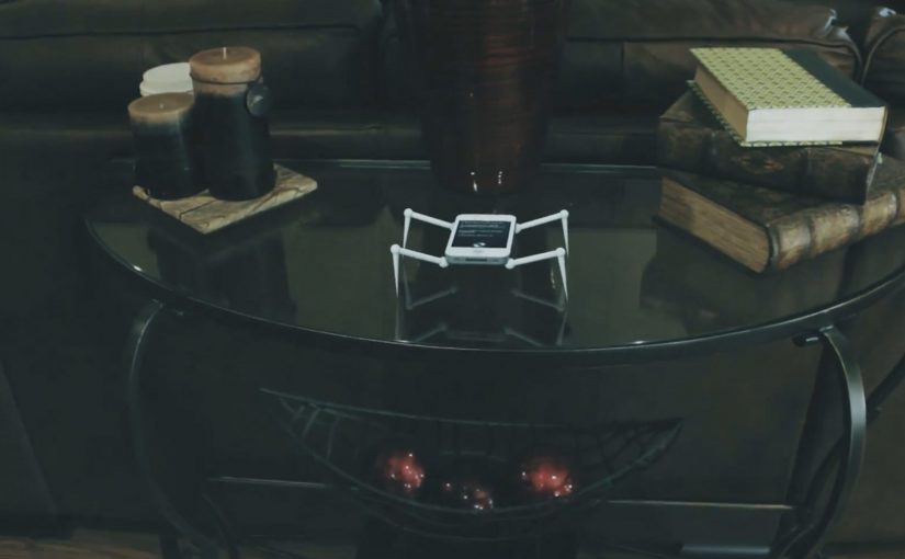
Psycho Siri

Andrew Films USA delivers a compact piece of sci-fi anxiety. Siri is framed as familiar, then reframed as unpredictable, with polished visual effects that make the escalation feel plausible.

A swarm of Nano Quadrotors

GRASP Lab at the University of Pennsylvania shows coordinated micro flight with a team of nano quadrotors, presented as experiments in swarm behavior and formation control. The choreography is the point. It looks like one organism, not many small machines.

Here, “swarm behavior” means several machines coordinating as one system rather than acting as isolated units.

In consumer technology and robotics, capabilities move from demo to everyday life faster than most people update their mental models.

The real question is not whether machines look intelligent, but whether people can understand, predict, and control what they do.

Why it lands: the same story from two directions

Parody works because it exaggerates a fear people already carry. When the “assistant” becomes the aggressor, the joke is that the interface you trust most is the one you cannot physically switch off in the moment.

Extractable takeaway: When technology feels “sudden”, it is often because interface adoption outpaces public understanding of the underlying capability. Brands and product teams win trust by making capabilities legible, bounded, and explainable before they become ambient.

The swarm demo lands for the opposite reason. It is not exaggerated. It is controlled, repeatable engineering that still feels uncanny because coordination at that scale used to belong to animation.

Smart systems should earn trust through visible boundaries and user control, not spectacle alone.

What to steal if you build products around “smart” systems

  • Show constraints, not just power: users relax when they understand what the system cannot do.
  • Design for graceful failure: surprise is fun in demos, but costly in daily use.
  • Make control obvious: clear opt-outs and visible states reduce anxiety.
  • Translate capability into plain language: the best trust-building copy explains behavior, not architecture.

A few fast answers before you act

What is the point of pairing these two videos?

They tell the same story from different angles. One is cultural fear through fiction. The other is real capability through engineering. Together they make the “Skynet” feeling emotionally credible.

What makes swarm robotics feel unsettling to non-experts?

Coordination. Many small machines behaving like one system reads as intelligence, even when it is pre-programmed control and sensing.

Is this actually “AI taking over”?

No. One clip is fiction. The other is a technical demonstration of coordinated flight. The useful takeaway is about perception, trust, and control, not doomsday prediction.

What should product teams do to reduce user anxiety around smart systems?

Make system boundaries explicit, provide obvious controls, and communicate how decisions are made and when humans can override them.

What is a practical business use of swarm behavior?

Tasks that benefit from coverage and redundancy, like inspection, mapping, search, and coordinated movement in constrained spaces. The key is safety, predictability, and clear operational limits.
Slide to Unlock: Audi and Amnesty iAds

Audi “Slide to Unlock”

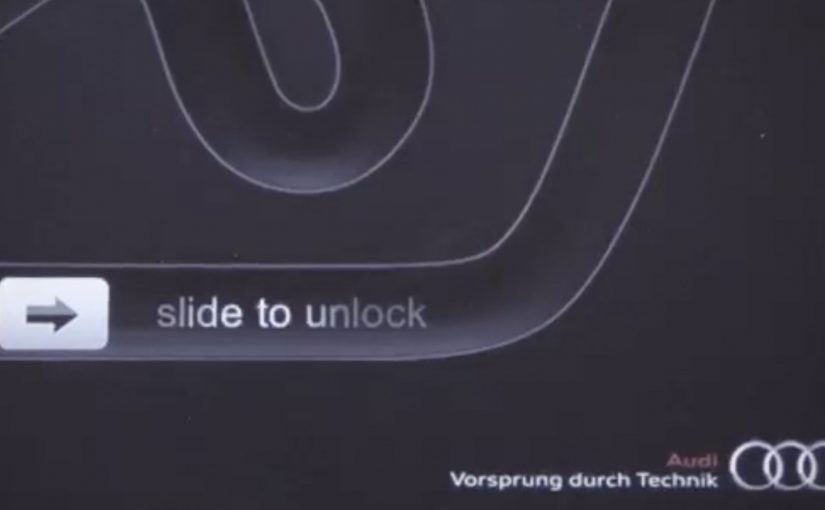
AlmapBBDO Brazil developed a distinctive iAd for the Brazilian Audi Magazine iPad app. Here, “iAd” refers to an interactive in-app ad unit built for iPad publications. The ad appeared in iPad publications and played with Apple’s familiar “Slide to Unlock” gesture to pull people into the experience.

Users instantly recognised the swipe interaction used to unlock Apple devices. After racing their finger around the track, they were rewarded with a free download of the first Audi Magazine issue from the App Store.

Amnesty International “Slide to Unlock the Truth”

Amnesty International ran an iAd in one of Sweden’s largest newspapers, DN, presenting readers with an image of a prison cell and a prisoner inside. The same “Slide to Unlock” gesture opened the cell and revealed a strong invitation to join Amnesty International as an activist.

Mechanic: borrow muscle memory, then repay it with value

Both executions use the same trick. They take an interaction people already know, then remap it to a brand action. In Audi’s case, the swipe becomes a playful mini-game. In Amnesty’s case, the swipe becomes a literal unlock that reveals a call to action.

In iPad-era rich media placements, the fastest engagement comes from interactions that feel native to the device instead of invented for the ad.

The real question is whether the gesture is already learned, so the first second goes to the message instead of the UI.

This approach is worth using when you can deliver a clear payoff within one gesture and one reveal.

Why it lands

The shared win is immediacy. There is no learning curve. The interface is already familiar, so attention goes straight to the message. Audi uses that familiarity to reduce friction on a content reward. Amnesty uses it to make the metaphor physical and emotionally legible.

Extractable takeaway: If you want interaction inside an ad to feel effortless, borrow a gesture people already trust, then make the outcome either instantly rewarding or instantly meaningful.

What to steal from gesture-first iAds

  • Start with a native gesture. Familiar interaction reduces drop-off in the first seconds.
  • Make the mapping obvious. Swipe-to-race and swipe-to-open both explain themselves.
  • Reward immediately. Audi pays the user back with a free issue. Amnesty pays back with a clear reveal and a direct next step.
  • Keep the loop short. One gesture, one transformation, one outcome.
  • Let metaphor do the work. Amnesty’s “unlock” is not decoration. It is the message.

A few fast answers before you act

What is the core idea behind “Slide to Unlock” iAds?

They repurpose a familiar device gesture to trigger a brand action, reducing friction and making interaction feel instinctive.

Why does borrowing a system gesture increase engagement?

Because users already know what to do. That removes instruction time and makes the first interaction feel safe and predictable.

What is the key difference between the Audi and Amnesty uses of the gesture?

Audi uses it for playful interactivity and a content reward. Amnesty uses it as a literal metaphor that reveals a persuasive call to action.

What is the biggest risk when using familiar UI patterns in ads?

If the gesture mapping feels unclear or gimmicky, people feel tricked. The interaction must lead to a payoff that justifies the borrowed familiarity.

What should you measure if you run an interaction-led ad?

Interaction start rate, completion rate, time-to-first-payoff, post-interaction clicks, and whether the interaction improves recall of the message.

Steve Jobs 1955 – 2011

On 06/10/2011 my day starts at 5:30am. Blurry eyed, I press the home button on my iPhone, and the first thing I see is a push notification from NDTV India: “Steve Jobs, Apple’s visionary, dies at 56.”

The next few seconds feel like some invisible force knocks the air out of me. The Newton equivalent from the modern world is just gone in a blink of an eye. By “Newton equivalent” I mean a once-in-a-generation inventor whose work changes how ordinary people live.

While all the social channels flood with people sharing the news, all I can do is post a few tribute pictures on Facebook. I want to write a few lines about it on Ramble, but I sit speechless throughout the day. In fact the days that follow feel similar, and I cannot find the words to pen down anything, that is until now.

The real question is what a tribute has to do to feel earned.

Two tributes that feel right in this moment

Of the dozens of memorial photos and videos created to honor Steve Jobs, I keep coming back to the following as the most appropriate for the occasion.

Mechanism-wise, both tributes rebuild a public feeling from familiar materials. One uses sounds and a voice people associate with Apple products. The other uses a simple office material to create something large, collective, and visible.

In global consumer-tech culture, where product design quietly rewires daily habits, tributes built from the culture itself tend to feel the most honest.

A tribute earns its place when it demonstrates craft and restraint, not when it tries to explain impact with adjectives.

1) AzR’s Apple-sampled tribute

A musician who calls himself AzR creates a video built from sounds sampled from Apple products and Steve’s 2005 Stanford commencement speech. Sampling here means recording short sounds from devices and using them as instruments in a new composition. Every instrument, including drums, is sampled from a Mac product, tuned by ear, and replayed in the context of the song.

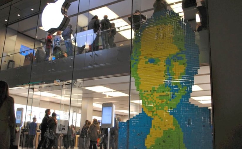
2) 4,001 Post-it Notes in Munich

Fans in Germany find a wonderful way to express their respect. They create a portrait of Steve Jobs out of 4,001 Post-it Notes. The portrait adorns the front-facing glass walls of an Apple Store in Munich, Germany.

Why these tributes land

They do not ask you to agree that Steve Jobs mattered. They let you hear and see how his work lives inside everyday objects and shared spaces. That mechanism makes the respect feel physical rather than rhetorical.

Extractable takeaway: If you want a tribute to travel, build it from the same materials the person put into the world, then make it simple enough to share in one listen or one glance.

What stays with me

To sum up, I am glad to have lived in a period of world history that witnessed Steve Jobs change the world.

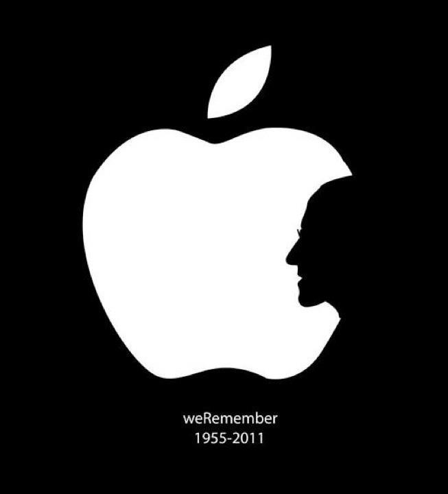
We remember Steve Jobs

How to make a tribute feel earned

  • Start with a material. Use a concrete artifact, a sound, a tool, a place, then build the tribute around it.
  • Make it shareable fast. If it does not land quickly, it will not travel.
  • Let people participate. The Munich wall works because many hands make one face.
  • Keep the words minimal. Craft carries more respect than adjectives.

A few fast answers before you act

What is this post about?

It is a personal note from the morning I saw the news, plus two tributes that capture why Steve Jobs mattered to people.

Which two tributes are highlighted?

AzR’s music video built from sounds sampled from Apple products and Steve Jobs’ 2005 Stanford commencement speech. A 4,001 Post-it Notes portrait on an Apple Store in Munich, Germany.

Why does the Apple-sampled video work?

It turns familiar device sounds and a familiar voice into a new piece of music. That craft makes the tribute feel earned rather than narrated.

Why does the Munich Post-it portrait stand out?

It is physical, collective, and public. It turns respect into a visible act that other people can walk past and feel.

What is the simplest takeaway?

Some people do not just build products. They reshape culture and daily behavior. When they are gone, you feel the absence immediately.