
Durex: Baby App

Making the consequence tangible, not the lecture louder

In consumer health marketing, the hardest problems are rarely about information. They are about motivation in the moment. This Durex idea is a clean example of turning a behavior barrier into an experience.

Condoms can feel like a downer. So how do you convince guys to put one on, and make Durex the favored choice?

This is the right move when information is not the problem. Make the consequence tangible, not the lecture louder.

Using the iPhone, Nicolai Villads, Peter Ammentorp and Raul Montenegro created what is called the Durex Baby application for the iPhone.

How the Durex Baby app worked as a behavioral nudge

The mechanism was simple. If the barrier is that protection feels like a mood killer, shift attention to what happens without it.

The app simulated the realities of having a baby, using the phone as a constant companion device. It turned an abstract risk into a persistent, personal experience that could be felt rather than explained. Because the phone stays close, the simulation can interrupt everyday moments, which is why it lands as a nudge instead of a lecture.

In consumer health marketing, consequence simulation works best when the audience already knows the facts but needs a visceral prompt.

The real question is how you make “responsible” feel like the easiest choice in the moment.

Why simulation can change decisions faster than persuasion

Most messaging about safe sex competes with optimism bias, the tendency to assume consequences happen to someone else. A simulation reduces that distance by making “later” feel like “now,” reframing the trade-off from short-term inconvenience to long-term responsibility.

Extractable takeaway: When persuasion stalls, build a simulation that collapses time and personal distance so the audience feels the outcome and re-evaluates the trade-off on their own.

The intent behind building it for Future Lions

The app was created for the Future Lions 2010 competition organized by digital agency AKQA and the Cannes Lions Advertising festival.

The business intent is clear. Use mobile to translate a sensitive topic into a playful but pointed interaction that can travel socially and be discussed without heavy moralizing, while keeping the brand associated with the responsible choice.

What to borrow from Durex Baby

  • Turn abstract risk into felt experience. Simulation can outperform warnings when the audience tunes out lectures.
  • Use the device people always carry. Mobile is effective when the behavior change depends on everyday moments.
  • Reframe the trade-off. Move attention from short-term friction to long-term consequence in a way people can grasp instantly.
  • Make it discussable. Playful interaction can open conversation on topics people avoid in direct language.

A few fast answers before you act

What is the Durex Baby app?

An iPhone app concept that simulates the realities of having a baby to encourage safer choices and reduce resistance to using condoms.

What was the core mechanism?

Behavioral reframing through simulation. The phone delivers an ongoing experience that makes the consequence of not using protection feel immediate.

Why does this approach work better than a warning for some audiences?

Because it reduces optimism bias. People are more likely to change behavior when the consequence feels personal and present, not distant and theoretical.

What business goal does it serve for Durex?

Positioning the brand as the responsible default choice by shifting the decision from mood-based resistance to consequence-based clarity.

What is the main takeaway for marketers?

If persuasion is failing, design an experience that makes the outcome feel real, then let the audience reach the conclusion themselves.
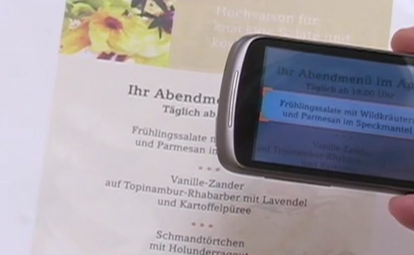
Google Goggles: Translate Text in Photos

A user takes a photo of text with an Android device, and Google Goggles translates the text in the photo in a fraction of a second.

It uses Google’s machine translation plus image recognition to add a useful layer of context on top of what the camera sees.

Right now, it supports German-to-English translations.

What Google Goggles is really doing here

This is not “just translation.” It is camera-based understanding. The app recognises text inside an image, then runs it through machine translation so the result appears immediately as usable meaning.

In everyday travel and commerce, camera-first translation removes friction at the exact moment that text blocks action. By camera-first translation, I mean pointing a phone at printed text and getting a translated overlay instantly in the same view. Because the result appears in place, people do not have to retype or switch apps, which is why it feels immediate.

In European travel and retail settings, camera-first translation turns printed text into immediate, actionable guidance.

The real question is whether your interface can turn raw capture into meaning without making users switch contexts.

This is the kind of feature worth shipping because it removes friction exactly where action stalls.

Why this matters in everyday moments

If the camera becomes a translator, a lot of friction disappears in situations where text blocks action. Think menus, signs, instructions, tickets, posters, and product labels. The moment you can translate what you see, the environment becomes more navigable.

Extractable takeaway: When you translate what people see in the same view they are already using, you turn blocked moments into forward motion.

The constraint that limits the experience today

Language coverage determines usefulness. At the moment the feature only supports German-to-English, which is a strong proof point but still a narrow slice of what people want in real life.

The obvious next step

I can’t wait to see the day when Google comes up with a real-time voice translation device. At that point, we will never need to learn another language.

What to copy from camera-first translation

  • Remove friction at the moment of intent. Translate or explain text exactly when it blocks action, not after users detour into search.
  • Keep meaning in the same view. Overlay the translation in-place so people stay oriented and do not have to retype or switch contexts.
  • Expand coverage before polishing edges. Language breadth determines usefulness more than UI refinements.

A few fast answers before you act

What does Google Goggles do in this example?

It translates text inside a photo taken from an Android device, using machine translation and image recognition.

How fast is the translation described to be?

It translates the text in a fraction of a second.

Which language pair is supported right now?

German-to-English.

What is the bigger idea behind this feature?

An additional layer of useful context on top of what the camera sees.

What next-step capability is called out?

Real-time voice translation.

NOOKA: Augmented Reality Accessorizer

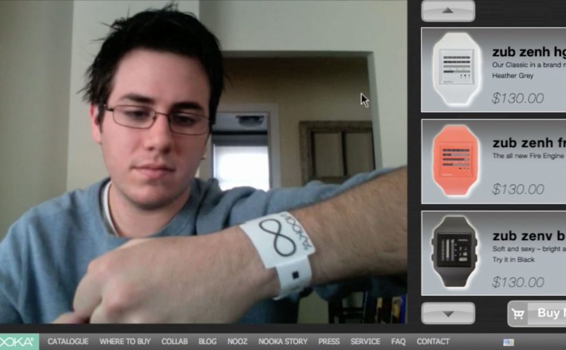
NOOKA watches created a video-led way to let you try out their watches virtually. All you need is a simple strip of NOOKA watch-representing paper to make it work, and once you see it in action, the idea becomes obvious.

A paper strip that turns your webcam into a fitting room

The mechanism is a coded wrist strip and a webcam. You place the strip on your wrist, hold your arm up to the camera, and the watch appears aligned to your wrist as you move. It is a fast, low-friction way to demonstrate “how it looks on me” without needing a physical product in hand.

Because the strip gives the webcam a stable reference, the overlay can track your wrist as it moves, which is what makes the preview feel believable.

In online retail, the fastest way to reduce hesitation is to replace abstract product specs with a visual proof the shopper can control.

The real question is whether you can turn “how will this look on me?” into a live proof the shopper can control before they decide.

Why this feels more convincing than a static product shot

Most product pages show the same images to everyone. This flips the experience from passive viewing to live preview. For look-and-fit products, a live preview like this is a stronger trust-builder than piling on more static shots. Even if the rendering is simple, the feeling of personalization comes from movement and alignment, not photorealism.

Extractable takeaway: If your product is bought on look and fit, design a try-on moment that uses a behavior people already understand (webcam + holding up your wrist), then make the payoff immediate so the demo does the selling.

Stealable moves for NOOKA’s print-to-digital bridge

By a “print to digital” bridge, I mean a physical cue that unlocks or anchors a digital preview in a way the viewer can control.

  • Use a physical key. A simple strip, card, or marker makes the digital experience feel tangible and intentional.
  • Keep the interaction one-step. The user should be able to try it within seconds, not after setup friction.
  • Build for sharing. The best proof is something people can show a friend in the moment.
  • Let the demo carry the story. If it needs heavy explanation, simplify the mechanic.

A few fast answers before you act

What is the NOOKA Augmented Reality Accessorizer?

It is an augmented reality try-on concept where a coded paper wrist strip and a webcam let a shopper preview a NOOKA watch aligned to their wrist in real time.

Why does a paper strip matter in an AR try-on?

It provides a consistent reference point for positioning and scale, and it makes the experience feel like a “real” object-assisted try-on rather than a random filter.

What makes this useful for e-commerce?

It reduces uncertainty about appearance and proportion. The shopper can see the watch on a wrist-sized reference and judge the look before buying.

What is one practical lesson to apply without AR?

Use a simple physical reference or on-screen guide that anchors scale and positioning, then let the shopper control the view quickly so the proof feels personal.

What is the main limitation of this type of approach?

It can show appearance and rough scale, but it cannot fully replicate comfort, weight, or how a strap feels. It works best as a confidence booster, not a perfect substitute for trying it on.