Lynx’s online tools for offline dating

Lynx’s online tools for offline dating

Lynx does something smart and very “of its time.” It takes the messy, awkward first 20 seconds of talking to someone offline, and it turns that moment into a mobile toolkit. Here, “toolkit” means lightweight, in-the-moment utilities you can pull up on your phone to create an opening.

BBH London releases a second round of mobile “pickup tools” for Lynx’s “Get In There” campaign. The promise is simple. Give young guys digital tips, tricks, and small utilities that help them make the leap from online confidence to real-world interaction. The tools are built as icebreakers you can actually use in the moment, not just a brand message you nod at and forget.

The idea, stripped down

Turn “offline dating” anxiety into a set of mobile utilities that create an opening.

What the toolkit looks like

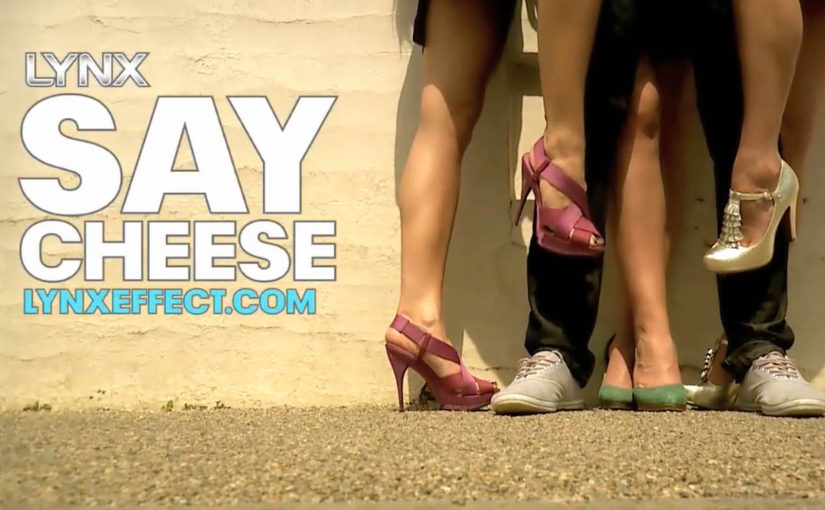
The campaign centers on a suite of mobile experiences backed by video content. Three apps sit at the heart of the set: “Say Cheese,” “Spin The Bottle,” and “Perfect Man Revealed.”

Say Cheese plays with the “take my photo” moment to create a surprise reveal.

Spin The Bottle gamifies group energy and removes the “who do I choose” tension.

Perfect Man Revealed reframes a quiz into a playful personal reveal.

The pattern matters more than the specifics. Each tool is designed to create a socially acceptable reason to start an interaction, then let the person take it from there.

In youth-focused consumer brands, the winning use of mobile is often to reduce in-the-moment social friction, not to replace the interaction.

The real question is whether your digital work helps people take the next awkward step in the real world.

When you want behavior change, utility-first beats message-first.

Why this works as marketing, not just “a funny app”

Most brand campaigns try to persuade with claims. This one tries to equip with utility. By making the icebreaker the mechanic, the brand shows up at the moment of action, which is why it sticks.

Extractable takeaway: When the behavior is awkward, ship a small, optional utility that creates a socially acceptable opening, then get out of the way and let the human interaction do the work.

  1. It inserts the brand into behavior, not media.
    If the tool gets used, the brand is present at the exact moment the customer cares, not ten minutes later in a recall survey.
  2. It makes “digital to physical” a real bridge.
    A lot of digital work stops at clicks. Here, the mechanic is literally about translating screen confidence into real-world action.
  3. It scales with video and gets remembered through the gag.
    The utility is the hook. The humor is the memory device. Video content becomes the distribution layer that makes a niche behavior hack feel like a mainstream campaign.
  4. It is brand-consistent without being product-heavy.
    The “Lynx Effect” idea is not explained. It is implied. The campaign behaves like an accomplice to confidence, which is exactly what the brand wants to stand for.

The deeper point

This is early evidence of a direction many brands move toward. Marketing that ships as tools, not just communications.

Instead of asking for attention, the brand earns a place in real life by being useful in a situation people actually want help with.

Patterns to borrow when you ship tools

  • Start with the awkward moment. Pick the one moment people avoid because it feels risky. Then design a tool that reduces the social friction in that moment.
  • Make the utility the hero. If the only payoff is “branding,” people drop it. If the payoff is a usable social script, they try it once, and that is often enough to create talk value.
  • Design for respect and consent, even when the creative is cheeky. When you play in dating and social dynamics, the difference between playful and creepy is not subtle. Build mechanics that keep choice and comfort with the other person, not tricks that corner them.

A few fast answers before you act

What is Lynx “Get In There” trying to do?

It aims to help guys get offline and start real-world interactions, using tips, tricks, and mobile tools as icebreakers.

What makes these tools different from standard mobile ads?

They are designed to be used in the moment, not just consumed. Utility first, branding second.

Which apps are part of the toolkit?

“Say Cheese,” “Spin The Bottle,” and “Perfect Man Revealed.” Each is designed to create a simple opening for real-world conversation.

What is the reusable marketing lesson?

If you can turn a customer’s friction point into a simple tool that helps them act, you move from awareness to behavior.

What is the main risk with this kind of idea?

If the mechanic crosses into manipulation, it backfires. The tool must stay playful, optional, and respectful.

Apple: 12 Days of Christmas

Apple: 12 Days of Christmas

Is it just me or is Christmas this year turning out to be very Apple.

Here is Apple making Christmas news again. This time with their new TV ad.

The ad reworks the standard Christmas carol of the same name to feature twelve iPhone applications related in some way to the holiday season.

  • 12 cookies cooking: The Betty Crocker Mobile Cookbook (Free)
  • 11 cards a’ sending: Postman ($2.99)
  • 10 gifts for giving: My Christmas Gift List ($0.99)
  • 9 songs for singing: TabToolkit ($9.99)
  • 8 bells for ringing: Holiday Bells ($0.99)
  • 7 slopes a’ skiing: Snow Reports ($1.99)
  • 6 games for playing: Christmas Fever ($0.99)
  • 5 gold rings: Anna Sheffield Jewelry (Free)
  • 4 hot lattes: myStarbucks (Free)
  • 3 flights home: Flight Search (Free)
  • 2 feet of snow: Weather Pro ($3.99)
  • And an app that can light up the tree: Schlage LiNK (Free but hardware required)

What the spot is really doing

The mechanism is a catalog disguised as a carol. Each lyric is a micro use case, and each use case quietly argues that “apps” are the reason the device feels personal in December, not just powerful on paper.

In consumer technology categories where feature lists blur quickly, showing everyday use cases beats claiming capability.

The real question is how to make an ecosystem feel instantly useful without falling back on a feature list.

Why it lands

It is lightweight, instantly recognisable, and structured for memory. You already know the song, so the ad can spend its time on the parade of utility and novelty instead of on explanation.

Extractable takeaway: If you want to sell a platform, turn your ecosystem into a familiar format people can hum, then make each beat a concrete “I can use that” moment.

What platform marketers can borrow

  • Use a cultural template. Borrow structure from something the audience already carries.
  • Keep each benefit bite-sized. One line per use case is enough when the rhythm does the glue work.
  • Let variety do the persuasion. A spread of small moments can outperform one big claim.

A few fast answers before you act

What is this Apple “12 Days of Christmas” ad?

A holiday TV spot that rewrites the classic carol to showcase twelve iPhone apps tied to seasonal moments.

What is the core mechanism?

A familiar song structure becomes a rapid-fire list of app use cases, turning the App Store into the product story.

Why does the format work so well for apps?

Because apps are easiest to understand as situations, not specs. The carol format delivers situations at speed while staying coherent.

What is Apple really selling here?

The ad sells the iPhone as an entry point to a seasonal ecosystem of useful apps, not just as a piece of hardware.

What should I copy if I am marketing a platform?

Package the ecosystem as a set of quick, concrete jobs-to-be-done, then anchor them in a structure the audience already recognises.

Google Goggles: Rise of Visual Search

Google Goggles: Rise of Visual Search

You take an Android phone, snap a photo, tap a button, and Google treats the image as your search query. It analyses both imagery and any readable text inside the photo, then returns results based on what it recognises.

This is visual search, meaning search where a captured image becomes the input instead of typed words. The point is not a clever camera trick. The point is that “point and shoot” can replace “type and search” in moments where you cannot name what you are looking at.

Before this, the iPhone already has an app that lets users run visual searches for price and store details by photographing CD covers and books. Google now pushes the same behaviour to a broader, more general-purpose level.

From typing to pointing

Google Goggles changes the input model. The photo becomes the query, and the system works across two parallel signals:

  • What the image contains, via visual recognition.
  • What the image says, via text recognition.

Because the system can extract both shape and text from the same frame, it removes the translation step between seeing something and turning it into keywords. That translation step is where most friction lives on a small mobile keyboard.

Why “internet-scale” recognition is the point

Google positions this as search at internet scale, not a small database lookup. The index described here includes 1 billion images, which signals the ambition to recognise the long tail of everyday objects, covers, signs, and printed surfaces.

In mobile, in-the-moment consumer and retail discovery, this matters because intent often starts with something you can see but cannot name.

Why it lands beyond “cool tech”

When the camera becomes a search interface, the web becomes more accessible in moments where typing is awkward or impossible. You can point, capture, and retrieve meaning in a single flow, using the environment as the starting point.

Extractable takeaway: The winning experiences are the ones that convert recognition into an immediate next step. Identify what I am looking at, then answer the implied question, such as “what is this?”, “where can I buy it?”, “what does it cost?”, “how do I use it?”.

When the camera becomes the keyboard, every physical surface becomes a potential search box. Brands that make their packaging, signage, and product imagery easy for humans and machines to read get discovered even when no one types their name.

The bet Google is making

This is a meaningful shift in input, but it will not replace typed search. It will win the moments where the user’s intent is anchored in the physical world and the fastest way to express that intent is to show the object.

What to steal if you build digital experiences

  • Design for machine-readable cues. High-contrast logos, consistent product shots, and legible typography increase the odds that recognition resolves to the right thing.
  • Assume zero-keyboard intent. Build journeys that start from what people see around them, not only from brand names and product model numbers.
  • Plan for ambiguity. Recognition will be probabilistic, so your assets should help disambiguate similar-looking items.
  • Treat demos as proof, not decoration. If your pitch is “this feels different,” show it working, as the original Goggles demo does.

A few fast answers before you act

What does Google Goggles do, in one sentence?

It lets you take a photo on an Android phone and uses the imagery and any readable text in that photo as your search query.

What is the comparison point mentioned here?

An iPhone app already enables visual searches for price and store details via photos of CD covers and books.

What signals does Goggles read from a photo?

It uses both visual recognition of what is in the image and text recognition of what is written in the image.

What is the scale of the image index described?

Google describes an index that includes 1 billion images.

What is included as supporting proof in the original post?

A demo video showing the visual search capability.