Volkswagen: Wolkswagen

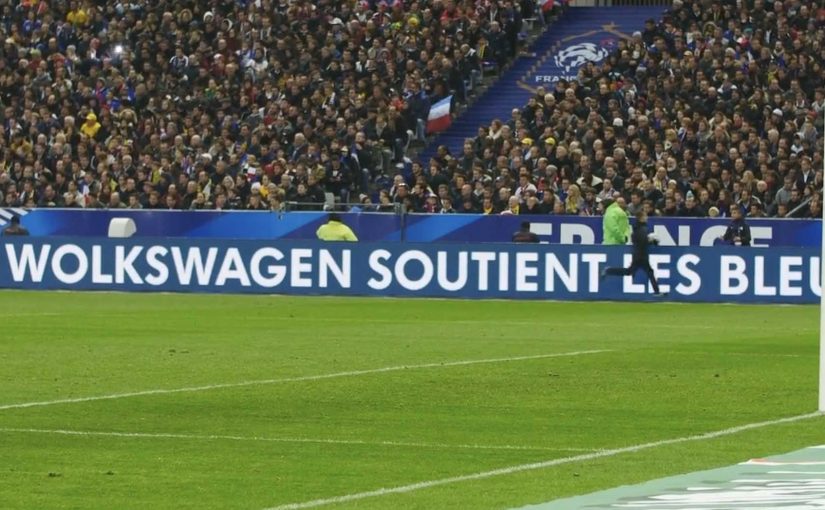
During a France vs Brazil football match in Paris, the LED boards around the pitch display a brand name that looks wrong. “Wolkswagen.”

Volkswagen leans into a simple human impulse. People love being the first to notice a mistake. So the campaign plants one at maximum scale and lets the crowd do what it always does. Point it out, correct it, and spread it.

The mechanism is the typo itself. A deliberate misspelling placed where 80,000 spectators and millions of TV viewers will see it, creating a wave of “they got it wrong” conversations that carries the real message. Volkswagen is present, watching, and ready to announce itself as a major partner of French football.

The psychology of a “correctable” brand moment

This works because correcting a visible public error lets people display attention and share the fix. Here, a “correctable” moment means a public cue that looks wrong but is safe and easy for the audience to fix. Noticing a typo feels like competence. Sharing it feels like helping others notice. The stunt converts that impulse into earned distribution, and it does it without asking anyone to watch a film or click a banner.

Extractable takeaway: If you want mass attention in a high-noise moment, design a safe, obvious “error” people can correct in public, then attach your actual announcement to the moment they point out and share the correction.

In live sports broadcasts, audiences are primed to scan for anomalies, and correcting them is a social reflex that spreads faster than the original message.

What the partnership announcement is really buying

The stated goal is awareness of a new relationship with French football. This is stronger than a standard sponsorship reveal because the audience helps distribute the news. The real question is how to make a routine partnership announcement impossible to ignore. The deeper goal is memorability. Sponsorship news is usually forgettable. A planted mistake is sticky, because people remember the moment they noticed it.

What to steal from this stadium-board stunt

  • Use one unmistakable deviation. The “wrongness” must be instantly readable from far away.
  • Make the correction harmless. The audience should feel clever, not manipulated or misled.
  • Deploy where attention is already concentrated. Stadium boards and live broadcast moments amplify small creative moves.
  • Ensure the reveal is clean. The moment must resolve quickly into the intended message, or it stays a gimmick.

A few fast answers before you act

What is the Wolkswagen idea?

A live stadium-board stunt that intentionally misspells “Volkswagen” as “Wolkswagen” to trigger public correction and attention, then uses that attention to support a football partnership announcement.

Why does an intentional typo generate more attention than a normal logo placement?

Because it activates a correction reflex. People engage to point out the “mistake,” and that engagement becomes the distribution channel.

What makes this feel like a live moment instead of an ad?

Placement and timing. It appears inside the live match environment, where audiences treat what they see as real-time context, not preplanned messaging.

What is the main risk with this pattern?

If the audience believes the brand genuinely made an error, the story can turn into ridicule. The execution needs a clear resolution so it reads as deliberate.

When should you use a “deliberate mistake” stunt?

When you have a time-bound announcement, a high-attention venue, and a brand that can credibly play with perception without damaging trust.

Google Maps Racing Advergame

Mini France has managed to successfully offer a virtual Mini experience with the help of a Social/Google Maps mash-up advergame called “Mini Maps”. Here, advergame means a branded game that turns the marketing idea into the experience itself.

With DDB Paris and Unit9 they created a Facebook app that lets you customize a virtual Mini and then challenge Facebook friends to time trials around the world through Google Maps. In the challenge you are racing your friends over satellite images of your favorite locations around the world!

Why this works

  • The idea is instantly graspable. Customize your Mini. Pick a place. Race the clock. Challenge friends.
  • Google Maps is not a backdrop. The satellite layer becomes the playable surface, which makes every track feel personal.
  • Social competition is built in. Time trials make it easy to compare performance without complex multiplayer setup.

In interactive brand marketing, the scalable advantage comes when a familiar platform becomes part of the mechanic, not just part of the media plan.

What this signals for interactive brand experiences

The real question is not whether a brand can borrow a popular platform, but whether the platform becomes the mechanic that makes the brand memorable. The strongest move here is that Google Maps is not a skin around the idea. It is the idea in use. That matters because location becomes the hook, customization becomes the commitment step, and friendly competition becomes the retention loop, meaning the simple reason people come back and play again. This gives the brand repeat interaction instead of one-time exposure.

Extractable takeaway: When the platform supplies the play mechanic, the brand experience feels more native, more personal, and easier to revisit with friends.

What to steal for map-based social games

  • Use real places as the content. When the track is a familiar location, the hook is instant and personal.
  • Make competition the retention loop. Time trials against friends give players a reason to come back and improve.
  • Keep customization lightweight but expressive. A few visible choices are enough for ownership without slowing play.
  • Build the platform into the mechanic. If Google Maps is the story, the experience should demonstrate it, not just reference it.

A few fast answers before you act

What is “Mini Maps”?

“Mini Maps” is a Facebook advergame for Mini France that combines social sharing with Google Maps to create location-based time trial races.

What does the viewer actually do?

You customize a virtual Mini and then challenge Facebook friends to time trials across Google Maps locations, racing over satellite imagery.

Why is Google Maps central to the experience?

Because it provides the world itself. The satellite view turns real places into tracks, which makes the challenge feel more personal and replayable.

What is the reusable pattern here?

Start with a concrete action, move to a simple challenge mechanic, then let social competition drive repeated return visits.

What should brands copy from this model?

Use a platform feature as the core mechanic, keep the player action simple, and add a lightweight social challenge that gives people a reason to come back.

The Escape Service: Press the red button

DDB Paris creates a new service for the French rail booking site Voyages-sncf.com. “The Escape Service” lets people escape to any destination they want by simply pushing a magical red button.

Together with the French collective Pleix, they design three celebrations that emerge from a 3×3 meter black box that unfolds like a giant jack-in-the-box. In Paris, the cube lures passers-by in, asks where they want to go, then bursts into a destination-themed surprise and hands out a mock ticket for the chosen trip.

The film also ends by inviting viewers to press the button themselves and experience a first-person view version of the Escape Service. That first-person view version is a POV cut where the camera takes your place at the button.

A black box that behaves like a travel shortcut

The mechanism is deliberately minimal. There is one obvious choice, press the red button. The payoff is oversized, because the box transforms into a celebration that makes “go anywhere” feel real without explaining routes, prices, or schedules.

In European rail and travel marketing, turning an abstract promise like “escape” into a public, physical moment helps people imagine the journey instantly.

Why the red button is the real interface

The button turns travel intent into an action you can perform in one second. That matters because it removes hesitation. You do not need to “plan” to participate. You only need curiosity, and the street does the rest.

Extractable takeaway: When your promise is intangible, make the first step a one-second action that people can try without planning, then let the payoff do the explaining.

What the campaign is really proving for Voyages-sncf.com

This is not about a single destination. It is about choice and immediacy. The idea says: if you can decide on the spot, you can book on the spot. The mock ticket detail pushes the story from spectacle into something you can take away and show.

The real question is whether your service promise can be compressed into one action people will try without needing more information.

This kind of one-action interface is worth copying when you need to turn curiosity into intent fast.

Moves to borrow from the red-button mechanic

  • Reduce the interaction to one decision. One button is better than a menu when you need street participation.
  • Make the reward visible to bystanders. If spectators can understand the payoff, the crowd recruits the next person.
  • Personalize the outcome fast. A destination choice and a ticket-like takeaway make the moment feel “mine”.
  • Bridge offline to online without forcing it. A first-person online version extends reach without changing the story.

A few fast answers before you act

What is “The Escape Service” for Voyages-sncf.com?

It is a public pop-up experience where a black box invites people to press a red button, choose a destination, and trigger a surprise celebration that dramatizes the idea of escaping by train.

Why use a red button and a box?

Because it is self-explanatory. A single button removes friction and creates a clear before-and-after moment that people remember and film.

What makes this more than a stunt?

The mechanic maps cleanly to the service promise: pick a destination and go. The mock ticket detail turns the experience into a personal travel intent, not only entertainment.

How does this support online booking?

It makes “decide and book” feel effortless. The film’s first-person online extension reinforces that the same impulse can continue digitally.

What is the transferable lesson for service marketing?

When your product is intangible, build a physical interface that compresses the benefit into one action and one memorable payoff.