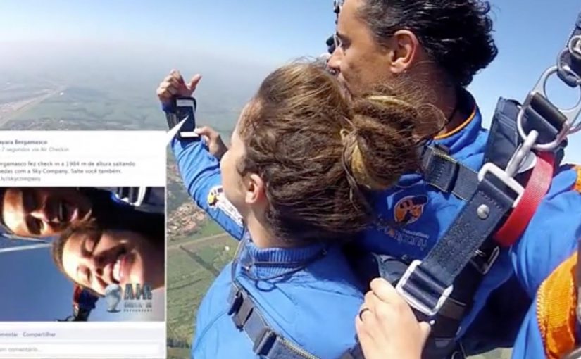
Free fall is not the moment you expect a social check-in. But that is exactly the hook behind Air Check-in, an app that lets parachutists post to Facebook while they are still in the air.
Parachuting specialists Sky Company wanted to promote their Facebook fan page. With ageisobar Brazil they developed the Air Check-in app. It lets users take pictures during the jump while recording their height, then attempts to post the details to the user’s Facebook timeline via 3G. If reception drops at altitude, it stores the check-in and publishes later.
How the mechanic earns attention
The mechanism is a simple risk-reward loop. Capture proof while falling. Attach altitude data. Post immediately if the network allows, or queue it for later so the story still lands. The social post itself carries a built-in path back to Sky Company’s Facebook presence, turning each jump into a shareable referral moment.
In consumer-facing mobile activations, the strongest ideas turn a real-world constraint (connectivity, timing, attention) into part of the narrative rather than a limitation to hide.
Why it lands
This works because it makes the experience legible to spectators. “I checked in while skydiving” is an instantly repeatable line, and the altitude detail adds credibility. It is also practical marketing. The product being sold is not the app, it is the jump itself, with the social artifact functioning as both proof and invitation. This is the kind of activation worth copying because it designs for the primary failure mode instead of pretending it will not happen. The real question is whether your sharing mechanic still produces a clean proof moment when the environment misbehaves.
Extractable takeaway: If you want social sharing to feel earned, tie it to a moment the audience already considers extreme, then package the proof in a format that posts cleanly even when the network is unreliable.
How to build a shareable proof moment
- Make the “impossible” part measurable. Altitude data turns a claim into a receipt.
- Design for network failure. Queue-and-post-later, meaning capture now and publish when signal returns, keeps the promise even when connectivity drops.
- Build referral into the artifact. If the post points back to the brand destination, every participant becomes distribution.
- Let the participant be the headline. The story is “what I did,” not “what the brand says.”
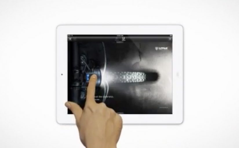
The same “on the fly” logic shows up in an earlier parachuting campaign for Hotels.com. The focus there is the brand’s high-speed mobile booking app, positioned as easy enough to use while airborne. To prove it, they team up with extreme athlete and stuntman JT Holmes for a stunt demonstration that dramatizes booking a room mid-jump.
A few fast answers before you act
What is Air Check-in in one sentence?
A skydiving app that captures photos and altitude during a jump and posts a Facebook check-in immediately if possible, or saves it to publish later if reception drops.
Why is “store it for later” a key part of the idea?
Because it protects the core promise. The story still posts even when the most likely failure mode, weak connectivity at altitude, happens.
What is the marketing value of adding altitude to the post?
It makes the claim credible and more shareable. The audience can immediately see this was not staged on the ground.
Why include the Hotels.com example in the same post?
It reinforces the same creative pattern. Use an extreme context to prove a mobile behavior is fast and simple, then let the spectacle carry the message.
What is the transferable pattern behind Air Check-in?
Turn a real constraint into the mechanic, make the proof measurable, and design the sharing flow so it still publishes cleanly when conditions are imperfect.