Fridge Magnets: Pizza Button and Smart Drop

Fridge Magnets: Pizza Button and Smart Drop

Who says plain fridge magnets cannot be reinvented? Here are two brands who do exactly that, and in the process also enhance the brand experience with their consumers.

VIP Fridge Magnet

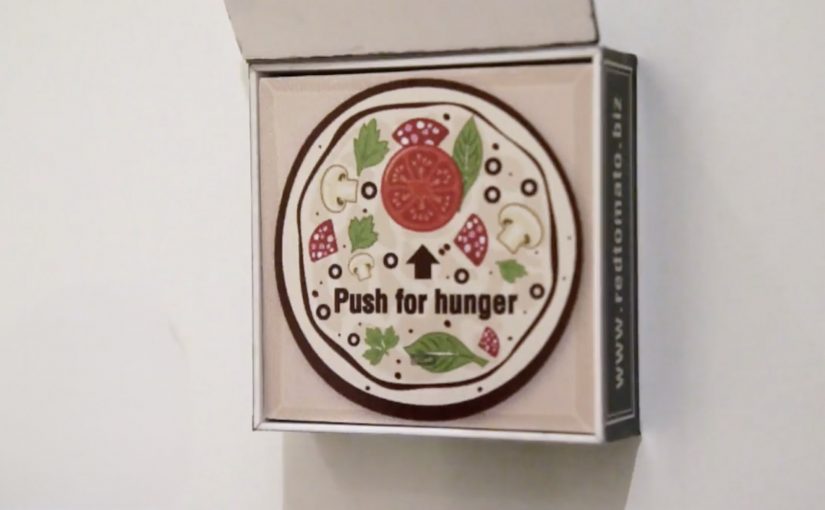
Red Tomato Pizza in Dubai take their loyal pizza patrons very seriously. So they created the “Pizza Emergency Button”, a fridge magnet with a difference. Each button has a loyal pizza patron’s favorite pizza programmed into its memory. When hungry, all the loyal patron needs to do is flip the pizza box lid on the magnet and press the pizza button inside.

Wifi Water Magnet

Evian in Paris created a simple fridge magnet that allows owners to order water and request a particular delivery time directly from their fridge.

The “Smart Drop” magnet is made up of a microcontroller, LED screen, a wireless chip, battery and an inbuilt HTML5 app that does all the work.

The mechanic: turn the fridge door into a service interface

Both executions take a boring surface and give it a single, high-frequency job. One turns repeat ordering into a one-press ritual. The other turns replenishment into a quick scheduling choice, without opening a laptop or digging for an app.

In connected-home style experiences, the winning pattern is not “more features”. It is fewer steps placed exactly where the habit already happens.

Here, “connected-home” means a branded shortcut embedded in an existing household habit, not a full smart-home platform.

Why this lands

These magnets win because they reduce effort at the moment of desire. Hunger and “we’re out of water” are not times when people want menus, logins, or long flows. A physical button and a tiny display on the fridge convert a decision into a reflex.

Extractable takeaway: If the customer action repeats weekly, design the interface around speed and placement first, and only then worry about adding options.

What the brands are really buying

Red Tomato turns loyalty into a tangible perk that feels exclusive and personal. Evian turns replenishment into an owned service moment, and makes delivery feel like part of the product, not a separate chore.

The real question is whether the brand can earn a permanent shortcut into a repeat household behavior.

What to steal for repeat-order design

  • Anchor the interaction to the habit location. Put the “button” where the decision already happens.
  • Make the primary action one-step. If it needs instructions, it is not a fridge magnet anymore.
  • Personalize the default. Pre-selecting “my usual” removes choice friction and makes the experience feel made for me.
  • Show just enough state. A tiny display that confirms quantity and timing often beats a full app for repeat tasks.

A few fast answers before you act

What makes these magnets more than gimmicks?

They replace a recurring micro-task with a faster interface placed at the point of need. The form factor is the strategy, not decoration.

When does a physical button beat an app?

When the action is frequent, low-consideration, and time-sensitive. In those cases, speed and placement outperform feature depth.

Why does placement matter so much here?

Because the fridge is where need becomes action. Putting the interface there removes recall and navigation steps that usually interrupt repeat behavior.

What is the transferable principle for digital teams?

Design around the moment of intent. If you can remove steps at that moment, you usually get higher repeat usage than by adding more functionality.

What is the biggest risk with this pattern?

Over-engineering. If the device needs setup, troubleshooting, or too many choices, the friction cancels out the convenience.

Flashmob Marketing Hits: April 2012

Flashmob Marketing Hits: April 2012

A big red push button sits in a quiet Flemish square. A sign says “Push to add drama”. Someone presses it, and the street turns into a live TV scene.

Flashmob marketing has been quite a fad in the last weeks. If you are unfamiliar with the concept, a flashmob is a large group of people who assemble suddenly in a public place, perform an unusual and pointless act for a brief time and then disperse. The whole act is normally recorded on video and then put on the web to generate more buzz.

Flash mobs can convert physical spectacle into shareable media without buying every impression. Here, “earned attention” means reach generated by people choosing to watch and share, rather than by paid placement.

Three street moments worth watching again

Daily dose of drama

To launch their new digital channel in Belgium, TNT placed a big red push button in a quiet Flemish square. A sign with the text “Push to add drama” invited people to use the button. And then the “ordinary day” collapses into staged chaos.

Why it lands: the invitation is frictionless, the payoff is immediate, and the viewer at home gets the same shock that the passer-by gets on the street.

The worst breath in the world

Tic Tac turns a simple “can you help me with directions” moment into social dread. A lost tourist asks for help in a busy square. Then, one person after another reacts as if the breath is so bad it triggers an apocalyptic chain reaction.

Why it lands: it weaponizes a universal fear, then exaggerates it so far that embarrassment becomes comedy. The crowd reaction becomes the story.

The Wouaaah Effect

For its Q10 Plus product, NIVEA in France creates a playful attention ambush on the streets of Paris. An unsuspecting woman tries a cream sample, walks on, and is suddenly met by a sequence of people lavishing her with attention.

Why it lands: it makes a product promise feel physical. The benefit is not “told”. It is acted out as a mini social fantasy.

Why the pattern behind the fad travels

The mechanism is simple. Create a one-line invitation, trigger a public spectacle, and film genuine reactions from the “mark” (the unsuspecting participant who triggers the stunt) and the bystanders. The distribution is the video, not the street corner. The street corner is the credibility engine because the live setting makes the reactions feel real, which makes the clip easier to share.

Extractable takeaway: If the trigger is simple and the payoff is instantly legible, real human reactions carry the persuasion when the video leaves the street.

In European consumer marketing teams trying to earn reach through social sharing, the street is only the proof point, not the media plan.

The real question is whether your spectacle earns a story people want to retell, or just a clip they scroll past.

What the brands are buying

These are not careful, message-heavy campaigns. They are attention accelerators. Flash mob-style stunts are worth doing only when the payoff embodies a brand promise you can show through human reactions. The business intent is to earn reach through surprise and shareability, then let the brand borrow the emotional afterglow of the moment.

How to steal the good parts without copying the gimmick

  • Start with a legible trigger. One button. One question. One sampling moment.
  • Design the escalation curve. The first five seconds decide if people stay for the next thirty.
  • Make reactions the hero. The crowd is your proof and your punchline.
  • Give the video a clean “retell”. If the concept cannot be explained in one sentence, it will not travel fast.

A few fast answers before you act

What qualifies as a flash mob in marketing terms?

A staged public action that appears spontaneous to bystanders, is filmed for real reactions, and is distributed primarily as a video asset to generate buzz.

Why do flash mob videos spread more than many traditional ads?

They feel like captured reality. The viewer gets surprise, spectacle, and social proof in the same clip, which makes sharing feel like passing on entertainment, not advertising.

What is the biggest creative risk with flash mob marketing?

People can read it as forced or manipulative. If the trigger feels like a trick, the audience turns on it and the brand takes the hit.

How do you keep a flash mob idea brand-relevant?

Make the payoff embody the brand promise. Drama for a drama channel, breath anxiety for mints, and attention for a beauty benefit are all direct translations.

What is the practical “steal” for marketers who cannot stage a street stunt?

Borrow the structure. A simple trigger, a clear escalation, and authentic human reactions, then build it for a format that you can execute safely and repeatedly.

Pinterest 2012: Early Brand Campaigns

Pinterest 2012: Early Brand Campaigns

Pinterest is one of the most talked about and fastest growing social networks of 2012. What makes this social site different from the others is its pinboard-styled social photo sharing feature that allows users to create and manage theme-based image collections.

Since it is still very new, a lot of major brands do not know what to make of it. However, a couple have already found creative ways to exploit the potential of the new social media destination.

Why the native loop matters

In early-stage social platforms, the first campaigns that win tend to be the ones that treat the platform’s native behavior, pinning, collecting, repinning, as the mechanic, not as an afterthought. The native loop, the repeatable cycle of pinning, repinning, and collecting, is what makes participation feel like curation instead of work.

In global consumer brands and agencies, early pilots work best when the platform’s native loop is the unit of design, not a channel to paste old formats into.

The real question is whether your idea makes the platform’s default action rewarding before you add any media spend.

Brands should ship only what is native-first, and skip anything that needs heavy explanation to feel like it belongs.

Four early Pinterest plays worth studying

Women’s Inspiration Day by Kotex

In Israel, Kotex reportedly identified 50 inspiring women and looked at what they were pinning on Pinterest, then sent them virtual gifts. If they re-pinned the gift, Kotex would send a real gift by mail. Smoyz, the agency behind the effort, claims nearly 100% of the women posted something about their gift, not only on Pinterest, but on Facebook, Twitter and Instagram.

Puzzle by Peugeot Panama

Peugeot Panama ran a contest that awarded fans who completed their Pinterest puzzle. The brand’s Pinterest presence featured images of cars running over two or more boards. In each case, a board was missing. To get the missing pieces, fans had to go to Peugeot Panama’s website to find and complete the full image set.

Color Me Inspired by Guess

Color Me Inspired by Guess

Guess challenged its fans to create boards based on four spring colors: Noir Teal, Hot House Orange, Red Hot Overdue and New Plum Light. Participants were asked to title their boards as “Guess My Color Inspiration” and pin at least five images, each tagged with #GUESScolor, in them. Four winners were then chosen by fashion bloggers Kristina Bazan of Kayture, Michelle Koesnadi of Glisters and Blisters, Jennifer Rand of Belle De Couture and Samantha Hutchinson of Could I Have That.

Pinterest Lottery by British Midland International

Pinterest Lottery by British Midland International

British airline “bmi” launched a game of chance to engage its fans. With “Pinterest Lottery”, bmi encouraged fans to re-pin up to six images of its travel destinations Beirut, Dublin, Marrakech, Moscow, Nice, London and Edinburgh. At the end of each week, the company chose a number at random, and users who had re-pinned the image with that number qualified for a chance to win a free return flight.

What these early campaigns get right

These ideas differ in execution, but they all turn Pinterest behavior into a simple loop you can complete and share.

Extractable takeaway: When a platform is new, design around the action people repeat, then let the reward validate the behavior, not the other way around.

  • They make “repin” the action, not the decoration. The platform behavior is the participation mechanic.
  • They reward curation. People are not asked to broadcast. They are asked to build a board that reflects taste.
  • They turn visuals into utility. Gifts, missing puzzle pieces, color palettes, destination boards. Each idea uses images as a system, not as wallpaper.

Rules for your first Pinterest test

  • Start with one native behavior. Make it do the heavy lifting, then build the incentive around it.
  • Design for identity, not reach. Boards are self-expression. Campaigns that respect that feel less like ads.
  • Keep the rules explainable. If the mechanic cannot be retold in one sentence, participation drops.

A few fast answers before you act

What made Pinterest feel different from other networks in 2012?

Its core object was a curated pinboard. People collected and organized images by theme, which made self-expression look like curation rather than status updates.

What is the common pattern across these early brand campaigns?

They use Pinterest’s native loop. Pin, repin, collect, complete, as the interaction, then attach a reward or outcome to it.

Why did Kotex’s approach travel well?

Because the output was personal and “worth pinning”. The gift reflected what someone had already revealed about themselves through their boards.

Why do puzzle and lottery mechanics fit Pinterest?

Because Pinterest already feels like collecting. Turning boards into completion tasks or numbered sets makes the platform behavior feel like a game, not a campaign.

What is the biggest risk when brands jump onto a new platform too early?

Forcing old formats into new behaviors. If the campaign does not feel native to how people already use the platform, it gets ignored or mocked.