Camp Nectar: Real Fruit Boxes

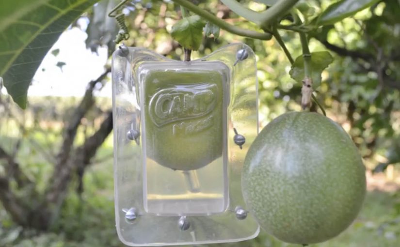
A piece of fruit is hanging from a tree. But it is not round. It is shaped like a juice pack, complete with the unmistakable carton silhouette.

Brazilian agency ageisobar was asked to prove that Camp Nectar juices were all natural. So they created molds in the shape of the brand’s packaging and attached them to fruit as it grew on farms. As the fruit developed and ripened, it took on the exact shape of the juice box, turning “made from real fruit” into something you can see without reading a claim.

The mold-on-tree mechanic

The mechanism is product proof, not persuasion. By product proof, the campaign uses the fruit itself as evidence instead of asking the audience to trust a written claim. Instead of showing ingredients or production steps, the campaign engineers a physical outcome that can only happen if real fruit is involved. The fruit becomes the packaging, and the packaging becomes the argument.

In packaged food and beverage marketing, “natural” claims are often distrusted, so literal demonstrations that collapse the gap between product and source earn attention faster than explanations.

Why the visual is hard to forget

The idea lands because it is a contradiction you can resolve instantly. You see something impossible, then you understand the trick, and the understanding reinforces the claim. It is also inherently shareable because the proof fits in a single frame. A fruit that looks like the pack.

Extractable takeaway: If your claim is routinely doubted, design a one-image demonstration that makes the claim self-evident, then let distribution follow the proof rather than the copy.

What the brand is really doing

Camp Nectar is not just saying “we’re natural”. It is trying to reset the credibility bar in a category full of vague promises. The stronger strategy is to make the claim visible, not louder. The execution borrows the authority of nature itself. Growth, time, and farming become the brand’s endorsement.

The real question is not whether the brand can say “real fruit”, but whether it can make that claim feel self-evident at a glance.

What food and beverage brands can take from this

  • Prove, do not promise. Engineer a physical or behavioral outcome that functions as evidence.
  • Compress the story into one frame. If the proof reads in a second, it travels further.
  • Let the medium match the message. A farm-grown artifact is more persuasive than a studio-made graphic.
  • Keep the claim implicit. When the proof is strong, the audience supplies the conclusion for you.

A few fast answers before you act

What is “Real Fruit Boxes”?

A demonstration campaign where real fruit is grown inside juice-box-shaped molds so it ripens into the shape of Camp Nectar’s packaging.

Why does this work better than ingredient messaging?

Because it is evidence-first. The audience sees a physical result that implies real fruit without needing technical explanation.

What is the core creative principle?

Make the proof visual, literal, and instantaneous. One glance should communicate the point.

What is the main execution risk?

If the proof looks fabricated or overly staged, trust collapses. The craft has to feel like a real-world process, not a prop.

When should brands use “literal proof” ideas?

When the category is saturated with claims and skepticism is high, and you can create a demonstration that is simple, safe, and repeatable.

Waternet Queen’s Day Challenge: Pee Race

Turning a messy problem into a canal-side race

Queen’s Day in Amsterdam brings huge crowds and heavy celebrations. It also brings a very practical problem for Waternet, the city’s water supplier: too many people treat the canals like a public toilet.

Instead of posting warnings, Waternet worked with Achtung! and installed several brightly colored urinals at different points along the canal. Each unit had four stalls and connected to a digital screen that turned peeing into a live race, with a simple incentive that makes people want to participate.

The mechanics that make it work

This is a strong example of ambient behavior-change design. Here “ambient” means the intervention lives in the environment, right where the decision happens, not in a banner ad or a TV spot.

Extractable takeaway: When the right behavior is a public, low-friction default with instant feedback, you can change behavior without asking people to absorb a lecture.

It works because the feedback is immediate, the experience is social by default, and the “right” behavior feels more fun than the “wrong” behavior. That combination reduces friction and replaces shame with competition. This is the kind of public-space activation brands should copy when the goal is behavior change, not sentiment.

In crowded city-center celebrations, playful public interactivity often changes behavior faster than moralizing signage.

Steal the ambient interactivity pattern

The real question is how to make the right behavior feel like the obvious choice in public, without needing anyone to read a sign.

  • Move the message to the moment. Put the interaction where the behavior happens, not weeks earlier in a campaign feed.
  • Make the desired action the easiest action. People choose the path that feels obvious and frictionless in public.
  • Use visible progress. A shared screen and a simple scoreboard create instant social proof.
  • Reward participation, not perfection. Even a small, symbolic payoff can tip the choice at scale.

A few fast answers before you act

What is the Waternet Queen’s Day Challenge?

It is a Queen’s Day activation in Amsterdam where Waternet installs canal-side urinals and turns their use into a multiplayer race on a connected screen, discouraging people from urinating into the canals.

How does the “pee race” work?

Four stalls connect to a shared screen. Participants use the urinal and the screen visualizes a race, making the act feel like a public, competitive mini-game rather than a private necessity.

Why does this kind of gamification change public behavior?

It replaces a negative instruction (“don’t do this”) with a positive, easy alternative that gives immediate feedback and a social payoff, which is especially effective in crowded, high-energy settings.

What makes an ambient activation succeed in public space?

Clear purpose, low friction, instant comprehension, and feedback people can see without explanation. If it needs a guide, it usually fails on the street.

How can brands use this pattern without relying on shock value?

Keep the mechanism. Swap the provocation. Put the interaction at the point of decision, make progress visible, and attach a small reward to the behavior you want to encourage.

Hire Us: Twitter Follow Stunt Lands a Job

Dutch creative team Bas van de Poel and Daan van Dam set up five separate Twitter accounts and started following various Dutch Creative Directors on Twitter. Their message was simple: HIRE US.

Even though the idea is very similar to the Jeep Twitter Puzzle campaign, the execution is different and innovative. It gets them noticed and finally a job with Boondoggle in Amsterdam.

Why five accounts is the point, not the gimmick

The mechanism is engineered repetition. By “engineered repetition,” I mean deliberately creating multiple small signals that form an obvious pattern in the target’s notifications. One account can be ignored. Five accounts create a pattern. When multiple new followers arrive with the same blunt message, it triggers curiosity and a small sense of social pressure. Someone is doing something intentional, and it is hard not to look.

It is also highly targeted. They do not broadcast “hire us” into the void. They place it directly in the attention stream of the people who can change their outcome.

In creative hiring markets, attention is scarce, so using a platform’s native behaviours to deliver an instantly legible message is often the fastest way to get noticed.

Why it lands: interruption plus clarity

This works because it is instantly legible. No clever puzzle to decode. No long portfolio pitch. The call to action is the entire creative idea. That clarity is what makes it feel confident. And because it happens inside Twitter’s native behaviours, following, notifications, profile clicks, it does not require extra friction. The recipient can react in seconds.

Extractable takeaway: When you need attention from specific decision-makers, create a small pattern using the platform’s native behaviours that communicates the ask in one glance and makes the next step easy.

The intent: turn hiring into a creative brief

The business intent is obvious. Get hired. But the deeper intent is to reframe the hiring process. Instead of asking for a meeting, they create a live demonstration of how they think. Targeted, lightweight, and culturally fluent in the medium.

The real question is how you create an impossible-to-ignore signal for the right people without turning the medium into spam.

Done with tight targeting and restraint, this approach is a legitimate creative proof point. Done broadly or repeatedly, it backfires as noise.

Borrow this for your own career marketing

  • Be specific about who you want. Target decision-makers, not “everyone”.
  • Design an interruption that fits the platform. Use native behaviours, not extra hoops.
  • Make the message instantly legible. One idea. One line. No explanation required.
  • Turn the ask into proof. Show your creativity in the method, not in a PDF pitch.
  • Keep it respectful and reversible. Clever is good. Spammy is not.

A few fast answers before you act

What did Bas van de Poel and Daan van Dam actually do?

They created five Twitter accounts and followed Dutch Creative Directors with a single message: “HIRE US”.

Why did using multiple accounts matter?

It created a noticeable pattern and a stronger interruption than a single follow, prompting curiosity and profile clicks.

How is this different from the Jeep Twitter Puzzle?

It is similar in spirit, but the execution is simpler and more direct. A single clear call to action rather than a puzzle mechanic.

What made it effective as self-promotion?

High targeting, low friction, and a message that communicates confidence in one second.

What is the main takeaway for personal branding?

If you want attention from decision-makers, design a small, platform-native experience that demonstrates how you think and makes the next step easy.