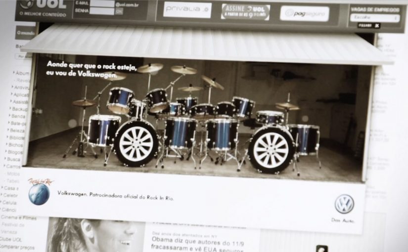
Volkswagen: Rock in Rio Drumset

A banner ad you can actually “play”

To celebrate Rock in Rio, Volkswagen built a banner execution that uses your webcam as the input device. Instead of asking you to watch, it invites you to perform, like a tiny drum solo inside a media placement.

How the mechanism earns attention

The core mechanic is simple: webcam permission turns a standard banner into an interactive surface, where your movement becomes the “controller” for the drum kit. That shifts the experience from passive exposure to active participation in a few seconds.

In brand-led entertainment marketing, the smallest possible interaction can turn a paid unit into something people choose to engage with.

Why it lands in a festival context

Rock in Rio is already about energy, performance, and communal hype. A drum kit inside a banner borrows that emotional language and makes it personal. You are not being shown “festival vibes”. You are generating them, even if it’s just for a moment at your desk.

The payoff is not the complexity. It’s the contrast: banners normally ask for a click, this one asks for a gesture. That little shift makes the format feel fresh again.

What to steal for your own work

  • Use one input. A single action users already understand (movement, tap, swipe) beats multi-step instructions.
  • Make the first five seconds obvious. If the user can’t “get it” instantly, they drop. Here, the drum metaphor does the teaching.
  • Match the interaction to the moment. Music festival content should feel performative. The interaction mirrors the cultural context.
  • Keep the reward emotional. The win is “I played it”, not “I learned a feature list”.

A few fast answers before you act

What is a webcam-controlled banner ad?

It’s a display ad unit that asks for webcam access and uses the camera feed as a live input, usually via motion detection, to let the viewer interact with the creative.

Why use a webcam in a banner at all?

Because it turns a standard media placement into an experience. That can increase attention and memorability when the interaction is instantly understandable.

What makes this Rock in Rio execution work?

The interaction fits the occasion. A drum kit is a native “festival” object, and the gesture-based control makes the format feel playful instead of intrusive.

What’s the main risk with webcam-based ads?

Friction and trust. If the value isn’t obvious, users will refuse permissions or bounce. The creative must communicate intent and payoff immediately.

What’s the simplest modern takeaway?

Give the audience a one-step action that creates a visible result. If the interaction is clear and rewarding, the format becomes the message.

Yellow Pages: Location Based Banner

Here is the next generation of interactive web banners. Tel Aviv agency Shalmor Avnon Amichay/Y&R promoted the Yellow Pages augmented reality location-based app by creating a banner that does the same thing.

The banner opens your webcam and lets you see the businesses around you. Wave your hand to switch between businesses. Click a business to jump straight to its Yellow Pages listing.

A banner that behaves like the product

The clever part is that this is not “interactive” for decoration. It is a working demo of the core value proposition. If the app helps you find what is near you, the banner proves that promise immediately, inside the placement, without asking you to imagine anything.

The mechanic: webcam as context, hand wave as UI

The flow is intentionally simple. Turn on the camera. Overlay nearby business options. Use a wave to move through results. Use a click to convert curiosity into action via the listing page.

In local discovery experiences, the strongest persuasion is a live, context-matched preview of usefulness rather than a feature claim.

Why it lands: it removes the “so what” gap

Most directory and local-search advertising dies in the space between promise and proof. This banner collapses that gap. You see your own context first, then you see results, then you can act. The interaction is the explanation.

Standalone takeaway: The fastest way to make a utility app feel essential is to let people experience the “aha” moment before they ever leave the page they are on.

What Yellow Pages is really trying to achieve

The business intent is to reposition Yellow Pages as modern, digital, and situationally useful, not just a legacy directory brand. The banner also creates a clear performance path. Engagement inside the unit, then click-out to a listing that can drive calls, visits, or follow-on app consideration.

What to steal from this execution

  • Mirror the product in the ad. If the product is a tool, make the ad behave like the tool.
  • Use one gesture people understand. A wave as “next” is instantly legible. No tutorial needed.
  • Keep the ladder of commitment short. Preview. Browse. Click through. No extra steps.
  • Make the experience readable for bystanders. In shared environments, obvious motion plus clear on-screen change sells the mechanic.
  • Watch privacy optics. If you turn on a camera, be explicit that it is for interaction and context, not identification.

A few fast answers before you act

What is a “location based banner”?

It is a banner ad that adapts its content to the user’s situation, typically location or environment cues, so the ad can show relevant nearby options instead of generic messaging.

How does this Yellow Pages banner work?

It opens a webcam view, overlays nearby business options, lets you wave to cycle through businesses, and lets you click a result to open the corresponding Yellow Pages listing.

Why use a webcam at all?

Because it makes the experience feel immediate and personal. The ad becomes a live “finder” interface rather than a static claim about finding things.

What makes gesture-controlled banners risky?

Friction and variability. If the gesture detection fails or is unclear, users assume the ad is broken. The interaction must be forgiving and the feedback must be instant.

What is the safest way to replicate the idea today?

Keep the mechanic to one simple input, provide clear on-screen feedback, and ensure the user can still get value even if they do not enable the camera.

Uniqlo: The Lucky Switch Banner Campaign

A banner that hijacks the whole page

Here is a strong example of a banner campaign that refuses to stay inside the banner frame. For Uniqlo’s end-of-year clearance push, the idea came in two parts. A blog or website widget, and a set of banners connected to a competition.

Flip the switch. Every image becomes a ticket

The core mechanic is simple. Embed the widget on a site, press it, and it transforms every image on that page into a Uniqlo “Lucky Ticket” that promotes the sale and the competition.

A widget is a small embeddable code block that adds interactive functionality to a webpage. In this case, it acts like a page-level switch the viewer controls, rather than a passive ad slot.

In Japan’s fast-fashion clearance cycles, speed and novelty matter, and the web is a shortcut to scale.

Results that make the concept concrete

The outcome is the part that makes this more than a clever demo. The widget was voluntarily installed on almost 5,000 blogs and generated over 2.8 million banner clicks.

Why it lands. It feels like a playful hack

A standard banner asks for attention. Lucky Switch gives the user a satisfying action with immediate, visible impact across the entire page.

This is the mechanism to why sentence. Because the viewer controls the switch and sees the whole page change instantly, the ad feels like a game mechanic, not a media placement.

It also reframes “click” into “cause”. The click is not a request to leave the site. It is a trigger that changes the environment.

What Uniqlo is really optimising

This campaign is not just chasing CTR. It is building voluntary distribution. Every blogger who installs the widget is effectively turning their own site into Uniqlo media, and every visitor is invited to interact with the brand on someone else’s page.

Extractable takeaway: Lucky Switch is what happens when you treat distribution as the product. Make the interaction so satisfying, and the reward so clear, that other sites choose to carry your campaign for you.

What to steal for your next interactive format

  • Design for “whole-page impact”. If your interaction only affects the ad unit, you are still competing with content. If it affects the page, you become part of the experience.
  • Make the click do something now. Deliver instant feedback before you ask for any deeper action.
  • Use viewer control, not autoplay. The switch metaphor makes participation feel self-directed and repeatable.
  • Reward both the host and the visitor. If you want voluntary installs, give both sides a reason to play.
  • Turn scarcity into a daily rhythm. Limited goods or rotating rewards create a reason to come back, not just click once.

A few fast answers before you act

What is Uniqlo’s “Lucky Switch” in one sentence?

A widget and banner concept that turns every image on a host page into a Uniqlo “Lucky Ticket”, making the whole page behave like the ad.

What is the core mechanism?

A page-level switch the viewer controls. Pressing it transforms the environment immediately, so the click delivers instant visible impact before any deeper action.

Why does this feel more engaging than a normal banner?

Because the user triggers a change across the entire page. The interaction reads like a playful hack, not a boxed-in ad unit competing with content.

What business intent does it serve for fast fashion?

It creates a high-speed, novelty-driven route to scale through voluntary installs, while driving sale awareness and competition participation.

What is the most transferable takeaway?

If you want banners to perform, make the click do something “now” in the user’s environment, not just ask them to leave the page.