The Adaptive Storefront: BLE Retail Display

Shop windows, billboards, bus stops, and car showrooms do not have to be passive experiences. In the video below, a prototype interactive digital display adapts to whoever stands in front of it.

The display identifies shoppers using Bluetooth Low Energy (BLE) and reacts to personal data stored on the shopper’s mobile device, such as shopping habits and preferences. Shoppers can swipe through personalised content, place items in a virtual shopping cart, and purchase straight from the display.

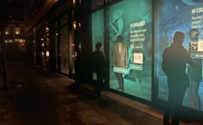
When glass turns into a shoppable interface

This “adaptive storefront” concept takes a familiar retail surface and makes it behave like a storefront UI. Here, “adaptive storefront” means the window can recognise a nearby device via BLE and change what it shows based on data available on that device. Not a poster. Not a looped video. A live interface that changes per person and lets you complete an action while you are still in that high-intent moment of attention.

How the prototype behaves in front of a shopper

  • Detect. BLE proximity is used to recognise that a specific shopper is present.
  • Adapt. The display adjusts what it shows based on data available on the shopper’s phone.
  • Let the shopper drive. Swiping changes what is on screen, rather than forcing a fixed sequence.
  • Close the loop. Items can be added to a cart and purchased directly from the display.

In physical retail environments, the storefront is the first high-attention interface a brand controls before a shopper reaches the shelf.

Why it lands

Because the display can recognise a nearby device and accept input on the surface, it compresses discovery, consideration, and purchase into one interaction. The value is not the novelty of a “smart window”. It is the reduction of steps between interest and action, while the shopper’s intent is still fresh. The real question is whether you can do that with clear permission and control, not silent personalisation.

Extractable takeaway: A surface becomes valuable when it combines context with immediate action. Personalisation only earns its keep when it removes friction and helps a shopper decide faster, not when it merely looks clever.

What it is really trying to unlock for brands

Behind the demo is a clear ambition. Turn high-footfall surfaces into conversion surfaces. If the experience is permissioned and useful, it can bridge the gap between physical browsing and digital checkout without forcing a shopper to open an app, search, and start over.

That also hints at a measurement upgrade. A storefront that can be interacted with can be instrumented. What people swipe. What they ignore. What they add. Where they drop. That is a very different feedback loop than counting impressions.

Practical takeaways for adaptive storefronts

  • Start with one job-to-be-done. For example, “help me shortlist”, “show me what is in stock”, or “let me buy in two taps”.
  • Make control obvious. If swiping is the interaction, design the UI so people understand it in one second.
  • Keep data minimal and on-device. Use only what is needed to improve relevance, and avoid making the experience feel intrusive.
  • Design for the environment. Glare, distance, dwell time, and group behaviour change everything compared to mobile UX.
  • Plan the opt-in moment. The experience works best when the shopper understands why the screen adapts and what they get in return.

A few fast answers before you act

What is an “adaptive storefront” in plain terms?

It is a storefront display that changes what it shows based on who is standing in front of it, and lets the shopper interact and buy directly on the surface.

Why use BLE for this type of experience?

BLE enables low-power proximity detection, so a display can recognise a nearby device and trigger the right experience without requiring scanning a code each time.

What data is needed to personalise the display?

Only enough to improve relevance. For example, stated preferences, browsing history, or saved items, ideally kept on the shopper’s phone and shared with clear permission.

What makes this feel useful instead of creepy?

Permission, transparency, and value. The shopper should understand what is happening, control it, and get something meaningfully better than a generic screen.

What should you measure in a pilot?

Opt-in rate, interaction rate, add-to-cart rate, conversion rate, and whether the experience reduces time-to-decision without increasing drop-off.

Daffy’s: The Undressing Room

You are walking past a Daffy’s store window in Manhattan and it looks like a fashion show has moved onto the street. Models are inside the display. A crowd is outside. And the public is controlling what happens by text message.

Daffy’s is a fashion retailer from NYC. For their fall fashion launch, they created a street-level event that blended window shopping, a fashion show, and an interactive peep show, meaning passers-by could text outfit requests to models inside while the exchange played out publicly on the glass, to create live interaction from hundreds of passers-by for an entire day and night.

The idea was simple. Put great-looking models in the window with items from the new range. Ask the public at street level to text a special number for each model, requesting specific items to try on and then change out of. Each message was projected onto the store window, letting the crowd follow the conversation, while the models used phones to interact with people on the street.

That shift from window to stage is what turns a shopfront into a live media channel when footfall competes with endless distractions.

Why the mechanism pulls a crowd

The mechanism is a tight loop. You text. Your message appears publicly. The model responds with an immediate, visible action. That creates instant feedback, plus social proof, because everyone can see that participation changes the experience.

Extractable takeaway: When participation is public and the response is immediate, bystanders become an audience because they can see cause and effect in real time.

It also turns fashion into a game with a scoreboard you can read. The projected message stream makes the crowd feel like a single audience, not scattered individuals passing by.

In high-traffic retail corridors, the format works best when the interaction loop is visible to everyone, not just the person who texts.

What Daffy’s is really buying

This is not just “engagement” for its own sake. It is earned attention at street level, then a shareable story that travels beyond the location. The activation is designed to make people stop, watch, talk, and tell others to come over.

The real question is whether you are designing for fast, visible participation that creates social proof, or just staging a spectacle.

This pattern is worth copying only when you can keep the loop tight and keep people safe once the crowd forms.

According to Daffy’s communications, more than 1,500 text messages were received between 6:00 p.m. and 9:30 p.m., and the event was suspended twice by NYC police due to crowd overflow impacting pedestrian and vehicle traffic.

Practical takeaways for interactive storefronts

  • Make the audience the controller. Participation should change something real, not just “send a message”.
  • Project the input publicly. Visibility creates social proof and gives bystanders a reason to join.
  • Design for fast feedback. The shorter the gap between action and response, the bigger the crowd gets.
  • Let the store be the medium. If the window is already the brand’s stage, use it as one.

A few fast answers before you act

What was Daffy’s “Undressing Room”?

A storefront window event where passers-by texted requests to models inside the window, and the messages were displayed publicly so the crowd could follow along in real time.

Why does projecting messages onto the window matter?

It turns private participation into a public feed. People see that the experience is live, and that others are actively shaping it, which increases curiosity and crowd growth.

What’s the core interaction design pattern here?

Public input plus immediate physical response. The text is the trigger. The window action is the payoff.

What makes this more effective than a normal fashion show?

Viewer control. People do not just watch. They influence what happens, and that makes them more likely to stay, share, and bring others.

What’s the biggest operational risk with this kind of activation?

Crowd control. If the moment works, it attracts more people than a normal storefront can safely handle, so permits and on-site management matter.

Nike: Trackball for CTR360

When Nike launched the CTR360 football boot in Singapore, they wanted something that could deliver the revolutionary features that make this product the ultimate in ball control.

So an interactive in-store experience was created where ball control and product knowledge of the Nike CTR360 was both seamless and seductive.

The real question is how to make a ball-control claim feel true within a few seconds of interaction.

For performance products, the best retail education is interaction, not explanation.

Why this retail execution works

The strongest part is that it does not separate “demo” from “education”. The interaction itself becomes the explanation. You learn by doing, and that is exactly how a ball-control product should be introduced. In performance-footwear retail, shoppers believe what they can trigger themselves without instructions. Here, “the mechanic” is the single interaction pattern that carries both the demo and the message.

Extractable takeaway: When a benefit is about control, design one self-explanatory action that proves control before you explain anything else.

  • Product truth in the mechanic. Control is demonstrated through controlled interaction, not described in copy.
  • Low friction discovery. Visitors do not need instructions to begin. The interface invites experimentation.
  • Retail as experience, not shelving. The store becomes the medium that proves the claim.

What to take from it

If your product benefit is physical or performance-based, build a retail moment that lets people feel the promise quickly. The goal is not to show every feature. It is to create one memorable proof point that makes the product easier to believe and easier to talk about.

  • Pick one proof point. Let people feel the promise quickly, instead of trying to cover every feature.
  • Make the start frictionless. Invite experimentation without needing staff to interpret what to do.
  • Design for retellability. Create a moment people can describe right after they try it.

A few fast answers before you act

What did Nike do for the CTR360 launch in Singapore?

Nike created an interactive in-store experience that demonstrated ball control while also communicating CTR360 product features through the interaction itself.

Why pair product education with interaction?

Because performance products are understood faster through demonstration than explanation. The experience makes the benefit tangible.

What is the core pattern behind this kind of retail activation?

Translate the product promise into a simple, inviting interaction. Then let that interaction deliver both the “wow” and the learning.

How do you know if an in-store experience is doing its job?

If a visitor can explain the product benefit immediately after trying it, without needing staff to interpret it, the design is working.