Interactive iPad ads: five touch-first patterns

New research from the IAB has shown that when it comes to advertising on tablets, interactivity is the key. And once you look at what the best iPad units are doing, that conclusion makes intuitive sense.

Take Microsoft’s iAd for Windows Azure. Instead of explaining “code in the cloud,” it lets you touch and change code inside the ad, and the layout responds. That is the core pattern for tablet advertising. Don’t describe the value. Let the reader experience it in seconds.

On tablets, display works best when the ad behaves like a small piece of product UI rather than a static interruption.

The IAB point, translated into creative

If your audience is holding a touchscreen, your ad has an extra superpower. Touch-first is the creative posture where the first meaningful thing the unit asks for is a gesture, and the response delivers the point. Drag, swipe, tap, reveal, simulate. The objective is not “more features.” It is to earn attention by giving the user a simple action and an immediate payoff. Because the payoff is immediate, the value lands without needing a paragraph of claims.

Extractable takeaway: On tablets, design the first gesture so it proves one promise immediately, then let everything else be optional.

In tablet-heavy retail and media environments, the strongest units turn touch into a tiny product moment that pays off in seconds.

The real question is whether your tablet creative proves the promise through a single gesture, or just says it in copy.

Interactivity should be the default assumption for tablet display, not a bonus layer.

Five iPad ad interactions worth stealing

White Collar

As a simple use of touchscreen behaviour, users solve a puzzle by dragging an icon across the screen to locate answers to questions displayed in the banner. It’s lightweight, but it turns a passive placement into an active moment.

Volkswagen Park Assist

To experience the Volkswagen Tiguan’s Park Assist, users touch two targets on the screen. The car then reverses and parks itself between those targets. A feature demo becomes a two-tap “proof” moment.
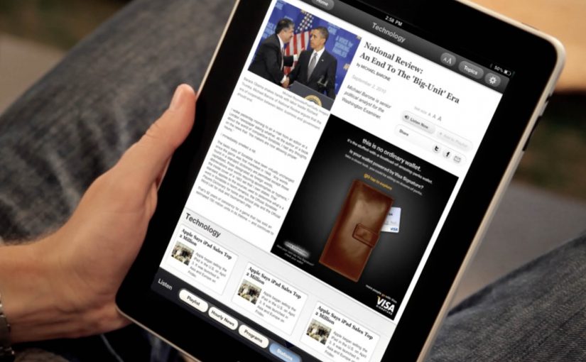
Visa Signature

Built in HTML5, the ad presents a virtual wallet that lets users browse and plan a holiday, buy theatre or cinema tickets, or reserve a hotel. It behaves like a mini service experience rather than an ad.

Toyota

Using the slogan “Filled with People,” the ad lets users drag a slider to watch an unfinished Toyota move through the factory floor while it is assembled. The interaction makes the narrative feel earned, not narrated.

Microsoft

Microsoft wanted developers to understand that Windows Azure allows code to be created in the cloud. So they built an iAd that lets readers alter its code, which in turn changes the layout. It’s a direct translation of message into mechanism.

What these examples have in common

  • One obvious gesture. Drag, tap, swipe. No tutorial needed.
  • Fast payoff. The response is immediate, so the user feels in control.
  • Feature-as-experience. Parking, planning, building, assembling. The “meaning” is in the interaction.
  • Tablet-native pacing. These units assume longer attention than mobile banners and reward it.

Touch-first moves to reuse in your next tablet ad

  • Make the first interaction the headline. The opening instruction should be one short verb. “Drag.” “Tap.” “Swipe.”
  • Use interactivity to prove one point. Pick one promise and build one satisfying micro-demo around it.
  • Design for fat-finger reality. Targets must be generous. Feedback must be unmistakable.
  • Keep exits graceful. If someone watches but doesn’t interact, the unit should still communicate the core idea.

A few fast answers before you act

Why does interactivity matter more on tablets than on desktop banners?

Because touch is the native input. When an ad uses the same gestures as the device, it feels more like content and less like a bolt-on placement.

What’s the simplest “interactive” pattern that still works?

A single drag or tap that reveals something meaningful. A before/after, a quick feature demo, or a short guided reveal with instant feedback.

What’s the most common way interactive tablet ads fail?

Too much complexity. Multiple steps, unclear targets, or slow loading kills the moment before the user gets a reward.

Do interactive ads always beat static ads?

No. Interactivity helps when it makes the message easier to understand or more satisfying to experience. If it’s interaction for its own sake, it becomes friction.

How do you decide whether a tablet idea should be a “mini app” like Visa’s example?

Only do it when the brand’s value is in navigation and choice. If you need users to explore options, then a mini UI can be the product story. Otherwise, a single micro-demo is usually stronger.

Bradesco Seguros: The Fake iPad Ad

A fake ad that behaves like a real crash

Bradesco Seguros created a cheeky ad in the iPad version of Quatro Rodas, a Brazilian car magazine. When readers swipe the “page,” the car in the ad follows the direction of the gesture and crashes into the side of the screen, unveiling the message: “Unexpected events happen without warning. Make an insurance plan.”

The mechanic: one native gesture, one irreversible consequence

The entire idea is built on the most common tablet behavior: swiping to move on. Instead of letting the user escape the ad, the ad “obeys” the swipe and turns it into the cause of an accident. The crash is the reveal. It is also the proof that the format is touch-native, not a print layout copied onto glass. Here, touch-native means the idea only works because the swipe directly causes the outcome on the screen.

In touch-first publishing, a single gesture-driven interaction can turn an ad into a micro-experience that earns attention the way content does.

Why it lands

It creates a moment of surprise without requiring explanation. The user thinks they are performing a routine action, then the ad responds in a way that feels physical and slightly alarming. Because the message is revealed by the crash itself, the brand does not need to overclaim. The interaction makes the point. The real question is whether the gesture itself makes the risk message feel immediate, inevitable, and brand-relevant. This is a strong use of tablet media because the interaction and the message are inseparable.

Extractable takeaway: If your message is about risk or unpredictability, make the audience cause a small, safe “unexpected event” through a familiar action, then reveal the message as the consequence.

What touch-first ad teams should steal

  • Exploit a default gesture. Build on what people already do, not what you wish they would do.
  • Make the payoff immediate. The interaction must resolve within a second or two, or it feels like a gimmick.
  • Let the mechanic carry the copy. If the interaction proves the point, the line can stay simple and memorable.
  • Keep it brand-safe. Use surprise, not fear. The crash is symbolic, not distressing.

A few fast answers before you act

What is Bradesco Seguros’ “Fake Ad” in Quatro Rodas?

It is an interactive iPad magazine ad where a swiping gesture makes the car in the ad move and crash into the screen, revealing the insurance message about unexpected events.

What is the core creative mechanic?

Gesture mirroring. The ad responds to the swipe like content would, then turns that response into a surprising consequence that delivers the message.

Why is this better than a standard banner or full-page ad?

It uses the tablet’s native behavior, so the attention is earned through interaction, not demanded through interruption.

What is the key lesson for touch-first advertising?

Design around one familiar gesture and make the output feel inevitable and meaningful, not decorative.

What is the most common way this approach fails?

When the interaction is slow, unclear, or unrelated to the message. The mechanic must be the argument.

Anthon Berg: The Generous Store

Generosity is one of the basic elements in human happiness. The campaign cites research suggesting that only 1 in 10 people experience generosity from others. To help change that trend, Danish chocolate maker Anthon Berg opens “The Generous Store”.

For one day only, the pop-up is described as the first chocolate shop where people cannot pay with cash or card. Instead, the store provides iPads where people log in to Facebook and post a promise of a generous deed to a friend or loved one.

When generosity becomes the price tag

The twist is simple. Chocolate is not discounted. It is “priced” in actions. Your payment is a public commitment, not a transaction, and that changes how the brand message travels.

How the mechanic works

Here, the mechanic is the rule set that turns each chocolate into a reward for a promised deed. Each product comes with a defined generous deed. At checkout you choose the deed, sign in on an in-store iPad, and publish the promise to the person you are doing it for. The store does not accept money. It accepts a visible commitment that a real person can later hold you to.

In FMCG and gifting brands, turning a private intention into a light public commitment often spreads faster than any discount ever could.

Why it lands

This works because it removes the usual friction of “sharing”. People do not share an ad. They share a promise addressed to someone they care about. That makes the post feel personal, not promotional, and it gives the brand a role as the trigger for a positive moment. The one-day constraint also adds urgency. If you want in, you have to show up and do the thing.

Extractable takeaway: If you can make the customer’s “payment” a social commitment with a clear recipient, the message travels as a relationship act, not as brand content.

What the brand is really buying

The real question is whether your brand can make the act of purchase double as a socially visible promise people want to complete.

The store trades short-term revenue for reach and association. The earned effect is not just “people talked about a pop-up”. It is that the brand gets attached to a stream of personal posts that already have attention and emotional context. That is a much stronger distribution layer than asking people to like a page or share a video.

What FMCG and gifting brands can steal

  • Use a non-monetary currency that matches your brand. Here the currency is generosity, not points.
  • Make the action specific. Vague kindness does not travel. Concrete deeds do.
  • Design for a real recipient. A named person increases follow-through and keeps it human.
  • Keep the steps brutally simple. Choice, login, post. No extra hoops.
  • Limit the window. Scarcity turns a nice idea into an appointment.

A few fast answers before you act

What makes this “social commerce” rather than a normal pop-up?

The checkout is a social action. The “payment” is a posted commitment to another person, which creates distribution inside an existing network.

Why is the Facebook post essential to the idea?

It turns intent into accountability. The promise is visible to the recipient and friends, which increases the chance of follow-through and gives the campaign its reach.

What is the main risk with a “good deeds as currency” mechanic?

If it feels forced or performative, people will reject it. The deeds must feel genuinely generous and culturally natural for the audience.

How would you adapt this if you cannot use Facebook or logins?

Keep the structure and change the channel. The key is a lightweight commitment addressed to a real person, made in a way that is easy to share and later remember.

What should you measure beyond views?

Track footfall during the activation, earned mentions, the volume of public pledges, and any lift in brand association with generosity in post-campaign tracking.