
Dentsu: iButterfly Location-Based Coupons

Coupons with wings: iButterfly turns deals into a mobile hunt

Here is a great example of Online, Mobile and Shopper Marketing converging with Augmented Reality (AR), where the phone camera view becomes the backdrop while digital objects are overlaid and tied to location signals like GPS. Integrated Marketing literally put into the hands of the people.

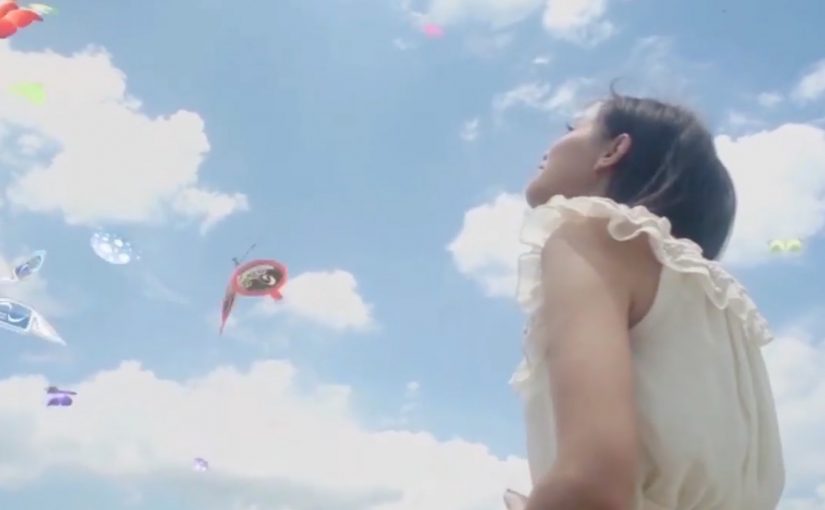
Japanese ad agency Dentsu has started this experimental coupon download platform called iButterfly on the iPhone. The free iPhone app transforms the habit of collecting coupons into a fun little game using AR and the device’s GPS.

The mechanic: catch a butterfly, unlock a coupon

The app tasks its users with catching virtual butterflies that are flying around, each representing one or more coupons. You can even share “butterflies” with your friends via Bluetooth.

In this context, the phone camera view becomes the backdrop, while digital objects, here butterflies, are overlaid and tied to location signals like GPS.

In retail and FMCG shopper marketing, the value of this approach is that promotions become a location-linked experience, not a passive download.

Why this format works for targeted promotions

The key shift is motivation. People are not “clipping” coupons. They are playing a simple collecting game, and the reward is a deal that feels earned. That feeling is why the offer holds attention long enough to drive action.

Extractable takeaway: When an offer is packaged as a collectible tied to place and moment, it feels context-aware rather than generic. Treat location as part of the experience, and keep the capture-to-redemption path short so the “find” turns into a real reward.

What Dentsu is really prototyping here

This is less about novelty AR and more about a new distribution behavior. Turning offers into collectible objects changes how often users open the app, how long they stay in it, and how naturally they talk about it with friends.

The real question is whether your promotion can create a repeat habit, not just a one-time redemption.

This format is worth copying when you can tie the reward to a real place and keep redemption friction near zero.

It is also a rare example where “share with a friend” is not a marketing CTA. It is a gameplay action that carries the promotion with it.

Shopper activation moves to copy from iButterfly

  • Make the reward immediate. Catch. Unlock. Redeem. Long funnels kill the game loop, the simple repeat cycle of catch, unlock, redeem.
  • Use location as a story, not a filter. Place rewards where people already go, so the map feels meaningful.
  • Let sharing be part of the mechanic. A tradable object beats a generic “share this” button.
  • Keep the collection simple. If users need a manual, they will not hunt.

A few fast answers before you act

What is iButterfly?

iButterfly is a mobile coupon platform that turns deal collection into a location-based AR game. Users catch virtual butterflies on their phone and unlock coupons as rewards.

How does the AR coupon mechanic work?

Users view the real world through the phone camera. Virtual butterflies appear and can be “caught”. Each butterfly contains one or more offers, which unlock after capture.

Why is this relevant for shopper marketing?

It shifts promotions from passive browsing to active discovery. Location and gameplay increase attention, repeat usage, and the likelihood of in-the-moment redemption.

What makes it feel targeted rather than random?

Butterflies can be tied to locations and contexts via GPS. That links the offer to where the shopper is, not just who they are.

What is the biggest execution risk?

If redemption is hard or the rewards feel weak, the novelty wears off fast. The game loop only survives when the payoff is clear and friction stays low.
Uniqlo: The Lucky Switch Banner Campaign

A banner that hijacks the whole page

Here is a strong example of a banner campaign that refuses to stay inside the banner frame. For Uniqlo’s end-of-year clearance push, the idea came in two parts. A blog or website widget, a small embeddable code block that adds interactive functionality to a webpage, and a set of banners connected to a competition.

Flip the switch. Every image becomes a ticket

The core mechanic is simple. Embed the widget on a site, press it, and it transforms every image on that page into a Uniqlo “Lucky Ticket” that promotes the sale and the competition.

In this case, it acts like a page-level switch the viewer controls, rather than a passive ad slot.

In Japan’s fast-fashion clearance cycles, speed and novelty matter, and the web is a shortcut to scale.

Results that make the concept concrete

The outcome is the part that makes this more than a clever demo. The widget was voluntarily installed on almost 5,000 blogs and generated over 2.8 million banner clicks.

Why it lands. It feels like a playful hack

A standard banner asks for attention. Lucky Switch gives the user a satisfying action with immediate, visible impact across the entire page.

Because the viewer controls the switch and sees the whole page change instantly, the ad feels like a game mechanic, not a media placement.

It also reframes “click” into “cause”. The click is not a request to leave the site. It is a trigger that changes the environment.

The real question is whether your format earns voluntary distribution by making the first interaction feel like a reward, not a request.

What Uniqlo is really optimising

This campaign is not just chasing CTR. It is building voluntary distribution. Every blogger who installs the widget is effectively turning their own site into Uniqlo media, and every visitor is invited to interact with the brand on someone else’s page.

Extractable takeaway: Lucky Switch is what happens when you treat distribution as the product. Make the interaction so satisfying, and the reward so clear, that other sites choose to carry your campaign for you.

What to steal for your next interactive format

  • Design for “whole-page impact”. If your interaction only affects the ad unit, you are still competing with content. If it affects the page, you become part of the experience.
  • Make the click do something now. Deliver instant feedback before you ask for any deeper action.
  • Use viewer control, not autoplay. The switch metaphor makes participation feel self-directed and repeatable.
  • Reward both the host and the visitor. If you want voluntary installs, give both sides a reason to play.
  • Turn scarcity into a daily rhythm. Limited goods or rotating rewards create a reason to come back, not just click once.

A few fast answers before you act

What is Uniqlo’s “Lucky Switch” in one sentence?

A widget and banner concept that turns every image on a host page into a Uniqlo “Lucky Ticket”, making the whole page behave like the ad.

What is the core mechanism?

A page-level switch the viewer controls. Pressing it transforms the environment immediately, so the click delivers instant visible impact before any deeper action.

Why does this feel more engaging than a normal banner?

Because the user triggers a change across the entire page. The interaction reads like a playful hack, not a boxed-in ad unit competing with content.

What business intent does it serve for fast fashion?

It creates a high-speed, novelty-driven route to scale through voluntary installs, while driving sale awareness and competition participation.

What is the most transferable takeaway?

If you want banners to perform, make the click do something “now” in the user’s environment, not just ask them to leave the page.

Nike: Music Shoes

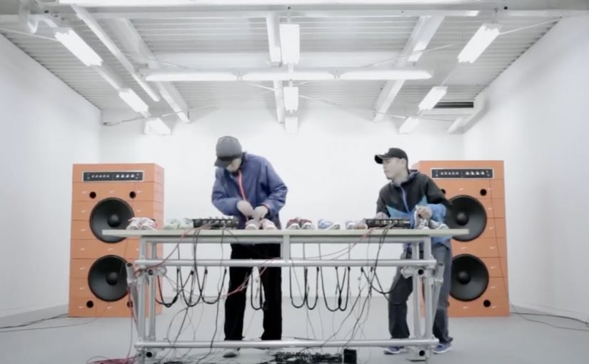
Shoes as we know it are never going to be the same again. Nike has just come up with the first of its kind music shoes!

Here is a short video showing how the shoes were made…

This is the final Nike Music Shoes ad…

Why this idea feels like a shift

The shoes are not styled as fashion first. They are staged as an instrument. They are also staged as an interface. Here, “interface” means the shoe becomes a control surface that converts movement into sound. That reframing matters because it turns product into performance. Because the movement-to-sound mapping is immediate, the audience can grasp the idea without extra explanation. In global consumer marketing, proof-led product storytelling like this tends to travel further than style-led messaging. You do not watch someone wear them. You watch someone play them.

Extractable takeaway: When you introduce a new interaction, show the input and output in the same moment, so belief is earned through observable cause and effect, not claims.

  • Product becomes interface. Movement is translated into sound, which makes the shoe feel “alive”.
  • Proof in the making. The build film adds credibility and curiosity before the final creative payoff.
  • Shareable demonstration. People want to show others because the concept is easiest to understand when you see it.

What to learn from the two-video structure

Pairing a “how it was made” film with the final ad is a smart sequencing move. First you earn belief. Then you deliver the spectacle. In innovation storytelling, that order often performs better than going straight to the hero spot. The real question is whether your innovation needs a proof chapter before you ask people to share it. For novel product behaviors, lead with proof, then pay off with spectacle.

  • Earn belief first. Let the making-of do the minimum explanation needed for “this could be real”.
  • Then stage the performance. Use the final ad as the payoff where the product is “played”, not described.
  • Keep it demo-able. If a viewer cannot retell it after one watch, it will not travel.

A few fast answers before you act

What are Nike “Music Shoes”?

They are a concept where the shoe is treated like a musical instrument, translating movement into sound to create music through performance.

Why include a making-of film as well as the final ad?

The build film establishes credibility and explains just enough to make the final ad feel possible, not magical.

What is the core creative pattern here?

Turn a product into an interface, then let a live-style demonstration carry the message without heavy explanation.

How can brands reuse this idea without copying it?

Identify one product behavior you can translate into a new medium, then show both the “proof” and the “performance” as two linked chapters.