Coca-Cola: FM Magazine Amplifier

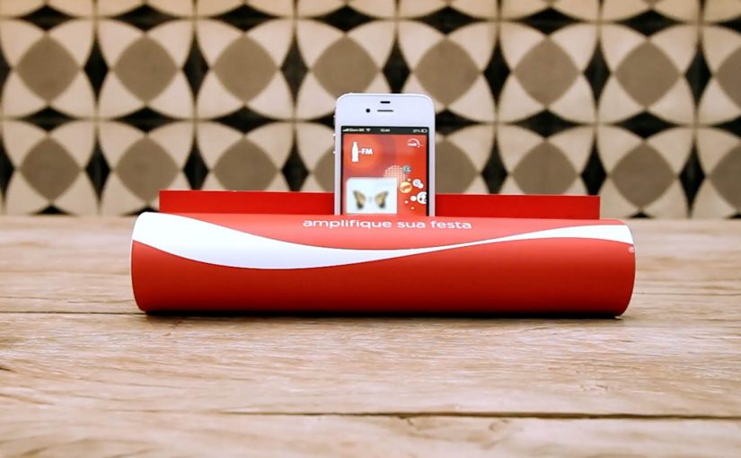
Coca-Cola to promote its FM app in Brazil allowed readers of the Capricho magazine to simply roll up the magazine and transform it into a portable amplifier for their iPhones. All the readers had to do was insert the iPhone into the spot indicated and tune into the Coca-Cola FM application. By “portable amplifier” here, I mean passive acoustic amplification from rolled paper, not electronics.

Why this is clever

The idea turns print into a functional accessory. No electronics. No QR-code dependency. Just smart physical design that rewards curiosity and makes the app the natural next step. Because the rolled magazine forms a simple acoustic horn, it directs the phone’s speaker output and makes the sound feel louder right away.

Extractable takeaway: When a piece of media becomes a working object, the “ad” turns into a demo and the digital step feels inevitable.

  • One simple action. Roll the magazine, insert the iPhone, hit play.
  • Instant utility. Louder sound is a real, immediate benefit.
  • Media becomes product. The magazine is not only a channel. It is the device.

In global consumer brands, analog-to-mobile bridges like this help when you need an obvious path into an app without adding new tech.

What to learn from it

This is a strong reminder that “mobile activation” does not always need a screen-first mechanic. When you can create a physical trigger that is obvious and satisfying, you reduce friction and increase shareability. People demonstrate it to others because it is surprising, and because it works.

The real question is how to make the next mobile step feel like a continuation of what people are already doing in the moment.

The strongest activations put physical utility first and let the app be the immediate follow-on.

  • Start with utility. Give people a benefit they can feel instantly, then invite the app as the next step.
  • Design one obvious move. Keep the interaction to a single action people can copy and demonstrate.
  • Make it easy to show. If it reliably “works”, people will hand it to someone else and replay the moment.

A few fast answers before you act

What is the Coca-Cola FM Magazine Amplifier?

It is a Capricho magazine execution in Brazil designed to be rolled into a tube that passively amplifies iPhone audio, used to promote the Coca-Cola FM app.

Why does a paper amplifier work at all?

The rolled shape acts like a simple acoustic horn, directing and concentrating the phone’s speaker output so it sounds louder.

What makes this effective as an app promotion?

The app is not advertised as a feature list. It is experienced. The physical utility creates a reason to open the app immediately.

What is the transferable pattern?

Turn media into a usable object, then connect that object to a single, obvious mobile behavior that completes the experience.

Listerine: Flipbook With Bad Breath

Bad breath is one of the most embarrassing issues for people when they socialize. Listerine decided to bring this experience to life with a flipbook that released a pungent onion scent.

To induce trials, a coupon was attached to the back of the flipbook and people could redeem it for a free Listerine bottle at nearby locations. Reported redemption rates reached 66%.

How the flipbook makes “bad breath” real

The mechanism is sensory contrast. By sensory contrast, the idea uses an unpleasant smell to make the problem felt before presenting relief. The flipbook invites curiosity, then the onion scent turns the message into a physical reaction rather than a line of copy. The coupon sits at the exact moment of discomfort, offering a clean, immediate next step.

In personal care and FMCG trial programs, multi-sensory sampling can convert awareness into action by making the problem visceral and the solution frictionless.

Why it lands

This works because it skips explanation and goes straight to feeling. The real question is whether the brand can make an invisible hygiene problem feel urgent without needing a long explanation. People do not need to be persuaded that bad breath is awkward. The scent creates instant empathy, and the coupon makes the brand’s role clear. This works because the unpleasant smell collapses the distance between message and felt need, so the offer lands exactly when the problem feels most real. It is not just “remember Listerine”. It is “fix this now”.

Extractable takeaway: If you can make an invisible problem tangible in seconds, you earn attention. When the solution is placed immediately at the point of reaction, trial becomes the natural next move.

What to steal from this trial mechanic

  • Use one sensory punch: pick a single sense and make the idea unmistakable, not subtle.
  • Place the offer at peak relevance: the call to action should appear exactly when the user feels the problem.
  • Keep the conversion step simple: a clear redemption path beats a complex signup flow.
  • Design for public reaction: when people react visibly, the activation creates its own distribution.
  • Measure beyond reach: redemption and repeat behavior are the real KPIs, not just views.

A few fast answers before you act

What is the Listerine “flipbook with bad breath” activation?

It is a flipbook handout infused with an onion scent to simulate bad breath, paired with a coupon for a free bottle to drive trial.

Why add scent instead of just showing a message?

Scent turns an abstract problem into an immediate, physical experience. That speed is what makes the idea memorable and shareable.

What role does the coupon play?

It converts the reaction into a next step. The coupon makes the solution actionable at the exact moment people feel the discomfort.

Is the 66% redemption figure reliable?

It is reported in trade coverage. If you need it as a hard metric, keep it but treat it as reported unless you have the primary source.

Where does this pattern work best?

When the product solves a problem people already recognize, and when you can make the problem instantly tangible without crossing into humiliation or offense.

Shell: Pedestrian Ghost

A driver approaches a crosswalk too fast. A “pedestrian” suddenly appears from a manhole cover, then shoots up into the sky like a soul escaping. The only sane response is to slow down.

Speeding cars and pedestrian safety is a huge problem in Ukraine. Ukraine is described as having the highest percentage of pedestrian collisions in Eastern Europe at 56%. To make people think twice about speeding, Shell along with JWT Ukraine created an ambient campaign called the Pedestrian Ghost, a person-shaped helium decoy that appears only when a driver is speeding. The campaign ran during Halloween and generated a lot of buzz over the internet.

A ghost that only shows up when you speed

The mechanism is built for one job. A radar detects an approaching vehicle that exceeds the speed limit. When the threshold is crossed, a hidden device integrated into a manhole cover inflates a person-shaped “ghost” using helium-filled balloons. The figure rises fast and disappears upward, creating a moment that feels like you just hit someone, even though nothing living is harmed.

In dense city streets where drivers routinely treat crosswalks as negotiable, the sharpest safety interventions are the ones that create a visceral consequence in the exact second a bad decision is made.

The real question is how to make speeding feel consequential before harm happens.

Why it lands

It works because it weaponizes surprise without needing explanation. The ghost is unmistakably human-shaped, the timing is unmistakably linked to speed, and the “escape” into the sky reads like consequence. That instant cause-and-effect loop is what resets behavior, at least for the next few blocks. For road-safety messaging, this is the right trade-off: simulate consequence hard enough to reset behavior, but never create real danger.

Extractable takeaway: If you want to interrupt dangerous habits, trigger the intervention only at the violation moment, and make the feedback so immediate and legible that drivers connect cause and effect without being told.

What this crosswalk ghost gets right

  • Trigger only on the infraction. The selectivity makes the moment feel targeted, not random.
  • Use a single, readable symbol. A human silhouette beats a statistic for behavior change.
  • Design for “I have to tell someone”. A story people can repeat in one sentence becomes earned media.
  • Keep the intervention non-injurious. The fear is simulated, the outcome is safe.

A few fast answers before you act

What is “Pedestrian Ghost”?

An ambient road-safety stunt where a ghost-like pedestrian figure rises from a manhole cover at a crosswalk when a radar detects a speeding car, forcing drivers to slow down.

What is the core mechanism?

Radar detects speeding. A concealed device inflates a person-shaped helium “ghost” and releases it upward. The driver experiences an immediate, consequence-like shock without any real harm.

Why does it change behavior better than a warning sign?

Because the feedback is timed to the violation and feels personal. The driver is not being advised. They are being startled at the exact moment of risk.

What is the biggest failure mode if I copy this pattern?

Unreliable triggering. If the effect fires at the wrong time, or too often, people stop believing the cause-and-effect link and the intervention becomes noise.

What is the simplest modern variant?

A violation-triggered intervention that is immediate, physical, and unmistakably tied to speed. For example light, sound, or motion that only activates above a threshold at the crosswalk.