Subway “Daredevil Delivery”

Subway was facing massive competition from other fast food chains in China. Mobile agency iconmobile was given the task to claim the mindsets of their target audience in an innovative way that also triggered sales.

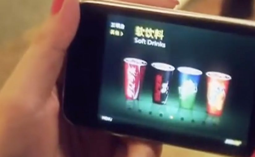
A mobile game was created to let users step into the role of a subway delivery guy. Rather than just providing an emotional benefit, the app also included…

  • a map that provided direction to shops nearby
  • a click-2-call order function
  • a mobile coupon channel to trigger sales according to the users behaviour

Here, a mobile coupon channel means offers delivered through the phone based on what the user does in the experience, not a generic discount blast.

Why the mechanics matter

The idea combines three practical conversion tools with gameplay. A nearby-store map reduces “where do I go”. Click-to-call reduces “how do I order”. Coupons reduce “why now”. The game gives all of it a reason to be opened in the first place. This is smart mobile thinking because it makes the route from attention to order materially shorter. The real question is how to turn a branded interaction into a faster path to purchase.

Extractable takeaway: entertainment works harder when it removes friction at the exact moment interest is highest.

In mobile-led fast food categories, this matters because attention is easy to win for a moment, but ordering friction still kills intent fast.

What Subway is really trying to do

The business intent is to turn branded play into store discovery, faster ordering, and timed coupon redemption.

What to borrow for mobile campaigns

  • Attach utility to entertainment. Games can drive attention, but the built-in tools drive action.
  • Keep the path to purchase short. If ordering is a tap away, intent has less time to cool down.
  • Use behaviour to time incentives. Coupons work better when they match what the user is doing in the moment.

A few fast answers before you act

What is Subway “Daredevil Delivery”?

A mobile game campaign in China that put users in the role of a Subway delivery guy, paired with tools that could trigger real orders.

Which agency created it?

iconmobile.

What features connected the game to sales?

A nearby-store map, a click-to-call ordering function, and a mobile coupon channel based on user behaviour.

Why is this stronger than a branded game on its own?

Because the game creates attention, while the map, call function, and coupon channel give that attention a direct path to store visits and orders.

What is the key lesson for mobile?

Pair a fun mechanic with immediate utility, so the experience can convert curiosity into action without friction.

Fiat Street Evo

Leo Burnett Iberia has launched a new app called Fiat Street Evo, described as a “not-printed” car catalogue. A catalogue that is virtually on every street in your city.

Fiat Street Evo recognises traffic signs as if they were QR codes and associates each sign with a feature of the new Fiat Punto Evo. For example, a STOP sign points you to braking. A curve-ahead sign points you to intelligent lighting that guides you through bends. The list continues across the everyday signage you pass without noticing.

When street furniture becomes a product demo

The mechanism is a neat inversion of the usual brochure logic. Instead of printing a catalogue and hoping people keep it, the city becomes the index. Your camera becomes the browser, and the sign becomes the trigger. Here, “street furniture” means the signs and fixtures already in public space.

In automotive launch marketing, the strongest mobile ideas turn the real world into media without asking people to change their routine.

Why it lands

It reframes “specs and features” as discovery. You do not read a list. You unlock a feature in context, tied to a symbol you already understand. That makes the catalogue feel lighter, and it makes exploration feel like play rather than research. This pattern is stronger than a brochure-style feature list because it earns attention through context, not interruption.

Extractable takeaway: Product education travels further when it is organised around familiar cues in the environment, not around the brand’s feature taxonomy.

What Fiat is really trying to achieve

The real question is whether you can make the phone the first place curiosity goes by attaching product education to cues people already recognise. This kind of execution is doing two jobs at once. It builds attention for a new model, and it makes the phone the first place curiosity goes. That matters because the intent moment is not always at a dealership. It is often on the street, in motion, and in between other tasks.

Patterns to borrow for mobile launch marketing

  • Borrow existing symbols. Traffic signs already carry meaning. Use that meaning as your information architecture.
  • Keep the mapping intuitive. The sign-to-feature link should feel obvious, or people will drop the experience.
  • Design for quick sessions. One sign. One feature. One payoff. Repeat when you feel like it.
  • Make “catalogue” feel like exploration. A sense of discovery beats a long scroll of specifications.
  • Use the city as distribution. When the triggers are everywhere, frequency becomes effortless.

A few fast answers before you act

What is Fiat Street Evo in one sentence?

It is a mobile catalogue concept that recognises traffic signs and uses each sign to reveal a related Fiat Punto Evo feature.

Why call it a “not-printed car catalogue”?

Because the “pages” are distributed across the city as street signs. The phone becomes the reader, and the street becomes the catalogue.

What makes the sign-to-feature mapping important?

The mapping is the comprehension layer. If the association feels natural, users keep going. If it feels random, the idea collapses into novelty.

What is the biggest execution risk?

Recognition reliability. If the app struggles to identify signs in real conditions, people will not persist beyond the first attempt.

What should you measure in a pilot?

Successful recognitions per session, repeat usage, time-to-first-payoff, and whether the experience increases search, dealership visits, or brochure requests.

Nutricia: Baby Connection

Young parents all over Belgium rely on Nutricia babyfoods every day. To support mums even before their baby is born, Duval Guillaume helped Nutricia create Baby Connection, an iPhone app designed to get dads more involved in the pregnancy.

Baby Connection works best when you use it as a couple. There is a mum version and a dad version, and everything each parent adds is automatically synced with their partner’s phone. The app can even transform two iPhones into one big screen.

A couples app that turns involvement into habit

The mechanism is simple and deliberate. Split the experience into two roles, then keep both roles in lockstep through syncing. Add a playful physical trick, two phones acting like one screen, to make “doing this together” feel tangible, not just promised.

In Belgian consumer brand building, support tools land best when they reduce friction for both parents and make the dad’s role practical, not symbolic.

Why it lands

This works because it shifts the conversation from “be more involved” to “here is exactly how”. Shared inputs, shared visibility, shared moments. The app design quietly nudges the couple into repeated check-ins, which is where involvement stops being intention and becomes routine.

Extractable takeaway: If you want two people to share responsibility, design the product so both can contribute in small ways, see each other’s contributions instantly, and feel like a team without extra coordination effort.

Launching an app with an experience, not a banner

The real question is how to make shared participation feel real before the baby arrives, not how to advertise another pregnancy app.

To launch Baby Connection, Duval Guillaume backed the app with a campaign designed to be as distinctive as the product itself, and to pull the idea into public conversation beyond the app store listing.

The stronger move is to market the shared behaviour the product enables, not just the app itself.

What pregnancy-support brands can borrow

  • Design for the couple, not the individual. Two roles, one shared narrative.
  • Make syncing the default. Shared visibility is the involvement mechanic.
  • Add one physical “together” moment. A simple device interaction can signal partnership better than copy.
  • Launch the product idea, not only the product. If the behaviour change is the point, market the behaviour.

A few fast answers before you act

What is Nutricia Baby Connection?

A paired iPhone app for expectant couples, with separate mum and dad versions that sync pregnancy updates and activities between both phones.

What is the core mechanism?

Two-role design plus automatic syncing, so both parents can add and see information without manual coordination.

Why does the “two iPhones as one screen” idea matter?

It turns a digital feature into a physical couple moment, reinforcing that pregnancy planning is shared, not solo.

What is the business intent behind this kind of app?

To support and deepen trust with parents before birth, by providing a practical tool that keeps the brand present in daily routines.

What is the most reusable lesson here?

If you want involvement from a second person, make contribution easy, feedback immediate, and shared progress visible.