
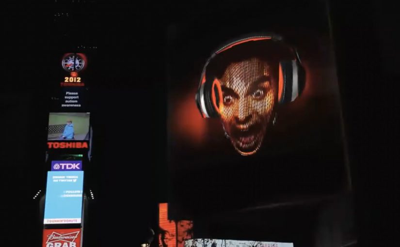
Denon VisYOUalizer: feel the music

Denon wants to bring to life the idea that with its line of lifestyle headphones you do not just hear the music, you feel it. So BBDO New York, described alongside Jam3 in production write-ups, creates an engaging experience for younger audiences who are not yet familiar with Denon’s long-running audio heritage.

A Denon VisYOUalizer app is created that lets people try on the headphones virtually and turn their faces into a dynamic, customized music visualizer.

How the VisYOUalizer turns “sound” into something you can see

The mechanic is simple. Your face becomes the canvas, the music becomes the driver. You line up to a camera, the headphones snap into place virtually, and the experience maps a moving visual layer to your expression and the track’s energy. Because the visual layer responds in real time to both the track and your expression, the “feel it” promise reads as proof rather than copy.

In consumer electronics and lifestyle brands, face-based interactivity works best when the visual payoff is immediate and the product benefit is embodied rather than explained.

Why it lands for a younger audience

Headphone marketing often leans on specs, heritage, or famous musicians. This goes the other way. It starts with play and self-expression, then backfills the brand story through the experience and its share value. The real question is whether you can make an intangible promise visible enough that people want to play with it before they care who you are. When awareness is the constraint, a participatory demo beats a spec-led pitch.

Extractable takeaway: If your benefit is sensory or emotional, make the user’s own face or movement the proof, and deliver the payoff before you ask for attention to the brand story.

That matters when awareness is the real problem. If people do not know Denon, a participatory demo can earn attention faster than a product film.

What the brand is really doing here

This is a virtual try-on wrapped around a music visualizer. The try-on makes the product tangible. The visualizer makes the “feel it” claim legible. And the combination gives Denon an interaction that people can show to friends without needing to explain anything.

Steal this for your next “feel it” product idea

  • Turn an abstract benefit into a visible response. If “feel” is the promise, show a reaction that moves with the input.
  • Make the first 10 seconds rewarding. The hook should work before anyone reads instructions.
  • Use virtual try-on as the entry point. It lowers friction because people already know what to do.
  • Let personalization do the marketing. When people see themselves in the output, they are more likely to share.

A few fast answers before you act

What is the Denon VisYOUalizer?

It is a face-based interactive experience that lets you virtually try on Denon lifestyle headphones and transforms your face into a music-driven visualizer.

What product message is it designed to prove?

It translates “you do not just hear the music, you feel it” into a visual reaction that changes in real time with the sound and the participant’s presence.

Why combine a visualizer with a virtual try-on?

The try-on makes the product concrete and recognizable on your face, while the visualizer supplies the emotional payoff that makes people stick around and share.

What do you measure to judge success?

Time spent, completion rate, share rate, repeat plays, and click-through to product pages are more meaningful than raw impressions for an experience like this.

What is the biggest failure mode for this format?

If the camera alignment is finicky or the output looks generic, people bounce fast. The experience needs instant feedback and obvious personalization.
Sprint: Unlimited Love Billboard in Times Square

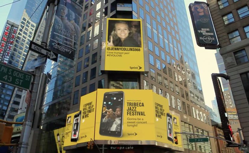
You are in Times Square and a billboard asks a simple question. What do you love. You tweet your answer with #EVOLOVE to @sprint, and the screen answers back with places in New York City where you can find it.

Sprint in the USA created an integrated advertising campaign for the launch of the HTC EVO 4G LTE phone on their network. To launch EVO in New York City they set up an interactive billboard in Times Square that encouraged visitors to tweet things they love with #EVOLOVE to @sprint. Then, with the help of local experts, the billboard re-tweeted locations of where these things of love could be discovered in New York City.

Why the mechanic works

The mechanism is a clean exchange. You give the brand a public signal. A tweet about something you love. The brand gives you an immediate, useful response. A location you can act on right now. That “reply with value” is what turns a hashtag prompt into participation.

Extractable takeaway: Interactive OOH works best when the public input reliably triggers a fast, specific reply that helps someone decide what to do next.

It also creates a visible social proof layer. The billboard is not only showing Sprint’s message. It is showing other people’s messages, which makes the campaign feel alive and current while you are standing there.

In consumer technology launches and telco marketing, a social-to-DOOH loop, where a social post immediately changes what the screen shows, turns a landmark screen into a real-time recommendation engine that people can influence from their own phones.

What Sprint is really buying

This is a launch tactic that behaves like service. It positions the EVO as a device you use to discover the city, not just a phone with specs. At the same time, it lets Sprint demonstrate “unlimited” as a lived experience. Always on, always connected, always responding in real time.

The real question is whether you can keep the reply layer fast, relevant, and brand-safe in public.

If you cannot operationalize that reliably, a simpler DOOH idea will outperform an “interactive” one that feels slow or generic.

Steal this reply-with-value billboard pattern

  • Make the input obvious. One hashtag. One handle. One sentence prompt.
  • Return something concrete. Maps, directions, a nearby place, a clear next action.
  • Curate the response layer. “Local expert” guidance beats generic automation for relevance and trust.
  • Design for the crowd and the clip. The street moment should be fun to watch. The video should still work without being there.

A few fast answers before you act

What is the Sprint #EVOLOVE Times Square billboard?

A digital billboard that invites people to tweet what they love with #EVOLOVE to @sprint, then responds by showing where in New York City they can find that thing.

Why connect Twitter to a billboard instead of running a normal DOOH spot?

Because participation becomes the content. The screen stays fresh, people feel seen, and the interaction creates a public spectacle that attracts more participants.

What is the “value exchange” in this campaign?

The user provides a public message and attention. The brand provides a timely, useful recommendation and makes the user visible on a high-profile screen.

What makes this different from simply displaying tweets on a screen?

The reply layer. The billboard does not only mirror tweets. It answers them with specific places and directions, which turns social chatter into utility.

What is the biggest execution risk?

If the responses feel slow, generic, or off-topic, people stop playing. The campaign only works when the replies feel genuinely relevant in the moment.

Turismo de Portugal: Cobblestone QR Codes

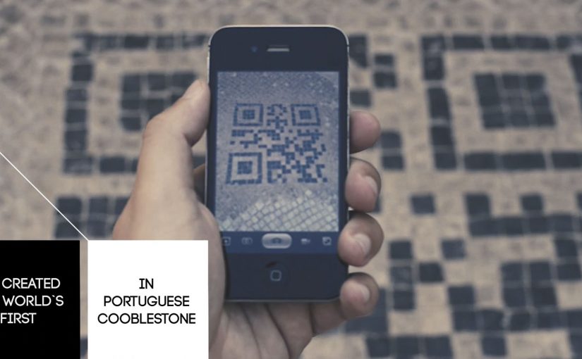
To get into the minds of tourists, Turismo de Portugal decides to fuse QR code technology with Portugal’s historical cobblestone tradition. The result is described as the first QR code made from Portuguese cobblestones.

The first QR code is embedded into the city ground in Lisbon, followed by an installation in Barcelona. Reported write-ups describe the campaign as successful enough to spark plans for similar cobblestone QR codes in other cities such as Berlin, Paris, Tokyo, New York, Vienna, Goa, Lima, and Oslo.

When street craft becomes the interface

The mechanism is simple. A familiar tourist behavior, looking down at the street and looking for cues, is turned into a scan trigger. The QR code is physically “native” to the place because it is built using the same black-and-white stone patterns people already associate with Portuguese streets, especially in historic areas like Chiado.

In destination marketing and city tourism promotion, bridging physical street culture to mobile content is a reliable way to convert foot traffic into deeper engagement. Destination brands should treat the street as the interface, not just the backdrop.

In European destination marketing, the most scalable activations turn street-level cues into a clear mobile doorway.

Why this lands with visitors

It does two jobs at once. It signals “authentic Lisbon” through material and craft, and it gives the tourist an immediate next step through their phone. The real question is how you turn a place’s own cues into a frictionless next step without making it feel like advertising. Unlike a poster or a billboard, the code is part of the ground people are already walking on, so discovery feels like finding something, not being targeted.

Extractable takeaway: If you want mobile interaction in public space, embed the call-to-action into something the place already owns. Local texture first, technology second. The scan should feel inevitable, not imported.

What to steal for your own place-based activations

  • Make the trigger belong to the environment. Use local materials, patterns, or rituals so the interaction feels contextual.
  • Design for tourist attention spans. The best street interactions reward a 5-second decision, not a long explanation.
  • Use “discovery” as the media buy. When people feel they found it, they are more likely to scan, share, and talk about it.
  • Plan for maintenance and legibility. Outdoor codes live or die based on wear, lighting, contrast, and camera-readability.

A few fast answers before you act

What is the Cobblestone QR idea in one sentence?

A QR code built into the street using Portuguese cobblestones, so tourists can scan a piece of the city itself to access content.

Why does making a QR code “physical” matter?

Because it turns a generic tech behavior into a place-specific experience. The scan feels like interacting with Lisbon, not with a random sign.

What makes this different from putting a QR code on a poster?

Placement and meaning. A poster is rented space. A street pattern is owned space. The medium carries authenticity before the message even loads.

What should the QR code open to?

A fast-loading mobile page that confirms you are in the right place and offers one clear next step. If the page feels generic or slow, the “found it” magic disappears.

What is the biggest execution risk?

If the code is hard to scan or the content behind it is weak, the novelty collapses. The physical build earns attention. The mobile experience must repay it.