Nike SPARQ: Immersive Digital Training

When training becomes the differentiator. Nike SPARQ goes digital

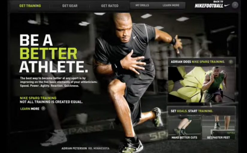
Not too long ago, talent determined greatness. Today, talent is a given, but training is what separates the exceptional from the merely promising. So to help athletes everywhere reach their true potential through better training, Nike along with ad agency R/GA New York created an immersive digital experience for the SPARQ program (Speed, Power, Agility, Reaction, and Quickness).

Athletes could now follow the same training regimens as professional athletes through detailed, customized video demonstrations delivered via iPods or handheld video players that made it accessible anywhere. The SPARQ website also let athletes set goals, track progress, find Nike SPARQ Trainers across the country, get an official SPARQ rating, and purchase gear.

The smart move: make elite training portable and personal

The experience does two things at once. It brings pro-level drills to anyone with a device, and it makes training feel individualized through customization and video guidance. That combination shifts SPARQ from “program” to “daily habit.”

In sports-performance brands and youth training programs, the winners make instruction portable enough to survive real life.

Why this feels bigger than content

The real question is whether your digital experience builds a habit-forming training loop, or just publishes drills. Because it is not just inspiration. It is infrastructure. Video demonstrations give you the “how,” goal setting and tracking give you the “keep going,” the rating gives you a yardstick, and trainers plus gear connect the digital loop to the real world. Here, the digital loop is the cycle of instruction, goals, tracking, and feedback that pulls you into the next session. Treat training as infrastructure, not content, if you want durable engagement.

Extractable takeaway: Pair instruction with goals, tracking, and feedback loops so progress is visible and practice becomes a habit.

The business intent hiding in plain sight

Build a performance ecosystem that increases commitment over time. The more you train, track, and compare, the more SPARQ becomes the platform you return to. And the more natural gear purchase becomes inside that flow.

Steal the habit loop, not just the videos

  • Ship a loop, not content. Guidance, goals, tracking, and a measurable score.
  • Design for anywhere use. Portability turns intention into repetition.
  • Connect digital motivation to real-world touchpoints. Trainers, ratings, and commerce.

A few fast answers before you act

What does SPARQ stand for?

Speed, Power, Agility, Reaction, and Quickness.

What did Nike and R/GA New York build?

An immersive digital experience for SPARQ that delivered customized training video demonstrations and a supporting website for goals, tracking, trainers, ratings, and gear.

How did athletes access the training content?

Through detailed video demonstrations delivered via iPods or handheld video players, making the training accessible anywhere.

Why did this feel bigger than training videos?

Because it combined instruction with goal setting, tracking, a rating, and connections to trainers and gear, creating a repeatable training loop.

What made the SPARQ website useful beyond videos?

It let athletes set goals, track progress, find SPARQ trainers, get an official SPARQ rating, and purchase gear.

What is the simplest principle to copy from SPARQ?

Pair guidance with goals and feedback so people can see progress and have a reason to return.
Bing: Decode JAY-Z

In a market dominated by Google, Bing wants to feel like a modern choice, and a younger audience is the fastest route to relevance. So it partners with JAY-Z for the launch of his book Decoded.

A book launch that shows up in the real world first

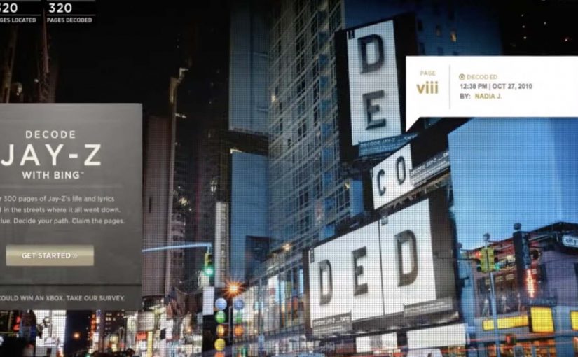
Instead of revealing the book in one place, pages are unveiled in locations referenced on those pages: a Gucci jacket, a restaurant, a hotel pool, a pool table, a car, a bus stop, and a subway. The stunt turns reading into a hunt, and turns “promotion” into something you can physically stumble into.

How the decode game works

Bing ties the physical reveals to an integrated game where fans assemble the book digitally using Bing Search and Bing Maps. Clues to page locations are released daily across Facebook, Twitter, and radio, pushing fans back into search behavior and map-based navigation as part of the entertainment.

In consumer search platforms, discovery mechanics that bridge real-world locations and digital navigation can turn a launch into participation.

Why it lands with a younger audience

The mechanics reward curiosity, speed, collaboration, and social proof. Finding a page is a story you can post. Decoding a clue is a micro-win. Watching the book come together feels like progress you helped create, not content that was simply handed to you. That works because each clue forces a Search and Maps action, so the product becomes the route to the reward.

Extractable takeaway: If you want a younger audience to adopt a utility product, tie progress to repeatable micro-wins that are easy to share.

The business intent hiding in plain sight

For Bing, the goal is not only buzz around Decoded. It is repeated usage of Search and Maps in a context where using the tools feels like play, not a utility task. The partnership borrows cultural gravity from JAY-Z, then converts it into product interaction.

The real question is whether your launch can force repeat product actions, not just cultural attention.

This is stronger than a celebrity endorsement, because it makes Search and Maps the game board instead of the backdrop.

Steal the decode launch mechanics

  • Make the “content” unlockable. People value what they have to discover, not what they are merely shown.
  • Anchor digital behavior to a physical trigger. Real locations make clues feel concrete and worth chasing.
  • Ship a daily cadence. Drip-fed clues keep attention warm without demanding long sessions.
  • Design for sharing as proof-of-work. Proof-of-work here means a visible signal that you did the effort, not just consumed the content.

A few fast answers before you act

What is “Decode JAY-Z” in one line?

A scavenger-hunt book launch where pages appear in real places, and fans use Bing Search and Bing Maps to find and assemble the book digitally.

What are the key mechanics?

Location-based page reveals, daily clues distributed through social and radio, and a digital assembly experience built around search and maps.

Why does this work better than a standard launch?

It converts passive awareness into repeat actions, and each action produces a shareable win that keeps the loop going.

What is the transferable takeaway for product marketing?

If your product is a tool (search, maps, utility apps), embed it inside a game where using the tool is the fun, not the homework.

What should you measure to know it worked?

Track repeat usage of the specific features you embedded in the game (search queries, map actions, and return visits), not only reach or mentions.

IKEA: A New Kind of Catalog

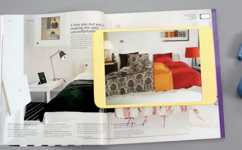
Every year, the IKEA Catalog inspires people around the world to create homes they love. For the 2013 edition, IKEA takes the inspiration one step further by bringing technology to the paper catalog and creating a more seamless connection to purchase.

IKEA worked with McCann New York to re-imagine the catalog via a visual recognition app that brings select pages and the offerings within to life. The experience is positioned around inspirational videos, designer stories, “X-ray” views that peek inside furniture, and more.

How the catalog becomes an interface

The mechanic is page recognition. You point your phone at a printed page and the app identifies the exact spread, then overlays or opens the matching digital layer. That is what “visual recognition” means here. The camera view is used to recognize the image itself, so the print can stay clean without obvious codes taking over the layout.

This is interactive print done as a product layer, not as a QR code workaround. The page remains a premium editorial surface, and the interactivity is unlocked through recognition rather than visible markers.

In global retail organizations with massive print distribution, recognition-based layers let brands turn a static catalog into a measurable, updateable experience without redesigning the entire print grammar.

The real question is whether your print can behave like an interface without sacrificing the editorial feel that makes people pick it up in the first place.

Why “X-ray” and stories beat a pure commerce push

What makes this approach land is that it does not start with “buy now.” It starts with curiosity. Here, the “X-ray” layer is a simple cutaway view that lets people see inside furniture to understand utility. Peek inside a unit. Watch the product in context. Hear the thinking behind a room setup. Those are the moments where browsing becomes intent.

Extractable takeaway: If you want print-to-digital to stick, lead with reassurance and curiosity, not a commerce CTA. Use interactivity to remove uncertainty in one fast payoff, not to add a menu of options.

The “X-ray” idea is also a smart translation of a physical store behavior. People open drawers and cupboards in-store to understand utility. This gives a lightweight version of that reassurance from the page.

What IKEA is really building with this

At face value, it is an augmented catalog. Underneath, it is a bridge between inspiration and action. A catalog is already a decision-shaping channel. Adding tappable layers makes it a trackable channel and creates new points where IKEA can educate, reassure, and nudge the path to purchase.

Copyable moves for print-to-digital catalogs

  • Keep the print clean. If the page looks like a code sheet, you lose the lifestyle premium.
  • Use interactivity to remove uncertainty. Show how it works, what fits inside, how it looks in a room.
  • Design for quick wins. One scan should yield something useful immediately, not a long menu.
  • Make the layer repeatable. If it can work on many pages, it becomes a system, not a stunt.

A few fast answers before you act

What is a “visual recognition” catalog app?

An app that recognizes a printed page using the phone camera, then unlocks related digital content tied to that exact spread.

Why is recognition better than QR codes for premium catalogs?

Because it preserves design. Recognition can keep layouts clean and still enable interaction, while QR codes often force visible markers into the page.

What is the “X-ray” feature actually communicating?

Utility and confidence. It helps people understand storage and function without needing to visit a store or guess from a single photo.

What is the main business value of interactive print?

It turns inspiration into measurable engagement and creates additional moments to guide purchase decisions, especially for considered categories like furniture.

What is the biggest risk with print-to-digital layers?

Friction. If scanning is slow, unreliable, or the payoff is thin, people abandon the habit after one try.