Volvo In-Car Delivery

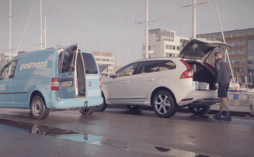
It is late November. You order groceries and Christmas gifts online. You park your Volvo somewhere in Gothenburg. While you are still at work, a courier finds your car, unlocks it once, drops the package into the boot, locks it again, and leaves. You receive a notification. When you drive home, your shopping is already waiting in your car.

That is the core idea behind Volvo’s in-car delivery service. It is available to customers who subscribe to Volvo On Call and live in Gothenburg, Sweden. For the Christmas period, deliveries come from two online retailers. Lekmer.com and Mat.se. PostNord handles the delivery. The courier uses a special one-time access digital key to open the car, place the package in the boot, and re-secure the vehicle.

Why “deliver to the car” is a bigger move than it sounds

At first glance, in-car delivery reads like convenience marketing. Skip missed deliveries. Avoid the “where is my package” loop. Reduce the need to be at home.

But the real shift is structural. The car becomes a secure delivery endpoint. Meaning, the vehicle is treated like a locked, addressable drop-off location with controlled access.

The real question is whether controlled access can make the car a dependable handover point for third parties, not whether the feature feels convenient.

That matters because it turns connected car capability into a service layer that can be monetized and extended. The value does not end when the car leaves the dealership.

The mechanism that makes it work

This service only becomes credible when the access model is precise. The logic is simple:

  • The courier does not get your physical key.
  • The courier gets a one-time digital key that grants limited access for a single delivery.
  • The car becomes the controlled handover point. The boot is the practical drop zone.

Because access is scoped to one delivery and the boot, the courier can complete the drop without you surrendering the car or the physical keys.

When you can grant time-bounded, narrowly scoped access and revoke it immediately, physical assets become secure handover points for partners.

This is not “keyless” as a gadget feature. This is access as a managed entitlement, designed for commerce and logistics.

In European urban settings where people spend the day away from home, reliable delivery depends on secure drop points that do not require the customer to be present.

Why Volvo is telling a marketing story through engineering

Volvo often wins when the innovation is concrete and utility-driven. In-car delivery is exactly that. It is a clean demo of connected technology that saves time, reduces hassle, and fits real family behavior during peak shopping season.

Extractable takeaway: If you want people to believe a new connected service, show it solving a real, repeatable pain point in one clear moment, then let the engineering do the persuasion.

The brand story is also clear:

  • Connected car tech is not an abstract dashboard feature.
  • It changes how everyday logistics works.
  • It makes the car useful even when it is parked.

That is a stronger narrative than “we have an app.” It is a capability that people can visualize immediately.

The strategic signal to other industries

In-car delivery is also a quiet message to adjacent ecosystems:

  • Retailers get a new delivery option that reduces failed deliveries.
  • Logistics players get a new category of secure handover.
  • Carmakers get a template for post-sale services that can scale through partnerships.

In short. Volvo is experimenting with moving beyond simply building and selling cars, by tapping into connected technologies that keep creating value after purchase.


A few fast answers before you act

What is Volvo In-Car Delivery in one sentence?

Volvo In-Car Delivery is a service that lets packages be delivered into your car’s boot using a one-time digital key, instead of delivering to your home.

Who can use it in this pilot?

In this pilot, it is available to Volvo On Call subscribers in Gothenburg, Sweden.

Which retailers and delivery partner are involved?

For the Christmas period described here, the retailers are Lekmer.com and Mat.se, and PostNord handles delivery.

What is the key innovation behind the experience?

The key innovation is controlled access via a one-time digital key that allows the courier to unlock the car once, place the delivery in the boot, and lock it again.

Why is this more than a convenience feature?

It turns the car into a secure delivery endpoint, which creates a service layer that can be monetized and extended through partnerships beyond the initial sale.

Klépierre: Inspiration Corridor

One of the biggest problems brick-and-mortar retailers face is that many consumers prefer the convenience of shopping online. So Klépierre, a European specialist in shopping center properties, decides to give customers a unique and personal window shopping experience that simultaneously advertises multiple brands available in its shopping center.

How the corridor turns browsing into a saved journey

The mechanism is a walk-in “inspiration corridor” that is described as using an infrared camera and live detection to adapt the interface to the visitor. The walls then show a curated set of products pulled from real-time inventory, and the visitor can tap items to add them to a personal shopping list. At the end, the selection syncs to the Klépierre mobile app, which then helps locate the chosen products in the mall.

Here, live detection means the corridor reads the visitor in the moment and adjusts what appears on the walls accordingly.

In European shopping centers, the winning retail experiences blend discovery and convenience, giving visitors a reason to browse physically while keeping the efficiency people associate with online shopping.

The result is a browse-first experience that keeps discovery and wayfinding in one flow.

Why this beats “more screens”

This lands because it does not ask shoppers to learn a new behavior. It upgrades a familiar one. Window shopping. The corridor simply makes browsing feel personal and actionable, then removes the “I’ll never find it again” friction by saving the picks and turning them into a navigable list. The stronger move is not to add more screens, but to make physical browsing easier to finish. That works because discovery, selection, and store-finding happen in one continuous interaction.

Extractable takeaway: If your category is losing visits to online convenience, do not fight browsing. Instrument it. Let people browse with their body language and taps, then hand them a saved list that makes the rest of the journey feel effortless.

The quiet business intent

The real question is whether one shared experience can turn mall-level discovery into measurable value for multiple tenants at once.

Klépierre is not only showcasing technology. It is selling a multi-brand promise. One interaction can route a shopper to several tenants, lift discovery across stores, and create measurable signals of interest without needing a single retailer to run the whole experience alone.

What mall operators should borrow

  • Curate across brands. A mall operator can create value by packaging discovery in a way individual stores cannot do alone.
  • Connect to live stock. Recommendations feel credible when they map to what is actually available right now.
  • Make saving the default. “Tap to add” is the key bridge from inspiration to purchase intent.
  • Close the loop with wayfinding. The experience should end with “here’s where to get it”, not just “wasn’t that cool”.
  • Design for low friction. The corridor should work in seconds, even for someone who did not plan to engage.

A few fast answers before you act

What is Klépierre’s Inspiration Corridor?

It is an in-mall interactive experience that personalizes product recommendations on surrounding walls and lets visitors tap to save items to a shopping list that syncs to the mall’s app.

How does the personalization work?

It is described as using live detection, for example via an infrared camera, to adapt recommendations and the interface to the visitor in the moment.

What problem does this solve versus standard mall advertising?

It turns passive promotion into active selection. Instead of only seeing brand messages, shoppers leave with a saved list and a practical path to find products.

What is the main metric to watch?

Saved items per session, app sync rates, store visit lift for featured tenants, and conversion from saved lists to purchases where measurement is possible.

What should you be careful about when deploying live detection?

Be explicit about what is being detected and why, keep the experience usable without any personal account setup, and avoid language that implies storing identities or profiling.

Amazon Dash: The Button That Rewrites Loyalty

A one-click purchase is not the point. Default is.

Amazon Dash Button looks simple. A branded button you stick near the place of usage. You press it. The same item arrives again.

But the strategic move is not “one click.” It is making the reorder the default behavior.

Dash Button turns repeat buying into an ambient habit. By “ambient habit,” I mean a repeat action triggered by the environment rather than an active shopping session. It shifts commerce away from discovery and toward automation. It pushes the battle for the customer from the shelf and the screen to the home.

What the Dash Button does

Dash Button is a small connected device tied to one specific product, and often one specific pack size. You link it to your Amazon account. You place it where the need occurs.

Examples are obvious in everyday life:

  • Detergent button near the washing machine
  • Coffee button in the kitchen
  • Pet food button near the feeding area

When the product runs low, you press. Amazon confirms the order, typically via app notifications, and ships.

The experience is intentionally narrow. That narrowness is the innovation.

In consumer convenience products, loyalty is often less about love and more about default.

In high-frequency household categories, the interface at the point of use can matter more than the message at the point of sale.

Why the narrowness matters

Dash Button removes three high-friction moments that brands fight over every day. Because one button equals one SKU, the moment of need no longer reopens the choice.

Extractable takeaway: If you can turn repeat purchase into a single configured action, you shift competition from persuasion in the moment to setup before the moment.

  1. Search. The customer does not type a query.
  2. Comparison. The customer does not see alternatives.
  3. Persuasion. The customer does not view ads, ratings, or promotions in the moment.

In other words, the customer does not shop. They simply replenish.

Once a household adopts replenishment behavior, the role of branding changes. The brand becomes less about persuasion and more about being the chosen default.

The hidden bet. Repeat purchases are the real moat

Dash Button is a physical expression of a platform strategy.

If Amazon captures replenishment categories, it wins the durable, high-frequency part of retail. The items that quietly drive recurring revenue and predictable logistics.

The button also functions as a data instrument. It reveals how often a household needs a product, where it is used, and which categories are truly habitual versus occasional.

That insight feeds subscriptions, predictive delivery, and future interface removal.

What this signals to CPG and retail leaders

Dash Button compresses marketing into an upstream decision.

The real question is how you become the configured default before the point of purchase even exists.

For CPG leaders, this forces uncomfortable clarity on loyalty, pack architecture, trade visibility, and availability. For retailers, it signals a shift in power toward whoever owns the reorder interface.

The consumer tension. Convenience vs control

Dash Button introduces a trust tradeoff.

Consumers value convenience, but they also worry about accidental orders, loss of price checks, oversimplified choice, and dependence on a single platform.

Those tensions do not invalidate the model. They clarify what platforms must solve through better confirmations, clearer reorder states, and smarter replenishment rules.

The bigger story. Interfaces disappear

Dash Button fits a broader direction in commerce. Buying moves away from screens and toward contexts.

The pattern is consistent: less explicit shopping, more embedded intent, more automation, and more default-driven brand outcomes.

Dash Button is not the endpoint. It is an early, tangible step toward commerce that feels invisible.

What to steal from Dash-default loyalty

  • Win the setup, not the moment. Treat the “configured default” as the real battleground, not the last-second persuasion layer.
  • Make narrowness a feature. If the goal is replenishment, deliberately constrain the action so choice does not reopen at the moment of need.
  • Put the trigger where the need occurs. The closer the interface sits to usage, the more it behaves like an always-on shelf for repeat buying.
  • Design for convenience with control. Keep confirmations and reorder states clear so automation feels helpful, not risky.

A few fast answers before you act

What was Amazon Dash?

Dash was a physical reorder button that let customers buy a specific everyday product with one press, removing browsing and checkout steps.

What is the core mechanism?

Turning replenishment into a default action. One button equals one SKU. The interface collapses choice into speed and habit.

Why does this change loyalty dynamics?

Because the reorder interface becomes the brand decision. If the button exists, switching requires extra effort, so the default compounds over time.

What is the business intent?

Increase repeat purchase frequency and reduce churn by owning the replenishment moment and lowering friction to near zero.

What should other brands steal?

Design for the reorder moment. If your category is habitual, the winning move is to remove steps, make the default easy, and earn repeat behavior through convenience.