FriendsWithYou: Cloudy

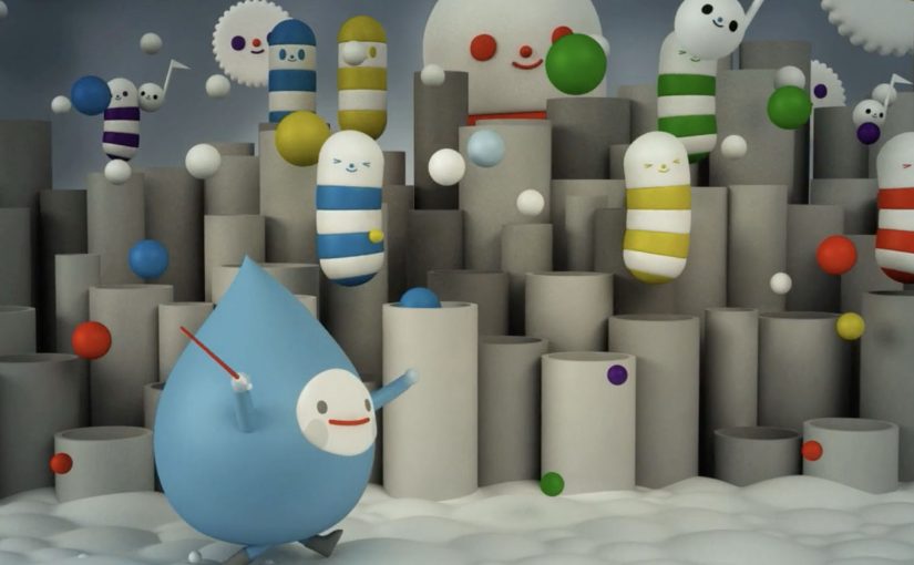
Miami based animation studio FriendsWithYou has produced “Cloudy”, a short film exploring the concept of clouds singing and performing their duties in a joyful manner while showing the viewer that everything in our world has a role and a purpose.

Sit back and enjoy this sweet visual soundscape that takes you through a personal journey into the sky. Here, “visual soundscape” means a piece where rhythm, tone, and imagery do the narrative work together.

A sky full of characters, not weather

“Cloudy” treats the atmosphere like a workplace musical. Clouds are not background texture. They are the cast, with jobs to do, rhythms to keep, and a mood that turns routine into celebration.

The mechanic: give nature a chorus

The film’s core device is straightforward. Personify the clouds, make the labor visible, and score it like a performance. Once the viewer accepts that premise, every movement becomes readable as intention rather than randomness.

In brand and studio storytelling, anthropomorphism lands when it is used to clarify a system rather than merely decorate a scene.

Why this lands as a “visual soundscape”

The piece is gentle, but it is not passive. It holds attention by pairing simple character purpose with musical momentum, so you feel guided through the sky rather than shown a series of pretty shots.

Extractable takeaway: If you want viewers to remember a message about meaning or purpose, do not explain it first. Stage it as a system of roles, then let the audience feel the order before you name it.

What it is really doing

Beyond the craft, the film is an attitude. It argues that work can look joyful, that duty can look like play, and that even the quiet background parts of a world can be the main event when you frame them that way.

The real question is whether purpose can be made felt before it is explained.

What to steal for your own short-form craft

  • Pick one premise and commit. Once clouds can sing, every scene should deepen that rule, not diversify into new ones.
  • Make “process” the plot. Showing how something gets done is often more watchable than inventing a separate story.
  • Let sound carry structure. A strong musical spine can turn a mood piece into a journey with forward motion.
  • Give the viewer one clean idea to take home. Purpose is easier to feel when every character has a job.

A few fast answers before you act

What is Cloudy?

“Cloudy” is a short animated film by FriendsWithYou that imagines clouds singing and joyfully doing their work, to suggest that everything has a role and a purpose.

What makes it a “visual soundscape”?

The experience is built as much on rhythm and audio mood as on imagery. The sound is not decoration. It is the structure that carries the viewer through the piece.

Why does anthropomorphizing clouds work here?

Because it makes an abstract system legible. Once clouds behave like characters with duties, the viewer can follow cause, effect, and intention without needing exposition.

What can brands learn from this kind of short?

When you want to communicate values like purpose, care, or optimism, show a world where roles are clear and the system feels coherent. That feeling transfers faster than a stated message.

What should creators copy first?

Start with the rule, not the ornament. Give the world one clear premise, then let character, sound, and motion keep proving it.

IKEA: A New Kind of Catalog

Every year, the IKEA Catalog inspires people around the world to create homes they love. For the 2013 edition, IKEA takes the inspiration one step further by bringing technology to the paper catalog and creating a more seamless connection to purchase.

IKEA worked with McCann New York to re-imagine the catalog via a visual recognition app that brings select pages and the offerings within to life. The experience is positioned around inspirational videos, designer stories, “X-ray” views that peek inside furniture, and more.

How the catalog becomes an interface

The mechanic is page recognition. You point your phone at a printed page and the app identifies the exact spread, then overlays or opens the matching digital layer. That is what “visual recognition” means here. The camera view is used to recognize the image itself, so the print can stay clean without obvious codes taking over the layout.

This is interactive print done as a product layer, not as a QR code workaround. The page remains a premium editorial surface, and the interactivity is unlocked through recognition rather than visible markers.

In global retail organizations with massive print distribution, recognition-based layers let brands turn a static catalog into a measurable, updateable experience without redesigning the entire print grammar.

The real question is whether your print can behave like an interface without sacrificing the editorial feel that makes people pick it up in the first place.

Why “X-ray” and stories beat a pure commerce push

What makes this approach land is that it does not start with “buy now.” It starts with curiosity. Here, the “X-ray” layer is a simple cutaway view that lets people see inside furniture to understand utility. Peek inside a unit. Watch the product in context. Hear the thinking behind a room setup. Those are the moments where browsing becomes intent.

Extractable takeaway: If you want print-to-digital to stick, lead with reassurance and curiosity, not a commerce CTA. Use interactivity to remove uncertainty in one fast payoff, not to add a menu of options.

The “X-ray” idea is also a smart translation of a physical store behavior. People open drawers and cupboards in-store to understand utility. This gives a lightweight version of that reassurance from the page.

What IKEA is really building with this

At face value, it is an augmented catalog. Underneath, it is a bridge between inspiration and action. A catalog is already a decision-shaping channel. Adding tappable layers makes it a trackable channel and creates new points where IKEA can educate, reassure, and nudge the path to purchase.

Copyable moves for print-to-digital catalogs

  • Keep the print clean. If the page looks like a code sheet, you lose the lifestyle premium.
  • Use interactivity to remove uncertainty. Show how it works, what fits inside, how it looks in a room.
  • Design for quick wins. One scan should yield something useful immediately, not a long menu.
  • Make the layer repeatable. If it can work on many pages, it becomes a system, not a stunt.

A few fast answers before you act

What is a “visual recognition” catalog app?

An app that recognizes a printed page using the phone camera, then unlocks related digital content tied to that exact spread.

Why is recognition better than QR codes for premium catalogs?

Because it preserves design. Recognition can keep layouts clean and still enable interaction, while QR codes often force visible markers into the page.

What is the “X-ray” feature actually communicating?

Utility and confidence. It helps people understand storage and function without needing to visit a store or guess from a single photo.

What is the main business value of interactive print?

It turns inspiration into measurable engagement and creates additional moments to guide purchase decisions, especially for considered categories like furniture.

What is the biggest risk with print-to-digital layers?

Friction. If scanning is slow, unreliable, or the payoff is thin, people abandon the habit after one try.

Goodyear Eagle F1 Test Drive

Goodyear does not try to “tell” you that a tire grips better. They stage a test drive that makes you feel it.

A customer walks into a Goodyear retail store expecting the usual sales conversation. Instead, a salesperson offers a test drive. The customer gets into a performance car with what looks like a normal driver. Then the drive turns into a controlled, choreographed, Hollywood-grade demonstration. The driver is a disguised stunt professional. The “test route” includes conditions that exaggerate what traction and control actually mean when things get unpredictable.

That single choice is the unlock. The product story is no longer a brochure. It is an experience.

Goodyear describes this execution as entertainment built around retail-store proof for its Eagle F1 Asymmetric All-Season line, often referred to as “Control Freak”. The point is not the stunt. The point is that grip becomes a felt outcome, not a claim.

The core move

Goodyear turns a retail test drive into entertainment that proves performance.

The real question is: how do you turn an “invisible” performance claim into belief at the moment intent is forming.

How the proof is staged

The stunt is engineered as a sequence of “proof moments” that escalate. The customer starts in a familiar retail context, then the driver introduces controlled chaos where traction and handling show up as outcomes you can feel. Because the demo is structured around cause and effect, the viewer does not need tire expertise to understand what is being proven.

In enterprise marketing organizations where retail, brand, and performance teams operate in different rhythms, retail-first proof content is one of the fastest ways to shorten the distance between awareness and intent.

Why this works so well

Most tire marketing struggles with the same problem. Performance is hard to visualize until you are already in a situation where you need it. “Better grip” sounds like every other claim until something slips.

Extractable takeaway: When a benefit is hard to evaluate in everyday life, do not buy more media to repeat the claim. Engineer one credible moment where the benefit becomes undeniable, then scale that moment through video.

This activation removes that abstraction by doing three things at once. Here, “activation” means a real-world, point-of-sale experience designed to prove one product claim with live human reaction and camera-ready structure.

  1. It makes proof visible.
    The story is designed around moments where traction and handling show up as a physical result. You do not need to understand tread compounds to understand what you just felt.
  2. It creates real human reaction.
    A staged product demo can feel like a stunt. A real customer reaction makes it believable, and shareable, at the same time.
  3. It anchors the brand in the point of sale.
    This is not a distant TV spot. The narrative starts inside the tire store. The purchase context is baked into the content, so the jump from awareness to intent is shorter.

The “retail first” storytelling pattern

A lot of experiential marketing starts with spectacle, then tries to connect it back to the product.

This one starts with the most ordinary commercial moment. A customer is about to buy tires. Then the experience expands outward. That sequencing keeps the brand motive clear. This is not adrenaline for its own sake. It is a dramatic way to demonstrate a benefit that is otherwise invisible.

If your category is dominated by price and familiarity, you win by making functional proof unignorable. You do not win by shouting “better” louder.

The deeper point

This is a category where functional proof usually loses to price promotions and familiarity. Goodyear flips that by turning functional proof into an event.

It is a reminder that “performance marketing” does not always mean dashboards and retargeting. Sometimes it means engineering a moment where the product benefit cannot be unseen.

What to borrow if you run marketing or commerce

  • Design for “proof moments,” not messages. Write down the one thing a customer must believe for your product to win. Then define the single moment they would need to see, feel, or experience for that belief to become non-negotiable.
  • Build the experience around the buying context. Placing the opening scene in a retail outlet removes friction. The story is already where the decision happens. For many categories, that is the most underrated advantage.
  • Treat the camera as a distribution strategy. The activation is designed to be filmed. Multiple angles. Real people. A sequence that escalates. In practice, the video becomes the scalable media layer on top of a physical stunt.
  • Make the customer the hero, not the brand. The most memorable part is not a feature list. It is the reaction. The brand earns attention by giving the customer an experience worth talking about.

A few fast answers before you act

What is the campaign actually demonstrating?

It demonstrates traction and handling by forcing controlled situations where grip and stability show up as physical outcomes, not claims.

Why stage it in a retail store instead of a track?

Because the purchase decision lives in retail. The story starts where intent is highest, so the proof is already in the buying context.

What makes this feel credible instead of gimmicky?

Real customer reactions plus a clear cause-and-effect link between the stunts and the product promise. The entertainment serves the proof.

What is the repeatable lesson for other categories?

Find your “invisible benefit,” create a safe way to make it visible through one engineered proof moment, then film it so it scales beyond the physical experience.

When does this approach fail?

When the experience is spectacle with no causal link to a product benefit. If you cannot explain what is being proven in one sentence, you are buying attention, not belief.